Fenix: Show site preview in tabs rather than the site's favicon
User Story
As a user, I want to see a visual preview of my open tabs, so I can easily distinguish between tabs, and save time navigating between them.
Dependencies
Acceptance Criteria
- I can see a visual preview of my open tabs
- I can see key elements of a site in the preview (e.g. not just the site header) to be able to distinguish between tabs
- The size and shape of the preview enhances the experience of the tab tray and does not cause clutter.
_Original Issue:_
_### Why/User Benefit/User Problem
As in current firefox, the tabs show site preview, which is very helpful in differentiating sites quickly. In fenix, it is not present and hence increases delay in choosing site, causes confusion when site names are similar_
_### What/Requirements
Increase the heights of individual tabs and show preview of the site's page_
_### How do I know when I’m done?
The tabs have preview of the page. Previews are large enough that some elements of page are can be readily identified to distinguish different sites, but small enough that at least 4-5 tabs can easily fit in screen (assuming 1080x1920)_
 Shaurya-Kalia
All 15 comments
I like it clean but I am sure many would like to have a tab preview like with the current Firefox... If this is to be implemented I just want to give some suggestions:
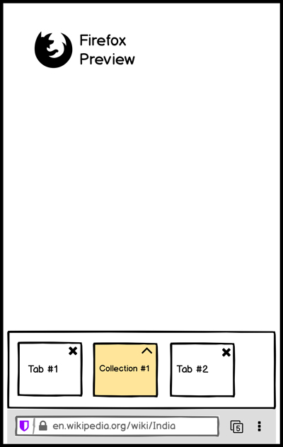
- Tab grid preview
- 2 Tabs under Firefox Logo (Tabs & Collections)
Collections need to be visible in my opinion because it is a pretty good feature for marketing and helpful for browsing the web. (Web-routine)
The design suggestion I made would offer the option to insert a 3. Tab like Library which would be pretty great (probably a UX-Ticket here).
 mikeGolf08
on 6 Oct 2019
mikeGolf08
on 6 Oct 2019
Maybe something like this:
- On tapping the tab-switcher icon, a window will slide-up from the bottom of the nav bar revealing the open tabs and collections in small-square previews scrollable horizontally.
- Collection squares can be tapped to reveal a slide to top vertical square previews of tabs within in as shown below.
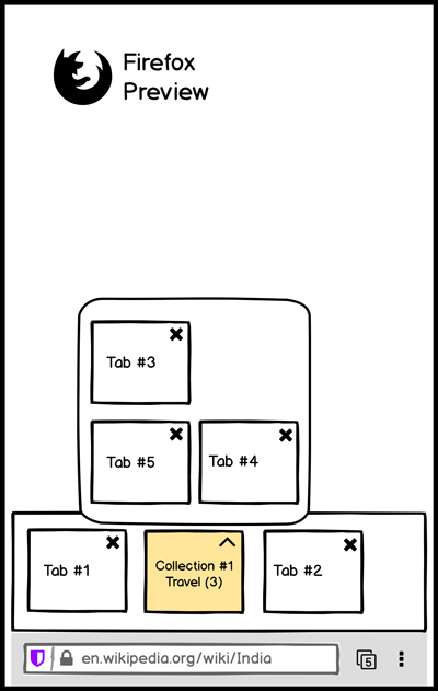
Related feature request: https://github.com/mozilla-mobile/fenix/issues/6083
 tonmoygoswami
on 17 Oct 2019
tonmoygoswami
on 17 Oct 2019
This design is quite good but has 2 disadvantages:
- A lot of vertical space is wasted
- There is little space to show site name or url for the tabs; at maximum it would be equal to the width of preview.
First one can be resolved to an extent by putting tabs and collections in separate rows, and/or having 2 rows.
The second one seems more difficult to tackle, but may not be necessary. Maybe greater clarity can be obtained by a working UI on how long a site name is required in order to quickly and accurately distinguish tabs in conjugation with the site's preview. In current firefox, they are actually equal to the tab width when compact tabs is enabled. Maybe more vertical space can be used if the page title/url is displayed in 2 or more lines above or below the tab (i would vouch for above)
Shaurya-Kalia
on 17 Oct 2019
So any progress?
Shaurya-Kalia
on 4 Feb 2020
Now I'm using Fenix Nightly as a daily driver I'm finding the absence of the page preview in the tabs view quite frustrating.
 madb1lly
on 27 Feb 2020
madb1lly
on 27 Feb 2020
Now I'm using Fenix Nightly as a daily driver I'm finding the absence of the page preview in the tabs view quite frustrating.
I have stopped using preview for this very reason. Just check occasionally if something's new. If a browser wastes my time, i do not prefer to use it. Actually holding off updating firefox nightly until some minor annoyances are resolved
Shaurya-Kalia
on 27 Feb 2020
As a user who has tons of tabs listed in the Tabs Tray, I would like to be able to choose actually, by a setting, whether I want to see concise tab information (basically like on current Fenix home page, favicon or really small preview and title, with more tabs per screen) or I want to see more detailed information (like larger site preview with or without title, with less tabs per screen).
For site preview is nice visually, but does not provide useful information on its own to facilitate navigation across numerous tabs, IMHO. That is why I prefer the current Fenix home page over the Fennec one with site previews, as article titles (in case of articles) are quite hard to read on previews for instance (unless the previews are larger, but then you have too fews tabs on a same screen).
 klint
on 7 May 2020
klint
on 7 May 2020
As a user who has tons of tabs listed in the Tabs Tray, I would like to be able to choose actually, by a setting, whether I want to see concise tab information (basically like on current Fenix home page, favicon or really small preview and title, with more tabs per screen) or I want to see more detailed information (like larger site preview with or without title, with less tabs per screen).
For site preview is nice visually, but does not provide useful information on its own to facilitate navigation across numerous tabs, IMHO. That is why I prefer the current Fenix home page over the Fennec one with site previews, as article titles (in case of articles) are quite hard to read on previews for instance (unless the previews are larger, but then you have too fews tabs on a same screen).
Truth be told, even the current favicon size in tabs is enough to show enough info in preview, to be able to completely distinguish different sites. Problem may arise when multiple pages of same sites are shown, which would be preventable by slightly increasing the preview size (as in fennec).
The current fenix implementation seems pretty useless to me. If more tabs were to be fit in page, the favicon could be made much smaller, without sacrificing functionality. As of now, fenix fits 4 tabs in a page, and one scroll up fits 6-7 (when firefox logo gets hidden) on my 1920 by 1080 screen. Compared to that fennec fits 4-5 tabs.
In my opinion, the fennec implementation was a very good midway between page preview approach of chrome browser and a simple list with small favicons. The fenix implementation is a step down, since it increases page identification time, while also not allowing a sufficiently large number of tabs to be fit in in return.
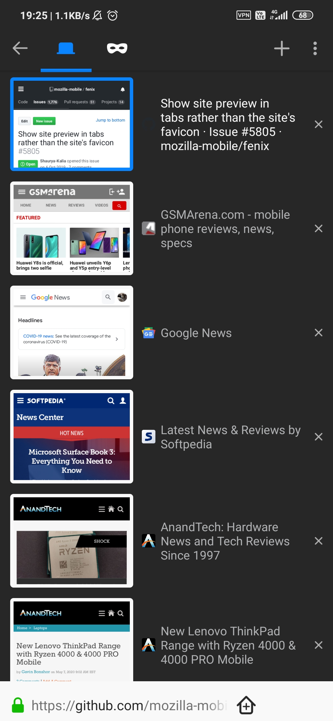
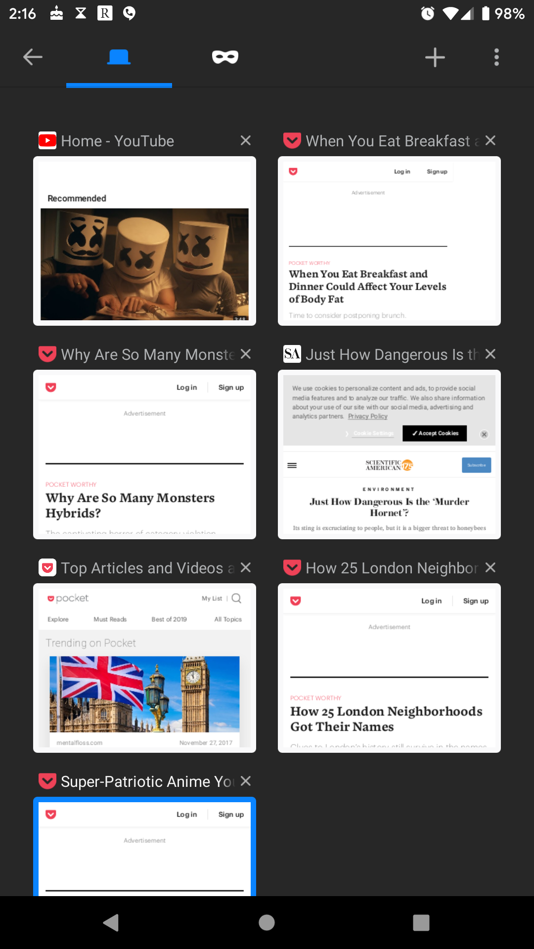
This is screenshot of fennec. It shows 6 tabs with previews which allow a site to be recognised easily, just through previews. One doesn't even need to read description to identify the site.
This is screenshot from samsung browser. Page previews are smaller. At max half a tab more can be fit, but identifying sites is a bit more difficult.

This is screenshot from kiwi browser, with list view enabled. It shows favicons. Its okay if different sites are open, but one needs to read the title to effectively identify site. It can fit roughly double the tabs, but it becomes increasingly difficult to identify tabs when a lot many pages from same site are opened
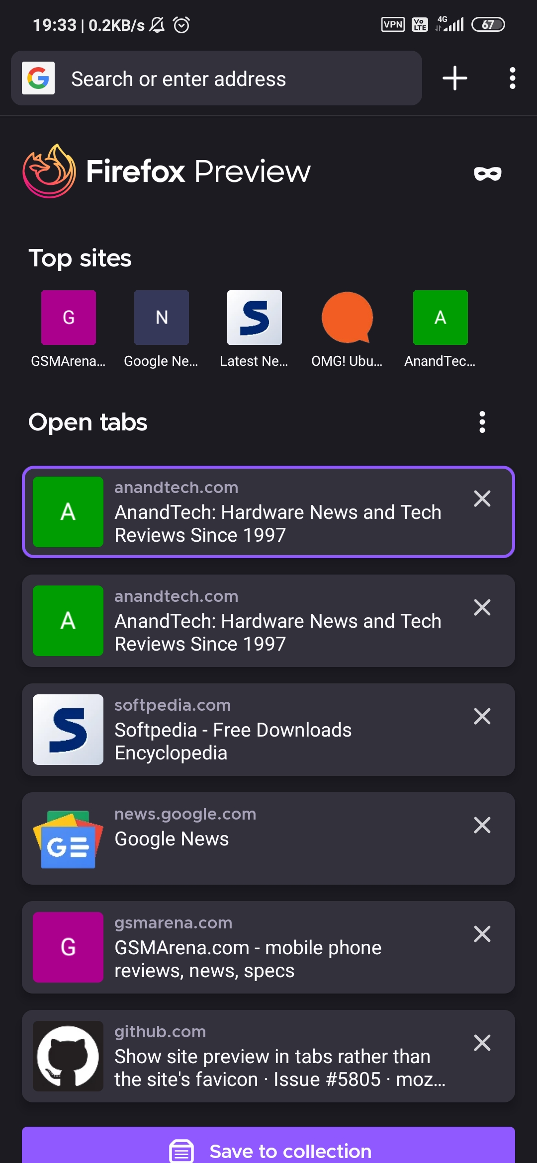
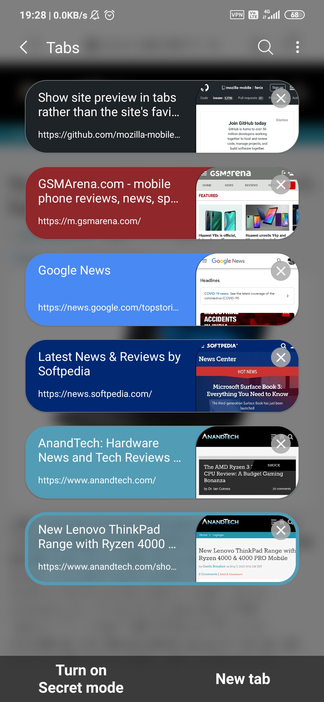
And finally, current fenix implementation. It can fit 2 more tabs at max, but the tradeoffs are not worth it. Site identification is slower compared to page previews, and it can't fit as many tabs as kiwi can.
Fennec's implementation and kiwi's implementation make sense, since they are able to achieve one thing at a trade off of another. Fenix takes an uneasy middle ground with no clear advantage.
The above screenshots were taken on device with 2160 by 1080 screen
Shaurya-Kalia
on 7 May 2020
Thank you for gathering all those examples.
I don't know what user research says actually, but when it comes to... me😉, the only option that show really useful information in the case of numerous tabs is the old Fenix implementation (without the top sites of course) : text contrast, colors, sizes for titles and urls , information density, favicons size (or site previews with the same size) allow to scroll fast and find the needed tab. Note that with the new Fenix tabs tray, additional tabs can be displayed as the top sites are not there anymore.
I also understand the need for a visualization as in fennec though, and it would be perfect if we had a user toggle to chose between both Fennec and old Fenix views!
klint
on 7 May 2020
Adding Fennec's compact layout:
 yoasif
on 7 May 2020
yoasif
on 7 May 2020
Hi all,
I think that compact tabs is another issue (which I also support 😉).
It's clear that some like favicons, some like previews. I'm the latter, but what's important is that we get the choice.
This is another one of those features that a huge number of people being migrated from Fennec are missing or will miss when they are migrated. To some it will be alienating and they will start using another browser. I still do not understand why feature parity with Fennec was not the baseline for Fenix, it really will be a huge risk migrating people before that parity is reached.
Cheers 🙂
madb1lly
on 8 May 2020
Until compact tabs with a preview system similar to the current fennic is implemented I just can't switch over to the new browser (and I'd love to give it a try)!
After I switched from Chrome to FF on Android mainly for ublock origin, I realised just how useful those compact tabs with previews are.
 ElvenSpellmaker
on 11 May 2020
ElvenSpellmaker
on 11 May 2020
Hi @cadeyrn and @andreicristianpetcu,
You don't agree with what I wrote, but can you explain in more detail what you don't agree with? That would help the discussion along.
Cheers 🙂
madb1lly
on 12 May 2020
Adding reference to #10683 as both tickets are related to the nature and amount of data displayed in the tab tray for its efficient usage in all cases (low number of items or high number of items in the tray).
klint
on 22 May 2020
This has been completed by @gabrielluong through several other issues. Closing.
 darkwing
on 2 Jun 2020
darkwing
on 2 Jun 2020
Related issues
 clitetailor
·
3Comments
clitetailor
·
3Comments
 bbinto
·
3Comments
bbinto
·
3Comments
 csadilek
·
3Comments
csadilek
·
3Comments
 AndiAJ
·
3Comments
AndiAJ
·
3Comments
 andreicristianpetcu
·
3Comments
andreicristianpetcu
·
3Comments
Most helpful comment
Adding Fennec's compact layout: