Fenix: Custom tab app bar does not follow UX specs
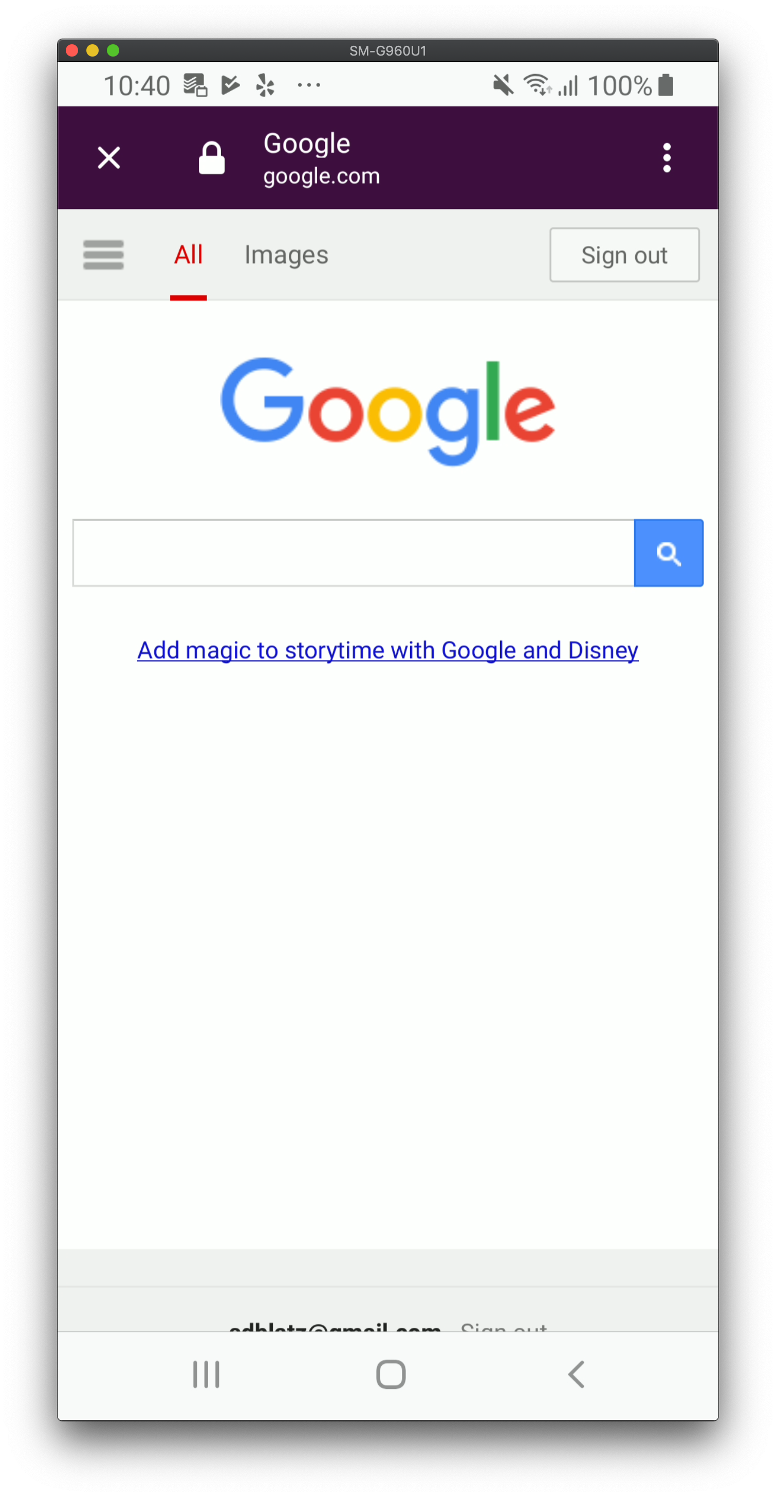
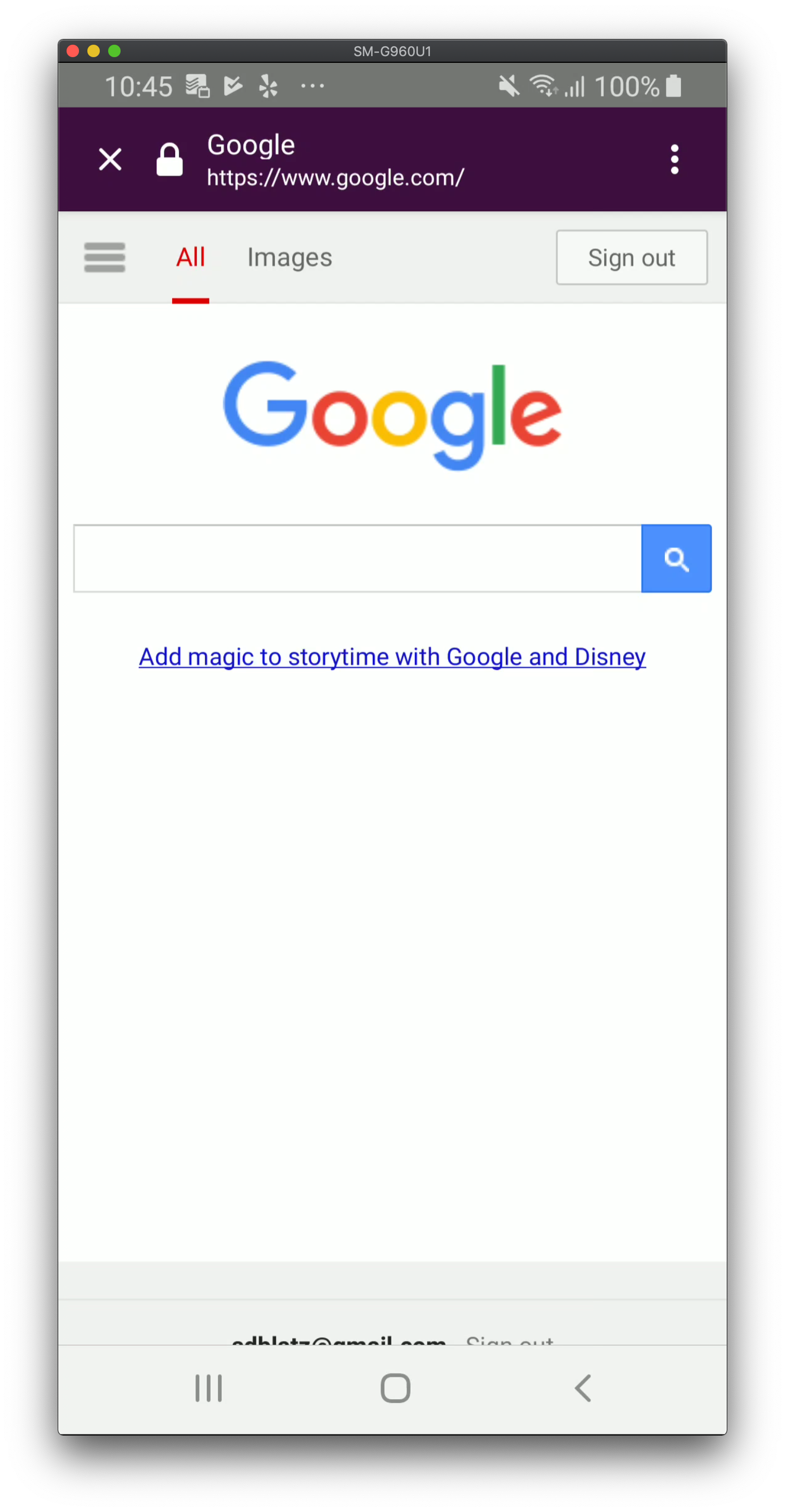
This has been filed in AC for a while, but I want it to have visibility in the Fenix repo so we can get it prioritized properly.
https://github.com/mozilla-mobile/android-components/issues/1514
I had a PR for fixing this but it caused issues for other consumers of AC: https://github.com/mozilla-mobile/android-components/pull/3610
Before

After

All 6 comments
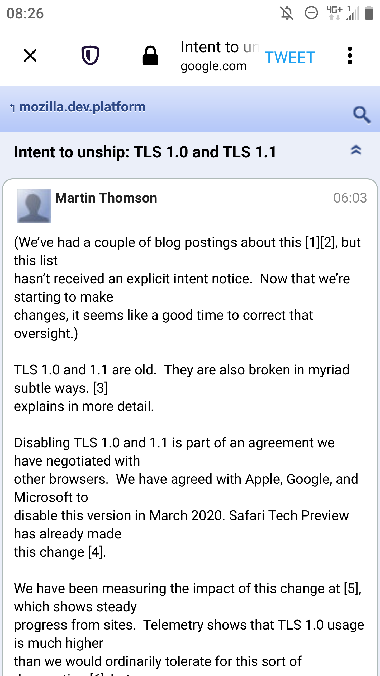
I hope this will be addressed soon. With a Twitter custom tab it's even more worse as in the screenshot because there is also a "TWEET" button which takes space, but also other apps have an additional button in the toolbar. On my device there is maybe 50 percent of the screen width available for the page title / hostname and since it's not possible to scroll the content of this area it would be good to have as much space available for the page title / hostname as possible.
The custom tab app bar in Firefox Preview is getting even worse. :( Now with the new shield icon there is almost no space left for the page title / URL.
Can this issue be prioritized, please? It's also a phishing vector if you can't see much of the URL - and again: you can't scroll the address field, this makes it even more important.
/cc @sblatz @pocmo

We could reduce the padding around the icons, this could save some space

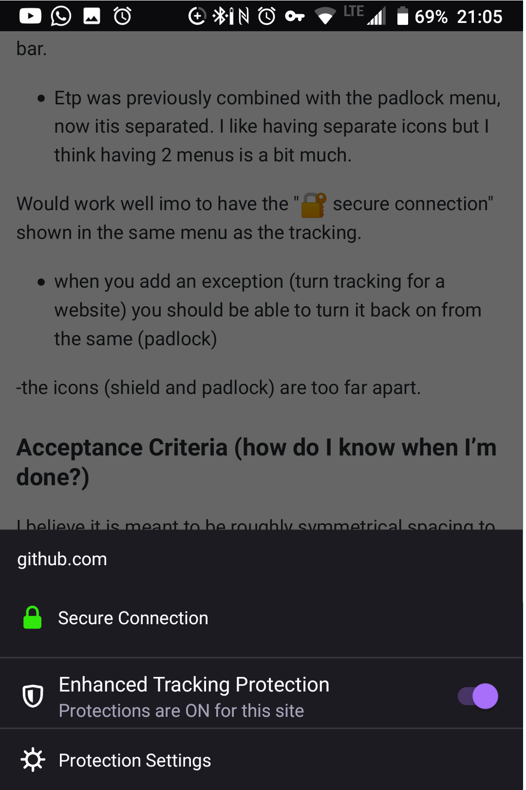
I suggest joining the shield and lock icon so there is only one icon and menu, like it was a few weeks ago
Also.. When you toggle off tracking for a website, it should not hide the tracking menu from the website.
Don't need 2 menus:

Seems to be fixed now by @Amejia481 😄
Verified as fixed on Nightly 9/27.
Samsung Galaxy Tab 3 (Android 8.0), Samsung Galaxy S8 (Android 9), Sony Xperia Z2 (Android 6.0.1)
Most helpful comment
We could reduce the padding around the icons, this could save some space