Why/User Benefit/User Problem
This issue handles several minor UX issues that are a bit related:
- I don't see the benefit of the quick action sheet.
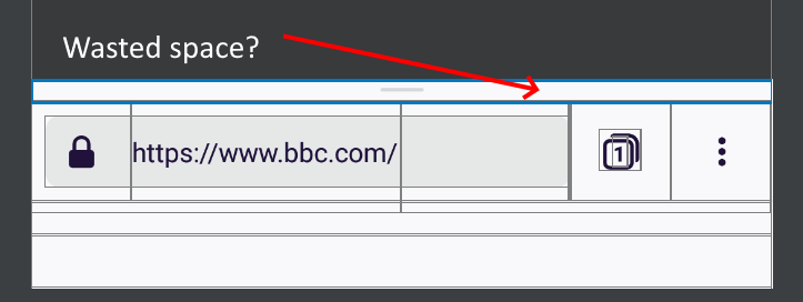
- Small usable screen estate.
Small usable screen estate
When comparing Fenix to Chrome there's much less usable ("website") screen estate:
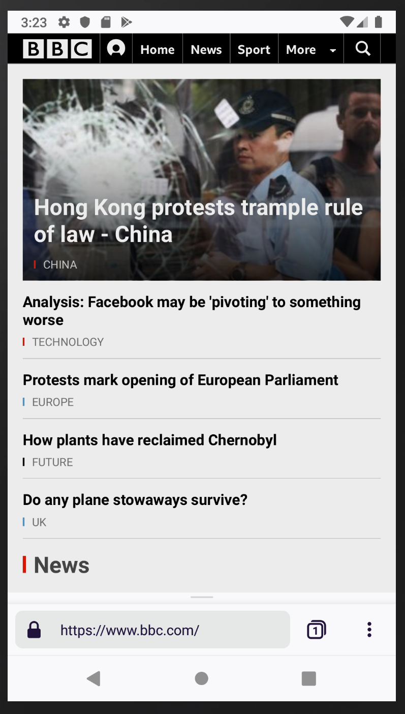
Fenix
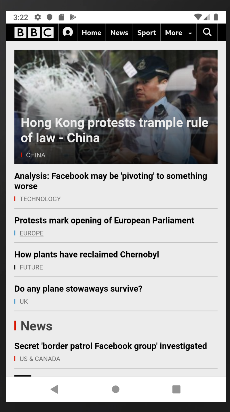
Chrome: More content is visible
Note: Chrome auto hides the toolbar (even when the toolbar is visible chrome has 1123px to display the content where as Fenix only has 1091px).
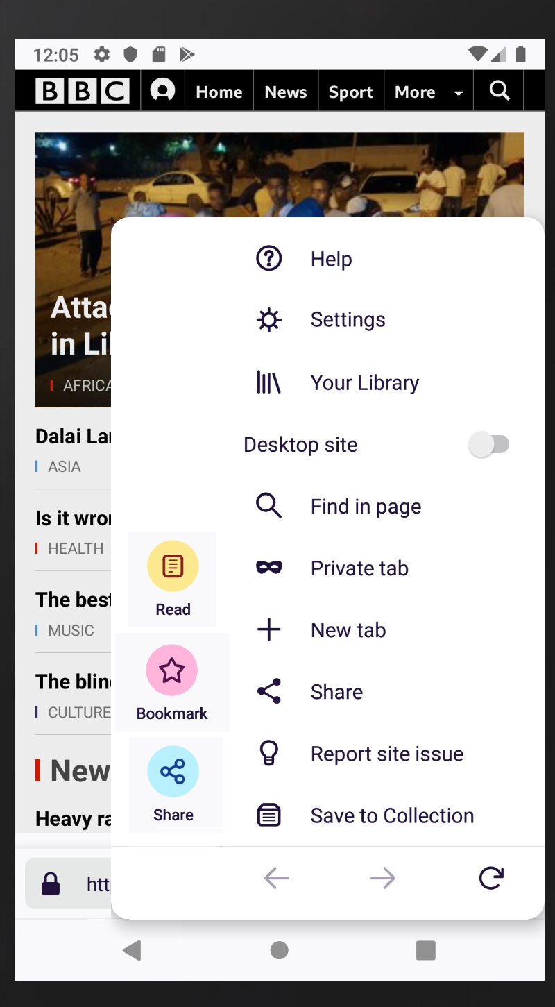
Benefit of the quck action sheet?
According to me the quick action sheet has no benefit: To invoke "Share" or "Bookmark" I need 2 interactions:
- Swipe to open the action sheet
- ...and then press the "Share"/"Bookmark" button.
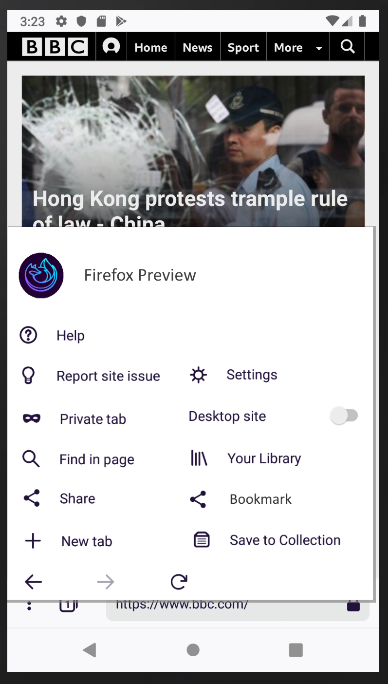
It also takes two interactions to invoke "Share" from the menu:
- Open the menu ("...")
- Press the "Share" button.
...No benefit but it wastes precious vertical space.
Possible suggestions
- Remove the quick action sheet altogether.
- ... or provide an option to disable the quick action sheet.
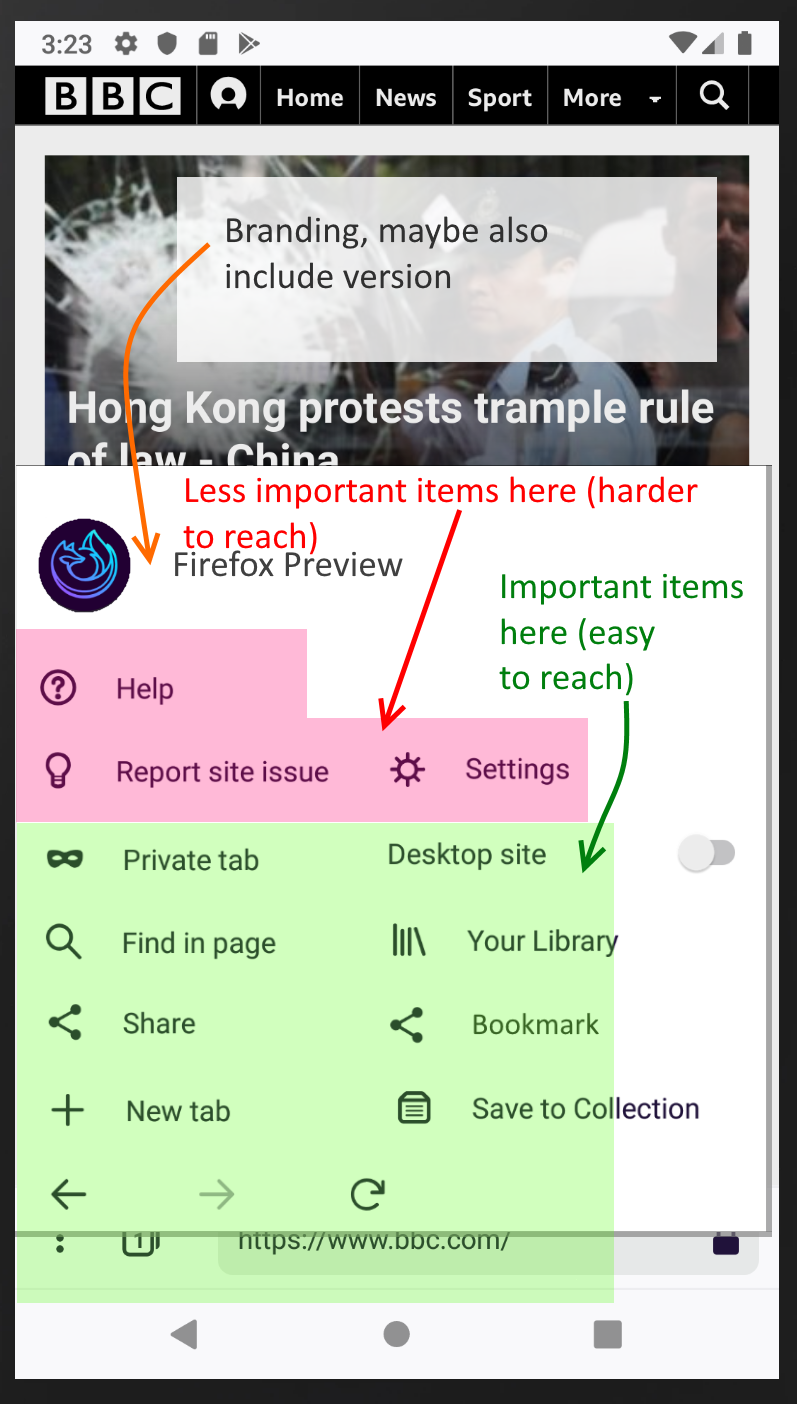
- ... or integrate the quick action sheet buttons into the menu (see example below).
- Auto-hide the toolbar (like chrome does).
Example 1: Menu integration
Phones get bigger and bigger I think there's enough space to provide a two column layout menu (*1). This has those advantages:
- Enough space to integrate the quick action sheet buttons.
- Using a two column layout you could place all important actions in the area that's easy to reach on big phones.
(*1): Not on all phones though: The layout should adapt to phone size: When there's not enough horizontal space the menu should fall back to a one column layout.
The menu could then look like this (note: The "bookmark" and "share" buttons from the quick action sheet have been integrated):
With description:
 cronosun
All 7 comments
@apbitner for your consideration as you look at QAB
 mheubusch
on 2 Jul 2019
mheubusch
on 2 Jul 2019
Personally not a fan of the two column layout, but I do think it'd be nice to disable QAB and have the items in menus.
 yoasif
on 2 Jul 2019
yoasif
on 2 Jul 2019
but I do think it'd be nice to disable QAB and have the items in menus.
Sounds like a good solution to me.
cronosun
on 3 Jul 2019
Please note that the QAB can contain more items than only "Share" and "Bookmark". For pages with reading mode available there is also the reader mode access in the QAB. And early mockups showed two more items which are not yet implemented in Fenix 1.0.0 but could be implemented later (Screenshot and Download).
In reading mode the QAB shows also items for "Appearance" and "Close".
Also due to the move of some menu items to the left your proposal make it more difficult to reach some menu items which are easier to reach in current implementation, for example the back button.
 cadeyrn
on 3 Jul 2019
cadeyrn
on 3 Jul 2019
@cadeyrn
And early mockups showed two more items
Also move them into the menu when the QAB is disabled.
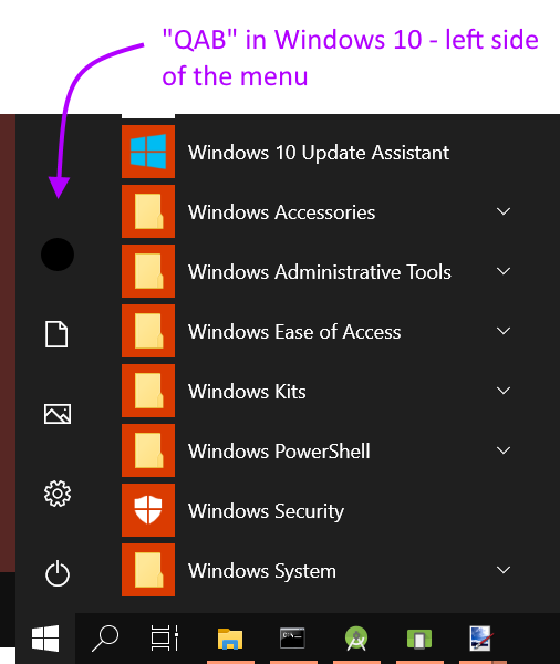
Or another solution: (Optionally) Merge the QAB and the menu; would look like this:
Prior Art: Windows 10 Menu
cronosun
on 3 Jul 2019
removing needs ux label - taking a look at this in a larger QAB design effort
 lime124
on 24 Jul 2019
lime124
on 24 Jul 2019
The Quick Action Bar is being removed at this point in time. Work covered in https://github.com/mozilla-mobile/fenix/issues/4281.
 apbitner
on 3 Oct 2019
apbitner
on 3 Oct 2019
Related issues
 clitetailor
·
3Comments
clitetailor
·
3Comments
 abodea
·
3Comments
abodea
·
3Comments
 bbinto
·
3Comments
bbinto
·
3Comments
 ekager
·
3Comments
ekager
·
3Comments
 andreicristianpetcu
·
3Comments
andreicristianpetcu
·
3Comments
Most helpful comment
@cadeyrn
Also move them into the menu when the QAB is disabled.
Or another solution: (Optionally) Merge the QAB and the menu; would look like this:
Prior Art: Windows 10 Menu