Fenix: Consider reordering toolbar items
Why/User Benefit/User Problem
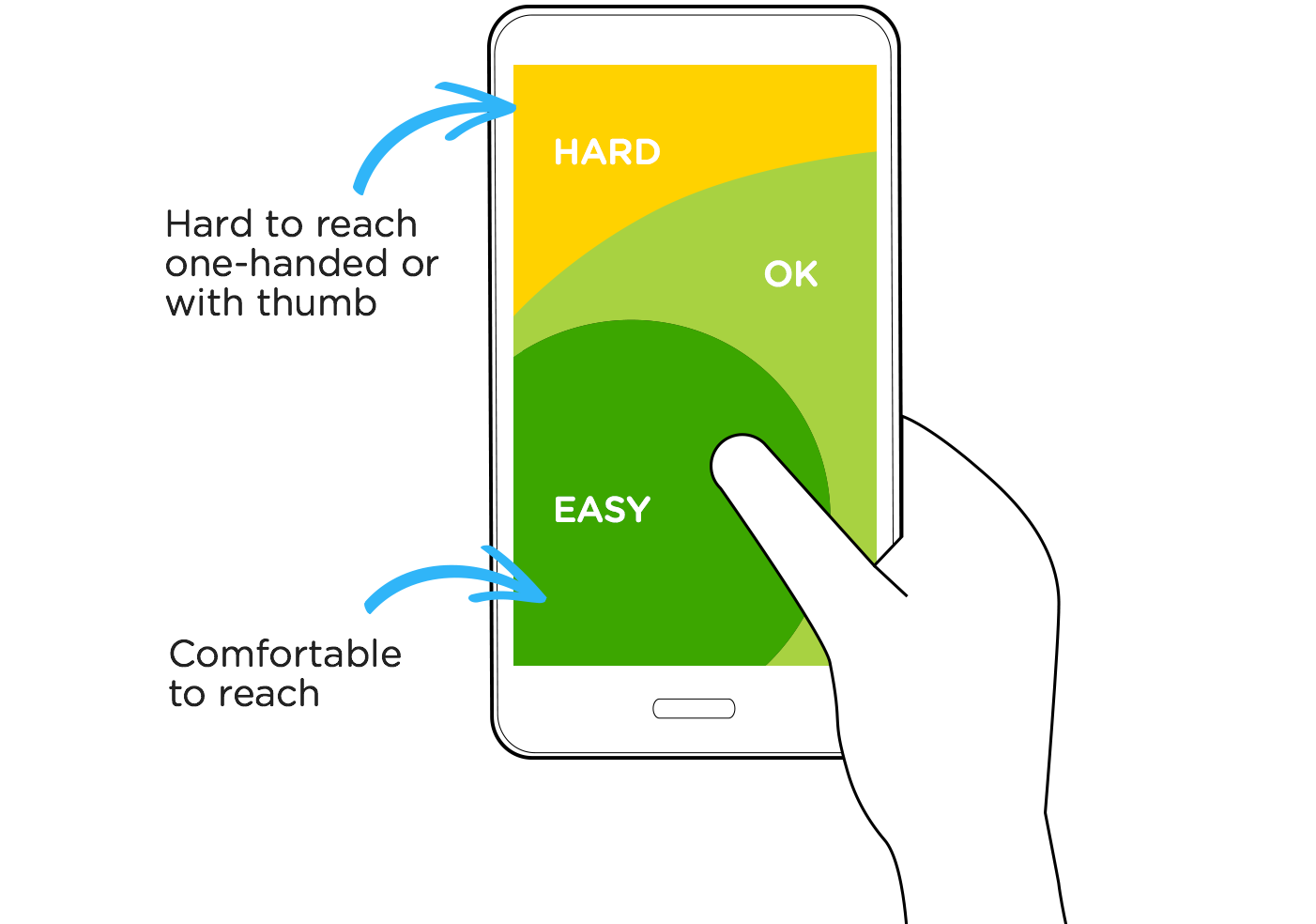
Over the last few years phones got bigger and bigger. It's hard to reach items in the top of the screen and on the right side of the screen. I appreciate placing the toolbar to the bottom, that's nice. I think you should also reorder the items in the toolbar a bit: things we don't use often should be moved to the right, things we use often should be moved to the left. The toolbar consists of those items:
- Security Information
- The URL
- The tabs buttons.
- The menu button ("...").
See also:
https://www.lukew.com/ff/entry.asp?1927
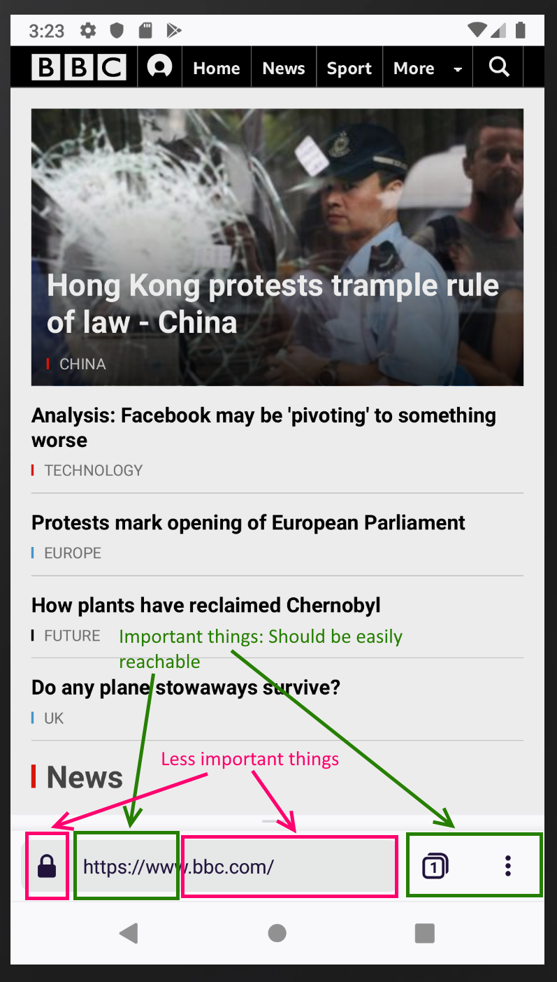
Security information and the right half of the URL usually do not need to be touched, so they should be moved to the right. Note: right half of the URL: why? To change the URL it's enough to touch the left half of the URL.
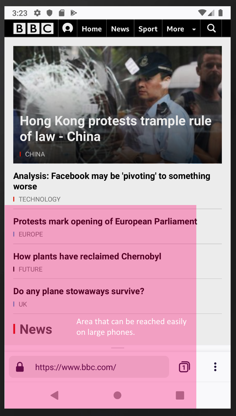
Currently (2019-07-02) looks like this
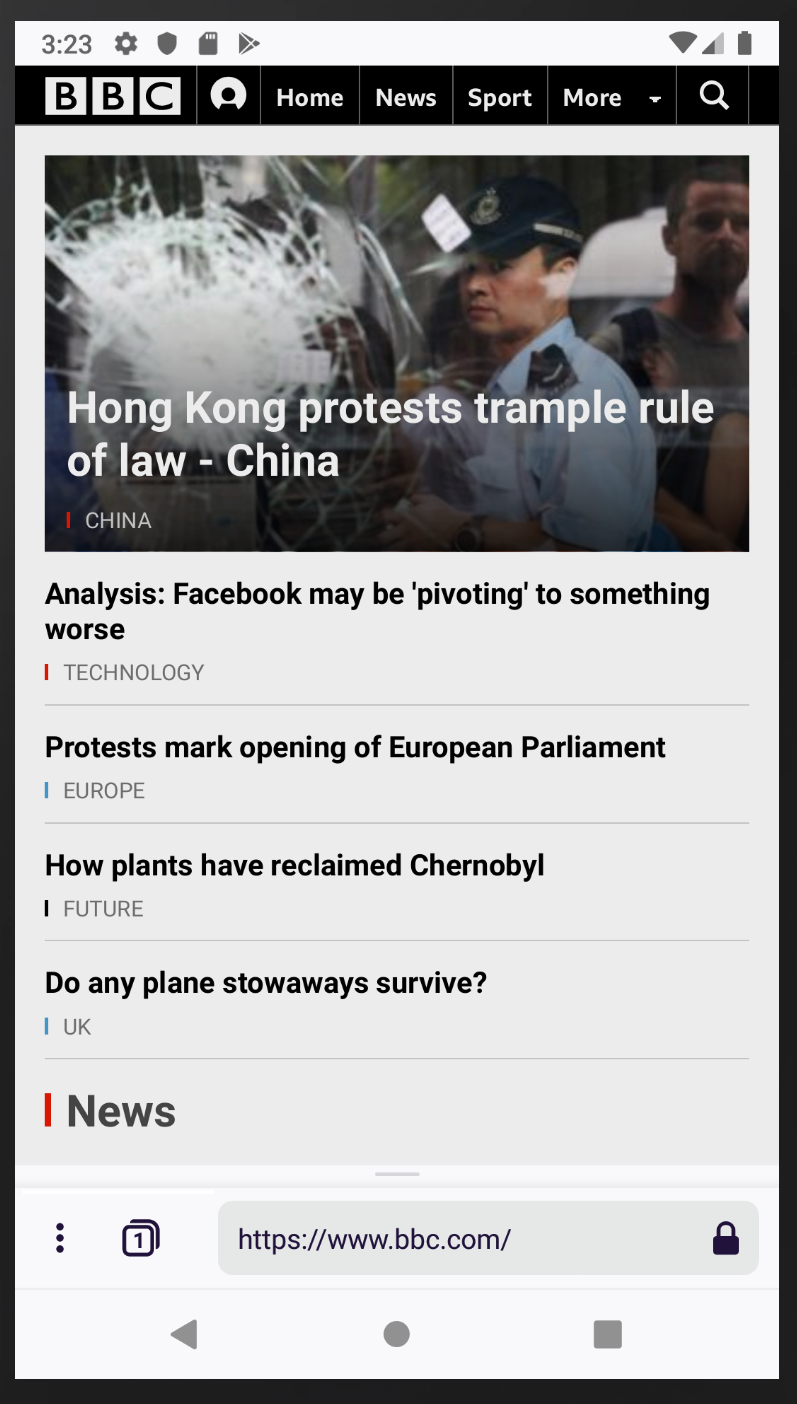
After reordering would look about like this
Considerations
- I don't know about people holding their phone in the right hand... maybe add an option to inverse ordering?
 cronosun
All 8 comments
I vote against your proposal. And the funny part is: Your image with the arrows and the "important things" / "less important things" shows the reason for not changing anything. 😉
The current implementation allows me to open the menu, reload the website and switch to the start screen with only one hand. With your proposal I would need two hands for all these actions. And all of these features are - by far - more important for me than reaching the padlock icon.
 cadeyrn
on 2 Jul 2019
cadeyrn
on 2 Jul 2019
@cronosun, I assume you are left-handed, because as a right-handed person, your proposal is the opposite of what I find convenient.
Maybe you should change the title to "Inverse toolbar ordering for left-handed"?
 rubcap
on 2 Jul 2019
rubcap
on 2 Jul 2019
@apbitner please consider as you explore navigation bar.
 mheubusch
on 2 Jul 2019
mheubusch
on 2 Jul 2019
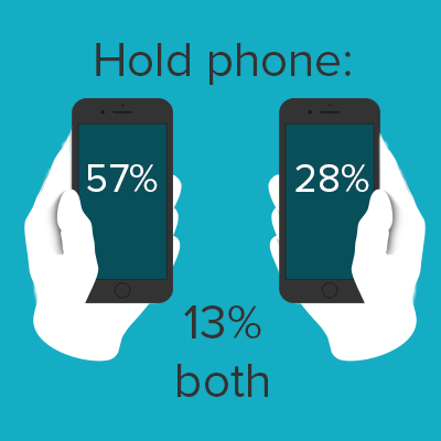
@rubcap : My right hand is the dominant hand (the "writing" hand; the "mouse" hand); But I hold my phone in the left hand (like 57% according to the linked study) and use the thumb to navigate / touch (the phone is too wide to reach to outer right edge - to reach the outer right edge I need the second hand - the right one).
Study: https://tristandenyer.com/work/user-research-people-hold-interact-phone/
cronosun
on 2 Jul 2019
To be honest I don't believe that these numbers are representative. It's based on a survey (why there is no number of asked people?) and it doesn't match my experience at all. It's known that there are much more right-handed people in the world and I've never seen someone right-handing holding the phone in the left. While it's possible and I am sure that these people exist I can't believe the "57 percent". Of course I can be wrong, I am also not representative and I don't know studies about this topic but I wouldn't change anything based on a survey that hides the number of participants.
Also the graphic with the "hard to reach" and "comfortable to reach" is not really true. As I already said, the buttons on the bottom right are very ease to reach for me (the graphic says only "okay") and the bottom left is not to reach at all for me (and the graphic says "easy" (!) to reach)…
And the argumentation is contradictory: The graphic with the "hard to reach" and "comfortable to reach" shows somehone holding the phone in the right hand and tells us that the bottom left is easier to reach than the bottom right. As I said I don't agree but let's assume it's correct. So for everyone holding the phone in the left hand the opposite has to be true. Now you posted another graphic saying 57 percent hold their phone in the left hand. So it's your own argumentation that says that nothing should be changed (at least as default)…
But maybe all people can be made happy - I am still against a change of the default. But an option to inverse the order could indeed make Fenix better accessible for some people. I don't know other browsers with such a feature. So it would also be some kind of USP.
cadeyrn
on 3 Jul 2019
@cadeyrn
I am still against a change of the default.
I agree. The proposed reordering should be optional: for example on a smaller phone like the 5.8" Xiaomi MI A2 Lite the current toolbar layout is more convenient.
I don't know other browsers with such a feature. So it would also be some kind of USP.
I tried several other browsers like Chrome, Opera, Samsung Internet, Edge and the Xiaomi Browser: All those browser AFAIK have about the same toolbar layout as the current version of Fenix. But: They can't be compared to Fenix, because I can't operate them with one hand anyway, because all these browsers have the toolbar (or at least the URL input) at the top. Even the URL input at the bottom is a great USP for Fenix.
cronosun
on 3 Jul 2019
removing @apbitner - he's focusing on related nav bar and QAB at the moment. removing UX label, i'm collecting these issues for ux to tackle at the same time.
 lime124
on 24 Jul 2019
lime124
on 24 Jul 2019
While the toolbar menu (3-dot menu) might be slightly easier to reach for right-handed users, once the menu is open those items would become more of a reach, so it makes sense to keep the menu on the right where it is.
 apbitner
on 3 Oct 2019
apbitner
on 3 Oct 2019
Related issues
 ekager
·
3Comments
ekager
·
3Comments
 vesta0
·
3Comments
vesta0
·
3Comments
 bbinto
·
3Comments
bbinto
·
3Comments
 softvision-miralobontiu
·
3Comments
softvision-miralobontiu
·
3Comments
 Chris01277
·
3Comments
Chris01277
·
3Comments