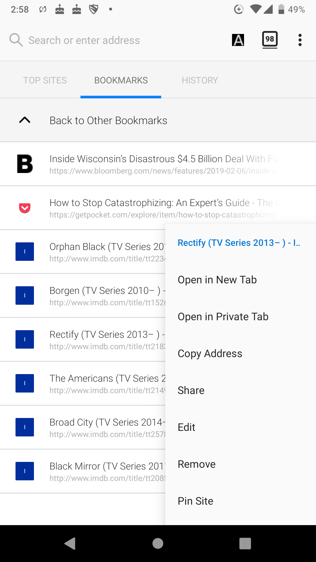
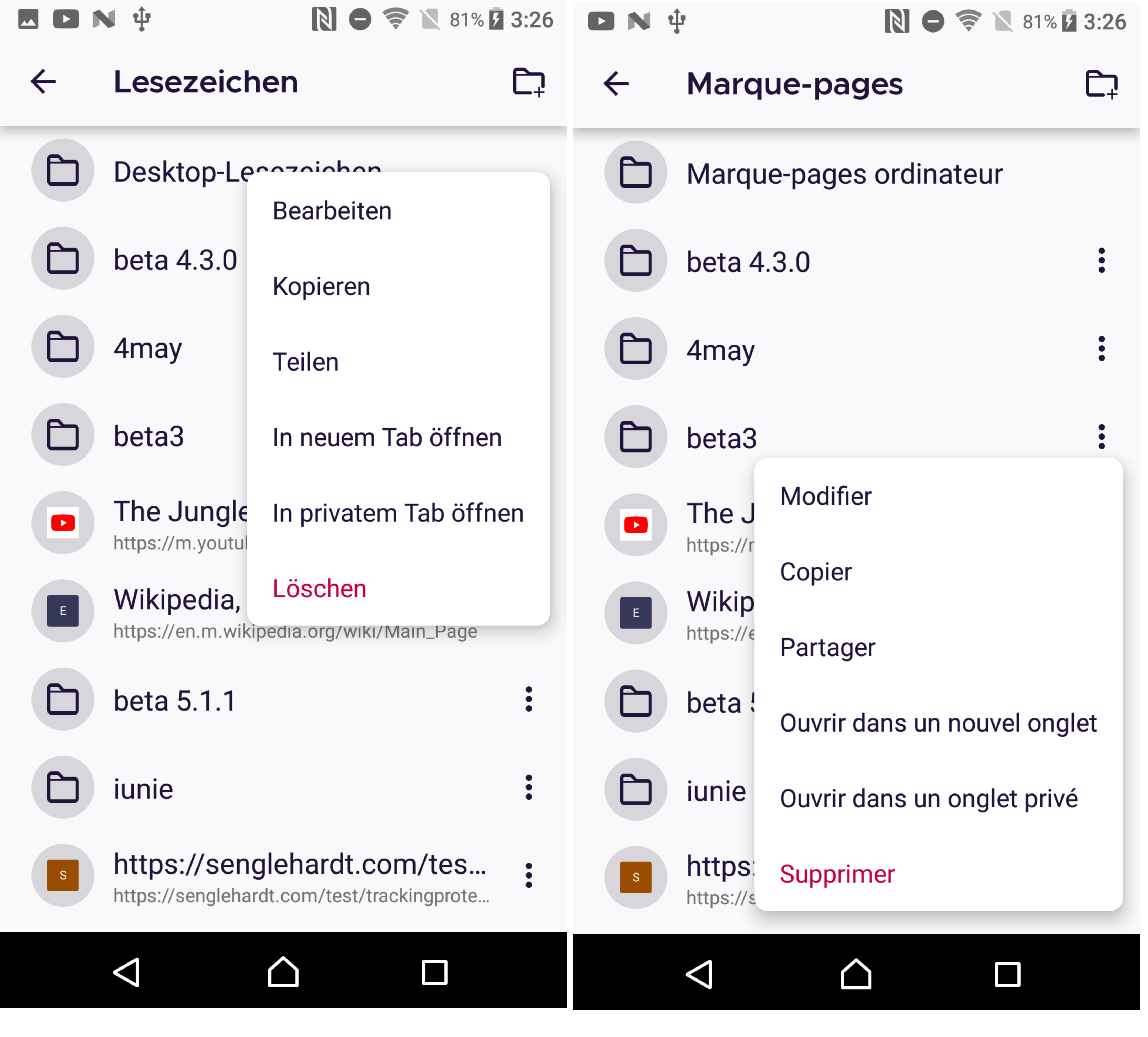
Fenix: FNX-486 ⁃ [Bug] Context menus across app are too wide (like Bookmarks)
Steps to reproduce
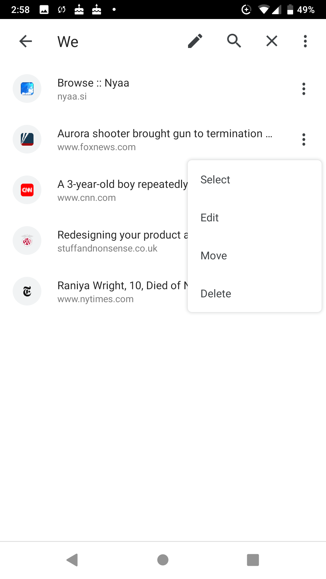
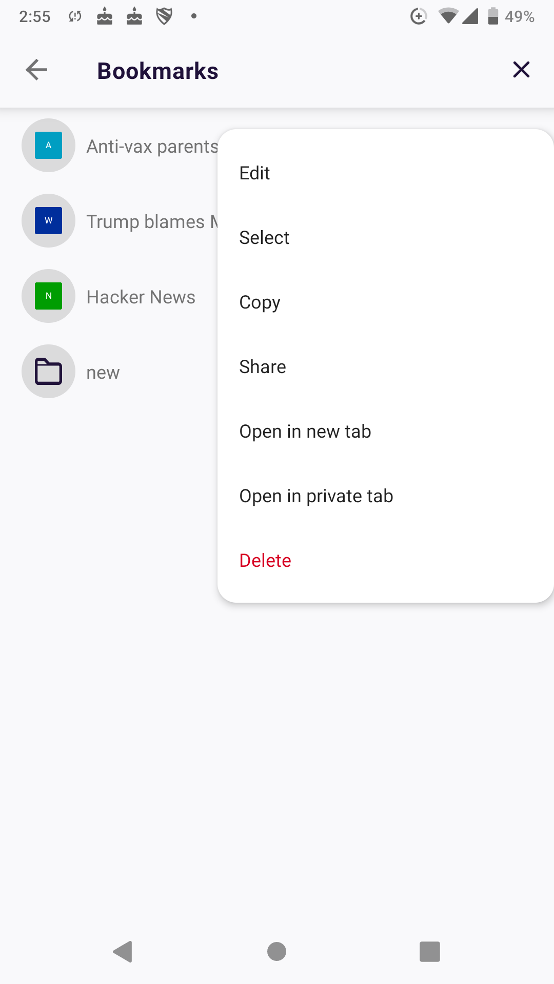
- Open Library > Bookmarks
- Open context menu next to a bookmark
Expected behavior
Narrower menu that shows menu items without looking oddly wide.
Fennec and Kiwi look neater:
Actual behavior
Menu looks too wide.
Device information
- Android device: Pixel 2
- Fenix version: latest play store
 yoasif
All 13 comments
This has already taken a lot of work, and isn't worth continuing bc of eng effort for ROI.
 liuche
on 19 Jul 2019
liuche
on 19 Jul 2019
 sblatz
on 19 Jul 2019
sblatz
on 19 Jul 2019
@liuche is this still too much ENG work (narrowing the BOOKMARK context menu)? If so, please comment and close this.
 vesta0
on 12 May 2020
vesta0
on 12 May 2020
@sblatz @ekager I assume the difficulty here hasn't changed much, and it's still hard to handle dynamically sizing (or shrinking) the context menus in AC?
liuche
on 12 May 2020
cc @Mugurell it looks like you landed something in AC that could help with this?
 ekager
on 12 May 2020
ekager
on 12 May 2020
Thanks Emily!
Indeed, I recently added support for dynamic width menus in A-C (https://github.com/mozilla-mobile/android-components/issues/6499) but using only xml set values.
The next step would be to add runtime values support, should be fairly easy.
For this ticket we would just need to know a min/max width for the menu.
I guess
- min would be let's say 10dp (as small as possible)
- max would be 250dp (I think what it is now)
?
The menu will have a dynamic width between this values, it will be as narrow as the widest menu action.
 Mugurell
on 12 May 2020
Mugurell
on 12 May 2020
Sounds good to me! As long as it's adjusting to the widest menu item doesn't really matter what the min is 👍
ekager
on 12 May 2020
Having the possibility of setting a min/max size for each menu is definitely nice.
Based on also what Emily said above I was thinking that maybe we should make it as a default for all menus to be as small as their widest item.
Currently all menus can have between 250dp-314dp width. Should we by default allow for even a smaller width?
Mugurell
on 15 May 2020
Would be great to align to an 8dp grid and follow material guidelines where the minimum width is 112dp and max width is 280dp.
 topotropic
on 4 Jun 2020
topotropic
on 4 Jun 2020
This is still important to Vesta, but it's too much work before Release.
liuche
on 11 Jun 2020
I think I might have an easy solution following the recent https://github.com/mozilla-mobile/fenix/issues/7157 and the UX directions from:
- https://github.com/mozilla-mobile/fenix/issues/10541#issuecomment-635147257 & https://github.com/mozilla-mobile/fenix/issues/7157#issue-537777448 - Maximum width: 314 dp while also ensuring a minimum 48dp tappable “exit area” available whenever the menu is open.
- https://github.com/mozilla-mobile/fenix/issues/1871#issuecomment-638842210 - minimum width is 112dp.
The menu width should be dynamic between this constraints, wrapping it's content.
Mugurell
on 15 Jun 2020
@Mugurell I think I'm somewhat late to report my comments now since there're some commits that have already been added, but can you please take a look at my comment on the issue #11716. I think the three-dot menus on the bottom navigation tray and the menu at the new Tabs Tray should be reverted to the previous state. I know it'll introduces some inconsistencies with the other existing menus but I think the menus I mentioned should be expanded back because of the usability of the buttons and when using them with only the right hand and the thumb button will be at the centre so clicking it'll be harder if the buttons are reduced in size.
 ghost
on 18 Jun 2020
ghost
on 18 Jun 2020
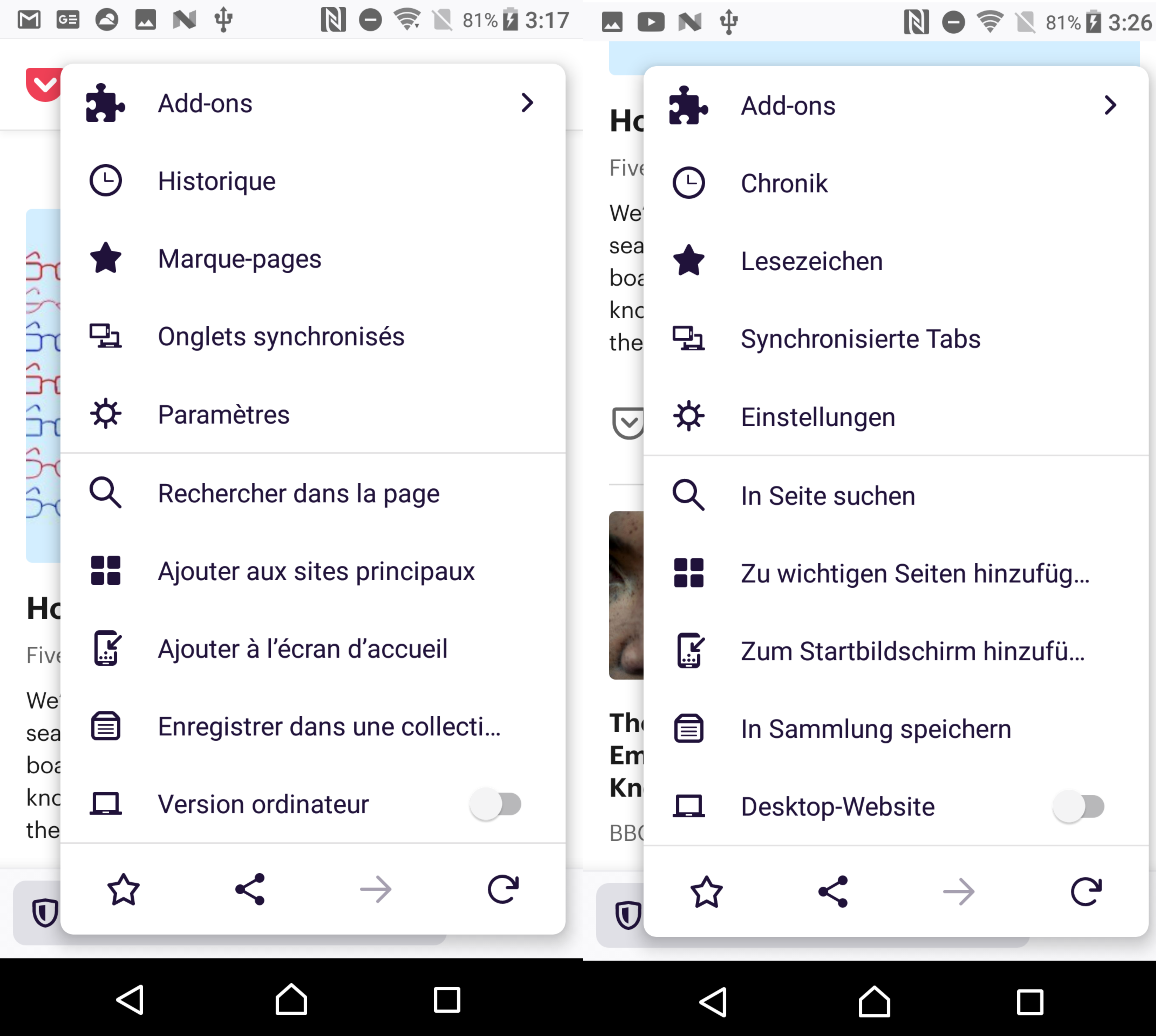
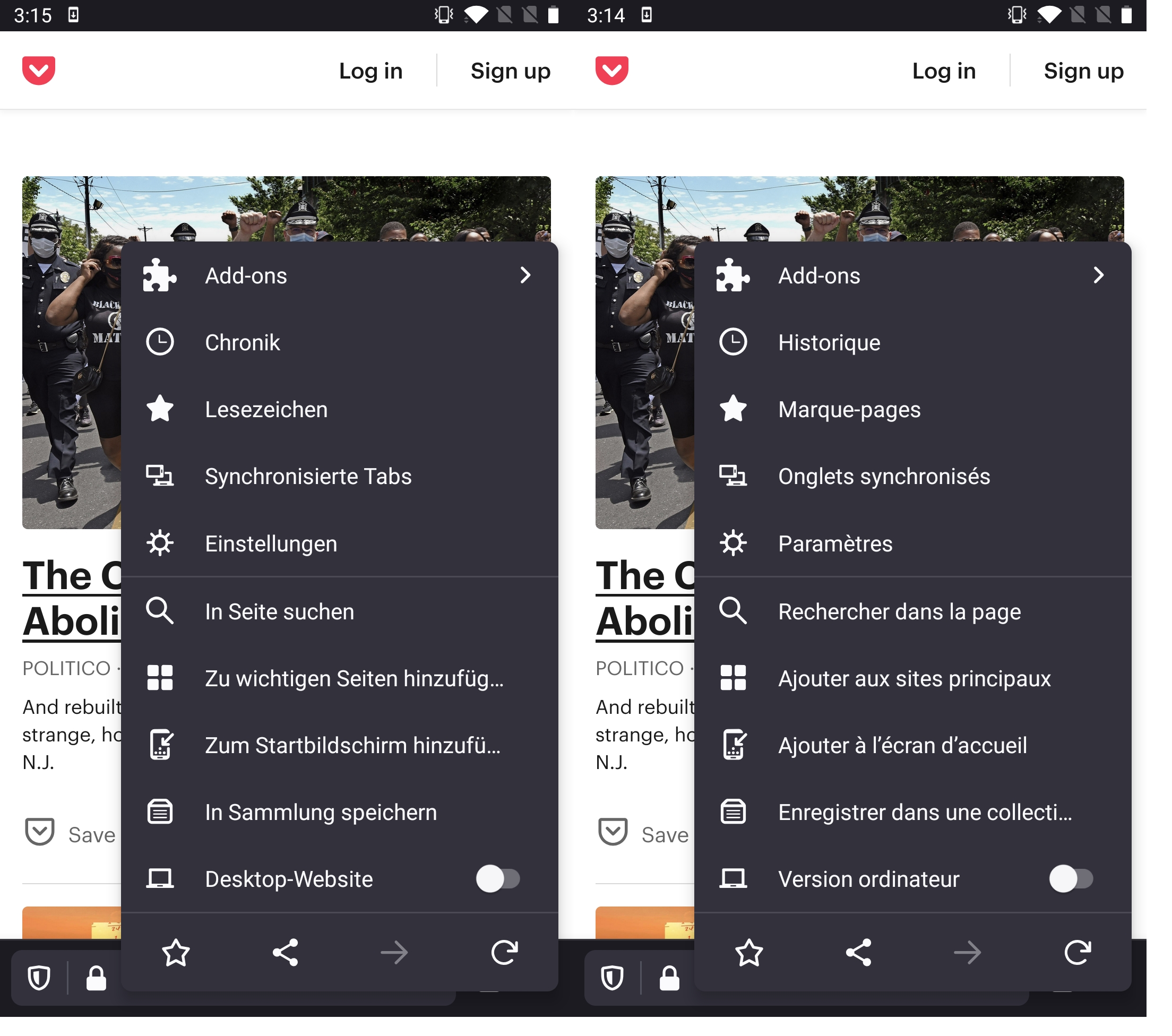
Verified as fixed on the latest Nightly build from 6/19 with Sony Xperia Z5 Premium (Android 7.1.1), and OnePlus 5T (Android 9).
The context menus, three-dot menus, bookmark menus are dynamic, adjusting to it's content.
 softvision-miralobontiu
on 19 Jun 2020
softvision-miralobontiu
on 19 Jun 2020
Related issues
 Chris01277
·
3Comments
Chris01277
·
3Comments
 abodea
·
3Comments
vesta0
·
3Comments
abodea
·
3Comments
topotropic
·
3Comments
abodea
·
3Comments
vesta0
·
3Comments
abodea
·
3Comments
topotropic
·
3Comments