Fenix: FNX2-15979 ⁃ Progressbar not visible at bottom because of shell or tempered glass
Why/User Benefit/User Problem
I use a tempered glass on my phone to protect my screen.
The glass has a black thin stripe all around, hidding a few pixels at bottom of the display.
This make the progressbar barely visible on my phone.
I think it's not a unique situation: as the phone edges are smaller and smaller over time, There are several tempered glass with this black stripe now and also some protection shell may cover a bit the display area on some phones.
What / Requirements
Maybe it's possible to change progress bar position (it could be optional) ?
it may be moved between address bar and page display (on top of address bar).
FYI, in my situation, the bar is partialy hidden, but still 1 or 2 pixel are visible.
So I compared with kiwi browser (address bar on bottom too, but dark theme).
On kiwi The progressbar is colored and address bar is black background: it's very thin, but still visible on my phone because of the bright color of the progress bar.
On Fenix, the progress bar is black and address bar is bright: this make the visibility worse.
Acceptance Criteria (how do I know when I’m done?)
Not sure what to propose as acceptance criteria, it's just an humble suggestion
But I would be happy when I can easily see the progress bar
Feel free to ask if any information or photo are needed
 bonjour81
All 16 comments
Thanks for your feedback @bonjour81 ! I have added this for the UX team to take a look at.
Quick question, do you not have the Android system nav bar on your phone then? Is that a customization or the phone?
 ekager
on 18 Mar 2019
ekager
on 18 Mar 2019
Hello @ekager !
You have guessed right: I do not have the android system nav bar: Fenix is displayed full screen, so the progress bar is at the very bottom edge of the entire display.
I use a oneplus 6T and I have enabled the so called "navigation gesture" mode. Android nav bar is replaced by simple gestures and is not displayed anymore.
This is a built in feature of my phone, no 3rd party customisation.
I think other brands offer similar feature.
bonjour81
on 18 Mar 2019
In previous builds of fenix have purple progress bar which has changed to the dark ink type of color which looks bad sometimes and doesn't blend well with awesome bar's color, so i think it should be changed to previous color, I'm not sure if it was a bug or feature which caused the change in previous color.
(Excuse my english as it's not my first language)
 Scripterr
on 19 Mar 2019
Scripterr
on 19 Mar 2019
Hi !
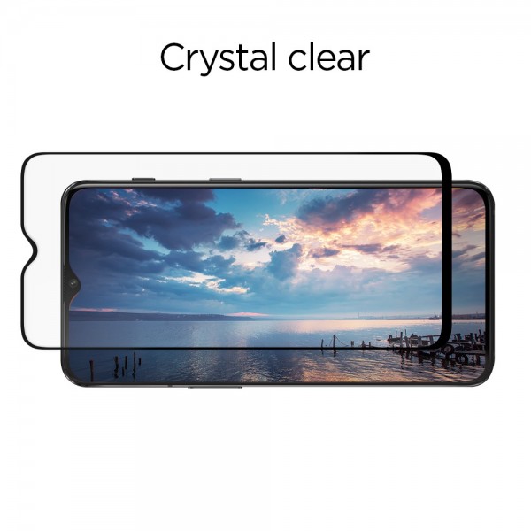
On my side, the issue is "mechanical/optical".
My tempered glass protection has a thin black stripe around, covering a thin band of pixel at bottom of the display. Those glass with stripe around are pretty common now (white, black, or matching phone color)
Depending of the angle I hold my phone, the progress bar is almost covered (here flashy color would help) or fully covered... and then color won't change any thing.
This may happens also with "a bit too much covering" protection shells.
Please see following picture of what kind of glass or shell I talk about:
bonjour81
on 19 Mar 2019
Alright, thanks for the additional info! We will need UX feedback about what they want us to do here because this will probably be a common request for users with no android navigation bar and edge to edge screen devices.
Some possible solutions could be:
- A bigger progress bar so it's more visible against the edge of the screen
- Move progress bar to the top of the toolbar instead of on the bottom
- A different progress animation all together
ekager
on 19 Mar 2019
if I can comment, I would say:
1- might seems weird to some users (with android nav bar?)
2- seems nice (similar to browser with address bar on top), it may be optionnal if bottom bar is also wanted.
3- why not :-).
(I have a stupid question: does "UX feedback" refers to anybody interested in the topic that wish to comment or refers to a "UX team/responsible" in the dev team ?)
bonjour81
on 19 Mar 2019
Haha thanks for your feedback, but yes I meant the UX team here at Mozilla will have to take a look and decide :)
ekager
on 19 Mar 2019
Thanks for explanation :-)
bonjour81
on 19 Mar 2019
Hi,
We can move the progress bar from below the search box to above (see attached spec for reference). I've also provided colour specifications for the loaded and unloaded portions.
As for animation, can we mimic what we currently have for the Fennec loader? Would this be a lot of effort to test out to see how it feels or revert if needed?
 AmyYLee
on 2 Apr 2019
AmyYLee
on 2 Apr 2019
Thanks, @AmyYLee! Looks great.
Eng work will be completed in 3 tasks
- Add themed photon gradient drawable to Fenix (Completed by #1352 )
- Use
ui-progressfrom AC for the Fennec animation you discussed (https://github.com/mozilla-mobile/android-components/issues/2621) - Adding ability for progress bar to be on top of the toolbar in layout (https://github.com/mozilla-mobile/android-components/issues/2392)
ekager
on 4 Apr 2019
Steps 1 and 3 have been completed and the progress bar is now at the top of the toolbar. Unfortunately, step 2 is not as easy as it seems; as the ui-progress component, while a nice animation, can slow down page load times.
ekager
on 8 Apr 2019
Steps 1 and 3 have been completed and the progress bar is now at the top of the toolbar. Unfortunately, step 2 is not as easy as it seems; as the
ui-progresscomponent, while a nice animation, can slow down page load times.
@ekager This looks great :-) Small detail - can you round out the end of the progress bar? (see attached)
AmyYLee
on 9 Apr 2019
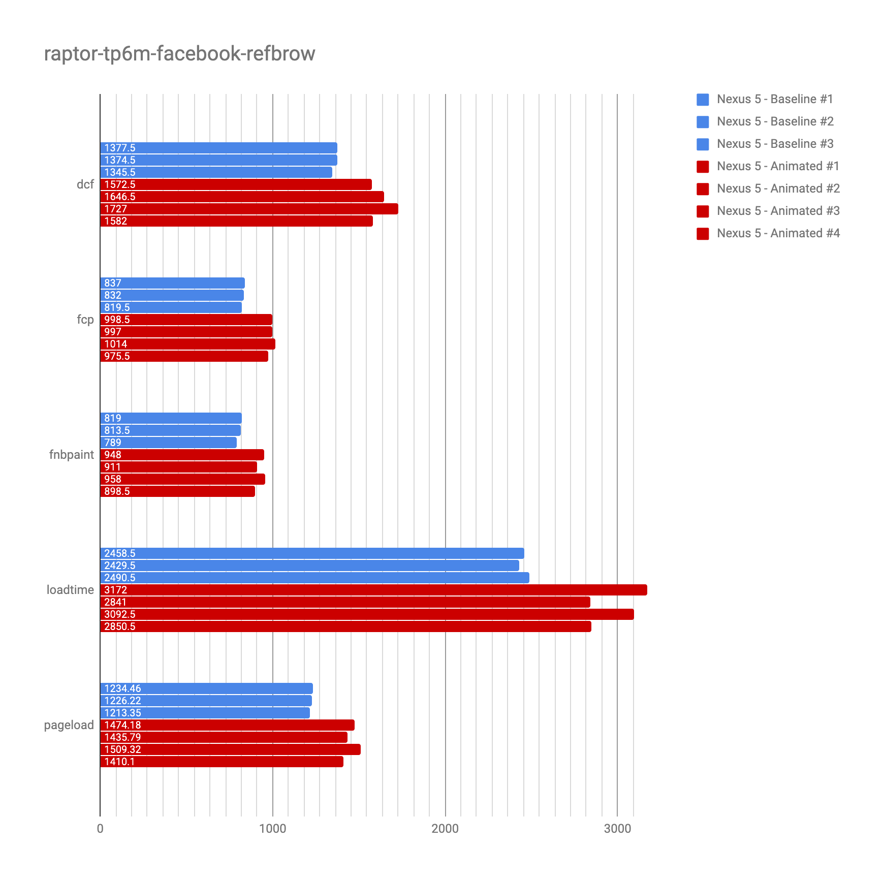
The Android Components team did some measurements with the animated progress bar (ui-progress) last week (Nexus 5, raptor-tp6m-facebook-refbrow). Unfortunately we saw the animation having a negative effect on the performance: loadtime was almost half a second (~400ms) slower on a Nexus 5 (while seeing almost no difference on high-end devices).
@AmyYLee Do you think the animation is something we will definitely need in Fenix (in addition to the gradient and positioning that @ekager already updated)?
Given the measurements the AC team is probably not going to make this the default progress bar for the toolbar component. However we could add an API to switch the progress bar implementation if Fenix wants to use one with animation.
 pocmo
on 15 Apr 2019
pocmo
on 15 Apr 2019
@pocmo This is not essential for beta. If we are able to add API down the road great but it would be a low priority item and not something that should affect performance. Thank you for looking into this.
I'm still seeing the progress bar at the bottom of the URL bar on my build and it's dated (April 16th) as the last update. Should I be seeing this at the top of the URL bar? Also small detail here:
@ekager This looks great :-) Small detail - can you round out the end of the progress bar? (see attached)
AmyYLee
on 17 Apr 2019
Sorry for the delay! Just rounded out the progress bar so this should be done from the eng side as long as it looks okay with you @AmyYLee . Rounded progress bar will be in Nightly tomorrow if you want to verify!
ekager
on 18 Apr 2019
Verified as fixed on the latest version 1.0.1916 (Build#11081206):
- the progress bar is visible,
- the progress bar is above the URL bar,
- progress animation is visible.
Tested with:
- Samsung Galaxy Tab S3 (Android 8.0),
- Motorola Nexus 6 (Android 7.1.1).
 softvision-miralobontiu
on 19 Apr 2019
softvision-miralobontiu
on 19 Apr 2019
Related issues
ekager
·
3Comments
 bbinto
·
3Comments
bbinto
·
3Comments
 abodea
·
3Comments
abodea
·
3Comments
 AndiAJ
·
3Comments
AndiAJ
·
3Comments
 thelazyoxymoron
·
3Comments
thelazyoxymoron
·
3Comments
Most helpful comment
Hi,
We can move the progress bar from below the search box to above (see attached spec for reference). I've also provided colour specifications for the loaded and unloaded portions.
As for animation, can we mimic what we currently have for the Fennec loader? Would this be a lot of effort to test out to see how it feels or revert if needed?
https://mozilla.invisionapp.com/share/74RBWE0D9SU#/screens