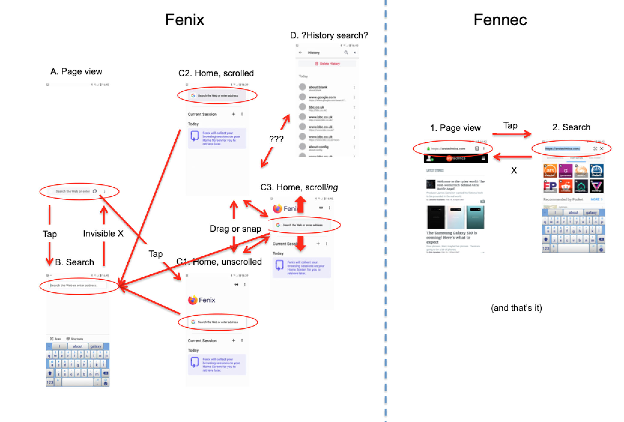
Fenix: Search bar moves top/middle/bottom depending on context
I find the disparity in position and styling of the three text/search boxes very confusing. My main touch and typing targets are all over the place
- URL bar at very bottom of screen, gray background, small vertical height OR
- search bar at very top of screen, white background, no Google icon, small vertical height OR
- search box at center of home screen, white background, drop shadow, Google icon, large vertical height
Frankly the bloody thing moves all over the place, doing a search or editing a URL feels like whack-a-mole. Tap the box at the very bottom of the screen! Oh wait:- now the box moves to the very top of the screen! Or if I'm on the Home screen, tap the middle of the screen! But the box moves back to the top of the screen! And then when I hit enter it moves back to the bottom of the screen! Gaahh.
I'm sure you have great plans for the home page in particular, I guess the space with the Fenix logo is earmarked for something and there's a good reason the search box is in the middle and but I thought it worth filing this issue now.
I love the bottom URL bar but chasing the search bar all over the screen seems ... odd. Perhaps I'm just old and unwilling to embrace the new.
Perhaps it would help if you tied the three boxes very strongly together with consistent visual styling (#559) and animation (#560).
Or how about a Home screen with move 3 dot menu and private browsing icon at the bottom (#561) and have search box at the top, with its normal position size and styling? Then I can learn "to search, always look at the very top of the screen" and "to navigate, always look at the very bottom of the screen". Then the home screen from the top down would go:- search box, Fenix logo with blank space, Current session & tabs, private browsing & 3 dot menu.
I also filed #466 which covers some of the same ground.
(PS I love the way Fenix is coming on, I'm sure there are great plans and a highly consistent UI emerging but I thought I'd get my grumpy gripes in early. Keep up the good work.)
 Cheap-Skate
All 13 comments
Sorry, there are more sub species of search on the Home screen, distinguished by coloration and habit.
- when the Home screen is unscrolled, fat white box with drop shadow in middle of screen C1
- when the Home screen is scrolled, fat gray box with no drop shadow at top of screen, similar location to thin white search bar of normal search screen, but different size and color C3
- when the home screen is scroll_ing_, transitional box C2 which presents a moving target as it crawls under its own power towards one or other of the top/middle states
Of course these last three aren't really search boxes, they are actually just buttons which take you to the search screen B. But pressing Back or "invisible X" from the search screen B doesn't take me back to Home screen C, it takes me to page content screen A. Then I have to go to C using the Tabs button.
And I think there might be another search screen in future, pages like History have a magnifying glass so there might be another search page D just for History etc??? Will that just search History, or everything? And will it look like the main Search screen, or summat else?
I tried to draw up the search state machine for Fenix, it's complicated compared with Fennec. The Fenix search box can be one of five styles in four different positions one of which moves under its own power. There might be a sixth in future. And the Back button doesn't necessarily do what I expect.
Could it be better to have a universal search bar at the bottom of every screen which has the same style as the URL bar (white, thin, roundrect for text, buttons as necessary) and a gray text hint e.g. "search or enter URL", "search _History_ or enter URL". Always the same target, always the same place (albeit moved when keyboard is visible), always the same style. Like Fennec really :)
Cheap-Skate
on 17 Feb 2019
FWIW, Kiwi browser's bottom toolbar causes the location bar that appears to be stuck to the bottom of the screen, not the top.
 yoasif
on 17 Feb 2019
yoasif
on 17 Feb 2019
That's nice, I played with Kiwi and I like the bottom browser & search bar. What I also really like is that search results rise up from the bottom and cover the content so it's clear that if I choose a search result it will overwrite the current tab content. That's given me an insight into one of my issues with Fenix which I'll try to write up. Thanks.
Kiwi also has one tap access to Shortcuts which is nice, of course it's negated by the fact that the shortcuts are too high up the screen to reach one handed :(
And of course Kiwi's search is the usual Chrome garbage, four search suggestions, no dedicated search buttons, nothing like Fennec's Awesomescreen ;)
Cheap-Skate
on 18 Feb 2019
I agree that consensus should be sought on the best position for the URL bar, and then the URL bar should stay there for consistency.
Whichever way the decision goes, I hope it is based on good User Interface and User eXperience [sic] design rather than the personal opinions of one or a few people.
Consistency in the UI is one of the first principles that all UI research and guidelines promote. Examples include:
- "Create consistency ... in layout" from none other than
usability.gov - "Consistently place elements throughout your site or app"
- "controls should be consistent so that users know how to repeat their actions" and so on.
 blokeley
on 3 Jul 2019
blokeley
on 3 Jul 2019
Whichever way the decision goes, I hope it is based on good User Interface and User eXperience [sic] design rather than the personal opinions of one or a few people.
Different people have different opinions about "good user interface design". There is not _one_ right answer. In the end _everything_ is based on opinions. ;-)
I'll copy my answer from the other issue because it was closed as duplicate:
I like the toolbar at the bottom and movement to the top when I enter something into the address bar because it makes sense. It would be confusing for me to have the suggestions above the address bar. The address bar stays on bottom in the Reference Browser and I don't like it at all, in my opinion it looks much better in Fenix.
I don't have a strong opinion about the search field on the Fenix start screen. If that changes, it's less of a problem for me.
 cadeyrn
on 4 Jul 2019
cadeyrn
on 4 Jul 2019
Why does the search bar need to go in a single fixed position? Clearly the better way to solve this is to add an option depending on how the user likes it? Either dynamic, static top / bottom etc.
 telans
on 13 Jul 2019
telans
on 13 Jul 2019
No, this is really not the better way. There can't be options for _everything_, otherwise the product is not maintainable, especially if you don't have the same ressources as Google or Apple. It's not only about the one-time implementation cost. All future changes have to work with all configurations. So whatever Mozilla does, they should find _one_ solution which works best for most users so that they can focus on the really important things.
cadeyrn
on 13 Jul 2019
@cadeyrn They weren't asking for options for everything. They were just asking for an option for placement. Kiwi lets you choose. I do however think that a dynamic option is a bit too much
 Poopooracoocoo
on 23 Jul 2019
Poopooracoocoo
on 23 Jul 2019
If the most ergonomic place for the search/URL field in normal use (viewing webpages) is the bottom of the screen then surely this is still the most ergonomic place for it on the start/home screen.
If it moves once focussed then that is another matter but at least the user would know where to expect the field to be when they want to start entering a search term or URL.
blokeley
on 23 Jul 2019
They weren't asking for options for everything. They were just asking for an option for placement.
You didn't get the point of my comment:
1) It's not that simple. A lot of people ask for _only one option_. But that adds up. So it's never an argument to say it's only about one option. Because you can argue for _everything_ in the same way.
2) My comment was about long term maintenance costs and that it's not only about one-time implementation costs because it makes a big visual difference meaning you have to test every change in all configurations. This is something that - in my opinion - should be implemented in one way which works well for most users because I don't see enough importance to add these long term maintenance costs.
Of course it's okay to have another opinion. I only wanted to clarify (because you mentioned me) what I really said because it obviously wasn't clear for you.
cadeyrn
on 23 Jul 2019
assigning for consideration during the re-design. removing ux label
 lime124
on 24 Jul 2019
lime124
on 24 Jul 2019
I use fenix as main browser and the most annoying thing that have fenix is a jumping search bar.
Here's my suggestion. https://imgur.com/a/L5B5wAu
 Neikon
on 30 Aug 2019
Neikon
on 30 Aug 2019
This work was covered in https://github.com/mozilla-mobile/fenix/issues/561.
 apbitner
on 3 Oct 2019
apbitner
on 3 Oct 2019
Related issues
 abodea
·
3Comments
abodea
·
3Comments
 vesta0
·
3Comments
vesta0
·
3Comments
 softvision-miralobontiu
·
3Comments
softvision-miralobontiu
·
3Comments
 andreicristianpetcu
·
3Comments
andreicristianpetcu
·
3Comments
andreicristianpetcu
·
3Comments
andreicristianpetcu
·
3Comments
Most helpful comment
I use fenix as main browser and the most annoying thing that have fenix is a jumping search bar.
Here's my suggestion. https://imgur.com/a/L5B5wAu