Fenix: FNX3-16310 ⁃ [UX] Bookmarks
User Story
As a user, I want to bookmark a page so that I can collect and organize information around a topic I’m interested in, save a page for later or have a way to quickly find it again. I also want to be able to edit, delete and organize my bookmarks.
Bookmarking requires minimal attention but allows to go deeper and edit or organize bookmarks.
- people can bookmark a page from the Quick Action menu
- they see a Snackbar confirmation with the option to edit the bookmark; the Snackbar disappears after 3 seconds or so
- If they tap edit on the Snackbar they have the option to update the pre-filled page title, URL and organize it into folders; they can also delete the bookmark
- login is promoted on the bookmark folder view so that people can also access their desktop bookmarks folder structure
Problem and Scope
- How might we enable people to find something again?
- How might we help people to continue a task later?
- How might we help people to open sites that are relevant to them quickly?
- How might we help people to organize information about a topic easily?
- How might we support people to do the above across devices?
Mockup
Single Screens: https://mozilla.invisionapp.com/share/4JQZ71H8GRE
Flow: https://mozilla.invisionapp.com/share/28QZ74Z3VSX
 bbinto
All 37 comments
@colintheshots Can you please take a look at the prototype? Is this enough for eng to get started? If not, please identify what else need.
I don't believe there are cross team dependencies as account syncing is covered by another [UX] issue - please correct me if I'm wrong.
@bbinto this is an established pattern and not very complicated so we can place it in later milestones or use it to balance out earlier milestones.
 lime124
on 24 Jan 2019
lime124
on 24 Jan 2019
From Eng meeting to review stories [1] @topotropic
Need more clarification from UX re: scope
- Start button
- Show up in awesome bar
- Category in library
@colintheshots please comment here if there are additional gaps. Thanks!
lime124
on 25 Jan 2019
@topotropic - please outline what exactly favourites flow should look like?
- flat hierarchy
- we probably will call Favourites Bookmarks after all
bbinto
on 5 Feb 2019
@topotropic can you please size this
bbinto
on 15 Feb 2019
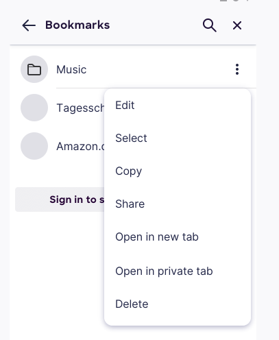
@lime124 The prototype doesn't show what is in the overflow menu for each favorite. Does long press or swipe on a favorite entry mean anything?
I assume clicking just loads the favorite. Should it load in the same tab or a new tab?
 colintheshots
on 21 Feb 2019
colintheshots
on 21 Feb 2019
@topotropic please see colin's questions above. thanks!
lime124
on 21 Feb 2019
@colintheshots here's the spec http://mozilla.invisionapp.com/share/SDQNWP8N4PC;
It would be good to know how much additional work bookmark organization is and discuss with PM if we can move it to a later point in time in favor of features with higher impact and/or uncertainty.
 topotropic
on 22 Feb 2019
topotropic
on 22 Feb 2019
@topotropic please add a S/M/L size for this work.
 vesta0
on 22 Feb 2019
vesta0
on 22 Feb 2019
@lime124 The prototype doesn't show what is in the overflow menu for each favorite. Does long press or swipe on a favorite entry mean anything?
Long press selects the entry and you can select more items or edit, share, copy, open in new/private tab or delete the item. We don't support a swipe gesture atm.
I assume clicking just loads the favorite. Should it load in the same tab or a new tab?
Same tab.
topotropic
on 25 Feb 2019
@colintheshots and @grigoryk, @jdragojevic to review and confirm if it's ready for eng
bbinto
on 1 Mar 2019
There isn't finished UX screens shown on the ticket. Based on the spec, I'm mostly concerned about additional details about bookmark organization, importing, and exporting.
In terms of organization, will we require hierarchical folders? How will the UX look for a mobile user to move a bookmark within the hierarchy of folders? Is it drag and drop across the whole hierarchy or say, selecting a folder and then dragging it within the folder?
What file formats will we import and export bookmarks from? Where can the user find this in the UI? Do we want to offer users access to the SDcard, Downloads, Drive, Dropbox, etc for finding files to import? Do we want users to be able to import bookmarks from web content, as this may require GeckoView dependencies?
colintheshots
on 1 Mar 2019
There isn't finished UX screens shown on the ticket.
@colintheshots I put a link to Invision further up:
http://mozilla.invisionapp.com/share/SDQNWP8N4PC
I'll need to look into importing/exporting.
topotropic
on 1 Mar 2019
I'm thinking if we need the export/import functionality?
I mean import would be really neat if we could do that by importing bookmarks from other browsers on their device. If that's not an option, I'd say delay import/export to after MVP.
And for import existing Fennec bookmarks, we could have a CTA to just use sync?
Thoughts, @topotropic ?
bbinto
on 8 Mar 2019
I mean import would be really neat if we could do that by importing bookmarks from other browsers on their device.
That's pretty much impossible nowadays unfortunately (but to be fair we also do not expose our data to other apps!). There used to be a public "content provider" that some browsers (including Chrome) used to save bookmarks and history. But this was removed with Android 6 (Bug 1183559).
 pocmo
on 8 Mar 2019
pocmo
on 8 Mar 2019
@topotropic I looked at both specs linked in this issue and made comments on both. On the one that I think i most recent, I see that we still need to add in a field for the URL (comparable with Fennec) to allow users to edit.
 mheubusch
on 8 Mar 2019
mheubusch
on 8 Mar 2019
And for import existing Fennec bookmarks, we could have a CTA to just use sync?
I think it would be preferable if both Sync and preferences (like bookmarks) could be migrated to Fenix, at least once Fenix replaces Fennec in the Play Store - otherwise, why "migrate" the users over without a clear indication that this is a totally different browser that doesn't retain any settings?
If it is simply to retain the installed base, I would rethink not performing a real migration, as I would fear real user disappointment from existing users.
 yoasif
on 8 Mar 2019
yoasif
on 8 Mar 2019
I added some comments related to multi-select and adding a bookmarks folder.
Sorry, I couldn't see any later pages of the prototype because Invision seems to not page any further when you scroll to the bottom of the page. You must use left arrow/right arrow to page. Ironically, this seems to be a major UX affordability issue in Invision itself. It should offer paging indicators when you reach the bottom of the first page.
colintheshots
on 11 Mar 2019
Okay, apologies. I went a bit nuts with the comments, but it's better to be well-specified than have open questions lingering.
colintheshots
on 11 Mar 2019
And for import existing Fennec bookmarks, we could have a CTA to just use sync?
CTA sounds good, we have already one on the Library bookmark view (https://mozilla.invisionapp.com/share/MGQZ7IZ52U7) and this is going to be further explored as part of the https://github.com/mozilla-mobile/fenix/issues/879
topotropic
on 13 Mar 2019
👍🏻 I only had a few nits left on the InVision.
 shorlander
on 15 Mar 2019
shorlander
on 15 Mar 2019
Here are some quick questions about the Invision mockups.
- How do I represent items buried within the folder hierarchy? Do the folders expand and collapse when clicked or does the user drill down into narrower screens and press back or up to return? It's not obvious from the mocks. If we expand and collapse, do we indent child items?
- We're getting separators from application-services as well as bookmarks and folders. Do we need to represent them in any way?
- How do we represent syncing/synced state?
colintheshots
on 20 Mar 2019
1. How do I represent items buried within the folder hierarchy? Do the folders expand and collapse when clicked or does the user drill down into narrower screens and press back or up to return? It's not obvious from the mocks. If we expand and collapse, do we indent child items?In the Library you drill down. When you bookmark a page and want to select a parent folder they are indented – both cases are similar to Fennec.
2. We're getting separators from application-services as well as bookmarks and folders. Do we need to represent them in any way?Yes, we display separators as set by people for the sync case; people are not able to set separators in app
3. How do we represent syncing/synced state?@ryanfeeley can you chime in here?
topotropic
on 20 Mar 2019
- How do we represent syncing/synced state?
Though it is perhaps too long to localize well, I think the presence of the Sign in to see synced bookmarks button when you are not signed in (and absent when you are signed in) is sufficient state indication.
Are you contemplating locking some bookmark editing features during longer syncs? IIRC Safari doesn't allow you to reorganize bookmarks mid-sync.
 ryanfeeley
on 20 Mar 2019
ryanfeeley
on 20 Mar 2019
Could I please get an design asset to use for the bookmark separator case?
Mostly, I'd like to know how we show the user that we're mid-sync. Should I put a spinner somewhere? Should I disallow changes? Should I have a last synced indicator with a time?
colintheshots
on 26 Mar 2019
@ryanfeeley ^
lime124
on 27 Mar 2019
Could I please get an design asset to use for the bookmark separator case?
Mostly, I'd like to know how we show the user that we're mid-sync. Should I put a spinner somewhere? Should I disallow changes? Should I have a last synced indicator with a time?
@colintheshots I can take a look at this bug on Monday and get back to you.
 AmyYLee
on 29 Mar 2019
AmyYLee
on 29 Mar 2019
@colintheshots From within the bookmarks view we would not showing the spinning sync wheel animation like we do inside Sync preferences, but during the sync we should disable editing/deleting features. Grey the first and last items out in the contextual menus during sync.
ryanfeeley
on 29 Mar 2019
Okay, I just need a bookmark separator to use and we can close this.
colintheshots
on 3 Apr 2019
I was wondering if we can render it. Let me know if that's not working. Thanks!
topotropic
on 5 Apr 2019
@colintheshots Did Nicole's advice here suffice? Can we consider this done from a UX perspective?
mheubusch
on 5 Apr 2019
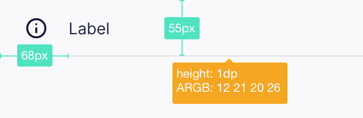
@mheubusch Yes, I think that resolves the ticket. I'll convert from pixels to dips and ARBG to RGBA.
colintheshots
on 8 Apr 2019
How should I portray an empty bookmarks folder when the user is browsing inside it? This is important because it's not obvious after moving or deleting the last bookmark in a folder that the previous folder in our back stack would be empty. The user just sees a blank screen with the title "Bookmarks" at the top.
Should I also change the title of the screen to the name of the current folder when browsing bookmarks?
colintheshots
on 8 Apr 2019
Also, for the multi-selection of bookmarks, how does the edit action in the action bar work if multiple bookmarks are selected? I thought we only edited one bookmark at a time. Should I list one bookmark after another with separate editing fields?
colintheshots
on 8 Apr 2019
How should I portray an empty bookmarks folder when the user is browsing inside it?
https://mozilla.invisionapp.com/share/4FRF40AVG56
Let's put "No bookmarks here" (Inter UI, 16sp, RGBA 21, 20, 26, 48) there.
Should I also change the title of the screen to the name of the current folder when browsing bookmarks?
Good catch, please do.
Also, for the multi-selection of bookmarks, how does the edit action in the action bar work if multiple bookmarks are selected? I thought we only edited one bookmark at a time. Should I list one bookmark after another with separate editing fields?
Yes, let's only edit one bookmark at a time – you can either remove the edit option or hide it, when someone selects more then 1 bookmark.
topotropic
on 8 Apr 2019
Would it be possible to move the bookmark and history list to the bottom of the page, near the URL bar and thumb?
 kumarharsh
on 28 Jun 2019
kumarharsh
on 28 Jun 2019
@mheubusch can we close this meta and track any redesign in a new issue?
vesta0
on 3 Jul 2019
Yes, we are managing this with Collections.
mheubusch
on 16 Jul 2019
Related issues
 Chris01277
·
3Comments
Chris01277
·
3Comments
 phileastv
·
3Comments
phileastv
·
3Comments
 robsmith11
·
3Comments
robsmith11
·
3Comments
 andreicristianpetcu
·
3Comments
andreicristianpetcu
·
3Comments
 abodea
·
3Comments
abodea
·
3Comments
Most helpful comment
Okay, apologies. I went a bit nuts with the comments, but it's better to be well-specified than have open questions lingering.