Feedback: Give me the option to hide navigation panes
The current doc format has 2 navigation panes on the sides and the content in the center. I use sometime the nav. pane on the left but never the one on the right so i'd like the option to hide it since it makes the center section (with the core content) too narrow.
The ideal would be the option to hide both so that if user want he can focus just on the content and have all the space dedicated to it. Thanks
⚠ Idea migrated from UserVoice
Created By: Antonio
Created On: 2017/03/23 11:04:26 +0000
Votes at Migration: 14
Supporters at Migration: 14
 supernova-eng
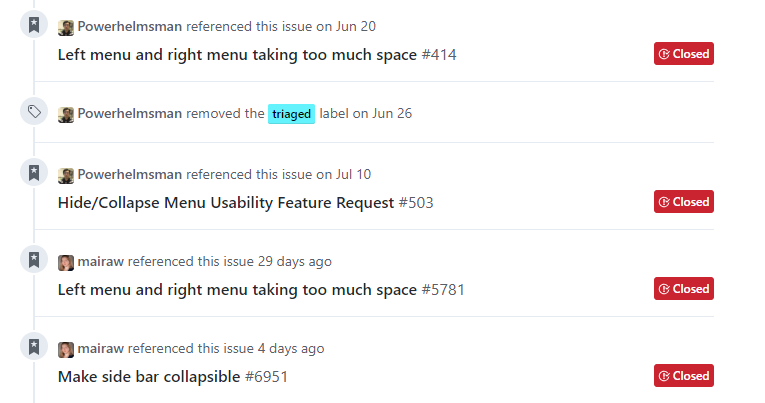
All 16 comments
@ShevaDas - something your team should look into.
 dend
on 7 Mar 2018
dend
on 7 Mar 2018
We're investigating providing a chromeless rendering experience for users. I've linked this issue to our internal issue so we can follow up when it's implemented. #in-process
 shirgoldbird
on 7 Mar 2018
shirgoldbird
on 7 Mar 2018
@ShevaDas any progress on this? We keep getting new issues about this.
 mairaw
on 11 Aug 2018
mairaw
on 11 Aug 2018
@dastaffo is the PM for chromeless, he could likely provide an update.
shirgoldbird
on 14 Aug 2018
My bad—apparently this is distinct from our chromeless rendering experience and as such needs separate design and engineering work. This isn't something we'll be able to prioritize this quarter with Ignite coming up but I'll work to get it prioritized for Q2. Could you link me any open issues so I can compile them into the VSTS item?
log-suggestion @ShevaDas
shirgoldbird
on 15 Aug 2018
@ShevaDas I've already closed other related open issue as duplicate. You can update the status on this issue.
 Powerhelmsman
on 15 Aug 2018
Powerhelmsman
on 15 Aug 2018
log-suggestion @ShevaDas
Powerhelmsman
on 15 Aug 2018
🚀 ATTENTION: Internal request logged.
supernova-eng
on 15 Aug 2018
@Powerhelmsman awesome—could you or @mairaw link me to the related issues that have been opened, so I can make a stronger case for prioritizing this feature?
shirgoldbird
on 15 Aug 2018
@ShevaDas we usually link to this one to mark as duplicate, so you can see them listed above.
Let me know if you need anything else.
mairaw
on 15 Aug 2018
Any update on this one?
I'm using Firefox 45.3.0 to view the docs. Especially on this page I'm not even able to clearly see the contents because the navigation pane's overlapping with the content:
https://docs.microsoft.com/en-us/sql/t-sql/queries/hints-transact-sql-table?view=sql-server-2017
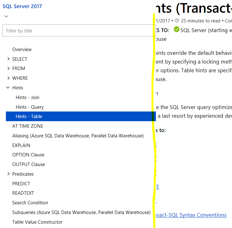
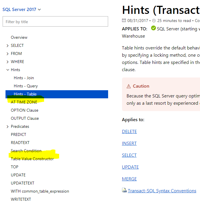
Also, in Chrome v69.0.3497.92 the same site works but I see that there are some of the navgiation links missing that are displayed in Firefox:
 rschindhelm-haba
on 14 Sep 2018
rschindhelm-haba
on 14 Sep 2018
@ShevaDas for your awareness.
Powerhelmsman
on 14 Sep 2018
in the meantime, if you need to get the table of contents out of the way this will take care of it temporarily:
$('#left-container').width(2);
$('#sidebar').hide();
$('.primary-holder').width('80%');
$('#main-column').width('95%');
especially useful if you have your browser tiled left or right
 dzsquared
on 5 Dec 2018
dzsquared
on 5 Dec 2018
Thank you all for the feedback! At this time, this is not something we're considering. We will revisit the conversation in the future.
supernova-eng
on 29 Nov 2019
I really love the Docs and the best experience is when you get to learn by actually implementing what you've learned. When you have just one monitor sharing the screen is the best option and that is when the index menu comes into trouble. It makes all the relevant text much harder to read, specially code, which now needs to be horizontally scrolled.
@docs-product, please consider collapsing the index menu on a window width basis. Docs have evolved so much and yet this one little feature was never implemented and would in fact improve the readability a whole lot.
In the meantime, @dzsquared, could you clarify how I can use your workaround?
 BrunoBlanes
on 4 Apr 2020
BrunoBlanes
on 4 Apr 2020
@BrunoBlanes I have put the workaround together into an Edge/Chrome extension that is available in this repo: https://github.com/dzsquared/MSDocsSidebarCollapser
as well as published in the Edge marketplace for convenience: https://microsoftedge.microsoft.com/addons/detail/hnjdejdpeeojbipggdjdpfdcononmbpn
dzsquared
on 4 Apr 2020
Related issues
 spottedmahn
·
4Comments
spottedmahn
·
4Comments
 BradGroux
·
3Comments
BradGroux
·
3Comments
 gautamhans1
·
5Comments
gautamhans1
·
5Comments
 fghzxm
·
4Comments
fghzxm
·
4Comments
 synercoder
·
5Comments
synercoder
·
5Comments
Most helpful comment
@ShevaDas we usually link to this one to mark as duplicate, so you can see them listed above.
Let me know if you need anything else.