Fec-cms: Update homepage mockups to include election map and bar chart viz preview
What are we after: Following the design/data studio discussion (https://github.com/fecgov/fec-cms/issues/2636) we are moving forward with an MVP that involves improving the raising and spending bar charts, as well as adding a preview (of sorts) to the homepage.
We had intended on adding the election search to the homepage as well, and that work was completed here: https://github.com/fecgov/fec-cms/issues/2541. Now that work must be updated to include the bar charts.
Completion criteria:
- [x] Update existing mock-up of homepage to include bar charts
- [x] Consider next steps in user journey as part of the mock-up from the bar charts preview
- [x] Consider removing the Get started (citizen's section) are part of mock-up
- [x] Share mock-ups with PMs, scrum master, and design team for review
- [x] Content review of proposed new language
- [x] Move to/update implementation issue (https://github.com/fecgov/fec-cms/issues/2562)
 JonellaCulmer
All 18 comments
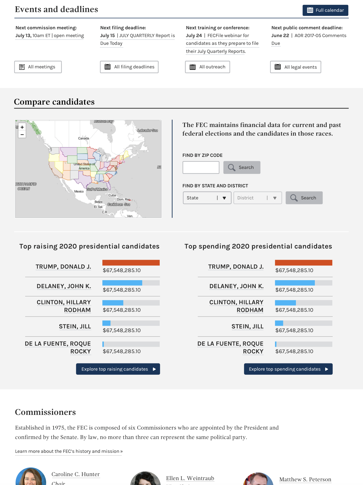
Below is a first draft mock-up of the top 2020 presidential raising and spending candidates on the homepage. I opted to not remove functionality from the homepage for the election search, as I did not want to create any accessibility issues.
This version removes, as was previously determined to be an option, was to remove the three sections for the citizen resources.
I welcome any and all feedback. cc: @patphongs @johnnyporkchops @rfultz @AmyKort @PaulClark2
Homepage design
JonellaCulmer
on 13 Feb 2019
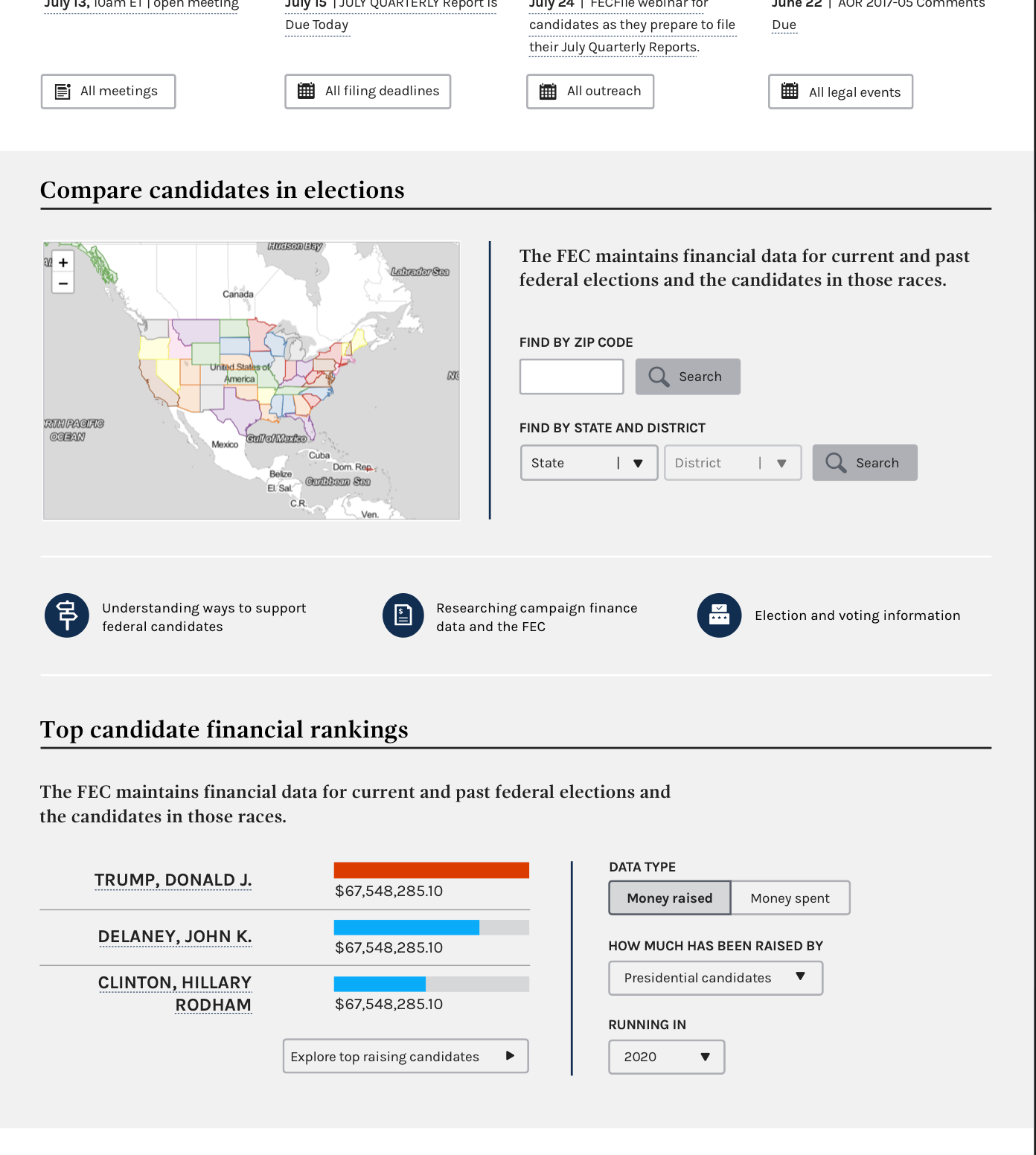
Based on feedback received from 8.1 demo, the design has been updated to include links to citizen's guide-type pages and reformats the functionality of the bar charts and includes filter interactions.
JonellaCulmer
on 15 Feb 2019
@AmyKort @dorothyyeager @kathycarothers @bmathesonFEC Need a content review on the language used for the bar charts header and explanatory text, as well as the toggle text.
JonellaCulmer
on 15 Feb 2019
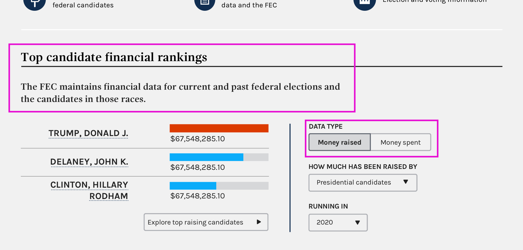
For the boxes in pink above, the only suggestion I have is adding "top" before candidates in the sentence above the list of candidates. I don't feel strongly about that and overall it looks great.
I do have another thought though... I know you took the wording of those buttons linking to the citizens' pages from the titles of the three sections in the citizens' section. Looking at it anew, I think that "researching campaign finance data and the FEC" should maybe be changed to "learn more about using the FEC's campaign finance data." That tracks better for me what actually shows up when one goes to that page . Just a suggestion and I'll defer to @AmyKort and others on it.
 dorothyyeager
on 19 Feb 2019
dorothyyeager
on 19 Feb 2019
@dorothyyeager Thanks! That sentence is just a duplicate of what's above it, but if you think it just needs a minor tweak that's fine by me! Happy to tweak the link text as well! No problem here!
JonellaCulmer
on 19 Feb 2019
@dorothyyeager Should all three of those links contain action words like "Learn". They're all formatted differently now. And we're good with using the word money in the toggle?
JonellaCulmer
on 20 Feb 2019
@JonellaCulmer Good thoughts. I agree, we should do action words. How about:
- Understand ways to support federal candidates
- Learn more about using the FEC's campaign finance data
- Find election and voting information
I'm fine with using "money" in the toggle - to me that's very clear - but will defer to other people who are more attuned to things data-wise in case I'm missing something. (Paging @bmathesonFEC @AmyKort @PaulClark2 )
dorothyyeager
on 20 Feb 2019
@JonellaCulmer I'm ambivalent about the use of 'Money' on those buttons, it certainly works for me the way that it is now. My only question for you is about consistency, is there a reason you didn't stick with "Raising"/ "Spending" we use elsewhere on the site?
 bmathesonFEC
on 21 Feb 2019
bmathesonFEC
on 21 Feb 2019
@bmathesonFEC I only chose to include money "raised" versus "spent" is because there's a little less context here on the homepage and I wanted to tell users what they were looking at. The numbers are what's being raised and spent, not raising and spending. And "Raising: by the numbers" and "Spending: by the numbers" work better as a summary for all the data we'll be able to see on those pages and not necessarily specific to the bar charts themselves. Plus they're too long for the toggles.
cc: @dorothyyeager @AmyKort
JonellaCulmer
on 21 Feb 2019
I'm okay with money in the toggle--it's short and makes sense to people. I worry that without context a toggle that asks what type of data and then offers "raising" or "spending" could be confusing, even though it's technically more accurate.
When you toggle to money spent, the label below changes to "how much has been spent by," correct?
 AmyKort
on 22 Feb 2019
AmyKort
on 22 Feb 2019
We're repeating the same sentence under Compare candidates in elections and Top candidate financial rankings. Maybe this is an opportunity to add more information.
What if under Compare candidates in elections, we said something like: "Learn about candidates in a particular state or district, including how they raise and spend their funds." But something better than that.
What if we labeled the raising chart "How much are candidates raising and spending." Or "How much money are candidates raising and spending." Then we could use the space below to give instructions, something like "Learn how much individual candidates have raised and spent for Presidential, Senate and House elections."
AmyKort
on 22 Feb 2019
@AmyKort For the one chart, I'm a little leery of saying "how" they raise and spend funds but I get what you're going for. Maybe "See funds raised and spent by candidates in a particular state or district."?
dorothyyeager
on 22 Feb 2019
@JonellaCulmer mocked up another version (and made my ideas a lot better), so can you look again when she posts, @dorothyyeager , @kathycarothers @bmathesonFEC @PaulClark2
AmyKort
on 22 Feb 2019
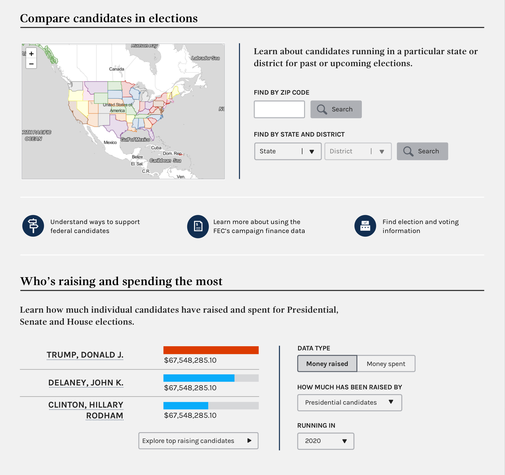
Please see updated mockup below. Includes changes to the language for the Compare candidates section, as well as the new bar charts section.
cc: @dorothyyeager @bmathesonFEC @kathycarothers @AmyKort @PaulClark2
JonellaCulmer
on 22 Feb 2019
Looks great, I really like this. Hopefully top 3 will stand the test of time.
I just remembered that Presidential candidate names will be "President / Vice President" once the full ticket is selected. In your example, "Trump, Donald J." will eventually be "Trump, Donald J. / Michael R. Pence". I'm point this out because Clinton's name is wrapped, so it could become a spacing issue in 2020.
bmathesonFEC
on 22 Feb 2019
My only nitpicky is that under GPO style, presidential is a lower case p unless it's a heading or starting a sentence (so lower case p in the sentence under "Who's raising and spending the most"). Otherwise, this looks and reads great!
dorothyyeager
on 22 Feb 2019
Thanks everyone for your help bringing this final design to fruition. Here's the "final" version.

JonellaCulmer
on 22 Feb 2019
Closing this issue in favor of implementation issue: https://github.com/fecgov/fec-cms/issues/2562
JonellaCulmer
on 22 Feb 2019
Related issues
JonellaCulmer
·
6Comments
 jenniferthibault
·
5Comments
dorothyyeager
·
5Comments
jenniferthibault
·
4Comments
jenniferthibault
·
5Comments
dorothyyeager
·
5Comments
jenniferthibault
·
4Comments
 johnnyporkchops
·
5Comments
johnnyporkchops
·
5Comments
Most helpful comment
My only nitpicky is that under GPO style, presidential is a lower case p unless it's a heading or starting a sentence (so lower case p in the sentence under "Who's raising and spending the most"). Otherwise, this looks and reads great!