Fec-cms: Design review of metadata page tables
What we’re after:
Improve the usability of the metadata tables. Review design and layout of metadata pages, especially the large tables at the bottom of each page.
Current state:
Some of the tables are very wide requiring users to use a scrollbar to view the contents of some table cells.
Completion criteria:
- [x] plan to improve the usability of the metadata tables
Pages to be reviewed:
Data catalog
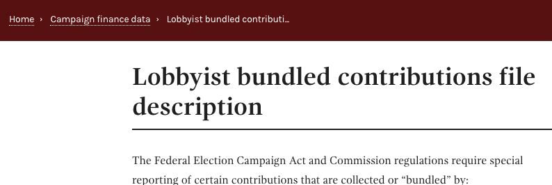
- [ ] Bundled contributions: https://www.fec.gov/campaign-finance-data/lobbyist-bundled-contributions-file-description/
- [ ] Committee summary: https://www.fec.gov/campaign-finance-data/committee-summary-file-description/
- [ ] Leadership PACs and sponsors: https://www.fec.gov/campaign-finance-data/leadership-pacs-and-sponsors-description/
- [ ] Lobbyist/registrant: https://www.fec.gov/campaign-finance-data/lobbyistregistrant-committees-file-description/
- [ ] Unverified filers: https://www.fec.gov/campaign-finance-data/unverified-filers-file-description/
- [ ] Candidate summary: https://www.fec.gov/campaign-finance-data/candidate-summary-file-description/
- [ ] Communication costs: https://www.fec.gov/campaign-finance-data/communication-costs-file-description/
- [ ] Independent expenditures: https://www.fec.gov/campaign-finance-data/independent-expenditures-file-description/
- [ ] Electioneering communications: https://www.fec.gov/campaign-finance-data/electioneering-communications-file-description/
- [ ] New statements of candidacy: https://www.fec.gov/campaign-finance-data/new-statements-candidacy-file-description/
- [ ] New committee registrations: https://www.fec.gov/campaign-finance-data/new-committee-registrations-file-description/
- [ ] Committee report summary: https://www.fec.gov/campaign-finance-data/committee-report-summary-file-metadata/
FTP files
- [ ] CM: https://www.fec.gov/campaign-finance-data/committee-master-file-description/
- [ ] CCL: https://www.fec.gov/campaign-finance-data/candidate-committee-linkage-file-description/
- [ ] CN: https://www.fec.gov/campaign-finance-data/candidate-master-file-description/
- [ ] OPPEXP: https://www.fec.gov/campaign-finance-data/operating-expenditures-file-description/
- [ ] OTH: https://www.fec.gov/campaign-finance-data/any-transaction-one-committee-another-file-description/
- [ ] INDIV: https://www.fec.gov/campaign-finance-data/contributions-individuals-file-description/
- [ ] PAS2: https://www.fec.gov/campaign-finance-data/contributions-committees-candidates-file-description/
- [ ] webALL: https://www.fec.gov/campaign-finance-data/all-candidates-file-description/
- [ ] webL: https://www.fec.gov/campaign-finance-data/current-campaigns-house-and-senate-file-description/
- [ ] webK: https://www.fec.gov/campaign-finance-data/pac-and-party-summary-file-description/
Reference pages
- [ ] https://www.fec.gov/campaign-finance-data/report-type-code-descriptions/
- [ ] https://www.fec.gov/campaign-finance-data/committee-type-code-descriptions/
- [ ] https://www.fec.gov/campaign-finance-data/disbursement-category-code-descriptions/
- [ ] https://www.fec.gov/campaign-finance-data/transaction-type-code-descriptions/
- [ ] https://www.fec.gov/campaign-finance-data/party-code-descriptions/
Administrative fines
 PaulClark2
All 6 comments
@johnnyporkchops Unrelated to the tables (which is the point of the issue), but in taking a quick look at these pages, I believe the breadcrumbs bar should be in federal-blue, not crimson, since it is in the Campaign finance data section.
Example:
 JonellaCulmer
on 3 Apr 2018
JonellaCulmer
on 3 Apr 2018
Initial discovery
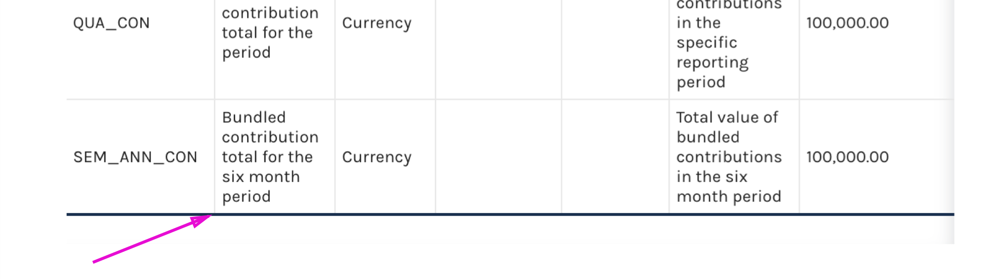
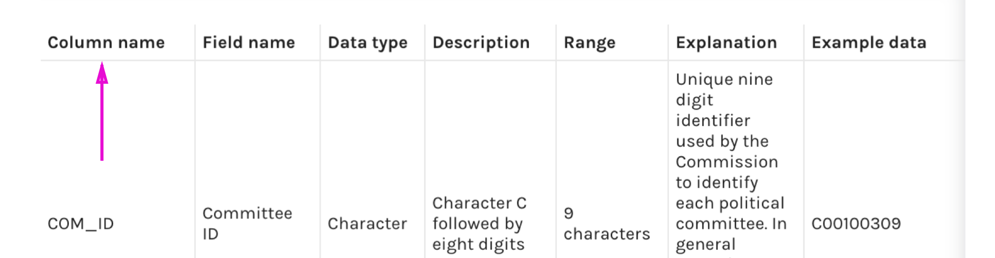
Not all tables across pages have similar styles applied. For instance, some tables have a blue bar across the bottom and some do not. This table style, simple-table dense-table should also have a dark blue dividing line across the bottom of the table headers.
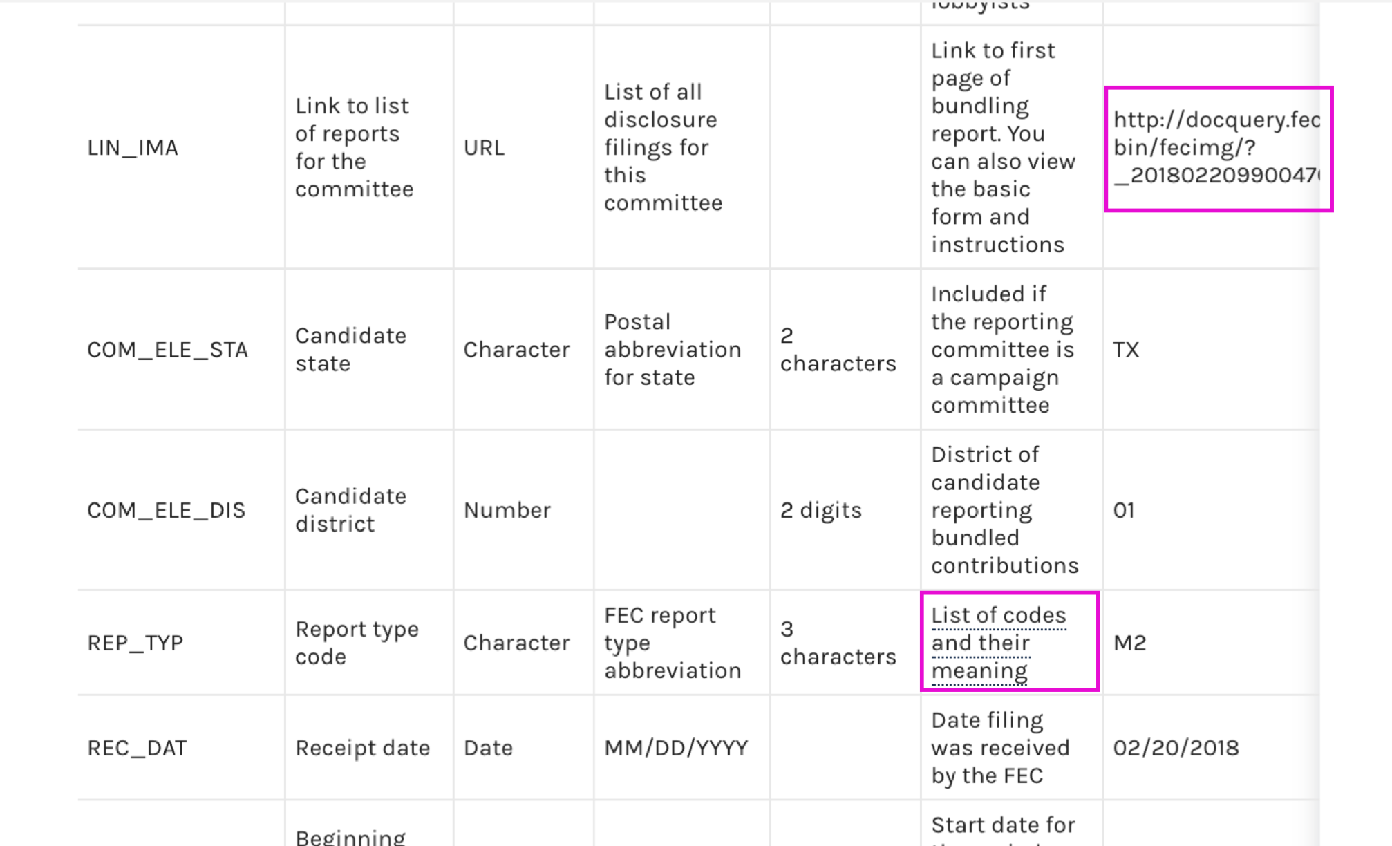
Links are not consistently applied. In some instances, links are hyperlinked and use the dotted line. Other links are text and must be copied in order to be used. Some of these links do not function.
The default state of these tables includes some information being concealed. The shadow and a scroll bar across the bottom help to make it clear that there is more information available. However, the same shadowed line across the left does not appear when information is concealed on the left.
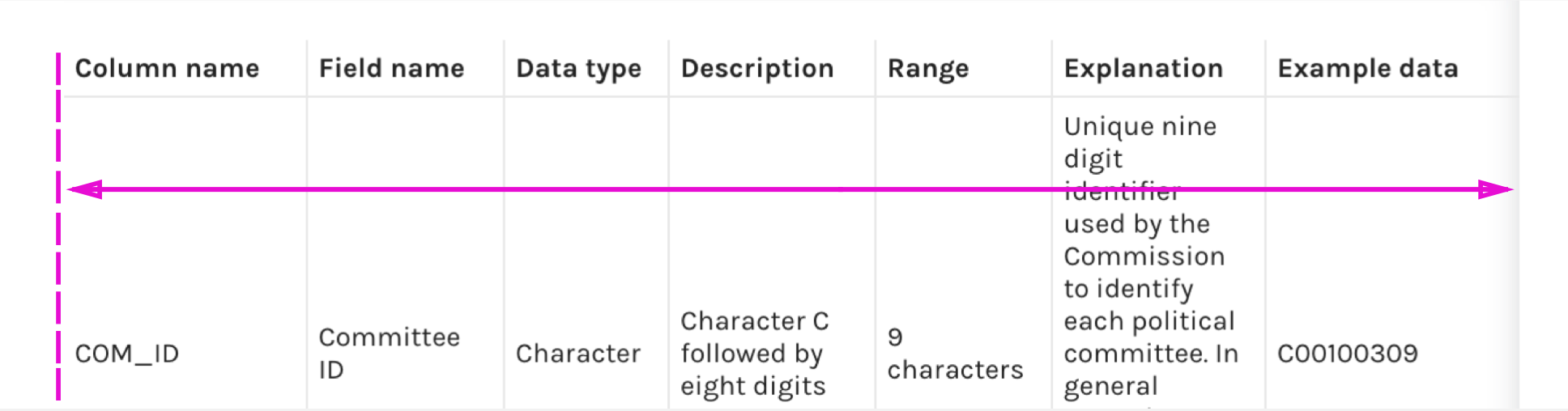
The scroll feature seen on the right is applied consistently across all tables. It also seen on tables where all information is already visible, so it could be perceived that the scroll isn’t working. Example: https://www.fec.gov/campaign-finance-data/unverified-filers-file-description/ or https://www.fec.gov/campaign-finance-data/report-type-code-descriptions/
Next steps:
@johnnyporkchops and/or @patphongs Before making a recommendation/plan for these tables I would like to schedule some time with you to look at the formation of this table and the classes it’s using. I understand there have been some modifications to this table from the version that’s in the pattern library to make it appear the way it does and to use links.
JonellaCulmer
on 30 Apr 2018
Based on the issues identified (see above) and some of the conversations I've had with @johnnyporkchops, I have a plan that I'd like the PMs to weigh in on. @PaulClark2 @AmyKort @jwchumley
Option A:
Update the tables.
We can update the tables to match the existing tables in the pattern library, dense table with display. By updating this table to match an existing pattern, we will:
- bring the site into better alignment and improve the readability of what we've already included in these tables.
- add alternating colors to rows
- add a dark blue line underneath the column headers to better distinguish them from the data in the tables
- make the table responsive and help with the column widths that seem to disproportionately give some columns more space than others with more information, such as the description column
Separately, we will want to address page breadcrumbs, which should be a federal blue color, and not crimson. @johnnyporkchops will need to investigate this further, but it appears that the page is retaining the color of the H4CC section since it seems these pages were designed to be for content.
Finally, there are two columns labeled Description that we'll want to address and we use hyperlinks in two different ways. Need to have a conversation about why that is.
Option B:
Create a new page template.
The page template that these metadata tables live on appear to be best suited for content. The tables require more space then they're given and so we may want to explore a new page template exclusively for these pages that require more room for our tables to be viewed at 100% width. This new page may also address the breadcrumbs problem previously mentioned.
Option C:
(Options A + B)
Recommendation:
My recommendation would be Option A. Option A will make the tables more readable and address some of the main concerns, it is reasonably easier to fix then a complete overhaul of our pages and uses an existing pattern.
In a future sprint, we can take a look at remaking these pages and I'm happy to make an issue to look at these pages again to improve the pages some more, particularly if/when we get more external feedback on the usability of these pages.
Thoughts?
JonellaCulmer
on 4 May 2018
@JonellaCulmer I agree with your recommendation. I think at some point we're going to want to start making new templates, but Option A solves our immediate problems, and we can take on a more complicated fix once we have more feedback on the feature and when we can consider our template needs more holistically.
 AmyKort
on 4 May 2018
AmyKort
on 4 May 2018
Closing in favor of implementation issue: https://github.com/fecgov/fec-cms/issues/1977
JonellaCulmer
on 7 May 2018
@JonellaCulmer the links in the far right columns are examples. The links in the second to last column, explanation, provide a path to more information. Of course, if there's a better way to help folks understand this, I'm all for it.
PaulClark2
on 8 May 2018
Related issues
 fec-jli
·
4Comments
AmyKort
·
6Comments
JonellaCulmer
·
6Comments
fec-jli
·
4Comments
AmyKort
·
6Comments
JonellaCulmer
·
6Comments
 dorothyyeager
·
5Comments
AmyKort
·
7Comments
dorothyyeager
·
5Comments
AmyKort
·
7Comments