Fec-cms: Alert design for homepage banner
We have received feedback during the shutdown that some users were not able to find the announcement banner on our homepage. This banner was used to announce that the FEC was closed. For situations in which the FEC must communicate important information and alert the public, we'll need a design that is more noticeable on our website.
Note: This alert is intended to be used only in extreme situations in which the public must be alerted. It should NOT be used to convey simple notices such as meetings or other routine FEC practices.
 patphongs
All 17 comments
To get the ball rolling today, below are three options for preliminary discussion and feedback.
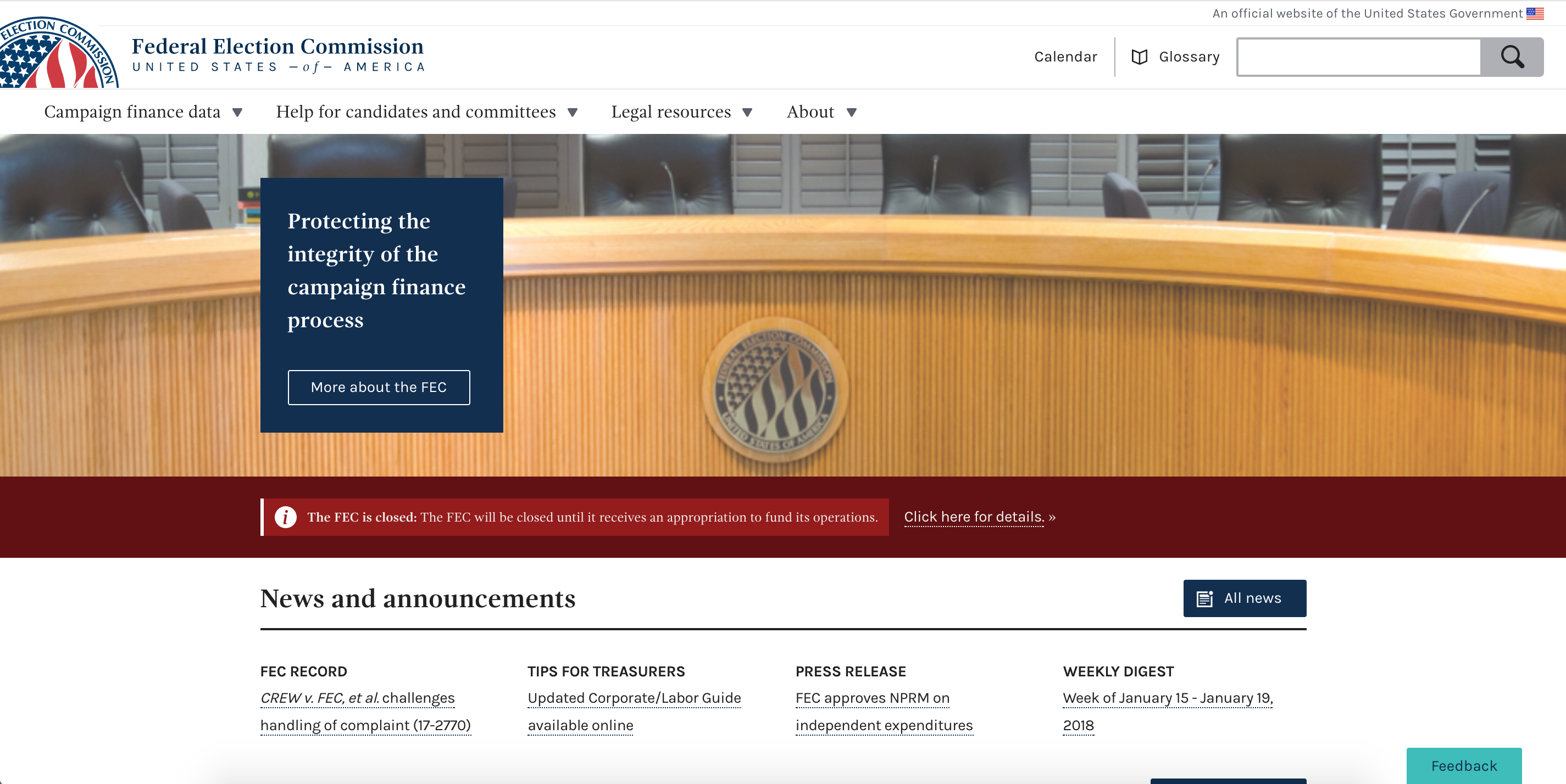
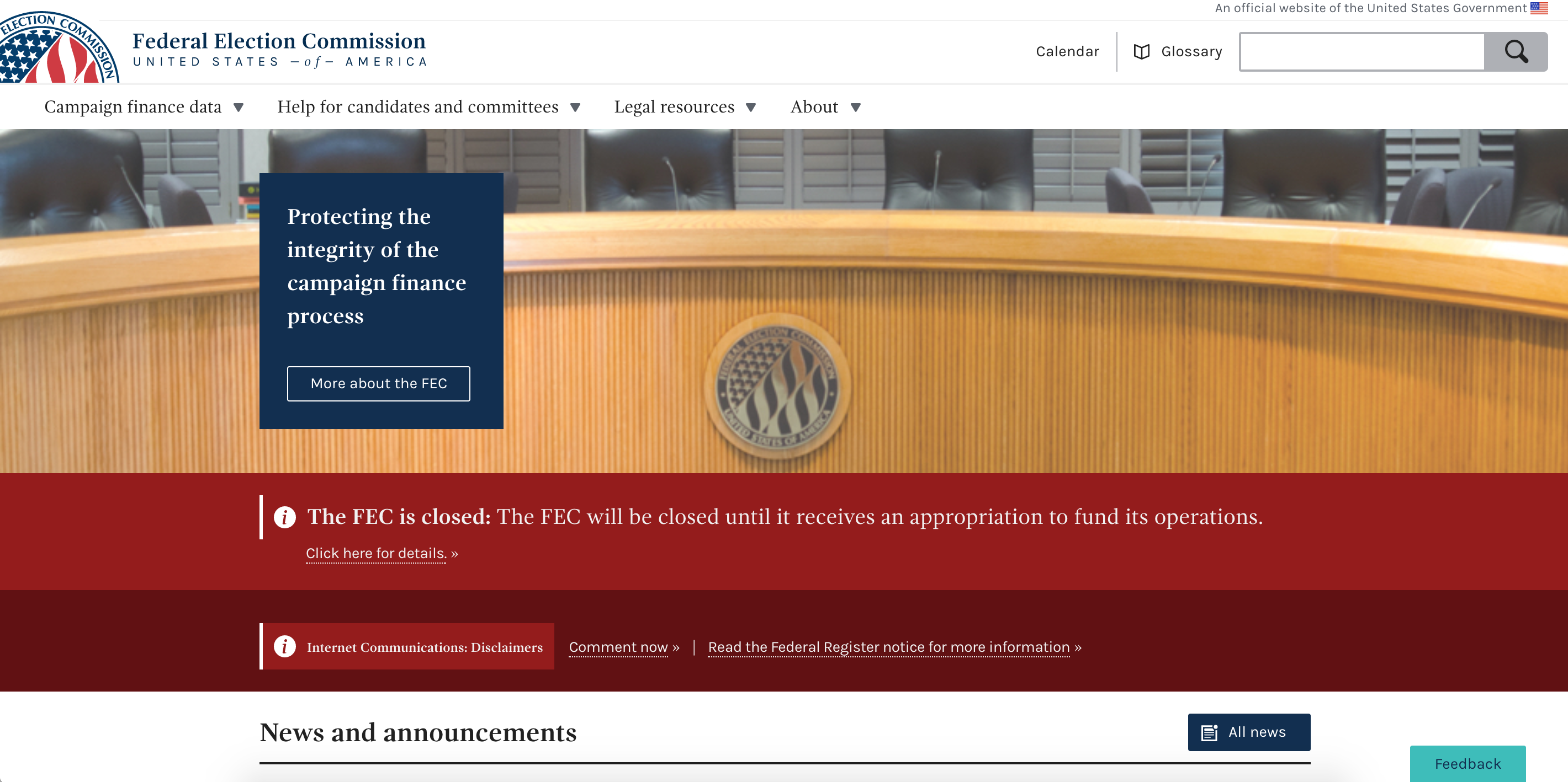
Option 1
Modified banner small (black and red)
This version is a minor modification of the existing banner. It simply changes the background color of the banner, currently crimson (#631010) to dark gray (#212121). This draws the eye much more and creates a greater sense of urgency than the standard color combination. The dark gray, however, has not been used on the website in this manner to date.

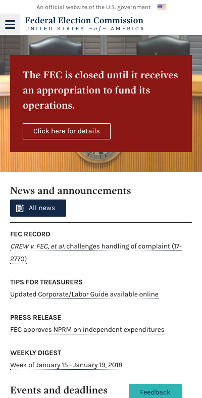
Option 2
Modified banner large (red)
Still a banner, this version changes the formatting to a greater degree. In this version, the text is much larger and the background color around the main copy has been removed. Of the three versions, I think this option is the most drastic as it is farthest from the design implementation as we have it today.

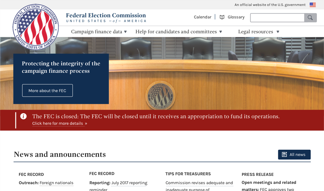
Option 3
Modified agency descriptor text
This version utilizes a space used for static content, is in keeping with the current design, satisfies the need to create a place for the closure content, or another emergency-level event, and holds a place of prominence on both desktop and mobile. I would recommend however, that the box be changed to deep-red and viewed at 50% (as seen in the mock-up), instead of 23% as it's currently seen in desktop, to give it a greater degree of visibility.
DESKTOP

MOBILE
My thoughts
My recommendation would be to pursue option 3. It is the most prominent of the three, addressing concerns by senior staff and utilizes a current design pattern (modified in color and the min. size of the bounding box) which is in keeping with the way the site's appearance.
Next steps
- [x] Determine direction
- [x] Approval
- [x] Wagtail prototype
- [x] Move to implementation/development ticket
cc: @patphongs @jwchumley @PaulClark2 @johnnyporkchops
 JonellaCulmer
on 23 Jan 2018
JonellaCulmer
on 23 Jan 2018
Thanks @patphongs and @JonellaCulmer for taking on this task. I wanted to amplify @patphongs 's notes above about how this banner is only to be used in extreme situations. This qualification serves a couple of purposes: one is to ensure that it stands out by its novelty. Potentially the fact that our current banner has been deployed on and off for regular announcement purposes (as it should be) actually made it less likely that regular visitors to our site noticed the language change. The second is that creating a banner that is only used in extreme situations, like a full closure of the agency, might mean that we could make something more visually disruptive than we would otherwise design.
Maybe one task for completion here is to draft a short list of potential circumstances where the banner might be used (and a long list of circumstances where it wouldn't). That might help us with the design.
 AmyKort
on 23 Jan 2018
AmyKort
on 23 Jan 2018
I like option 2. I'm not sure about option 3. It's high visibility, but from a messaging standpoint I don't think we should replace the language of our mission statement with the closure announcement. Also, I'm not sure the color change is enough of a signal to users that the box of text they've already read now contains different text.
@rhoughfec , what are your thoughts?
AmyKort
on 23 Jan 2018
Arg, I forgot the most important part, which was to say these are great options. Thank you @JonellaCulmer for putting together these super thoughtful designs, and so quickly too!
AmyKort
on 23 Jan 2018
Wow, kudos to @JonellaCulmer and @patphongs for being so incredibly fast at handling this situation!
I agree with Amy. I'm inclined to go with option 2, it's the one that caught my eye the most and also seems to stick to the site design.
Re situations to be used: honestly the only situation I think this is appropriate is for an agency shutdown or some emergency where the agency has a whole cannot assist the regulated community/public. Every other situation should use the normal banner for meetings/NPRM/filing deadlines.
 rhoughfec
on 23 Jan 2018
rhoughfec
on 23 Jan 2018
I agree with @rhoughfec on the short list. Thanks!!
AmyKort
on 23 Jan 2018
How much bigger is the banner in Option 2 compared to the current banner?
I like the brightness of Option 2 but it seems really big. What does 75% height of Option 2 look like?
Also, the red in Option 2 isn't really one of our color pattern reds, right?
 PaulClark2
on 23 Jan 2018
PaulClark2
on 23 Jan 2018
@PaulClark2 The banner is bigger simply to accomodate the size of the font. The font sizes in the mock-up in Option 2 are 18 (The FEC is closed...) and 14 (Click here for details...)
The red is one of our standard colors: deep-red, #961A16
Below is a mock-up of what it would look like with the banner shrunk down a bit. But it's a bit tight this way.
JonellaCulmer
on 23 Jan 2018
Thanks, @jonellaculmer. That’s good to know that red is in our color pallet. I see what you mean about the message being squeezed in the slightly smaller banner.
I’ll defer to @rhoughfec and @amykort
PaulClark2
on 23 Jan 2018
Thanks @PaulClark2
@AmyKort and @rhoughfec anyone else you think should take a look at this before we move forward with getting approvals for option 2? Also, how do you think we should approach that with senior staff?
JonellaCulmer
on 23 Jan 2018
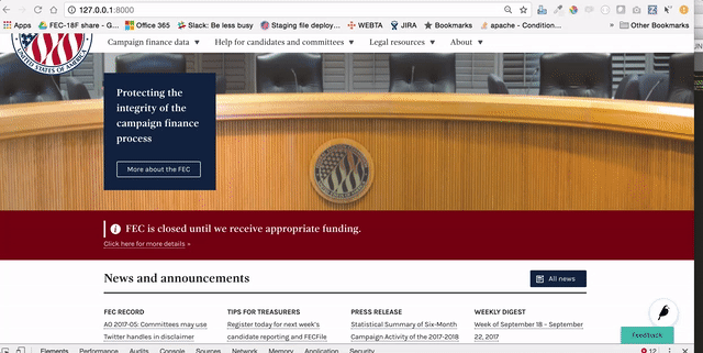
@JonellaCulmer Thanks for working on this. Another thing to note is how this will look up against other banners that are posted to our site simultaneously. We have the capability of posting multiple banners at once.
Current banner capability:
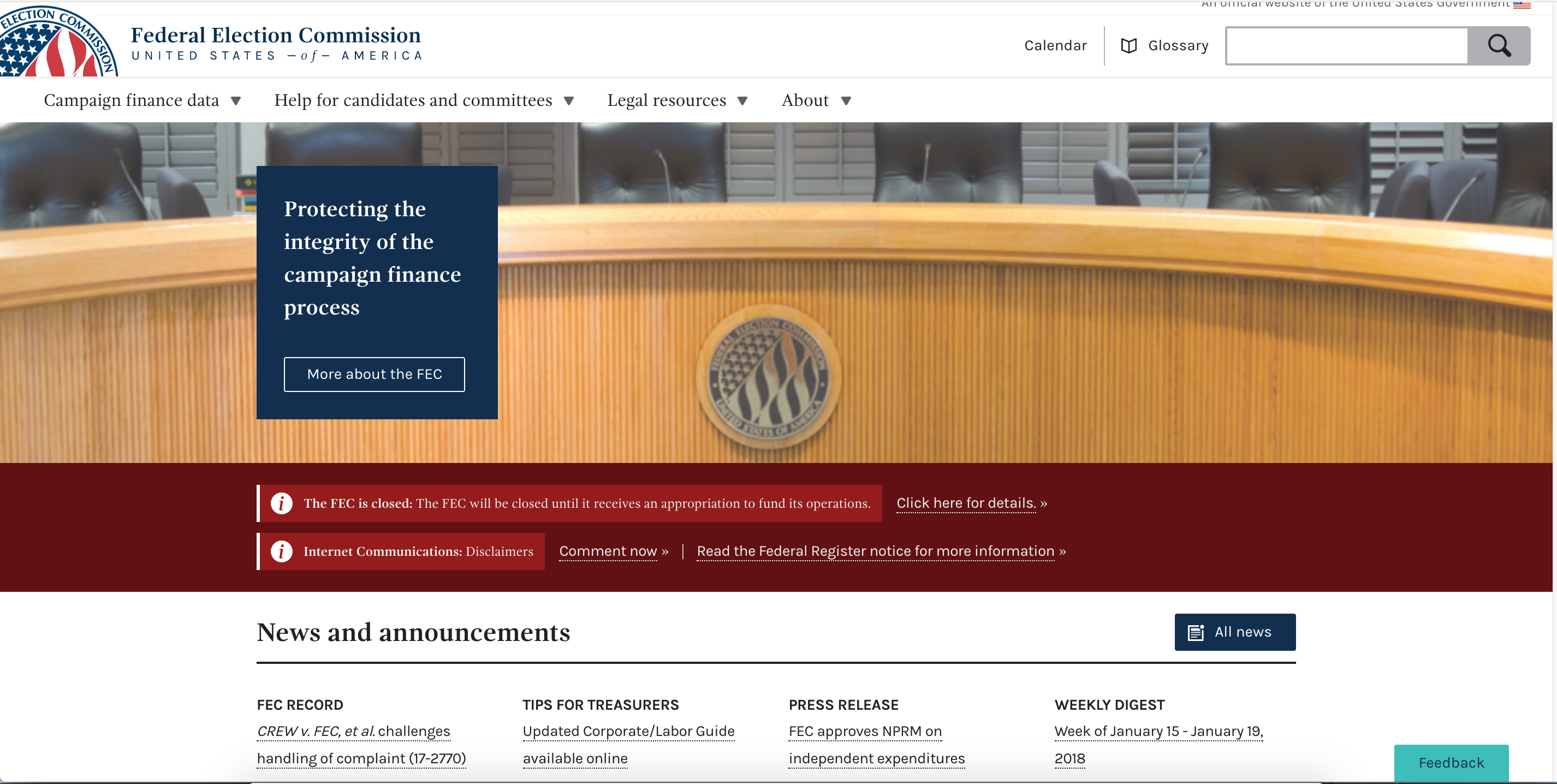
I did a quick code mock-up of what it would look like to apply 2 banners at once in which 1 was an emergency banner. I think the shutdown banner background (deep-red) adds enough contrast with the crimson for it to stand out. The one thing I would note is the deep red that is being used in the shutdown banner is the same deep red that is used for the title of the normal banner. What do you think?
patphongs
on 23 Jan 2018
@patphongs I agree. I think there's a great enough distinction between the two banners to make the first stand out.
Side note, compared to the closure banner, the other text looks teeny. Hmm....
JonellaCulmer
on 23 Jan 2018
@JonellaCulmer if you can just print me up a nice version of the proposed emergency banner I'll make sure folks are ok with it.
On the other banner issue...Amy mentioned that we make it a separate item about whether or not people are actually seeing the banner, but that's not at all a top priority for us :)
rhoughfec
on 23 Jan 2018
Thanks @JonellaCulmer ! Looks good to me!
I do think we need to look at the visibility of our regular banner. @patphongs has already made a ticket for that, so we won't forget.
AmyKort
on 23 Jan 2018
@johnnyporkchops started on a prototype last night:
uses the same home page banner announcement that we are using now, adding a button to click to change the bg color and font size.
JonellaCulmer
on 24 Jan 2018
Closing in favor of implementation issue: https://github.com/18F/fec-cms/issues/1717
JonellaCulmer
on 24 Jan 2018
The approach of a new additional style in the banner space makes sense to me— thanks for showing what it would look like on top of the existing banner. Definitely agree that making a new banner style (instead of using the existing but with new styles) will help visually separate this emergency notice.
If we just changed the banner style alone, principles of visual hierarchy predicts that we'd likely encounter the same problem—where all the alerts look the same and none stand out as different.
I absolutely think we should keep moving with this direction and test with external users before changing further. Though if we test and find this approach isn't succeeding, I think @JonellaCulmer 's third option above best uses hierarchy and placement to communicate the emergency shutdown message for short periods of time. Maybe there's a way to do it so that we don't have to lose Protecting the integrity... statement, but we could explore that possibility only if testing shows necessary.
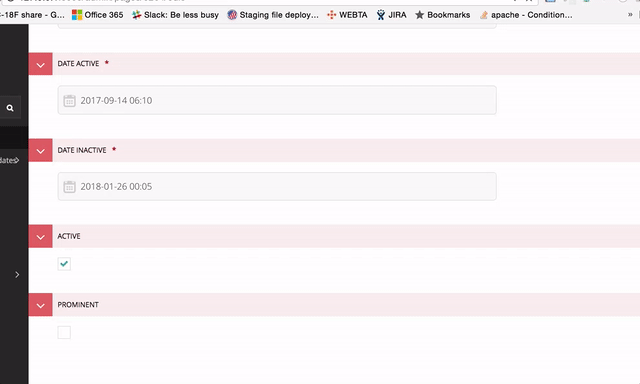
On the wagtail interface
One thought here (inspired by Hawaii, thanks Hawaii!) is we need to provide more context to the Prominent checkbox, so people know how and when to use this feature. I'll carry that thought over to the implementation issue in #1717 so that it will be closer to where the change is being implemented.
 jenniferthibault
on 30 Jan 2018
jenniferthibault
on 30 Jan 2018
Related issues
AmyKort
·
3Comments
jenniferthibault
·
5Comments
jenniferthibault
·
6Comments
JonellaCulmer
·
5Comments
 fec-jli
·
4Comments
fec-jli
·
4Comments
Most helpful comment
Wow, kudos to @JonellaCulmer and @patphongs for being so incredibly fast at handling this situation!
I agree with Amy. I'm inclined to go with option 2, it's the one that caught my eye the most and also seems to stick to the site design.
Re situations to be used: honestly the only situation I think this is appropriate is for an agency shutdown or some emergency where the agency has a whole cannot assist the regulated community/public. Every other situation should use the normal banner for meetings/NPRM/filing deadlines.