Fec-cms: Redesign interaction for selecting a total or subset increment of time
History in https://github.com/18F/fec-cms/issues/1444
The phrase "Election cycle" is only accurate to use when speaking about a period of time measured from one general election to another general election (hat tip to @rhoughfec for that language) Using it as we have on the site can be confusing (especially to expert users and FEC staff), since the data shown is broken down for calendar years.
While considering replacing the language in #1444 we also found an opportunity to clarify what's being shown by improving the interface's design.
Current interaction for selecting a period of time

Design goal:
Make it more clear that you are selecting a total period of time, or a subset of time from the total period.
Language will play into this, certainly, but the label/text fields involved may change if the interaction changes.
Completion criteria
- [x] Research common interaction patterns
- [x] Identify and propose option(s) to try
- [ ] Create InVision prototype of interaction in place
- [ ] Review concept with stakeholders & team
- [ ] Use prototype to perform usability tests on new interaction
- [ ] Create implementation issue (that identifies what pages and templates would be impacted)
 jenniferthibault
All 10 comments
One of the big jobs of this component is to help the user understand that the time period is subservient to the election, which wasn't totally obvious in the existing interaction.
As I got working, the goals outlined above evolved a little more:
Working goals:
- Emphasize the relationship between the election select & time period refinement
- Use existing patterns if possible
- Try to use less to do more: simplify and reduce the number of components/fields if possible
In the examples below, you'll see my working hypothesis:
If we make it more obvious the time period is a refinement of the election selected, we can drop the "time period" label altogether.
I ended up with a few options to consider:
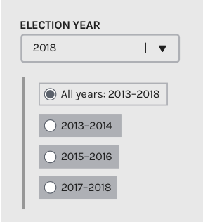
Option 1: Radio buttons
Radio button patterns allow users to select 1 and only 1 option at a time, so will need to have an "All" option
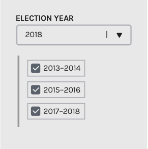
Option 2: Checkboxes
Checkboxes patterns allow users to select one or more options from a visible list. Using this arrangement would mean we'd need to allow people to select 2013–2014 and 2017–2018 as an option to view data for.
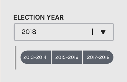
Option 3: Modified limited range
This interaction feels most natively related to our pattern that allows users to select a specific period of time within a pre-defined two year period. We've called this a limited range pattern, and it could be used for any interaction that involves a total and subset. You can see an example of this pattern live on the site on the independent expenditures data table
Using the inspector, I hacked a _really rough_ version showing the basics of how this would interact. (try to ignore the last two seconds where it breaks if you can, I didn't time it perfectly)

My review
My initial preference is for option 3, the modified range, since it ties in closely to an existing pattern with similar goals. The thing to consider here is that it's likely more complex to implement, but a good learning opportunity
Second to me would be option 1, the radio buttons, for its (relative) straightforward implementation, and since the checkboxes pattern allows users looking at six year senate data to create the weird split-year views mentioned above which detracts points for me.
Other design notes:
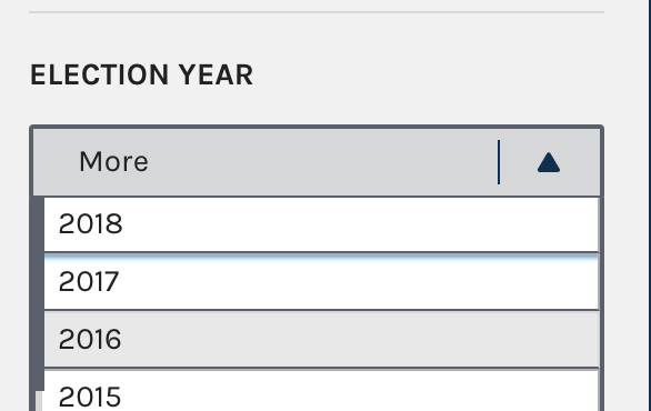
I found that we had already solved the problem of how to not call it "Election cycle" in the dropdown filter on the Candidates data table, so I used that label here.
Next steps:
Review & feedback from the team!
@jameshupp , @AmyKort , @jwchumley (and @JonellaCulmer if you have time between conference activities), what do you think about:
- the above interactions
- the proposal to drop the secondary "Time period" in this iteration
- and using "Election year" as the primary label language?
jenniferthibault
on 6 Dec 2017
nudge to @jameshupp & @AmyKort — could you take a look?
jenniferthibault
on 7 Dec 2017
I agree option 2 is my least favorite. In addition to what you pointed out—enabling 2013-14 and 2017-18 while excluding 2015-16—there's the less complex but still different capability of 2013-2016 and 2015-2018. While there _might_ be reasons to enable any of these searches, they seem like distant edge cases, and anything that reduces the users' choice complexity seems important. Otherwise it's too easy to accidentally select the wrong number of ranges. If it's either one two-year period or all two-year periods, you're on safer ground.
Option 1 feels more intuitive to use than Option 3 in terms of knowing for sure exactly what results I'm going to be served. But I agree that Option 3 is a closer match to what we want to achieve for people. However, I'm not clear how it gets around the problem from Option 2 of enabling four-year searches in six-year elections. Maybe that's okay, but it doesn't change that. How's that strike you @jenniferthibault?
As to the other two bulleted questions:
- Fewer labels rather than more if there are ways to make it clear. I think all of these options let us make it clear without "Time period" so I prefer dropping it.
- Yes, "Election year" is great.
 jameshupp
on 7 Dec 2017
jameshupp
on 7 Dec 2017
I like option 1 the best, and I'm on the fence about "time period." BUT, I might need someone's help (@jwchumley probably) mapping the functionality we have to the proposals.
My first reaction is that "time period" was hopefully jogging people's memories to say that senators have 6-year election cycles. I'm wondering if option 2 doesn't have enough prompts to remind me why I am looking at these 3 time periods (especially if I'm toggling between house and senate candidates or among senate candidates up for election in different years). I think options 1 and 3 do more work to remind me that I'm looking at parts of a continuous time period.
Also, I agree with James. I'm not sure how much flexibility we have in displaying/aggregating multiple two-year periods, but I'm not sure it would make sense to try to show 2013-2014 and 2017-2018 at the same time.
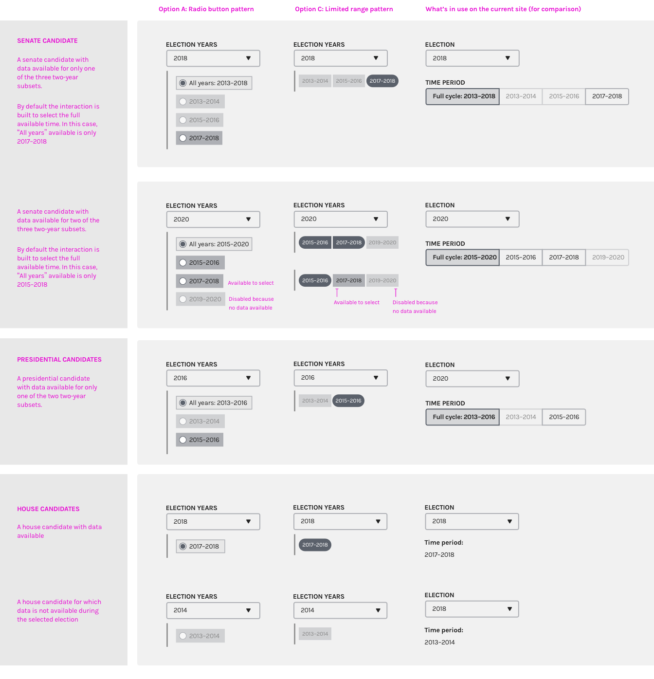
One other thought. Without the "all years" or "time period" prompt, I'm also not sure how intuitive it would be for users in cases where we don't have data available for all of the subsets. In this example, the committee was formerly a House committee and was turned into a senate committee (I think), which is why the 2013-2014 and 2015-2016 options are grayed out even though the committee itself has filings for those periods: https://www.fec.gov/data/candidate/S8IN00189/
https://www.fec.gov/data/candidate/S8IN00189/
In this example, the committee first registered in 2017, which is why the 2013-2014 and 2015-2016 options are grayed out: https://www.fec.gov/data/candidate/S8CA00317/
In this example, the election is 2020, so the 2019-2020 time period is unavailable https://www.fec.gov/data/candidate/S2TX00106/
Looking quickly through our data, I started to think there are a lot of instances where not all of the subsets are available. I hadn't recognized that as an important part of this issue before today.
My 2 cents.
 AmyKort
on 7 Dec 2017
AmyKort
on 7 Dec 2017
I forgot the most important part, which was to say thank you @jenniferthibault for the really thoughtful review of this feature and the great designs!
AmyKort
on 7 Dec 2017
Option 1: Radio buttons
Using the radio buttons will follow the existing pattern we have for making one selection at a time. This would also maintain the current pattern for making one time period selection at a time that we have on the site right now.
Option 2: Checkboxes
I completely agree that there is an opportunity for confusion if someone wants to check just the first and last time periods and returning split results. Of course we could always build it in that if the first and last time periods were selected, it would automatically select the second option. But that may upset those who specifically searched for that split data. Eliminating that as an option at this point makes the most sense and keep in in the bucket of ideas to remember for later.
Option 3: Modified limited range
This is obviously the more visually appealing option. Feels more like a flow across time, which I like, but doesn't seem to fit the pattern of how this is used elsewhere on the site. I'm familiar with this drag-and-click interaction when used for calendars and it seems to work on those instances because there's generally a larger span of time to cross. With so few options here, I'm not convinced that this is the best path forward.
My Vote: Make the text change, leave the design as is.
I'll take another look at #1444 but I'm not seeing the motivation for changing this system we have in place now, when the focus of this issue was to change the text. I don't believe the current system has been over-burdensome to data users thus far, with the exception of some wanting to search across multiple time periods in advanced data sections. (But that's another issue entirely.) Of course, there may have been a more detailed discussion of this during your last meeting. I am curious, however, how these interactions would be modified to fit on Candidate Profile Pages.
If I'm in the minority on not making the design change, I would suggest making the text change first, along with new logic, and create a separate issue for the design change. That way we can solve the first problem first - and solve the rest in the new year.
@jenniferthibault @AmyKort @jameshupp @PaulClark2
 JonellaCulmer
on 8 Dec 2017
JonellaCulmer
on 8 Dec 2017
Thank you all for the great feedback! And especially great call @AmyKort for bringing in the inactive states which represent time periods in which there is no data available from the candidate's authorized committees. This happens more often than it doesn't, but for a lot of different reasons.
@JonellaCulmer you're totally right, there could be a faster fix to change the wording, and we could still pursue that if we need to fix in NOW. What we chatted about this week while you were at the COGEL conference is that there might be an opportunity to prune some of the language through a different design. For example, option C with the limited range select eliminates the most problematic label field, "Full cycle", altogether.
I'm going to drop in some applications of the designs discussed above, but that's not closing down your idea, it's just keeping both running for now until we can sync up at our design pairing session later today.
Updated designs
The checkbox approach seems clearly out— it doesn't clarify much, and adds confusion around splitting years.
To kick the tires and see if either reveals any more info to which might be better, I've applied options 1 and 3 to real scenarios with real data across Senate, House, and Presidential candidate profiles. The right-most column shows what we currently do on the live site.
(Pro tip: Click the image to open it larger in a new tab and zoom in)
Initial thoughts
What I've come to appreciate more about the limited range (Option C) is it clarifies more (though maybe still not perfectly) that from the start you're looking at the full amount of data _that's available_ within that period. With the checkboxes and the toggle currently in use, selecting "All years: yyyy–yyyy" doesn't omit or recognize the years for which no data is available.
Whether we need the label on the subset field is still an open question to me, and one that probably could be deciphered through usability tests to see if users can read back what they think is happening successfully.
Successful testing might sound like any variation of:
The subset field shows the two-year time periods within the selected election years for which the candidate filed financial reports with the FEC and there is data available. Inactive periods/options are years within that election in which the candidate did not report financial activity.
So, if we find/feel that a label is needed, how might we turn that into 2-3 words for a label?
🍿 Looking forward to a good discussion at design pairing today!
jenniferthibault
on 8 Dec 2017
One more thought!
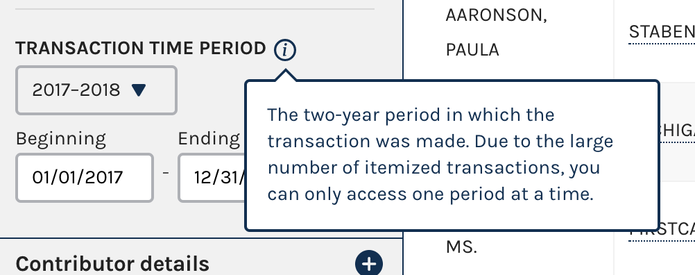
One additional pattern that we have in our toolbox is the tooltip. This is useful for scenarios where a longer explanation is helpful but not required to understand the basics. We've used this before to explain tricky labels or data fields, and might talk about whether it feels like a good fit here
jenniferthibault
on 8 Dec 2017
At today's design pairing, we identified that we should pursue a short-term quick fix to change "Full cycle" on the existing toggle to "All years," and a longer-term redesign that tests the limited range pattern with additional context in a tooltip.
I'll carry the quick fix back into #1444 to keep this issue focused on the longer-term redesign.
The limited range pattern is adapted & designed above, so the next step step for this redesign is to write the content in the tooltip. Needs for the tooltip:
- The content should be generalized enough so that we only need one description for all types of candidates (senate, presidential, and house)
- We should jog people's memories to the fact that the amount of time they're able to see at once depends on the length of the type of candidate's election cycles (senators = 6, president = 4, house = 2)
- Help them understand the reasons why certain time periods might be unavailable:
- Candidates can enter a race mid-way through an election cycle. There won't be data available for them before they filed their Statement of Candidacy
- There is no data in those period of time because the candidate has not yet filed their financial reports
- The time period is in the future and hasn't happened yet (so the candidate has not filed their financial reports)
- All as concise as possible. A rough goalpost would be around 45 words or 290 characters max? (I estimate that this would be roughly 1/2 the height of an iphone 5 screen)
@rhoughfec you've been so helpful in spotting the wording sensitivities in design reviews, would you be up for taking a stab at this content with @AmyKort or @jameshupp on for review?
Review and testing next steps
- Once the tooltip content is written we should run the concept & tooltip content by Press (Christian and I think @rhoughfec suggested Eileen?) to ask for their help in using this as a way to explain to people calling to get more info on the data, and to see if it fits their needs.
- Ask for Lauren's help to enlist RAD analysts in testing that the interaction and the data is working correctly in a code-based prototype
- Usability test with external users with a code-based prototype This should be done somewhere that is _not_ develop so that it's free from the release cycle—I'll investigate what we'd need to make this work
jenniferthibault
on 8 Dec 2017
@jenniferthibault yes, happy to work on the content with @AmyKort and @jameshupp. Yes, I think Christian and Eileen would be good people to reach out to since I think their callers are most likely to use the tooltip.
 rhoughfec
on 11 Dec 2017
rhoughfec
on 11 Dec 2017
Related issues
 kathycarothers
·
3Comments
kathycarothers
·
3Comments
 johnnyporkchops
·
5Comments
johnnyporkchops
·
5Comments
 lbeaufort
·
5Comments
lbeaufort
·
5Comments
 dorothyyeager
·
5Comments
dorothyyeager
·
4Comments
dorothyyeager
·
5Comments
dorothyyeager
·
4Comments
Most helpful comment
@jenniferthibault yes, happy to work on the content with @AmyKort and @jameshupp. Yes, I think Christian and Eileen would be good people to reach out to since I think their callers are most likely to use the tooltip.