An icon to represent Patreon, useful on webpages

 kurisubrooks
All 14 comments
Seconding this! Patreon recently did a complete rebrand — their new logomark looks like this:

 evansims
on 2 Oct 2017
evansims
on 2 Oct 2017
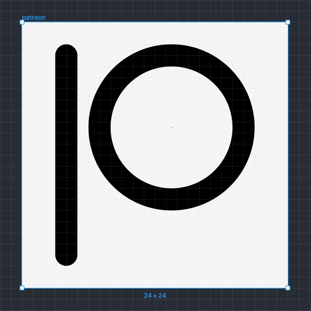
I tried to copy their new logo's dimensions while still following the rules, how does this look @colebemis ?
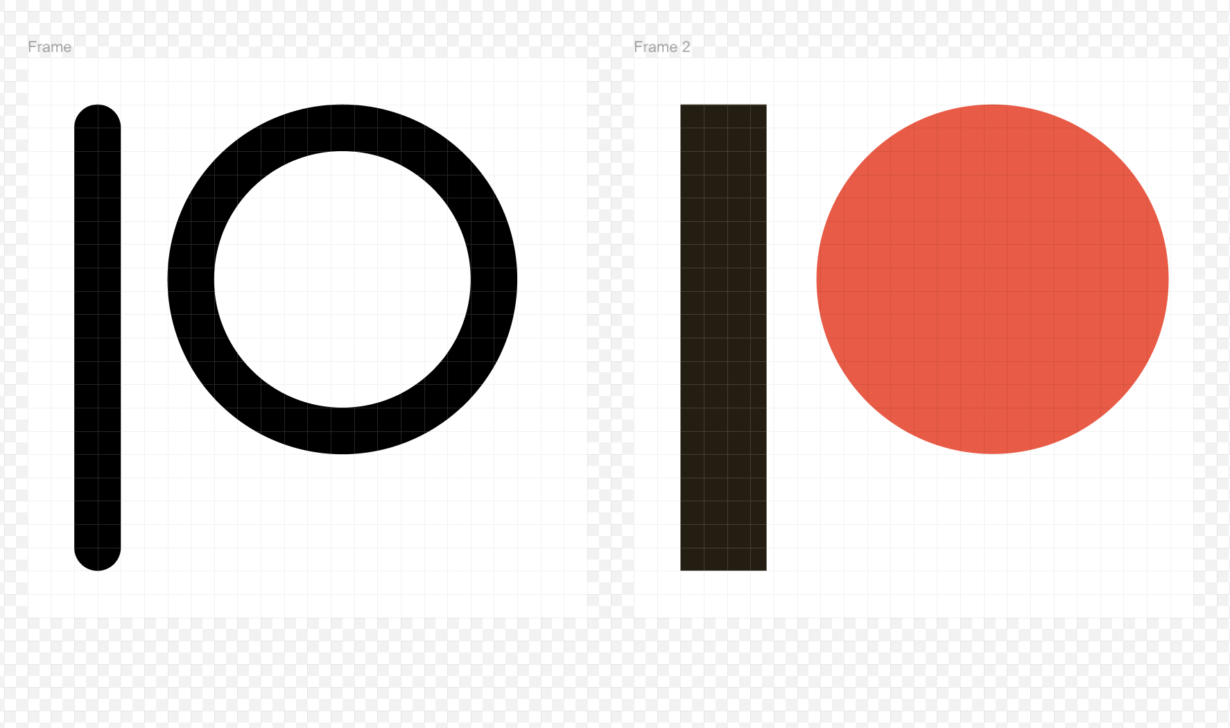
here's a Figma file as well:
patreon.fig.zip
 csandman
on 1 Apr 2019
csandman
on 1 Apr 2019
Just some small changes to @csandman's icon so that it follows #171 ... what does everyone think? Figma
cc @locness3 @ahtohbi4
 jletey
on 21 Jul 2019
jletey
on 21 Jul 2019
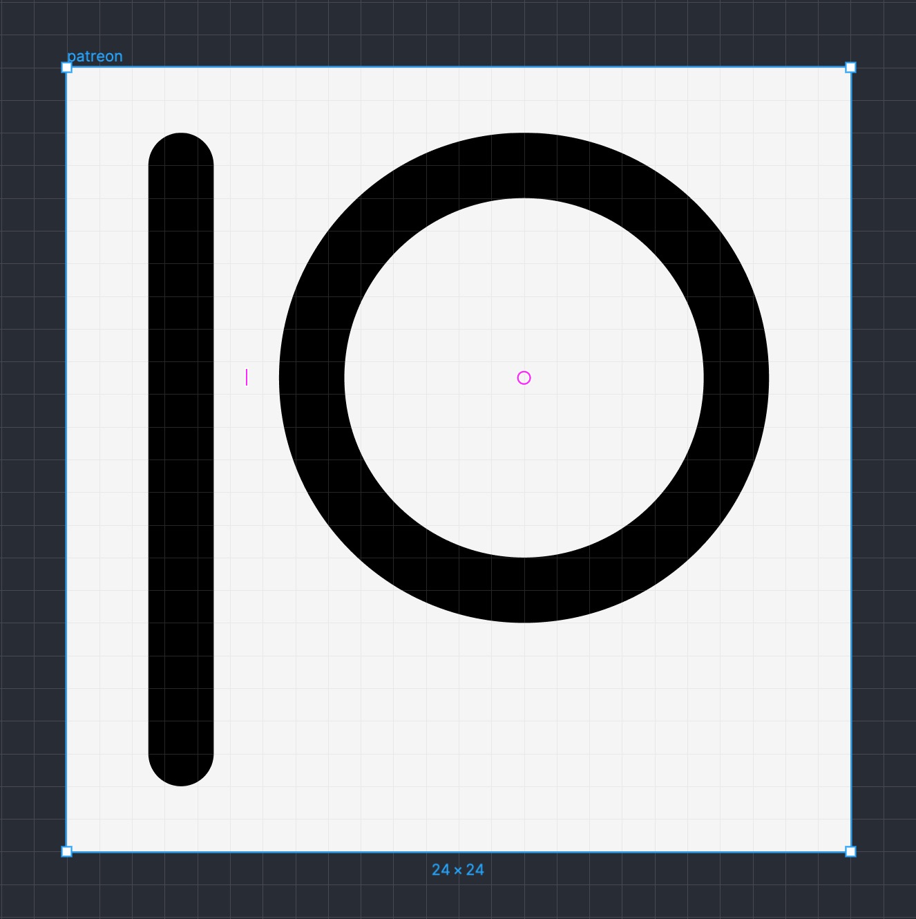
Maybe use 2px spacing
 locness3
on 21 Jul 2019
locness3
on 21 Jul 2019
@locness3 Updated!
jletey
on 21 Jul 2019
That looks not aligned with the grid.
locness3
on 22 Jul 2019
@locness3 It is aligned with the grid ... it looks off because in order to centre it I had to adjust it to be on half-squares (if that makes sense)
jletey
on 22 Jul 2019
Well, it should be on squares I think
locness3
on 22 Jul 2019
@locness3 Does it matter? As long as it's centered right? I will have to adjust the circle size in order to be on squares and have a 2px distance
jletey
on 22 Jul 2019
idk
locness3
on 22 Jul 2019
@locness3 I'll go ahead and open a PR
jletey
on 22 Jul 2019
Ok
locness3
on 22 Jul 2019
@johnletey It does matter in general that the pixels are aligned correctly because on lower resolution devices, misaligned SVGs will look fuzzy. I'm also curious what rules you believe my original version to break?
csandman
on 24 Jul 2019
@csandman It wasn't more of rule-breaking, and more of that the icon needed to be centered and I changed it so that the line and the circle were 1px away from each other ... although it turns out that @locness3 wanted them to be 2px away.
jletey
on 24 Jul 2019
Related issues
 alexantr
·
5Comments
alexantr
·
5Comments
 arinbjornk
·
4Comments
arinbjornk
·
4Comments
 jamesponddotco
·
5Comments
jamesponddotco
·
5Comments
 designgrill
·
5Comments
designgrill
·
5Comments
 ericfennis
·
4Comments
ericfennis
·
4Comments
Most helpful comment
I tried to copy their new logo's dimensions while still following the rules, how does this look @colebemis ?
here's a Figma file as well:
patreon.fig.zip