Fe-interview: [css] 第232天 使用css实现彩虹的效果
All 3 comments
使用 box-shadow 或 radial-gradient 或 svg
 forever-z-133
on 4 Dec 2019
forever-z-133
on 4 Dec 2019
<!DOCTYPE html>
<html lang="en">
<head>
  <meta charset="UTF-8">
  <title>彩虹</title>
  <style>
    .rainbow-wrap {
      width: 500px;
      height: 500px;
      background-color: red;
      position: relative;
      left: 20px;
      top: 20px;
      border-radius: 100%;
    }
    .rainbow-wrap::after {
      content: '';
      width: 500px;
      height: 250px;
      background-color: white;
      position: absolute;
      bottom: 0;
    }
    .rainbow-wrap::before {
      content: '';
      width: 200px;
      height: 200px;
      background-color: white;
      position: absolute;
      bottom: 0;
      border-radius: 100%;
      top: 150px;
      z-index: 10;
      left: 150px;
    }
    .rainbow-wrap .rainbow-item {
      position: absolute;
      width: 400px;
      height: 400px;
      border-radius: 100%;
      background-color: yellow;
      top: 50%;
      left: 50%;
      transform: translate(-50%, -50%);
    }
    .rainbow-item:nth-child(2) {
      background-color: blue;
      width: 300px;
      height: 300px;
    }
    .rainbow-item:nth-child(3) {
      background-color: green;
      width: 200px;
      height: 200px;
    }
  </style>
</head>
<body>
<div class="rainbow-wrap">
  <div class="rainbow-item"></div>
  <div class="rainbow-item"></div>
  <div class="rainbow-item"></div>
</div>
</body>
</html>
 SXX19950910
on 4 Dec 2019
SXX19950910
on 4 Dec 2019
👀4
😕3
👍3
🎉1
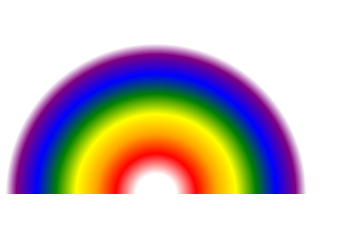
使用radial-gradient径向渐变实现
<div class="rainbow"></div>

.rainbow{
        width: 300px;
        height: 150px;
        background: -webkit-radial-gradient(50% 100%,white 0px, white 20px, red 40px, orange 60px,yellow 80px, green 100px,  blue 120px, purple 140px, white 150px);
        border-radius: 100% 100% 0 0;
}
 carrie-xin
on 26 Feb 2020
carrie-xin
on 26 Feb 2020
Was this page helpful?
0 / 5 - 0 ratings
Related issues
 haizhilin2013
·
3Comments
haizhilin2013
·
3Comments
haizhilin2013
·
3Comments
haizhilin2013
·
3Comments
haizhilin2013
·
3Comments
haizhilin2013
·
3Comments
haizhilin2013
·
3Comments
haizhilin2013
·
3Comments
haizhilin2013
·
3Comments
haizhilin2013
·
3Comments
Most helpful comment