Faas: Proposal: Enable "Remove function" in FaaS UI
Issue
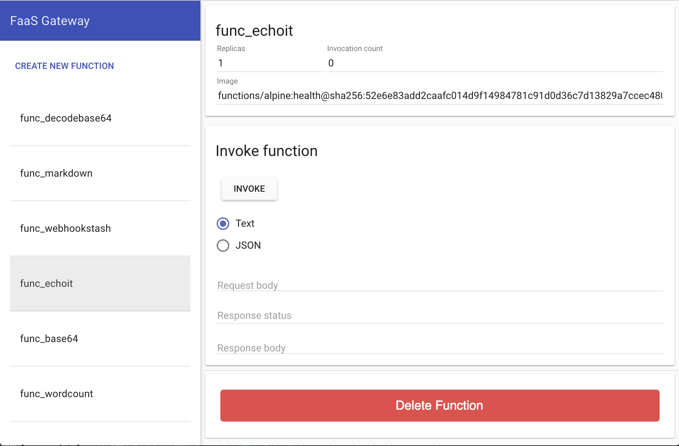
It is not possible to delete functions via the FaaS UI.
Proposed fix
Add an Angular card with a delete button below the Invoke function card. See this comment for some UX direction on implementation.
 johnmccabe
All 19 comments
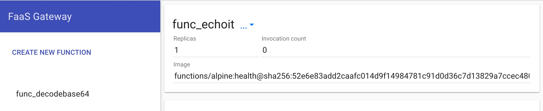
@johnmccabe Please can you put together screenshot in paint or whatever works and attach?
 alexellis
on 21 Aug 2017
alexellis
on 21 Aug 2017
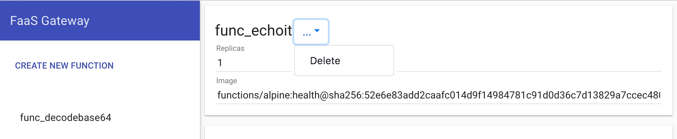
@alexellis this good for you?
johnmccabe
on 21 Aug 2017
While we've got this page open do we want to change FaaS to OpenFaaS in the top left too?
 rgee0
on 21 Aug 2017
rgee0
on 21 Aug 2017
@johnmccabe that is too big and easy to hit. Perhaps this should be on a pop-up dialog via a "..." break-out.
alexellis
on 21 Aug 2017
@rgee0 good point, can you put that suggestion on issue #123 and ping @glyif?
alexellis
on 21 Aug 2017
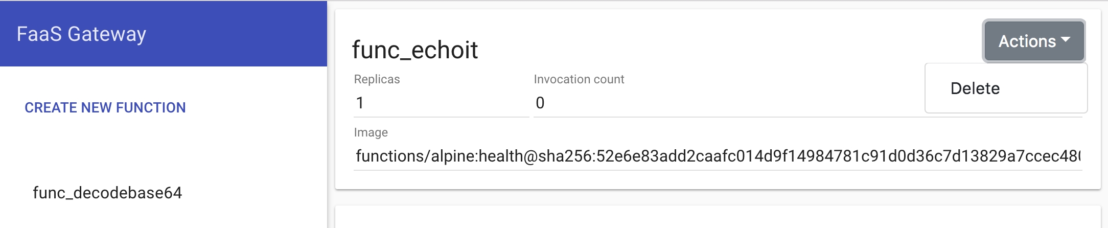
@alexellis with a dropdown, the wide delete button in a card seems like the more material-ly one to me fwiw, very subjective ofc :)
johnmccabe
on 21 Aug 2017
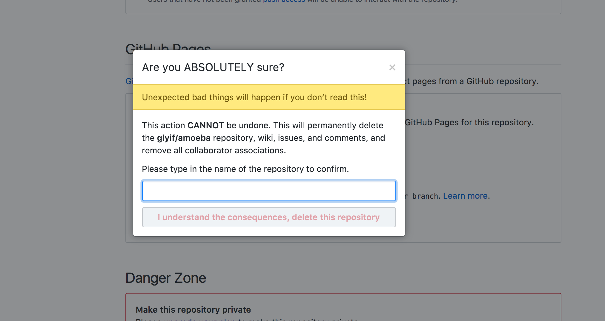
we can also do something like this so peeps don't accidentally delete
 glyif
on 21 Aug 2017
glyif
on 21 Aug 2017
If you want to mix both you could but it on the row with Invoke, but have the pop-up for confirming. I think the huge red button in the first screenshot could draw the eye too much and it'll be hard to find when you invoke a function (i.e. it will be pushed very far down the screen)
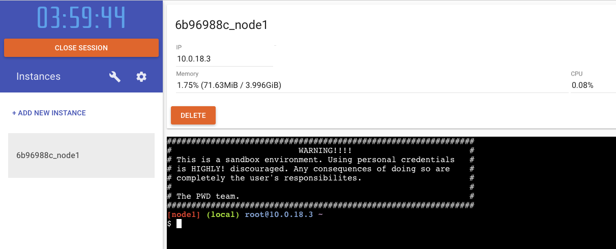
The PWD site has a much more subtle delete button:
alexellis
on 21 Aug 2017
And with an ellipsis, looks cleaner when unselected..
and selected...
@alexellis I've come round to your suggestion here, think this is the nicest.
johnmccabe
on 21 Aug 2017
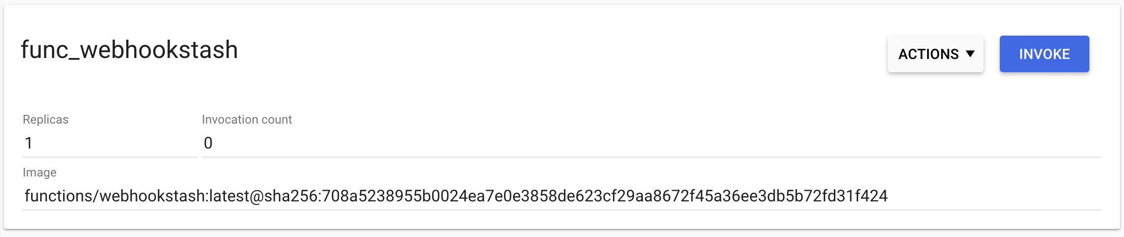
I'd say the delete button needs to be away from the function output. Top right feels better to me.
rgee0
on 21 Aug 2017
Hi, my thoughts on this issue:
- I agree with the dropdown solution, that let delete option appears
- I would place all action buttons at the same place, it makes more sense (invoke, actions, and maybe more in the future) at top right
- Use label and/or pictograms could helps user to understand the UI (e.g.: http://fontawesome.io) - ⚠️ Not everywhere of course, but it can be self-explanatory in some situations
An attached screenshot with what I think quite appropriate (did not saw @johnmccabe proposition at first, that is quite similar):
- The delete button is in a dropdown as @alexellis suggested
 fabienheureux
on 23 Aug 2017
fabienheureux
on 23 Aug 2017
Can we move forward with the last suggestion - but with a caveat:
- Add the contextual menu top right
- Keep invoke where it is and revisit after adding actions drop-down menu
alexellis
on 23 Aug 2017
@fabienheureux - how do you feel about implementing the UI? cc @aafrey
alexellis
on 2 Sep 2017
@fabienheureux ping 🏓
alexellis
on 7 Sep 2017
@alexellis sure, I will work on this next week 👍
fabienheureux
on 8 Sep 2017
Hi, I didn't realize this thread and was thinking about deletion, too. I basically agree with the final suggestions but how about making the "ACTIONS" button an ellipsis icon like @rgee0 suggests?
Here is a sample I was making. But including the above suggestions, the trash icon would become an ellipsis and also, it would become a dropdown.
@fabienheureux I could have a look at this today or tomorrow (JST timezone) so feel free to ping me if I can help!
 kenfdev
on 11 Sep 2017
kenfdev
on 11 Sep 2017
I like this final gif - @kenfdev if you want to commit this in a PR I think we could just merge it and close this issue.
alexellis
on 13 Sep 2017
@alexellis No problem. I think I can implement it tonight (GMT+9)
kenfdev
on 13 Sep 2017
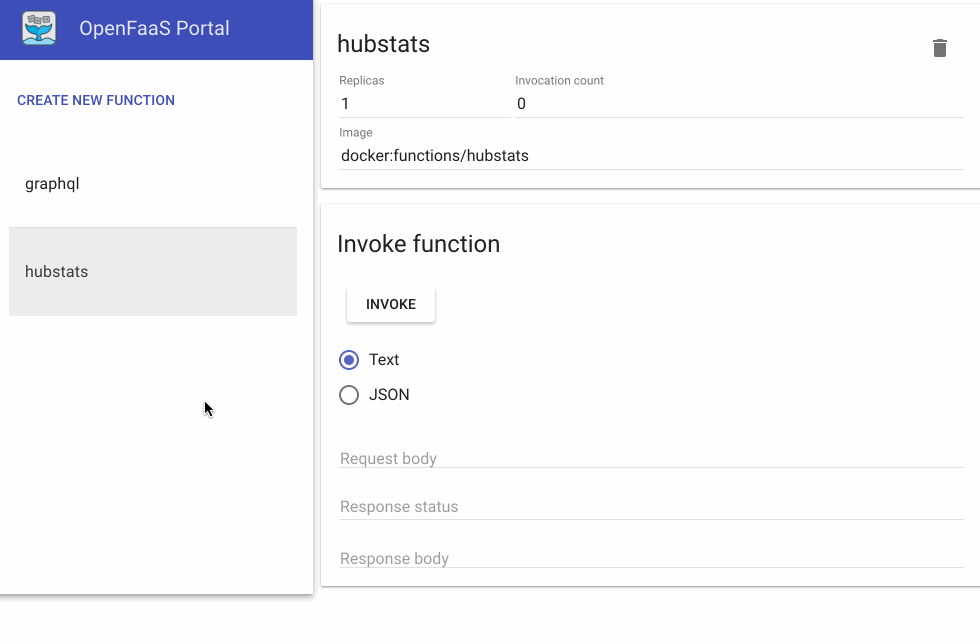
Merged. Thank you to everyone on the thread for your contribution and to @kenfdev for the PR.
alexellis
on 17 Sep 2017
Related issues
 edouardkleinhans
·
8Comments
edouardkleinhans
·
8Comments
 hotjunfeng
·
5Comments
hotjunfeng
·
5Comments
 ndarilek
·
4Comments
alexellis
·
5Comments
ndarilek
·
4Comments
alexellis
·
5Comments
 derailed
·
6Comments
derailed
·
6Comments
Most helpful comment
Can we move forward with the last suggestion - but with a caveat: