There is a lot to absorb here, please ask questions where things are unclear.
I have taken a best guess at things that felt like possible departures from current EUI and outlined what might be separate pieces under the hood.
Desired outcome
A template, pattern, and/or coded prototype demonstrating the flyout* in action
_*I'm admittedly making a bit of an assumption on this being the MVP but, regardless, it feels like the best first thing to work toward._
General themes
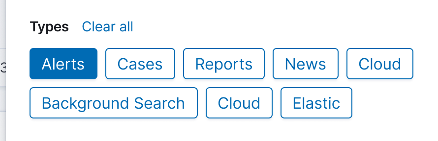
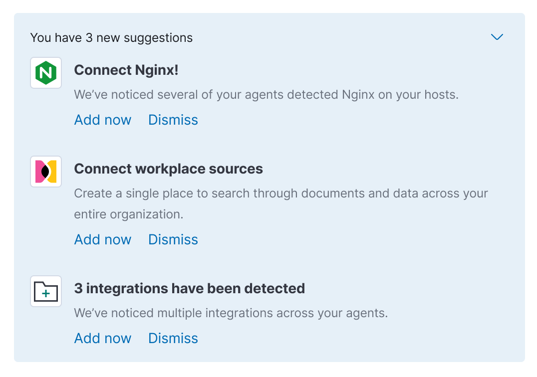
- Many notification types, but one stream
- Filtering is used to manage the stream
- Promoted content is positioned up top (e.g. Getting Started 'suggestions')
- Notifications support actions
- Dedicated view for greater control
- Assumed that current "What's new?" feed will be inertwined, but there may be technical reason for not doing that initially (i.e. perhaps these are separate header buttons/flyouts)
Roadmap
- 7.11 Visual designs
- 7.11 EUI templates/component work (this issue)
- 7.12 Kibana development (likely _only_ the flyout to start; TBD)
- TBD Dedicated notifications center view/page
Figma designs
Big picture of the flyout
Potential EUI changes for the 7.11 work (i.e. flyout)
Flyout header & filters
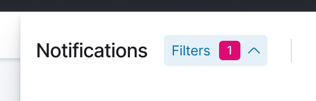
- See the filters button in the header, in particular how it expands down; not sure the flexibility of EuiHeaderFlyout here
With filters open; see the button list; they strike me as potential toggle buttons (need a checkmark?); alternatively, should these be badges?
Note the presence of the table header with the new (yet to available in EUI) batch controls
Lastly, is the filter badge in the shaded button do-able?
Flyout body
Two main content pieces here...
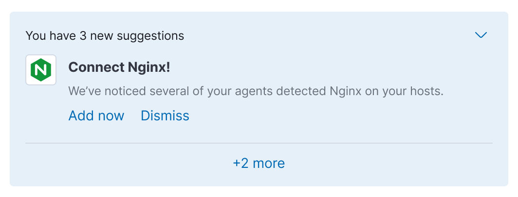
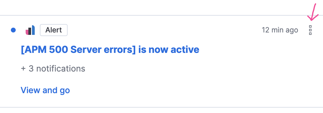
- Promoted notification (aka 'suggestion), pretty straightforward
- The intent is to show only one at any given time with the option to expand and see more/all
- Probably should assume the logo can be optional
- Likely to be a max of two primary/visible actions (e.g. Add now, Dismiss)
- Secondary actions at upper right
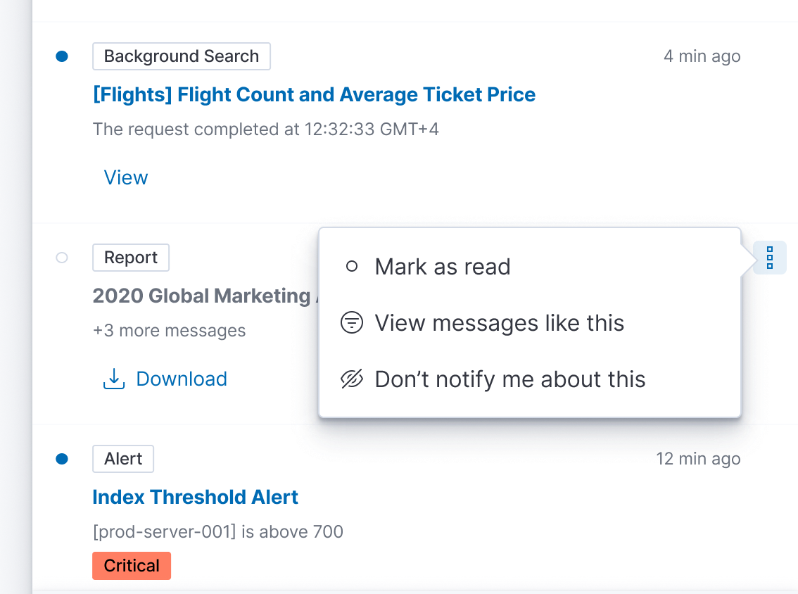
- Standard notification, also pretty straightforward
- Optional primary action below text
- Optional overflow actions in upper right
- Similar layout to EuiHeaderAlert
Flyout footer
Nothing strikes me as being atypical here
cc:/ @mdefazio @alexfrancoeur
 ryankeairns
All 22 comments
Thanks for putting this together. A few additional notes:
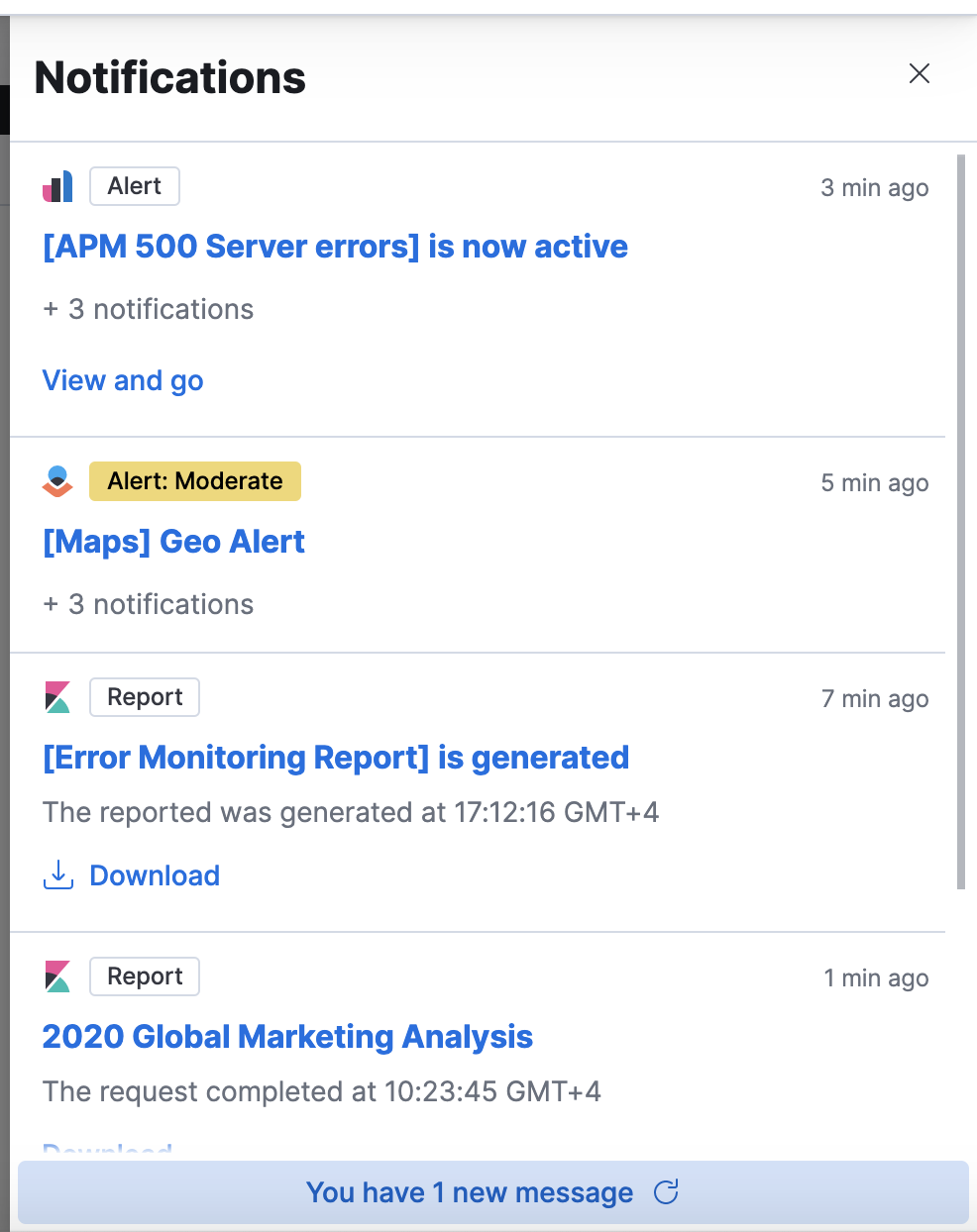
Promoted messages: Note that the overflow icon is for the group, not the individual message (see screenshot). Also, I realize there are two different icons for the overflow menu—so perhaps these use the typical boxesVertical icon in both places.
Standard messages:
- There a few variations included in here (No action, action button, action + icon, status badge), but it might not be necessary for the first round.
- I will work out in more detail what a grouped/threaded notification looks like. Again, might be something to tackle on the 2nd round.
- Clicking on title or body of message goes to detail view in the solution. For the variation with the Report, the action button would do what it says on the tin, but clicking the title/body would take you to the Reporting view in Management (open to hear thoughts on this though)
- Clicking the message type badge would apply the filter to the notification window. Also open to hear thoughts on this one. Perhaps this action can only be done via the overflow menu.
- The small summary text below the message title should be truncated and stay on one line IMO to avoid these becoming too tall. It's tough to know if the title will also be long. We will need to consider the difference between message title and description and set guidelines for the Solutions when implementing. (Message title should be the title of the alert/report/page whereas the description is a status message). The summary text changes to the thread count when there are more messages with the same title.
Activity Stream
- Still waiting on feedback regarding how the stream gets cleared out (or if it does) when things are read. I originally saw this as very much a 'in the moment' view with the Notification Center maintaining the seen/unseen messages. But if that is included in later iterations, then messages have no where else to go when 'read'. Does present the question of what happens when I have a 1000 though.
 mdefazio
on 12 Nov 2020
mdefazio
on 12 Nov 2020
One interesting piece of feedback was whether this should live in a popover as opposed to a flyout so it does not hide flyouts that are currently open. I will show this in design first but would be good to hear thoughts on potential pitfalls (or benefits) of this approach
mdefazio
on 12 Nov 2020
Its been brought up but not exactly solved, but we still need to figure what precisely we want to do with the news feed. As it stands, it is a singular RSS feed which would be challenging to interleave with the other content. The two top-level things that come to mind are adding tabs within the flyout or a maintaining separate header buttons for the time being.
@mdefazio thoughts?
ryankeairns
on 17 Nov 2020
It's easy enough to close the flyouts when another is clicked (Passing context down from chrome). I'd keep it as a flyout if for no other reason then it makes scrolling really easy on the user and we're assuming a lot of content here.
Its been brought up but not exactly solved, but we still need to figure what precisely we want to do with the news feed.
I'd suggest merging them in and not keeping them separate. Again, think of your phones / OS. There's a lot of content there for sure, but it's up to the user to filter and parse that content as they see fit. Separate feeds and icons will just muddy the call to action. If there's something super duper important in the news feed we're worried about losing in the stream, utilize that "pinned" concept for the feed items we feel need it.
 snide
on 17 Nov 2020
snide
on 17 Nov 2020
I will show this in design first
Having the design would be very helpful 👍.
If the content lives inside a popover we would have to show less content because we should avoid making a popover too big.
So we should think what's the goal here. As @snide mentioned, If we're assuming a lot of content, we should go for a flyout.
But, on the other hand, going for a popover would also have benefits. Having a smaller space would help us to focus on what is really required to show. For example, the news feed inside a popover IMO would be too much.
 miukimiu
on 17 Nov 2020
miukimiu
on 17 Nov 2020
I'm good with sticking with the flyout. Based on other feedback around keeping unseen messages in the flyout, I think the content with grow quickly. And we're keeping with some established patterns.
In regards to the news feed, I tend to lean towards keeping in a single stream as Dave mentioned. As discussed, we show news in other places and so if it gets 'lost' in this feed, maybe that's ok. It also keeps this first iteration as simple as possible (at least from a UI perspective). If we think the news feed needs more prominence, is it overly painful to keep the separate header icon? Users already know to find news there.
mdefazio
on 17 Nov 2020
If we think the news feed needs more prominence, is it overly painful to keep the separate header icon? Users already know to find news there.
I'm pro combining all of these feeds but in case others still need to be convinced, this is the painful future of having too many places to notify people of a notification: This is GitHub's UI today for notifications...
 myasonik
on 17 Nov 2020
myasonik
on 17 Nov 2020
I'm on board with doing what we can to combine them and, admittedly, I'm jumping to the conclusion that there will be technical hurdles that take us a different route.
Let' stick to the single stream, single button, and revisit once we get into the Kibana dev side (if need be).
ryankeairns
on 17 Nov 2020
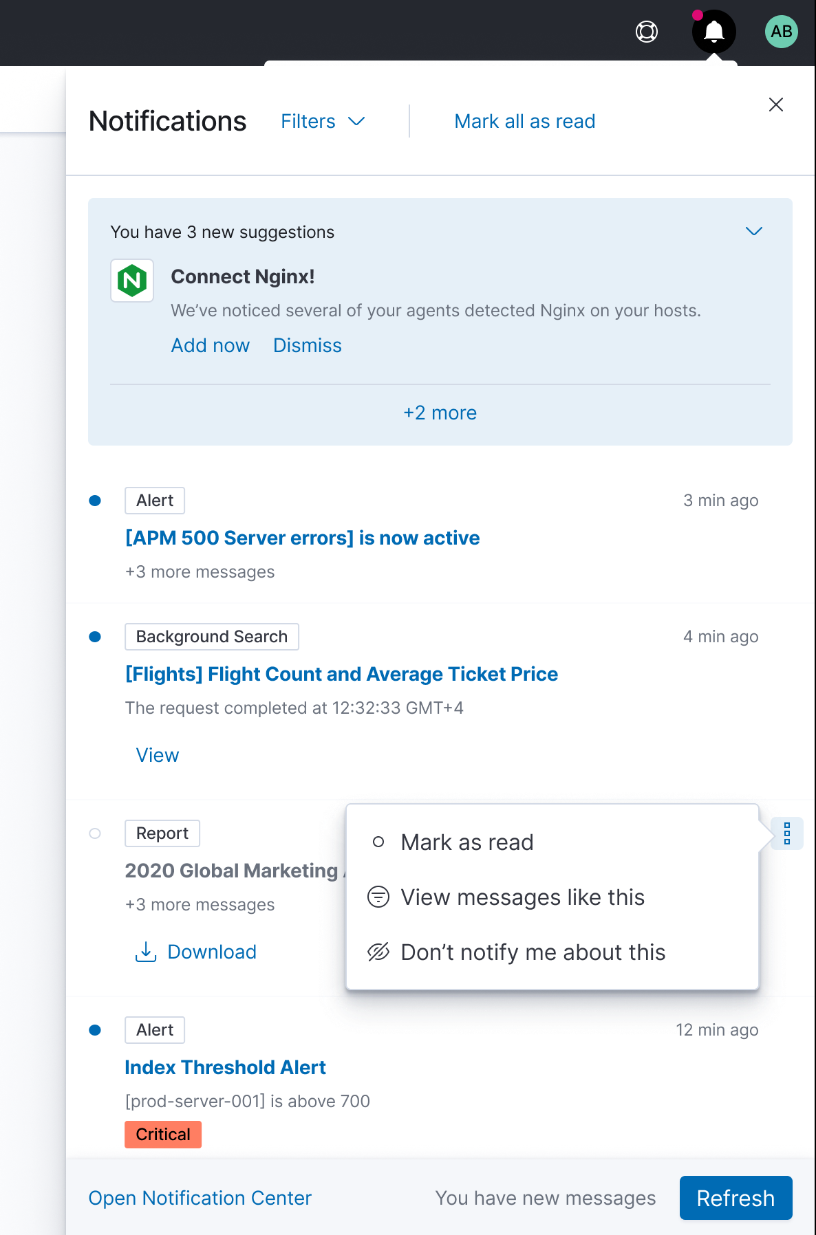
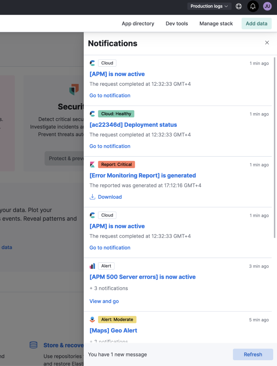
@mdefazio, @ryankeairns, and @cchaos I starting to add the notification template into EUI. From a design perspective, I need to know if is there something that we need to change. I took some design decisions that are not part of the Figma file and I'm listing those decisions here so we can all discuss them.
1. Secondary actions always visible
While implementing the secondary action, I decided to make it always visible.
I think is better for a11y and I also think that is weird to have a white space when the actions are not visible.
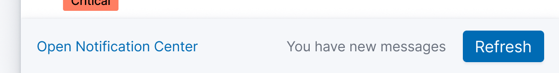
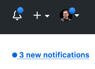
2. New notifications and refresh
On the mockups, if the flyout is open and we receive a new notification we would see a message in the flyout footer, and then we could click refresh:
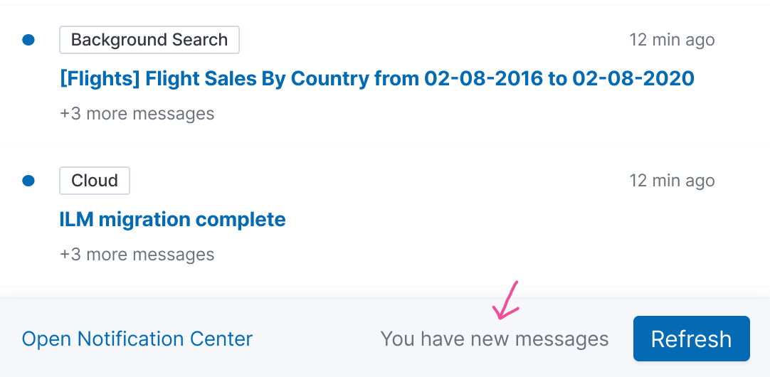
This design makes the Open Notification Center a secondary action and Refresh a primary. But we only want to refresh if we receive new notifications. So having there always the refresh button is not probably the best pattern.
Also, after playing around with the coded prototype and when receiving a new notification the message in between Open Notification Center and the Refresh button is almost unperceivable.
So I thought to try the following solution. A popover in the header:
https://user-images.githubusercontent.com/2750668/103670587-aac70300-4f71-11eb-8a47-702c1929da80.mov
Let me know what are your thoughts.
3. Badges as Health Status
Instead of having a badge just saying critical
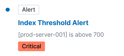
We can use the alert type badge with the health status (and maybe we also need to write the status):
Also, feel free to add more comments here on things you think we should change.
Links
miukimiu
on 5 Jan 2021
@miukimiu , this is looking awesome and I think you have been able to dive in further than I have at this point, so I really appreciate you taking a harder look at some of these items. Here's some additional thoughts on your comments:
Secondary actions always visible: I struggled with this while designing and am good keeping it visible. I remember we were concerned initially with the overall visual noise in the list, but I think the design overall has changed enough since then that we can keep the overflow action visible and see how things progress from there.
New notifications and refresh: I like your suggestion of switching the priority of the actions, where the notification center becomes the primary. Maybe just having the link be "You have new messages/2 new messages" (similar to github) might be enough to have as the secondary. This way we could avoid having popovers overtop the flyout—this felt a bit odd that I was viewing my notifications, but I receive a separate popover to let me know I have more—I think it would be nice to be able to keep it all in the flyout somehow. That said, I can see how the critical notification might be lost in this.
Badges as Health Status: I can see the issue of having 2 badges and the confusion that causes. I don't think we can assume that the color will be enough to indicate the health status though (as I believe you mentioned as well). Perhaps we can simply tweak how we display statuses instead of trying to combine them. We use
EuiHealthin places and so maybe that's a better route to go here than using badges for heath. Could also just be a separate text treatment inline with the summary. My original hope was that you could click on 'Alert' and filter down messages for that type. So my hope is that we can maintain that consistency with other notification messages. But if we feel like the filter menu does enough to accomplish this, maybe we simply find another way to display the message type altogether.
Again, its amazing the amount of work completed on this so far and thank you for focusing in on these details.
mdefazio
on 6 Jan 2021
Just a quick interjection here about the badges, since I've also been the one pushing for combining status and type into a single badge. I agree that we can't rely on color alone to signify status, but also remember that EuiBadge accepts icons. We could consider deciding on an icon set to signify status in the badges along with color. Or honestly, combining the words into a single badge: Critical Alert.
 cchaos
on 6 Jan 2021
cchaos
on 6 Jan 2021
@miukimiu you really did a great job here. As Michael said, you've exercised deeper thoughts here than likely anybody else and the reasoning for your decisions is sound. It feels to me that we've arrived at a stage where further edits should largely be fleshed out once engineering begins. At that time, we can also consider any necessary adjustments for the MVP and impact from the in-flight technical design.
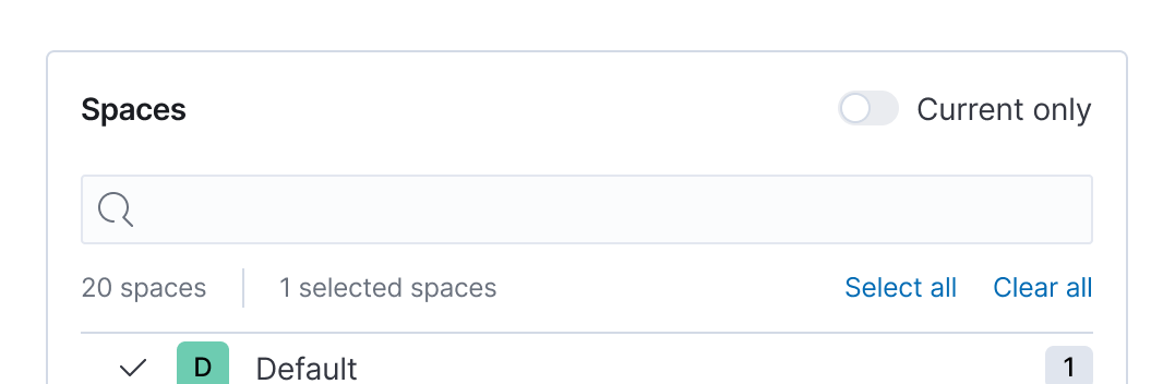
One section I did not see mentioned above was the departure for the Filters UI, but what you've built seems smart in terms of using existing components and keeping it simple for the first version. In other words, I don't see us accommodating multiple Spaces and Deployments to start so what you have seems sufficient.
As I alluded to above, I'd imagine the conversation will soon move to adapting this design for the MVP. I presume this component/pattern is flexible and can see us doing things like leaving out the 'read/unread' capabilities, the overflow menu on the individual notifications, suggestions (or actions on suggestions), etc. These are all loose assumptions on my part, but things for us to be prepared for as we enter the MVP implemenetation phase.
Again, great work. Thank you putting together a really solid prototype that will surely help speed conversations and progress.
We could consider deciding on an icon set to signify status in the badges along with color. Or honestly, combining the words into a single badge: Critical Alert.
I'm good with using an icon, but I personally prefer the clarity of an extra word here given the space exists to do so.
ryankeairns
on 6 Jan 2021
Thanks! 🎉
Yes, a few component props are not required. The things that @ryankeairns and @mdefazio told me they were not sure about it for the MVP I made them optional:
- Read states
- Overflow menu
- Top filters / Marl all as read
And even other props can be left blank. The design accommodates according to the props passed.
I can update the prototype by combining the words into a single badge: Critical Alert.
And I can also create a version without read states, overflow menu, and top filters.
Maybe just having the link be "You have new messages/2 new messages" (similar to github) might be enough to have as the secondary
@mdefazio, I'll try your suggestion.
miukimiu
on 7 Jan 2021
Hey team, I've been following along this issue and it's absolutely amazing to see the progress here. I'm working with @restrry on the functional requirements for the notification center and he raised a good question. How are we treating "warning" and "severe" in the fly out and eventual dedicated notification center.
If we take a step back, criticality is primarily an alerting feature. Most other sources will not have a grouping or state associated with the notification. In the current prototype, and I think this has been discussed already, it's not obvious that the color itself relates to the severity of an alert. Given that, my inclination was to simply append as text. From @miukimiu's latest comment I can update the prototype by combining the words into a single badge: Critical Alert., it seems as if we're aiming to add another badge. Could you confirm?
I think another badge makes sense, but wanted to raise a few questions around UX. We have recently kicked off an effort (that @mdefazio is co-leading) which will provide us with a consolidated alert list. This UI allows end users to slice and dice active and historic alerts, including filtering on severity. Knowing this feature is incoming, here are my questions.
- From an end user experience perspective, are we OK with "inconsistent" notification experiences in the feed. Outside of this additional badge, every other notification follows the same format. Type badge, title, description, action.
- If we are, should we have additional filters on secondary badges / filters? Or is that too odd of an experience?
The way we're heading, it feels like we're OK with the UX for providing an end user with severity badges where applicable, but we don't necessarily need to offer filtering on them, because we'll have a dedicated UI for that soon. Does that sound right?
 alexfrancoeur
on 13 Jan 2021
alexfrancoeur
on 13 Jan 2021
I feel like we are still following the same format even with the alert notifications: Type (+sub type), Title, Description, Action. Adding the severity to the badge is just one possible approach. Perhaps pivots might be to show the badge instead as Alert: Critical and include this 'type' in the notification filter dropdown (though I'm not sure the extra filter option is even necessary). The other option is to include 'Critical' in the description text and show it in some other way than a badge.
I think it's important to try and condense the amount of UI elements in this notification view, so I think we're heading in a good direction with 'Critical Alert' or 'Alert: Critical' in the type badge until we know more about how this view will be used.
(Side note: The alert conditions will vary across alert types, so we will have to make sure it works for severity, but also non-severity related conditions.)
...we're OK with the UX for providing an end user with severity badges where applicable, but we don't necessarily need to offer filtering on them, because we'll have a dedicated UI for that soon.
If I understand correctly, I think so. We want further investigation/exploration of alert severity to happen in the alert app.
This is just an initial reaction, so definitely curious to hear other thoughts around this.
mdefazio
on 13 Jan 2021
I think it's important to try and condense the amount of UI elements in this notification view, so I think we're heading in a good direction with 'Critical Alert' or 'Alert: Critical' in the type badge until we know more about how this view will be used.
It seems to be more a product decision: Do we want to filter notifications by severity level? If so, should this be in the Filter section?
Does this section exist to group promoted notifications only? Do we need grouping for other types of notifications?
Filtering is used to manage the stream
Do we preserve the filter state between page re-loads? If so, should it be stored in a URL to make a bookmark?
 mshustov
on 14 Jan 2021
mshustov
on 14 Jan 2021
This section is primarily for the onboarding 'tasks'. Though I can imagine system critical messages could be promoted in a similar way.
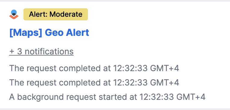
We had designs early on for a grouping similar alerts/notifications (if I get 20 instances of the same alert, I don't want that clogging my feed). So the idea here was to have+20 messages in place of the description line. Clicking on this row would then take you to a new view in the flyout, listing out all the messages for that single alert. We likely need to think through this a bit more.
Perhaps additional grouping/filtering can happen in the Notification Center view, not the flyout window.
As we get into the Unified Alerting UX work stream, maybe alert groups can send notifications, but that would still be a single notification, albeit around multiple alerts. I'm not sure I can speak to the other notification message types on whether it makes sense to group them.
Do we preserve the filter state between page re-loads? If so, should it be stored in a URL to make a bookmark?
Good question! I think it would be nice.
mdefazio
on 14 Jan 2021
As I alluded to above, I'd imagine the conversation will soon move to adapting this design for the MVP. I presume this component/pattern is flexible and can see us doing things like leaving out the 'read/unread' capabilities, the overflow menu on the individual notifications, suggestions (or actions on suggestions), etc. These are all loose assumptions on my part, but things for us to be prepared for as we enter the MVP implementation phase.
I created a new prototype with only the MVP functionalities. I wanted to make sure everything works as expected, and I was also curious to see how it would look like without so many functionalities.
For the MVP prototype:
- Added the badge following the format Alert: Critical
- Removed the suggestions
- Removed the read/unread capabilities
- Removed the overflow menus
- Removed the filters on top and "mark all as read"
Initially, we're not going to have a dedicated notifications center view/page. Consequently, we're not going to have the button "Open notification center," and the MVP's flyout footer doesn't make sense.
This way, we could avoid having popovers overtop the flyout—this felt a bit odd that I was viewing my notifications, but I receive a separate popover to let me know I have more—I think it would be nice to be able to keep it all in the flyout somehow.
@mdefazio to avoid the popover overtop the flyout and because we won't have the footer, I tried a different approach. A button below with an action to refresh. What do you think?
Could you all take a look at the new prototype? Is anything missing for the MVP?
Links
miukimiu
on 14 Jan 2021
I discussed with @mdefazio and @ryankeairns moving the Refresh button into a EuiFlyoutFooter and consequently, I updated the MVP prototype with those changes.
miukimiu
on 20 Jan 2021
Do we preserve the filter state between page re-loads? If so, should it be stored in a URL to make a bookmark?
Good question! I think it would be nice.
After thinking it over, I don't think it's necessarily. A user can open Notifications flyout on any page, so it's likely doesn't make sense to bookmark it.
Perhaps additional grouping/filtering can happen in the Notification Center view, not the flyout window.
+1 on it. The flyout element should provide a minimal set of functionality. For advanced use-cases (filter by source type, severity, group, etc. ) a dedicated page is better from the UX point of view. Thus I'd rather remove this grouping from MVP design.
+ 3 notifications is a link that redirects a user to Notification Center UI with active filter by groupId. WDYT?
Could you describe what these actions are supposed to do?
mshustov
on 21 Jan 2021
Very good points @restrry. I have to agree that open and close +1 and +3 don't seem necessary. But initially, if we won't have a Notification Center UI we can't link users. So we can just show the information like that.
I put together a document where I'm focused on the requirements for the MVP. Can you take a look? https://docs.google.com/document/d/1s7iuSvXO5Sef-F7e-rc4cENH7u_XJuNwWtS7JrrSZxY/edit?usp=sharing
Could you describe what these actions are supposed to do?
Good point. Those were on the initial designs. We removed it from the MVP because we need more details on the functionality.
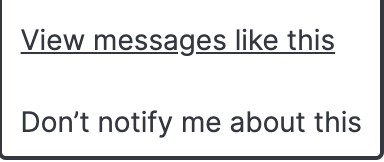
But on the first prototype, I assumed that:
- View messages like this - would filter by "type"
- Don't notify me about this - It's not present on the first prototype.
miukimiu
on 21 Jan 2021
After thinking it over, I don't think it's necessarily. A user can open Notifications flyout on any page, so it's likely doesn't make sense to bookmark it.
@restrry I agree. I think it could make sense to keep the filter state of the notification flyout between pages though. But it would be nice to get a sense of how much users are actually filtering to the degree it's a pain every time they open the flyout.
mdefazio
on 21 Jan 2021
Related issues
 j-m
·
3Comments
j-m
·
3Comments
 thompsongl
·
3Comments
thompsongl
·
3Comments
 peteharverson
·
4Comments
peteharverson
·
4Comments
 chetanmajithiya
·
4Comments
cchaos
·
3Comments
chetanmajithiya
·
4Comments
cchaos
·
3Comments
Most helpful comment
I discussed with @mdefazio and @ryankeairns moving the Refresh button into a EuiFlyoutFooter and consequently, I updated the MVP prototype with those changes.