Eui: [EuiLoadingContent] Make indicators lighter?
This type of indicator is usually used to build out skeleton screens, and in Cloud we think they'd be a lot better if they were a lighter shade of gray
 bevacqua
All 6 comments
@daveyholler Maybe something you can tackle in the Amsterdam theme?
 cchaos
on 13 May 2020
cchaos
on 13 May 2020
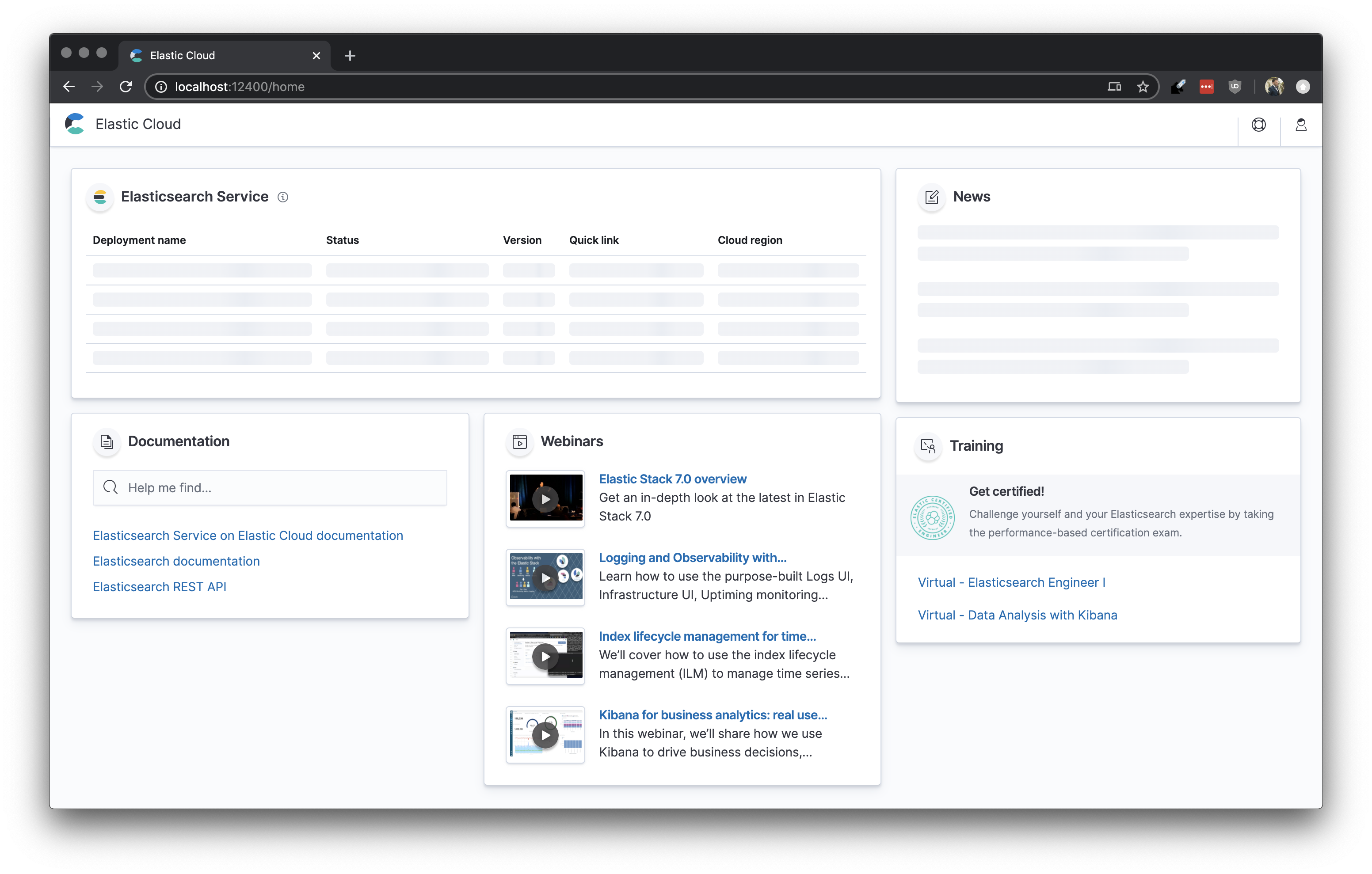
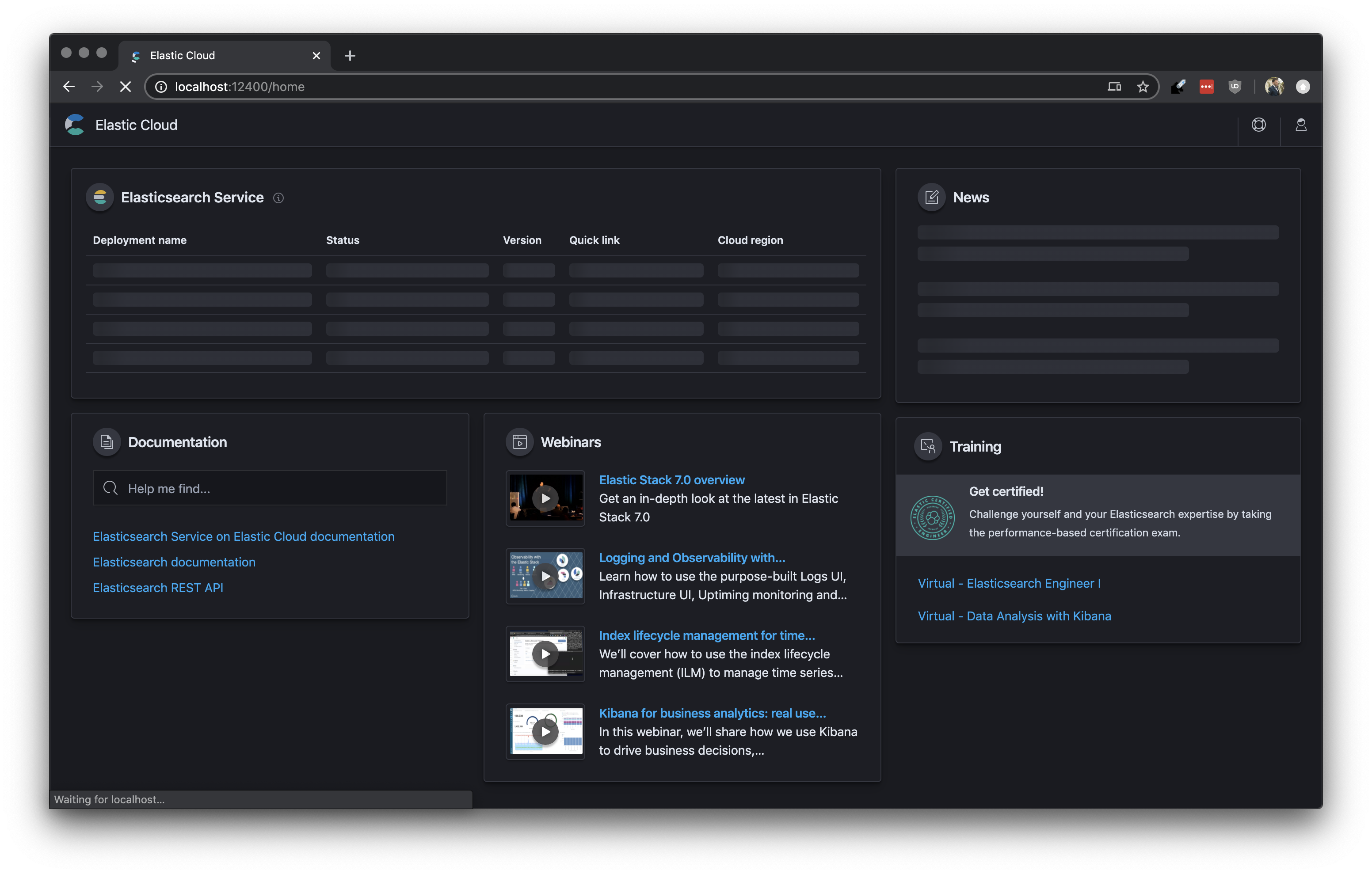
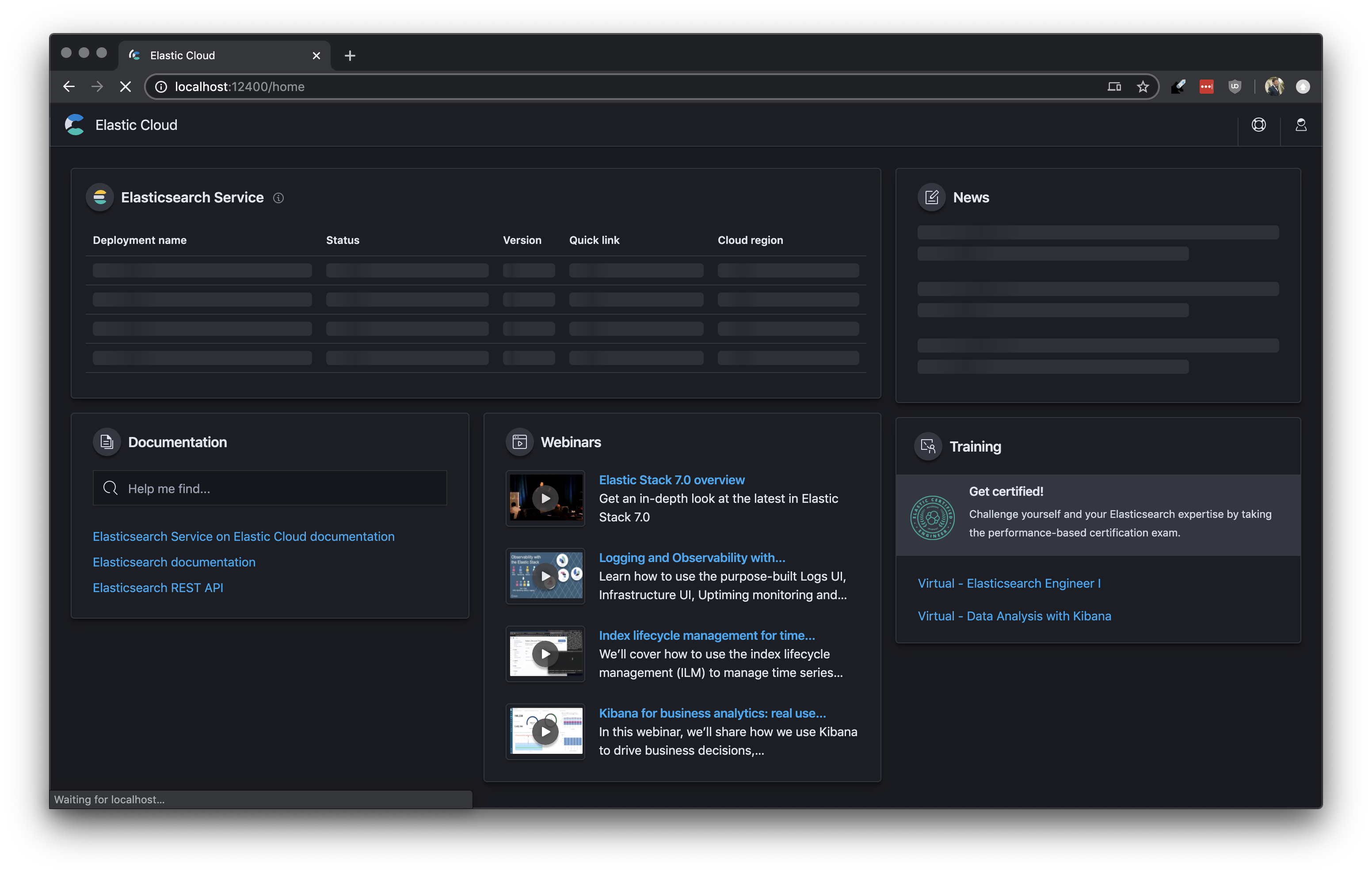
Wanted to show a comparison of what we have in mind for the loading state using the current loading/text content color and a lighter EUI shade. It definitely makes the page less overwhelming and heavy with something lighter (shade here is just an example)
Current EUI loading color

Lighter version

 kaleighflynn
on 13 May 2020
kaleighflynn
on 13 May 2020
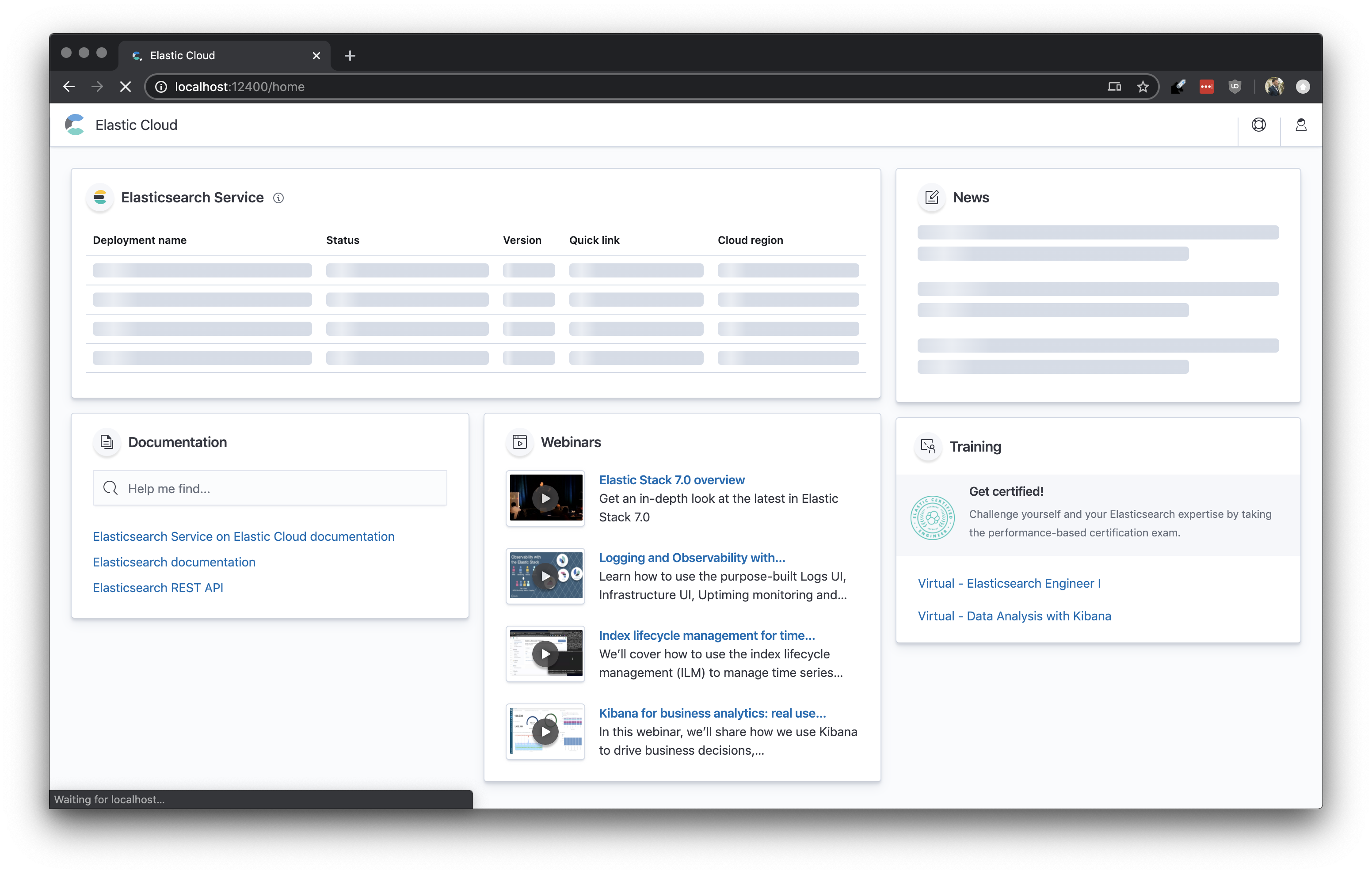
Agreed, it's pretty dark atm. Here's the actual UI side by side with a version where we hack loading styles:
| Actual | Hacked |
|-------|---------|
|  |
|  |
|
|  |
|  |
|
Custom styles:
.euiLoadingContent__singleLineBackground {
  $euiGradientStartStop: tint($euiColorLightShade, 65%);
  $euiGradientMiddle: tint($euiColorLightShade, 50%);

  background: linear-gradient(
    to right,
    $euiGradientStartStop 45%,
    $euiGradientMiddle 50%,
    $euiGradientStartStop 55%,
  );
}

// this bit is just so the dark theme styling doesn't change, because it was already fine
.euiTheme-dark .euiLoadingContent__singleLineBackground {
  @import '../styles/variables.scss';

  $euiGradientStartStop: shade($euiColorDarkestShade, 12%);
  $euiGradientMiddle: shade($euiColorDarkestShade, 24%);

  background: linear-gradient(
    to right,
    $euiGradientStartStop 45%,
    $euiGradientMiddle 50%,
    $euiGradientStartStop 55%,
  );
}
This is definitely an improvement. I’ll certainly tackle this in Amsterdam. It’s such a nice improvement though I wonder if we ought to just make this change against the current theme. Thoughts?
 daveyholler
on 14 May 2020
daveyholler
on 14 May 2020
I think it's fine to just switch this everywhere.
 snide
on 14 May 2020
snide
on 14 May 2020
👋 Hey there. This issue hasn't had any activity for 180 days. We'll automatically close it if that trend continues for another week. If you feel this issue is still valid and needs attention please let us know with a comment.
![github-actions[bot] picture](https://avatars.githubusercontent.com/in/15368?v=4&s=40) github-actions[bot]
on 20 Mar 2021
github-actions[bot]
on 20 Mar 2021
Related issues
 wylieconlon
·
3Comments
wylieconlon
·
3Comments
 peteharverson
·
3Comments
peteharverson
·
3Comments
 thompsongl
·
3Comments
thompsongl
·
3Comments
 flash1293
·
3Comments
peteharverson
·
4Comments
flash1293
·
3Comments
peteharverson
·
4Comments
Most helpful comment
I think it's fine to just switch this everywhere.