Eui: [GSoC] Playground / Toggle System for Live Documentation
A better playground / toggle system for EUI live documentation. Right now we have flat, read-only code displayed next to static examples. It would be nice if people could change the code examples in-browser on our docs site and see the changes live in the examples.
Outcome
An edit mechanism that would allow users to change, add, or otherwise modify props and content in rendered examples.
Related Discussion
- Discuss comment; Please note that the ideas mentioned are _not_ requirements but concept suggestions that would need to be thoroughly vetted.
- Discuss comment; "having the interactive playground inline in our documentation is something we'd really like to see"
_Interested in working on EUI for Google Summer of Code? See more details here: https://github.com/elastic/gsoc_
 thompsongl
All 49 comments
@anishagg17 We'll use this issue to discuss and track modifications to your proposal.
Comment in this thread and then I can assign the issue to you.
thompsongl
on 11 May 2020
@thompsongl Sorry for the late reply , I think my mention notifications are turned off.
@anishagg17 We'll use this issue to discuss and track modifications to your proposal.
Sure this would be great!
 anishagg17
on 13 May 2020
anishagg17
on 13 May 2020
@cchaos We'll use this issue to track discussion for the EUI docs project. Post anything you've been thinking about for design, etc.
I'll be updating the main summary area soon
thompsongl
on 13 May 2020
My current thoughts are that I'd like to avoid creating a new tab to each documentation section. Instead, I'm thinking that it's basically a separate page(application) with all the components listed in it's own side nav on the left and toggles/code editor on the right. Then each component in our normal docs would just have a button/link that goes to it's playground section in this new page/app. I'll probably think through the design/layout of this over the next month, but that's the basic idea.
 cchaos
on 13 May 2020
cchaos
on 13 May 2020
I'd like to avoid creating a new tab to each documentation section. Instead, I'm thinking that it's basically a separate page(application) with all the components listed in it's own side nav on the left and toggles/code editor on the right. Then each component in our normal docs would just have a button/link that goes to it's playground section in this new page/app.
@anishagg17 You can start exploring this idea. I'll do some research, as well.
Some things to consider:
- How would this concept change the scope of your original proposal?
- How would this concept change the technology choices (i.e., react-live) in your original proposal?
thompsongl
on 15 May 2020
Before coding , let's discuss several alternatives that can be used for this purpose
- react-live
- react-view
- react-cosmos-playground
- react-source-render (_DEPRECATED_)
Also ,
just have a button/link that goes to it's playground section in this new page/app
Inculcates creating a new section within the docs-site this would be the first step later we can use the library of our choice and utilise it
anishagg17
on 16 May 2020
react-live
Pros
- Same code can be used for both readOnly code and Playground
- Some modifications would be required to codeExamples.
- CodeEditor, ErrorDisplay, ComponentPreview all can be designed, customised.
Cons
- Import Statements are not supported inside the code example. _(We can pass code through a function to comment out import statements)_
- TypeScript code can't be used
anishagg17
on 16 May 2020
react-view
Pros
- Import Statements are supported.
- Supports TypeScript code.
- Provides more flexibility, adding toggles, ranges
Cons
- We would have to write out separate codeExamples for the playground, but about
40%would be copy pasted. Same code can also be used for both readOnly code and Playground but we would have to write out some complex function to remove all import statements and use them forimportprop that might require special care for some examples as in case ofEuiSideNavone import statement is multiline.
 const params = useView({
    initialCode: `() => {
      const text: string = "Hey";
      return <h2>{text}</h2>;
    }`,
   scope: {
      /* Component Name */,
    },
    imports: {
      '@elastic/eui': {
        named: ['/* Component Name*/'],
      },
    },
  });
react-view looks interesting. Have you seen any usages where the prop configuration is less manual? Like, is it possible to consume prop types from PropTypes or TypeScript output?
thompsongl
on 18 May 2020
Like, is it possible to consume prop types from PropTypes or TypeScript output?
Yes, that might be made possible with some modifications, checks.
@cchaos Can you add more clarity to the app do we need separate playground for Buttons can also be links and Button with icon or a single playground for Button would work?
anishagg17
on 18 May 2020
No there would be a single playground for each component, not docs example. So a single playground for EuiButton with toggles based on all the possible props.
cchaos
on 20 May 2020
@thompsongl these are the props definition rendered by doc-gen _(only some props are mentioned for simplicity)_
const docsProps = {
  color: {
    defaultValue: {
      computed: false,
      value: "primary",
    },
    description: "`text` color is set for deprecation",
    required: false,
    type: {
      name: "enum",
      value: [
        { value: "ghost", computed: false },
        { value: "text", computed: false },
      ],
    },
  },
  fullWidth: {
    description: "",
    required: false,
    type: { name: "bool" },
  },
};
And these are the prop definition required by the react-view component.
const modifiedProps = {
  children: {
    value: "Hello",
    type: PropTypes.ReactNode,
    description: "Visible label.",
  },
  color: {
    defaultValue: "primary",
    description: "`text` color is set for deprecation",
    required: false,
    options: { ghost: "ghost", text: "text" },
    type: PropTypes.Enum,
  },
  fullWidth: {
    description: "",
    value: false,
    type: PropTypes.Boolean,
  },
};
The similarities look promising.
Even if react-view isn't the answer, I would imagine that the output from the TypeScript props parsing project will be helpful. @ashikmeerankutty what kind of props output are you expecting from your project?
//cc @chandlerprall
thompsongl
on 21 May 2020
{
  "description": "",
  "displayName": "EuiToast",
  "methods": [],
  "props": {
    "title": {
      "defaultValue": null,
      "description": "",
      "name": "title",
      "parent": {
        "fileName": "react-docgen-typescript/src/components/toast/toast.tsx",
        "name": "EuiToastProps"
      },
      "required": false,
      "type": {
        "name": "ReactNode"
      }
    },
    "iconType": {
      "defaultValue": null,
      "description": "",
      "name": "iconType",
      "parent": {
        "fileName": "react-docgen-typescript/src/components/toast/toast.tsx",
        "name": "EuiToastProps"
      },
      "required": false,
      "type": {
        "name": "string | ReactElement<any, string | ((props: any) => ReactElement<any, string | ... | (new (props: any) => Component<any, any, any>)> | null) | (new (props: any) => Component<any, any, any>)> | undefined"
      }
    },
    "onClose": {
      "defaultValue": null,
      "description": "",
      "name": "onClose",
      "parent": {
        "fileName": "react-docgen-typescript/src/components/toast/toast.tsx",
        "name": "EuiToastProps"
      },
      "required": false,
      "type": {
        "name": "(() => void) | undefined"
      }
    },
    "color": {
      "defaultValue": null,
      "description": "",
      "name": "color",
      "parent": {
        "fileName": "react-docgen-typescript/src/components/toast/toast.tsx",
        "name": "EuiToastProps"
      },
      "required": true,
      "type": {
        "name": "enum",
        "raw": "ToastColor",
        "value": [
          {
            "value": "\"primary\""
          },
          {
            "value": "\"success\""
          },
          {
            "value": "\"warning\""
          },
          {
            "value": "\"danger\""
          }
        ]
      }
    },
    "className": {
      "defaultValue": null,
      "description": "",
      "name": "className",
      "parent": {
        "fileName": "react-docgen-typescript/src/components/common.ts",
        "name": "CommonProps"
      },
      "required": false,
      "type": {
        "name": "string | undefined"
      }
    },
    "aria-label": {
      "defaultValue": null,
      "description": "",
      "name": "aria-label",
      "parent": {
        "fileName": "react-docgen-typescript/src/components/common.ts",
        "name": "CommonProps"
      },
      "required": false,
      "type": {
        "name": "string | undefined"
      }
    },
    "data-test-subj": {
      "defaultValue": null,
      "description": "",
      "name": "data-test-subj",
      "parent": {
        "fileName": "react-docgen-typescript/src/components/common.ts",
        "name": "CommonProps"
      },
      "required": false,
      "type": {
        "name": "string | undefined"
      }
    }
  },
  "hasHtml": true
}
@thompsongl This will be the output from the parser. It seems like it is similar to what required by react-view
 ashikmeerankutty
on 21 May 2020
ashikmeerankutty
on 21 May 2020
That's great; thank you.
@anishagg17 what about using EUI components inside react-view? I think we would want to be able to use EuiCheckbox, EuiFieldText, etc. instead of the default form fields.
thompsongl
on 21 May 2020
I have made a sample playground for EuiButton
those editor props can consumed by Eui-components also it provides a setter function as a prop to update the value of prop, so it was quiet easy setting up the playground.
anishagg17
on 21 May 2020
Can we have the roadmap for the first month?
anishagg17
on 26 May 2020
This is awesome, @anishagg17
Nice job setting up that now.sh environment, also.
@cchaos What do you think about this concept?
thompsongl
on 26 May 2020
This is definitely very similar to the UI explorations I'm currently working on. The only concern I have is looking at the code, it seems very manual to create the "toggle" parts. I was hoping we could utilize more of the __docgenInfo or something similar to automatically pull in the props and it's supported values from the component itself.
cchaos
on 26 May 2020
it seems very manual to create the "toggle" parts
I don't think we would create many toggles as the working would proceed with initialCode prop , code for which would be extracted from any example demo thus toggles won't be utillized , and would make work much less manual.
EuiButton, EuiLink, EuiIcon, etc are some components for which live coding doesn't make much sense so ,I think toggles should be provided for them only, instead of initialCode as shown in the demo.
anishagg17
on 26 May 2020
components for which live coding doesn't make much sense so ,I think toggles should be provided for them only
We do need some distinction between what props to make toggles and which to leave to the editor, but I think most components would have some toggles. For instance, anywhere color or size is part of the API we'd want to show the available options as toggle/select elements. It's less about the complexity of the component and more about its API.
To make creating the toggle UI less manual, we could possibly recreate the knob/knobs component with the EUI form components.
thompsongl
on 26 May 2020
I noticed that sometimes size props use radio buttons, and sometimes use select elements.
creating too many radio buttons would occupy more space and that's why when the number of Options are more that 5 knobs is designed to render EuiSelect insted of radioGroup.
text input (for size) in Beacon should use a number input.
I too think that would be much better 👍
Also, currently there are no Labels
anishagg17
on 2 Jun 2020
Current Utilisation
'ref' -> <a/> tag
'string' , 'date' , 'number' -> EuiFieldText
'bool' -> EuiCheckbox
'enum' -> numberOfOptions < 6 ? EuiRadioGroup : EuiSelect
'node' , 'array' , 'func' , 'object' -> EuiTextArea
'union' -> we have to define custom component
anishagg17
on 2 Jun 2020
there are some issues with the union prop such as
EuiImage has size prop which can accept enum, number, or string as acceptable value but it's type can be only either PropTypes.String or PropTypes.Number,
, works fine for strings and enum but not for numbers.
anishagg17
on 3 Jun 2020
EuiImage has size prop which can accept enum, number, or string
We'll need to take these on a case-by-base basis. For this one, I think the enum is the most important one to have available.
Otherwise, I think the current list looks good. Perhaps enum should use a select for anything more than 2-3, but I'll let others weight in here.
thompsongl
on 3 Jun 2020
@cchaos and @miukimiu have been working on designs and layouts for this project. They plan to have something to look at maybe later this week.
In the meantime, we can continue to hone in on the toggle forms. Labels, especially, will be important regardless.
thompsongl
on 3 Jun 2020
There are multiple components which have sub components _ex: EuiSideNav & EuiSideNavItem , EuiTreeView & EuiTreeViewNode_
for which toggles are applicable only for the root component. So , we also need to decide how to handle such components.
anishagg17
on 3 Jun 2020
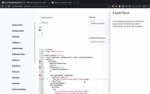
There are some limitations in implementing playground for EuiFlyout as it's open/close state is controlled externally . Should this example be turned into live-code only example ?
Also, while editing the code, EuiFlyout traps the focus and hence removes the focus from the editor.
anishagg17
on 10 Jun 2020
Thanks for highlighting this, @anishagg17. Are there any potential options you see to solve the external control problem while keeping toggles?
@cchaos and @miukimiu here's another category of component to consider for your design work. In terms of its low prop complexity, EuiFlyout makes sense for toggles. But as a more full-page UI element it's unique. The focus trap problem, specifically, is a tricky one.
thompsongl
on 11 Jun 2020
There are multiple components which have sub components _ex: EuiSideNav & EuiSideNavItem , EuiTreeView & EuiTreeViewNode_
for which toggles are applicable only for the root component. So , we also need to decide how to handle such components.
Sorry I missed this comment 😞
I believe the designers have ideas for how to handle composed components like this.
thompsongl
on 11 Jun 2020
here's another category of component to consider for your design work
BottomBar and Progress take the entire screen width they too should be considered
ToolTip requires some space at all 4 sides to render correctly.
anishagg17
on 11 Jun 2020
@thompsongl I have successfully setup playground for EuiButton should I create a pr for review .?
anishagg17
on 1 Jul 2020
Great! Yes, open a draft PR and we can use that for more focused discussion.
thompsongl
on 1 Jul 2020
Let's start a list of components that will get a Playground tab.
EuiButton is the obvious one. Some already marked complete in #3529 make sense.
What other simple components make sense?
thompsongl
on 2 Jul 2020
OKay then I would post a list of components here only
anishagg17
on 2 Jul 2020
Layout
- [x] Accordion ( has a function
onToggle, ComponentsextraActionandbuttonContent)
~Bottom Bar~ https://github.com/elastic/eui/pull/3870#issuecomment-669988003 - [x] EuiFlexGroup ( has child components if we set some default for all of them then this example makes sense )
- [x] EuiFlexGrid
- [x] Horizontal Rule ✅
- [x] Panel ( has betaBadgeTooltipContent as reactNode)
- [x] Spacer ✅
Navigation
- [x] Button ✅
- [x] Facet ( has a function
onClick) - [x] Key Pad Menu (
EuiKeyPadMenuItemseems simple it too has a functiononClick) - [x] Link ( has a function
onClick) - [x] Pagination ( has a function
onPageClick) - [x] Steps (
EuiStepseems simple) - [x] Tabs (
EuiTabseems simple it too has a functiononClick)
Display
- [x] Aspect ratio ✅
- [x] Avatar ✅
- [x] Badge ( has a function
onClick) - [x] Callout ✅
- [x] Card ( has a function
onClick) - [x] Code ✅
- [x] Comment list (
EuiCommentseems simple) - [x] EmptyPrompt ✅
- [x] Health ✅
- [x] Icons ✅
- [x] Image ✅
- [x] Loading ✅
- [x] Progress ✅
- [x] Stat ✅
- [x] Text ✅
- [x] Title (Mostly depends upon children , reactNode)
- [x] Toast ( has a function
onClose) - [x] ToolTip ( has a function
onMouseOut)
Forms
(_for most of the forms we would have to set some default onChange and value so that they can be made simple_)
- [x] EuiFieldText
- [x] EuiFieldSearch
- [x] EuiFieldNumber
- [x] EuiFieldPassword
- [x] EuiTextArea
- [x] EuiCheckbox
- [x] EuiRadio
- [x] EuiSwitch
- [x] EuiColorPicker
- [x] EuiCodeEditor
- [x] EuiExpression ✅
- [x] EuiRange (has an array
levels) - [x] EuiDualRange (has an array
levels)
Utilities
- [x] EuiBeacon ✅
- [x] EuiHighlight ✅
- [x] EuiMark ✅
~- [ ] EuiPortal (don't have any idea as it doesn't has any meaningful props)~ https://github.com/elastic/eui/issues/3057#issuecomment-673098366 - [x] EuiToggle ( has a function
onToggle)
#
I have added almost all the components which are already simple or could be made simple via some modifications in the config file.
anishagg17
on 2 Jul 2020
@thompsongl I have completed the list If you find any component missing you may add it.
anishagg17
on 6 Jul 2020
(for most of the forms we would have to set some default onChange and value so that they can be made simple)
We have a kind of toggle system in place already for form controls, so they are lower on the priority list. We eventually move them over the playground, but we can wait.
thompsongl
on 7 Jul 2020
Let's start working on the Display components. Probably a single PR per component.
I think Badge, Card, and Toast can be added, also, as long as we fake the necessary onClick/onClose functions.
thompsongl
on 9 Jul 2020
@thompsongl as EuiIcon doesn't render props currently . So, should we skip EuiIcon component for now and can build it later on.
anishagg17
on 30 Jul 2020
So, should we skip EuiIcon component for now and can build it later on.
Yep, sounds like a good plan
thompsongl
on 31 Jul 2020
@thompsongl I noticed that EuiEmptyPrompt has actions , title and body as some major props(_all ReactNode_) .
If body and actions are set to String, and title is faked then it works
Otherwise , it's playground shouldn't be considered.
Also, since it is the last component of Display section , do let me know which section should I work next
anishagg17
on 31 Jul 2020
If body and actions are set to String, and title is faked then it works
Let's try this for EuiEmptyPrompt
let me know which section should I work next
Start with Layout components, then Utilities
thompsongl
on 10 Aug 2020
@cchaos does EuiPortal(Utilities) requires a playground?
anishagg17
on 12 Aug 2020
does EuiPortal(Utilities) requires a playground?
No, we can skip that one
thompsongl
on 12 Aug 2020
@thompsongl #3959 marks the completion of all playgrounds 🎉 . Anything more that I need to do?
anishagg17
on 25 Aug 2020
@anishagg17 Thank you so much for all the work you did on this project!!! 🎉 🎉 It's amazing what's been accomplished over this past summer. The playground toggles really step up our documentation game and gives us such an easier way to test all the permutations of each component. Best of luck to you in future endeavors!
cchaos
on 25 Aug 2020
@anishagg17 Nothing more as far as EUI is concerned 😄 Just make sure you submit all your GSoC evaluations, etc. before the deadline later this week (if you haven't already).
You've done great work and should be proud of the last few months! I know all of us here were glad to have you and are thrilled with the outcome 🚀
thompsongl
on 25 Aug 2020
Closing this because @anishagg17 did _all the things_
We'll track anything related to component playground in the future in separate issues.
thompsongl
on 25 Aug 2020
Related issues
 peteharverson
·
4Comments
peteharverson
·
4Comments
 sebastienlabine
·
3Comments
sebastienlabine
·
3Comments
 miukimiu
·
3Comments
miukimiu
·
3Comments
 flash1293
·
3Comments
flash1293
·
3Comments
 stacey-gammon
·
4Comments
stacey-gammon
·
4Comments
Most helpful comment
@anishagg17 Thank you so much for all the work you did on this project!!! 🎉 🎉 It's amazing what's been accomplished over this past summer. The playground toggles really step up our documentation game and gives us such an easier way to test all the permutations of each component. Best of luck to you in future endeavors!