Eui: [Spec] Add a popover component to text and textarea fields for inserting variables
Users need an easy way to add index fields (or other possible variables) into an input text field or textArea field.
Proposal:
Add an optional icon to the right of the text and textarea input types that would open a popover.
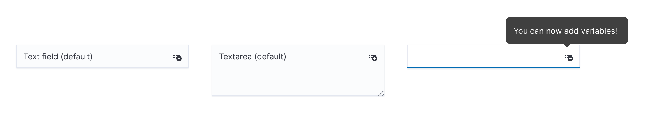
When the icon is clicked, a popover will appear (to the right or at the bottom, depending on space). This will provide a scrollable list of variables available for use.

Clicking on a variable will insert the variable at the current point of the cursor. We could style the variable differently from the rest of the input entry so it stands out more. Or we can wrap it in curly brackets. Either way, it should be clear it is dynamic entry.

To change a variable, the user can simply press the text and the popover will reopen.

To remove a variable, the user would press the cross next to the variable (in the styled version).
In the alternate version, they would simply navigate their cursor to the point of the variable and delete using the keyboard. However, we should treat the entire variable as a single key, so deleting the right curly bracket, would delete the entire variable. This is to avoid residual text from a variable that may confuse the user.

 mdefazio
All 8 comments
This has got some tricky accessibility concerns mainly around changing and removing variables... Before jumping in to far on a component like this, we should probably mess with some PoC in this area to make sure we can nail it.
The problems comes in with not being able to have anything other than text content in input/textarea. We could make it work by using div[contenteditable] but making those accessible is a concern in and of itself...
The alternate design option is would be way simpler to implement. The trickiness would be communicating when we're about to delete a whole chunk (or communicating it after the fact) and figuring out what a keyboard version of the change interaction would look like (potentially a keyboard shortcut to "activate" the current variable's change-y popover?).
 myasonik
on 14 Jan 2020
myasonik
on 14 Jan 2020
Getting ahead of myself here, I think I'd really like the ability to toggle between the two versions...
It's kind of like Slack's markdown entry vs their WYSIWYG entry. Each have their strengths and different users will prefer different experiences.
One questions: if the "alternate" version ends up getting implemented, how would we treat it if a user typed in some content in brackets? (Or, whatever syntax we use to indicate it's a variable.) What if they typed in a "variable" we don't recognize?
myasonik
on 14 Jan 2020
Certainly would be a powerful feature. Some open-ended thoughts & questions in no particular order -
Programability
- Probably should be a new stand alone component (or components) instead of adding onto the existing text & textarea fields. Injecting additional content and interaction into the fields'
valuefeels like it's over-stretching those elements' intentions. As new components we could properly focus on what makes this implementation special. - Plan for re-purposing - allow icon configuration & more generic popout/panel
User Experience
- Maintaining the cursor location in the field while interacting with the popover will be very interesting, for many reasons including keyboard accessibility and popover focus trap - but I agree it's an important feature for this.
- I lean toward the first version (treat variable as a separate visual unit, provide an
xto remove); I feel this better verifies to the user what is happening. - Potential Overlaps
- With the in-progress markdown editor? Should there be?
- EuiExpression
Implementation
- If not the alternate version, definitely will have some custom DOM to get the right support for and styling & screen readers.
- How "editory" would we want to go with this? Ideally we don't end up with a dozen different editor-like implementations in EUI /cc @snide directly on this one
 chandlerprall
on 15 Jan 2020
chandlerprall
on 15 Jan 2020
How "editory" would we want to go with this? Ideally we don't end up with a dozen different editor-like implementations in EUI /cc @snide directly on this one
I think this is the rub. Looking out two years from now I could see us focusing more and more on wysiwyg style content editables. We have two "similar" problems here in the markdown+ component and this one. Generally I'd say let's build them functionally out first, then see where they share functionality. We've been pretty disciplined about rewriting core layers when we see the need, and as long as we're thinking in a direction that these things are similar, we can probably save some hassle.
I agree this is a very powerful component and something that will see a lot of use.
 snide
on 15 Jan 2020
snide
on 15 Jan 2020
I've been loosely following along and each time I pass by, the UX similarities with EuiComboBox stand out to me. In particular, typing and inserting a badge within the input.
I'm not able to sort out whether that should be explored/leveraged further or if its better to be clearly different (i.e. adding the icon button). A textarea input with a dropdown would certainly be unexpected and break norms, so that requirement seems to break away from the combo box pattern.
Using a key (character) based trigger as opposed to the icon button might be worth exploring if the accessibility and/or cursor placement present issues. Typing something like {{ feels like a familiar UX pattern to look into in this situation.
 ryankeairns
on 21 Jan 2020
ryankeairns
on 21 Jan 2020
I've been loosely following along and each time I pass by, the UX similarities with EuiComboBox stand out to me. In particular, typing and inserting a badge within the input.
Similarly, I think this is a good place for EuiToken to represent the variables' datatype, which moves toward EuiSuperSelect's additional rendering features. However, I don't think either of those would extend well into a textarea.
There was an attempt at unifying some code between the combo box's and super select's popover, though I can't find it now. Also related: _Create a service for joining inputs with popovers_ #2104
chandlerprall
on 21 Jan 2020
I think the best way forward is to create a dev spec for this component and ask questions like:
- Does this need edit and preview views?
- How will a11y be handled?
- Does the input's height grow?
- How will consuming applications interpret or need the data to interpret the final message?
 cchaos
on 31 Jan 2020
cchaos
on 31 Jan 2020
👋 Hey there. This issue hasn't had any activity for 180 days. We'll automatically close it if that trend continues for another week. If you feel this issue is still valid and needs attention please let us know with a comment.
![github-actions[bot] picture](https://avatars.githubusercontent.com/in/15368?v=4&s=40) github-actions[bot]
on 20 Mar 2021
github-actions[bot]
on 20 Mar 2021
Related issues
 sebastienlabine
·
3Comments
sebastienlabine
·
3Comments
 j-m
·
3Comments
j-m
·
3Comments
 cedeber
·
4Comments
cedeber
·
4Comments
 igoristic
·
4Comments
igoristic
·
4Comments
 peteharverson
·
3Comments
peteharverson
·
3Comments