Espeasy: Webpages less user friendly than before
Using version mega-20180416 I see that the webpages look worse than before (comparing to 20180407).
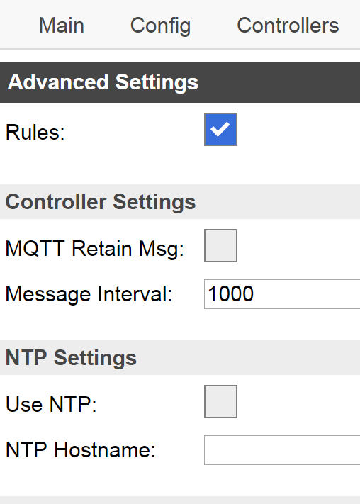
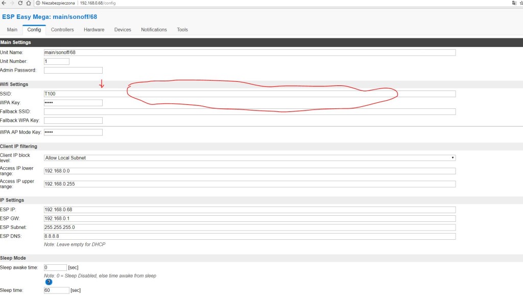
Input fields and dropdowns are very wide on screen but most annoying is that checkbox fields do not have a line drawn around them so the can hardly be seen (using Chrome at least).
 wdonker
All 9 comments
I'm the designer behind the checkboxes... And please understand that this is a work in progress and friendly suggestions are welcome. Words such as "annoying" is making me tear. You will get the your point clear with nice words and positive feedback.
The input and select are now covering 80% of the screen by default, I don't see why this should be a problem? We will do a re-write of the GUI further down the line. Thank you for your input.
 Grovkillen
on 16 Apr 2018
Grovkillen
on 16 Apr 2018
Grovkillen,
My remark was not meant as negative feedback, I appreciate all the effort being put into ESPEasy very much. The word annoying was badly chosen, sorry for that.
wdonker
on 16 Apr 2018
Great answer @wdonker :+1:
Grovkillen
on 16 Apr 2018
Borders added to checkboxes. Thanks for the suggestion! :)
The thing with wide input/select is not changed. I close this for now.
Grovkillen
on 16 Apr 2018
Grovkillen
on 16 Apr 2018
 flexiti
on 16 Apr 2018
flexiti
on 16 Apr 2018
Password fields and numerical fields are not part of CSS yet, that's why you see that.
We will control everything from CSS making code of GUI more coherent and easily maintained. I understand that many users will feel that the wideness of the inputs are off but once we got everything CSS we can start the design re-make. You will have to live with it until then.
Sum: we are CSS:ing the interface making a overhaul easier once done.
Grovkillen
on 16 Apr 2018
I agree that for full screen the boxes may be a bit smaller.
There is a switch in the CSS to act differently for screens smaller than N pixels.
It would be nice to have some static value set there to set some maximum width on the boxes for screens with width > N pixels, or perhaps use more columns.
 TD-er
on 16 Apr 2018
TD-er
on 16 Apr 2018
@TD-er yup we'll get there ;)
Grovkillen
on 16 Apr 2018
Related issues
 MarceloProjetos
·
4Comments
MarceloProjetos
·
4Comments
 s0170071
·
3Comments
Grovkillen
·
6Comments
s0170071
·
3Comments
Grovkillen
·
6Comments
 SANCLA
·
4Comments
SANCLA
·
4Comments
 hamed-ta
·
5Comments
hamed-ta
·
5Comments