Hey guys, I know this may be a bit of a side-problem, but I think the logo is a very i,portant thing for a product, so I had a bit of a remake done to our nice logo - I really like @axel-lauer new site and actually borrowed the logo and font layout from the new site but I made a couple changes:
- enhanced colours of the globe,
- added an actual (toy) satellite and put a couple lights on it;
- added monochrome patch where the satellite's field of view is blind - ie our analyses are fully coloured only when there is OBS data
- changed the writing to white and gave it a very dark grey background, much more visible -> and I think we need to get rid of that grey band on the new website as well, just leave it black with white font and menu entries
What do you think? @ESMValGroup/esmvaltool-coreteam


 valeriupredoi
All 7 comments
Nice logo, couldn't find the submarine yet, though ;-) But I think we have to discuss a possible change of logo with @veyring first before deciding anything...
Regarding the gray bar on the website, I just changed that to slightly funkier semi-transparent dark blue and modified the current logo so that text and satellite orbit are now in white. The menu font is now also white. I think not having the menu items floating in "space" is kinda nice, but that can be up for discussion.
 axel-lauer
on 23 Oct 2019
axel-lauer
on 23 Oct 2019
nice one @axel-lauer - like the blue band much better :beer: Yes, of course -- discussing the logo change with @veyring is a must -- I am just starting this thread to put forward propositions, we can have a few of them and a bunch of ideas to choose from. The submarine is in the North Atlantic but you can't see it since it's currently at 400m depth :grin:
valeriupredoi
on 23 Oct 2019
But the old logo could be self-consistently generated using a NCL script and CMIP5 + ERA-Interim data. :laughing:
 mattiarighi
on 23 Oct 2019
mattiarighi
on 23 Oct 2019
Hi,
I've been following and learning a lot from your threads, so I wanted to pay it back now with some advice about the logo. First of all I see that the font style in the logo seems to be off with the scaling, could be that it is not an font style that is done in vectorized format, that is both on the ESMValTool, and the smaller text (scale the browser window and you will get quick response).
Then I looked it up on my phone (read a lot on the train and bus to learn me more), there I saw the menu bar is disappears on smaller screen.
So just some few thougths from a destroyed frontend mind trying to learn more on climate data.
 Fridunn
on 30 Oct 2019
Fridunn
on 30 Oct 2019
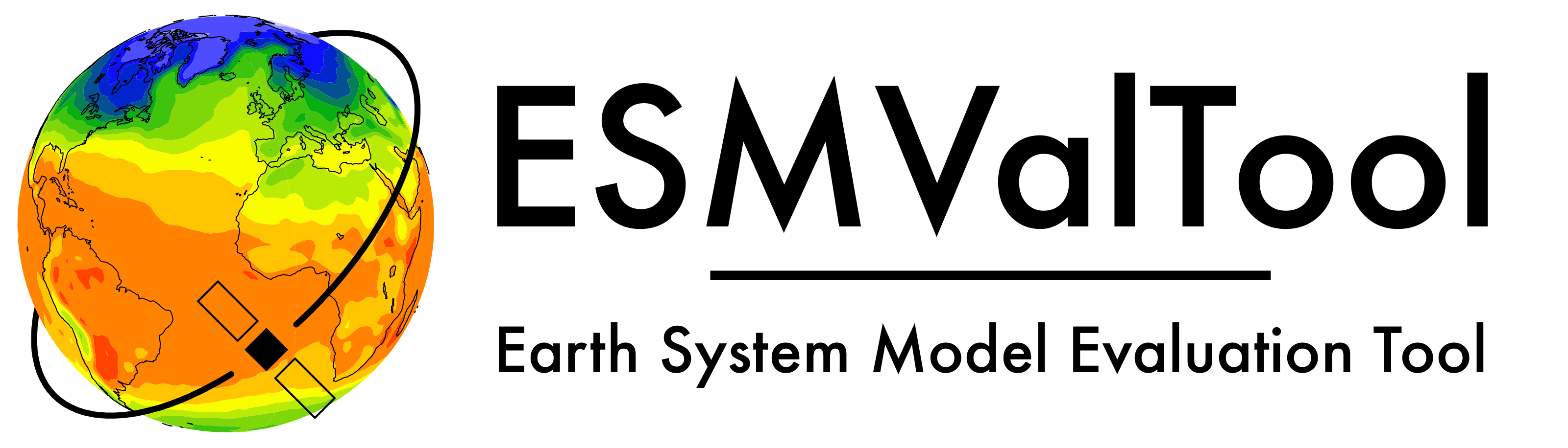
"New" logo used on current ESMValTool website:
Two of the monochrome versions:


axel-lauer
on 6 May 2021
Nice. Could you post the names of the fonts you used?
 zklaus
on 6 May 2021
zklaus
on 6 May 2021
@zklaus font used is Futura (medium).
axel-lauer
on 6 May 2021
Related issues
 jvegasbsc
·
4Comments
valeriupredoi
·
5Comments
jvegasbsc
·
4Comments
valeriupredoi
·
5Comments
 bouweandela
·
4Comments
bouweandela
·
4Comments
 jonnyhtw
·
4Comments
valeriupredoi
·
4Comments
jonnyhtw
·
4Comments
valeriupredoi
·
4Comments
Most helpful comment
"New" logo used on current ESMValTool website:

Two of the monochrome versions:

