Eslint-plugin-jsx-a11y: label-has-for: broken in v6.1.0
/Users/justfly/projects/aggrow-static/src/components/common/input-combobox.js
  265:9   error  The value for aria-controls must be a idlist      jsx-a11y/aria-proptypes
  267:9   error  The value for aria-owns must be a idlist          jsx-a11y/aria-proptypes
  297:11  error  The value for aria-activedescendant must be a id  jsx-a11y/aria-proptypes
  298:11  error  The value for aria-controls must be a idlist      jsx-a11y/aria-proptypes

/Users/justfly/projects/aggrow-static/src/components/common/input-quantity-go-to-cart.js
  29:3  error  Form label must have ALL of the following types of associated control: nesting, id  jsx-a11y/label-has-for

/Users/justfly/projects/aggrow-static/src/components/common/input-quantity-max.js
  28:3  error  Form label must have ALL of the following types of associated control: nesting, id  jsx-a11y/label-has-for

/Users/justfly/projects/aggrow-static/src/components/common/input-quantity-remove.js
  28:3  error  Form label must have ALL of the following types of associated control: nesting, id  jsx-a11y/label-has-for

/Users/justfly/projects/aggrow-static/src/components/common/input-select.js
  249:9   error  The value for aria-controls must be a idlist      jsx-a11y/aria-proptypes
  251:9   error  The value for aria-owns must be a idlist          jsx-a11y/aria-proptypes
  277:11  error  The value for aria-activedescendant must be a id  jsx-a11y/aria-proptypes
  278:11  error  The value for aria-controls must be a idlist      jsx-a11y/aria-proptypes

/Users/justfly/projects/aggrow-static/src/components/common/labeled-checkbox.js
  38:3  error  Form label must have ALL of the following types of associated control: nesting, id  jsx-a11y/label-has-for

/Users/justfly/projects/aggrow-static/src/components/common/labeled-combobox.js
  43:5  error  Form label must have ALL of the following types of associated control: nesting, id  jsx-a11y/label-has-for

/Users/justfly/projects/aggrow-static/src/components/common/labeled-select.js
  39:5  error  Form label must have ALL of the following types of associated control: nesting, id  jsx-a11y/label-has-for

/Users/justfly/projects/aggrow-static/src/components/common/labeled-textarea.js
  38:3  error  Form label must have ALL of the following types of associated control: nesting, id  jsx-a11y/label-has-for

✖ 15 problems (15 errors, 0 warnings)
Can somebody explain what does means idlist, nesting ?
label-has-for is really bothers me - I have template literals there, and it works fine in 6.0.3
looks like all of this errors are false negatives.
 JustFly1984
All 29 comments
I'm rolling back to 6.0.3, until I have better understanding.
JustFly1984
on 3 Jul 2018
The idlist ones are caused by #454.
Can you provide code examples for what's breaking on label-has-for?
 ljharb
on 4 Jul 2018
ljharb
on 4 Jul 2018
Sure:
import {
  React,
  PropTypes,
  classnames
} from '../../vendor'

import {
  checkbox,
  checkboxInput,
  description
} from '../../styles/fields.css'

import {
  df, aic, bold, normal
} from '../../styles/utility.css'

const LabeledCheckbox = ({
  id,
  value,
  checked,
  labelText,
  checkboxText,
  descriptionText,

  labelClassName,
  checkboxClassName,
  validClassName,
  invalidClassName,

  noValidate,
  valid,
  invalid,
  required,
  disabled,

  onChange
}) => (
  <label
    htmlFor={id}
    className={
      classnames(labelClassName, bold)
    }
  >
    { labelText }

    <div
      className={
        classnames(df, aic, normal, checkbox, checkboxClassName, {
          [validClassName]: valid,
          [invalidClassName]: invalid
        })
      }
    >
      <input
        id={id}
        type='checkbox'
        name={id}
        value={value}
        className={checkboxInput}
        checked={checked}
        noValidate={noValidate}
        required={required}
        disabled={disabled}
        onChange={onChange}
      />

      { checkboxText }
    </div>

    {
      descriptionText && (
        <div
          className={
            classnames(description, normal)
          }
        >
          { descriptionText }
        </div>
      )
    }

  </label>
)

LabeledCheckbox.propTypes = {
  id: PropTypes.string.isRequired,
  value: PropTypes.string,
  checked: PropTypes.bool,
  labelText: PropTypes.string,
  checkboxText: PropTypes.string.isRequired,
  descriptionText: PropTypes.string,
  labelClassName: PropTypes.string,
  checkboxClassName: PropTypes.string,
  validClassName: PropTypes.string.isRequired,
  invalidClassName: PropTypes.string.isRequired,
  noValidate: PropTypes.bool,
  invalid: PropTypes.bool.isRequired,
  valid: PropTypes.bool.isRequired,
  required: PropTypes.bool,
  disabled: PropTypes.bool,

  onChange: PropTypes.func.isRequired
}

export default LabeledCheckbox
Thanks - this seems like a bug. You're providing an input, wrapped in its label (nesting), with an htmlFor that matches the ID ({id}, and it's the same identifier), so it should be passing.
ljharb
on 4 Jul 2018
exactly =) hope you can fix it soon!
JustFly1984
on 4 Jul 2018
We should fix this ASAP, to try to get it in a 6.1.1.
ljharb
on 6 Jul 2018
@JustFly1984 use label-has-associated-control instead of label-has-for. We deprecated label-has-for in v6.1.0.
I'll look into the breakage, though. Deprecated doesn't mean broken :)
 jessebeach
on 6 Jul 2018
jessebeach
on 6 Jul 2018
I'm using only default settings. should I add label-has-for: 'off' to my
eslintrc.js ?
2018-07-06 12:59 GMT-05:00 J. Renée Beach notifications@github.com:
@JustFly1984 https://github.com/JustFly1984 use
label-has-associated-control instead of label-has-for. We deprecated
label-has-for in v6.1.0.I'll look into the breakage, though. Deprecated doesn't mean broken :)
—
You are receiving this because you were mentioned.
Reply to this email directly, view it on GitHub
https://github.com/evcohen/eslint-plugin-jsx-a11y/issues/455#issuecomment-403105932,
or mute the thread
https://github.com/notifications/unsubscribe-auth/ACJseVYc_rcN6_XAriIsQMAlcMlFTXEbks5uD6VmgaJpZM4VBoya
.
JustFly1984
on 7 Jul 2018
@JustFly1984 yes, just turn it off.
@ljharb label-has-for should be turned off in the AirBnB defaults.
jessebeach
on 9 Jul 2018
@jessebeach I'm not going to turn it off until after both rules have been on together for awhile; i'd love to see the bug fixed so we can do that,
ljharb
on 9 Jul 2018
label-has-for: 'off' doesn't work in my case. Still has a lot of false negatives warnings.
JustFly1984
on 9 Jul 2018
@ljharb @JustFly1984 this isn't a bug in the rule. It's just the way the rule works. The configuration is confusing; I honestly don't really understand it, which is why I introduced label-has-associated-control.
I think I can update this: const required = options.required || { every: ['nesting', 'id'] }; to const required = options.required || { some: ['nesting', 'id'] }; so that it accepts either/or.
@JustFly1984 I don't know why label-has-for: 'off' isn't working for you. That's should be an ESLint-level behavior, although I'm not 100% sure here. Maybe each rule needs to check for this option setting? That would be odd, but I concede it may be true. I can try it out.
jessebeach
on 9 Jul 2018
The rule changed tho; it worked in 6.0 and is broken in 6.1, so it must be a bug in the rule.
ljharb
on 9 Jul 2018
I faced the same too. I didn't note jsx-a11y plugin was missing. My current config works even with v6.1.0:
{
  "extends": "plugin:jsx-a11y/strict",
  "plugins": [
    "jsx-a11y"
  ]
}
eslint version: ^5.1.0.
Now it works fine.
 salchichongallo
on 10 Jul 2018
salchichongallo
on 10 Jul 2018
@JustFly1984 @ljharb Ok, got the test case.
This fails:
<label htmlFor={id}>{ labelText }<div><input id={id} type="checkbox" name={id} value={value} />{ checkboxText }</div></label>
This passes:
<label htmlFor={id}>{ labelText }<input id={id} type="checkbox" name={id} value={value} />{ checkboxText }</label>
It's not recursing enough.
jessebeach
on 12 Jul 2018
@JustFly1984 "jsx-a11y/label-has-for": "off",
 kayakyakr
on 13 Jul 2018
kayakyakr
on 13 Jul 2018
Fixed by #464.
ljharb
on 13 Jul 2018
Now I have another issue with label-has-for rule:
import {
  React,
  PropTypes,
  classnames
} from '../../vendor'

import {
  field
} from '../../styles/combobox.css'

import {
  db, bold
} from '../../styles/utility.css'

import InvalidMessage from './invalid-message'

import InputSelect from './input-select'

const LabeledSelect = ({
  id,
  onClick,
  onBlur,
  value,
  values,
  invalid,
  valid,
  disabled,
  required,
  invalidClassName,
  validClassName,
  className,
  placeholder,
  labelText,
  invalidMessage
}) => (
  <div
    className={className}
  >
    <label
      htmlFor={id}
      className={
        classnames(field, db, bold)
      }
    >
      {
        labelText
      }

      <InputSelect
        id={id}
        autoCapitalize='off'
        autoCorrect='off'
        autoComplete='off'
        disabled={disabled}
        required={required}
        value={value}
        values={values}
        invalid={invalid}
        valid={valid}
        validClassName={validClassName}
        invalidClassName={invalidClassName}
        placeholder={placeholder}
        onClick={onClick}
        onBlur={onBlur}
        readOnly
      />
    </label>

    {
      invalid && (
        <InvalidMessage
          value={invalidMessage}
        />
      )
    }
  </div>
)

LabeledSelect.propTypes = {
  id: PropTypes.string.isRequired,
  labelText: PropTypes.string.isRequired,
  value: PropTypes.string.isRequired,
  values: PropTypes.arrayOf(
    PropTypes.string.isRequired
  ).isRequired,
  invalid: PropTypes.bool.isRequired,
  valid: PropTypes.bool.isRequired,
  disabled: PropTypes.bool,
  required: PropTypes.bool,
  invalidClassName: PropTypes.string.isRequired,
  validClassName: PropTypes.string.isRequired,
  className: PropTypes.string.isRequired,
  placeholder: PropTypes.string.isRequired,
  invalidMessage: PropTypes.string.isRequired,
  onClick: PropTypes.func.isRequired,
  onBlur: PropTypes.func.isRequired
}

export default LabeledSelect
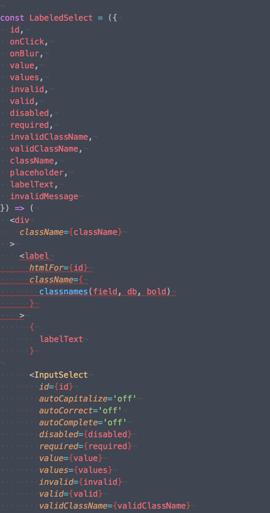
It false negative.
input-select:
```
import {
React,
Component,
PropTypes,
classnames
} from '../../vendor'
import {
isBrowser
} from '../../utils/document'
import SvgMoveDown from '../svg/move-down'
import SvgMoveUp from '../svg/move-up'
import OptionSelect from './option-select'
import {
box,
combo,
expanded,
input,
fieldExpanded,
dropdown,
dropdownExpanded,
dropdownList,
dropdownIcon
} from '../../styles/combobox.css'
import {
dn, pr, pa, full, pen, cp, zi1, lsn, normal
} from '../../styles/utility.css'
class InputSelect extends Component {
static propTypes = {
id: PropTypes.string.isRequired,
autoCapitalize: PropTypes.string.isRequired,
autoCorrect: PropTypes.string.isRequired,
autoComplete: PropTypes.string.isRequired,

disabled: PropTypes.bool,
required: PropTypes.bool,
readOnly: PropTypes.bool,

value: PropTypes.string.isRequired,
values: PropTypes.arrayOf(
  PropTypes.string.isRequired
).isRequired,
invalid: PropTypes.bool.isRequired,
valid: PropTypes.bool.isRequired,
invalidClassName: PropTypes.string.isRequired,
validClassName: PropTypes.string.isRequired,
placeholder: PropTypes.string.isRequired,

onClick: PropTypes.func.isRequired,
onBlur: PropTypes.func.isRequired
}
state = {
value: 'none', // eslint-disable-line
activeIndex: -1,
selectedIndex: -1,
open: false
}
static getDerivedStateFromProps (props, state) {
let obj = null
if (props.value !== state.value) {
  obj = Object.assign({
    value: props.value,
    activeIndex: props.values
      .indexOf(props.value)
  }, obj)
}

if (props.disabled) {
  obj = Object.assign({
    open: false
  }, obj)
}

return obj
}
handleChangeState = () => {
if (isBrowser) {
if (this.state.open) {
document.addEventListener(
'mousedown', this.handleClick, false
)
} else {
document.removeEventListener(
'mousedown', this.handleClick, false
)
}
}
}
toggleDropdown = e => {
e.preventDefault()
this.setState(
  ({ open }) => ({
    open: !open
  }),
  this.handleChangeState
)

this.input.focus()
}
componentWillUnmount = () => {
if (isBrowser) {
document.removeEventListener(
'mousedown', this.handleClick, false
)
}
}
onChange = () => {}
handleClick = ({ target }) => {
if (!this.div.contains(target)) {
if (this.state.selectedIndex !== -1) {
this.props.onBlur({
value: this.props.values[this.state.selectedIndex]
})
}
  this.setState(
    () => ({ open: false }),
    this.handleChangeState
  )
}
}
selectOption = ({ index }) => {
this.setState(
() => ({
activeIndex: index,
selectedIndex: index
})
)
this.props
  .onClick({
    index
  })
}
onKeyDown = e => {
e.stopPropagation()
switch (e.keyCode) {
  case 13: // Enter
  case 32: // Space
  case 35: // End
  case 36: // Home
  case 38: // Up
  case 40: // Down
    e.preventDefault()
    break
  default:
    break
}

switch (e.keyCode) {
  case 13: // Enter
  case 32: // Space
    if (this.state.open && this.state.activeIndex !== -1) {
      this.selectOption({
        index: this.state.activeIndex
      })

      this.toggleDropdown(e)
    } else {
      this.toggleDropdown(e)
    }
    break
  case 27: // ESC
    if (this.state.open) {
      this.toggleDropdown(e)
    }
    break
  case 35: // End
    if (this.state.open) {
      this.setState(
        (state, { values }) => ({
          activeIndex: values.length - 1
        })
      )
    }
    break
  case 36: // Home
    if (this.state.open) {
      this.setState(
        () => ({
          activeIndex: 0
        })
      )
    }
    break
  case 38: // Up
    if (this.state.open) {
      this.setState(
        ({ activeIndex }, { values }) => ({
          activeIndex: (
            activeIndex <= 0
              ? values.length
              : activeIndex
          ) - 1
        })
      )
    } else {
      this.toggleDropdown(e)
    }
    break
  case 40: // Down
    if (this.state.open) {
      this.setState(
        ({ activeIndex }, { values }) => ({
          activeIndex: activeIndex < (values.length - 1)
            ? activeIndex + 1
            : 0
        })
      )
    } else {
      this.toggleDropdown(e)
    }
    break
  default:
    break
}
}
getInputRef = input => {
this.input = input
}
getDivRef = div => {
this.div = div
}
render = () => (
ref={this.getDivRef}
>
tabIndex='0'
aria-controls={${this.props.id}-owned_listbox}
aria-expanded={this.state.open}
aria-owns={${this.props.id}-owned_listbox}
aria-haspopup='listbox'
aria-label={${this.props.id}-combobox}
aria-activedescendant={
this.state.activeIndex !== -1
? ${this.props.id}-${this.state.activeIndex}
: undefined
}
className={
classnames(combo, cp, pr, {
[expanded]: this.state.open
})
}
    onClick={this.toggleDropdown}
    onKeyDown={this.onKeyDown}
  >
    <input
      ref={this.getInputRef}
      id={this.props.id}
      name={this.props.id}
      type='text'
      autoCapitalize={this.props.autoCapitalize}
      autoCorrect={this.props.autoCorrect}
      autoComplete={this.props.autoComplete}
      aria-autocomplete='none'
      aria-activedescendant={`${this.props.id}-${this.state.selectedIndex}`}
      aria-controls={`${this.props.id}-owned_listbox`}
      className={
        classnames(input, full, cp, {
          [fieldExpanded]: this.state.open,
          [this.props.invalidClassName]: this.props.invalid,
          [this.props.validClassName]: this.props.valid
        })
      }
      placeholder={this.props.placeholder}
      disabled={this.props.disabled}
      required={this.props.required}
      readOnly={this.props.readOnly}
      value={this.props.value}
      onChange={this.onChange}
    />

    <div
      className={
        classnames(dropdown, pen, pa, {
          [dropdownExpanded]: this.state.open
        })
      }
    >
      <div
        className={
          classnames(dropdownIcon, pen)
        }
      >
        {
          this.state.open
            ? <SvgMoveUp />
            : <SvgMoveDown />
        }
      </div>
    </div>

    <ul
      role='listbox'
      id={`${this.props.id}-owned_listbox`}
      className={
        classnames(
          dropdownList, pr, full, zi1, lsn, {
            [dn]: !this.state.open
          }
        )
      }
    >
      {
        this.props.values.map((value, index) => (
          <OptionSelect
            key={value}
            index={index}
            id={this.props.id}
            isSelected={index === this.state.selectedIndex}
            isActive={index === this.state.activeIndex}
            onClick={this.selectOption}
            onKeyDown={this.onKeyDown}
            value={value}
          />
        ))
      }
    </ul>
  </div>
</div>
)
}
export default InputSelect
``
JustFly1984
on 13 Jul 2018
Is InputSelect in your eslint config as an input component? if not, then the linter can't know it's an input, and will warn because you have a label by itself.
ljharb
on 13 Jul 2018
InputSelect I've pasted after an image.
JustFly1984
on 13 Jul 2018
PS I do not have this issue if I'm rolling back to 6.0.3
JustFly1984
on 13 Jul 2018
@JustFly1984 that's because prior to 6.1, the rule had a bug which didn't check nested children. Your code should have always warned.
What I mean is, your eslint settings themselves have to configure the rule to treat InputSelect as if it's an input component: see the "Components" option here
ljharb
on 13 Jul 2018
Well, actually the rule combination that get rid of my errors is "allowChildren": true:
"jsx-a11y/label-has-for": [ 2, {
        "components": [],
        "required": {
            "every": [ "nesting", "id" ]
        },
        "allowChildren": true
    }],
Adding input components doesn't help, and even make it worse.
Also without a rule, I had an issue with textarea wrapped in label.
const LabeledTextarea = ({
  id,
  placeholder,
  labelText,

  autoComplete,
  autoCapitalize,
  autoCorrect,

  icon,
  iconClassName,

  labelClassName,
  inputClassName,
  validClassName,
  invalidClassName,

  value,
  valid,
  invalid,

  disabled,

  onBlur,
  onFocus,
  onChange
}) => (
  <label
    htmlFor={id}
    className={
      classnames(labelClassName, bold)
    }
  >
    { labelText }

    <textarea
      id={id}
      name={id}
      className={
        classnames(inputClassName, normal, {
          [validClassName]: valid,
          [invalidClassName]: invalid
        })
      }
      value={value}
      placeholder={placeholder}
      disabled={disabled}

      onChange={onChange}
      onBlur={onBlur || onChange}
      onFocus={onFocus || onChange}

      autoComplete={autoComplete}
      autoCapitalize={autoCapitalize}
      autoCorrect={autoCorrect}
    />

    {
      icon && (
        <div className={classnames(iconClassName, pen)}>
          { icon }
        </div>
      )
    }

  </label>
)
@JustFly1984 use label-has-associated-control instead :) label-has-for is a little too brittle.
jessebeach
on 13 Jul 2018
After googling, I did not found how to setup label-has-associated-control rule
JustFly1984
on 17 Jul 2018
I was also having issues getting label-has-for to shut off. The rule was not being followed. I had to upgrade my eslint package from 4.x.x, and all associated packages to the latest version for the rule to work.
These are my eslint packages for reference
"eslint": "^5.4.0",
"eslint-config-react-app": "^2.1.0",
"eslint-loader": "^2.1.0",
"eslint-plugin-flowtype": "^2.50.0",
"eslint-plugin-import": "^2.14.0",
"eslint-plugin-jsx-a11y": "^6.1.1",
"eslint-plugin-react": "^7.11.1",
With this rule
"jsx-a11y/label-has-for": "off"
 mdrideout
on 29 Aug 2018
mdrideout
on 29 Aug 2018
I had to upgrade my eslint package from 4.x.x, and all associated packages to the latest version for the rule to work.
=O
@boon4376 That's super helpful, thank you! Did you upgrade to eslint@latest?
jessebeach
on 30 Aug 2018
@jessebeach - I actually just manually specified the "^5.4.0" to my package.json, deleted my node_modules folder, and then ran npm i
I can never get the actual "upgrade" command to work because I'm a n00b
mdrideout
on 30 Aug 2018
Please use label-has-associated-control instead of label-has-for.
jessebeach
on 20 Jun 2020
Related issues
 Steve-O-Cassels
·
5Comments
Steve-O-Cassels
·
5Comments
 JosephNK
·
4Comments
JosephNK
·
4Comments
 uknmr
·
5Comments
uknmr
·
5Comments
 mikehwagz
·
4Comments
jessebeach
·
3Comments
mikehwagz
·
4Comments
jessebeach
·
3Comments
Most helpful comment
@JustFly1984 use
label-has-associated-controlinstead oflabel-has-for. We deprecatedlabel-has-forin v6.1.0.I'll look into the breakage, though. Deprecated doesn't mean broken :)