Enterprise: Forms: Implement optional smaller field sizes
Is your feature request related to a problem? Please describe.
We need to implement a (design to follow) design that has smaller form fields and reduce field and padding sizes so that larger forms can fit in the pages better. This is from customer feedback upgrading from 3.x to 4.x.
The roughly means adding a field-small-stacked or field-short-stacked class like the current field-short but with new designed sizes and the labels on top.
Describe the solution you'd like
- [x] All changes should go in tokens, so add field sizes and form layout details for normal, short fields and short fields stacked.
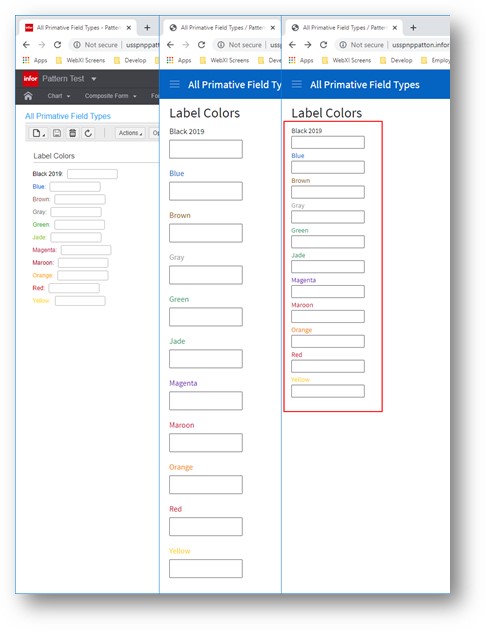
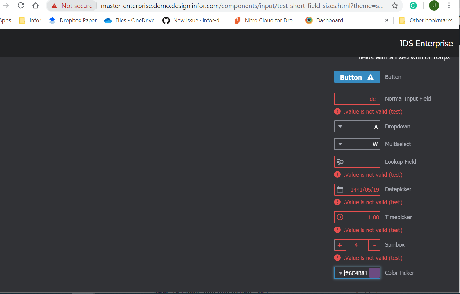
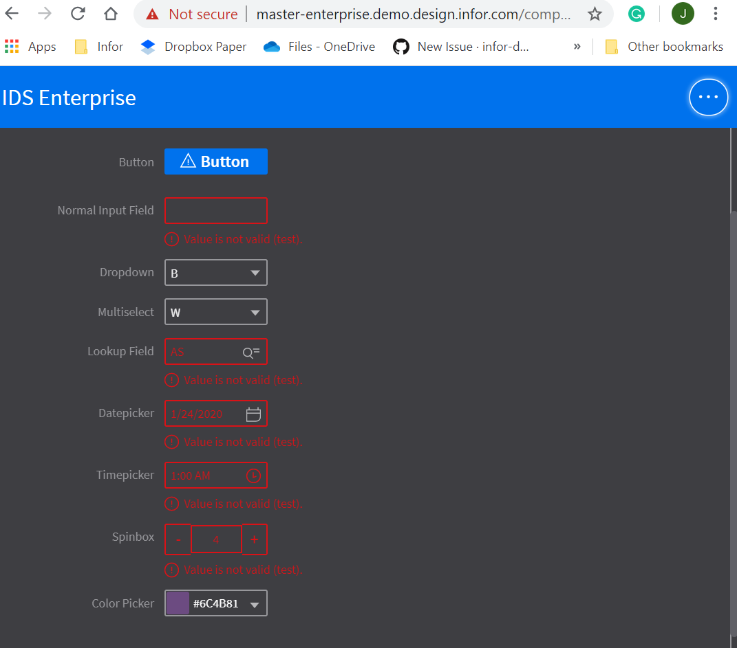
- [x] Add field-short-stacked example like field-short examples and test all fields and widths (Screen Shot 1)
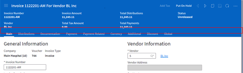
- [ ] Reduce bottom padding on context forms (Screen Shot 2)
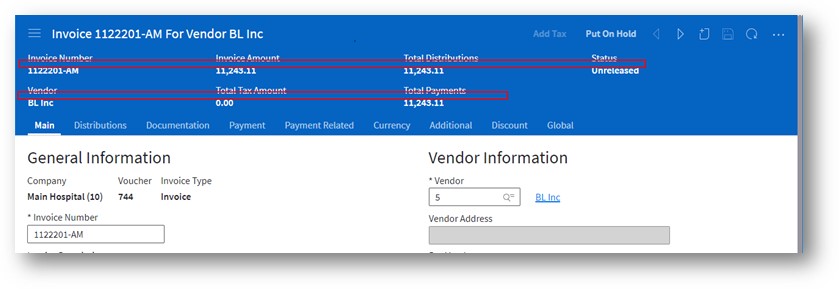
- [ ] Reduce bottom padding between data labels on summary fields (Screen Shot 3)
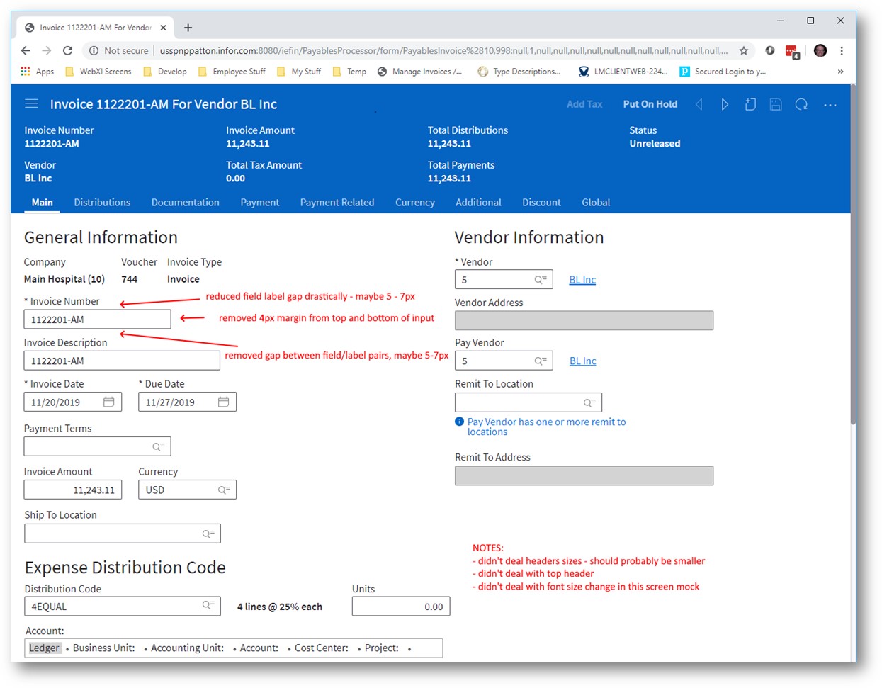
- [x] Add some form label examples showing size between fields (Screen Shot 4)
- [x] Add form level “switch” to toggle compressed mode in an example with a possible form level class and menu item
- [x] Make test page with all form features for testing
Component List
- [x] autocomplete
- [x] button
- [x] checkbox
- [x] dropdown
- [x] colorpicker
- [x] datepicker
- [x] lookup
- [x] timepicker
- [x] radios
- [x] spinbox
- [x] completion-chart? (in landmark called progress bar)
- [x] input (done)
- [x] tags
- [x] hyperlinks
- [x] textarea
- [x] fileupload
- [ ] field filters
- [ ] editor
- [ ] fieldset/expandable area
- [ ] rating
- [ ] switch
- [ ] context forms
- [ ] summary forms
- [ ] counts - would counts be smaller?
- [ ] slider
- [x] badge/tag - i think the size should be ok for both personally
- [x] toolbars A: No Change as no padding.
- [x] input with validation messages
- [x] paragraphs - Q:
<p>for text marked as "display as text" A: Use tokens$input-size-regular-font-size, $label-size-regular-font-size, $input-size-compact-font-size, $label-size-compact-font-size - [x] icons - Q: would these stay the same height? A: in fields they go down but buttons stay same size
Describe alternatives you've considered
N/A
Additional context
Outlook email "Our initial POC / mocks for "compact" form layouts"
Screen Shot 1
Screen Shot 2
Screen Shot 3
Screen Shot 4
 tmcconechy
All 13 comments
cc @pwpatton for any feedback - i didn't add the exact values for sizes yet but have them from you if needed. We will get design as a next step to work up some examples/guidance.
tmcconechy
on 13 Dec 2019
Hey Tim. I'm working on this right now; you can assign it to me if you want to.
 kentonquatman
on 17 Dec 2019
kentonquatman
on 17 Dec 2019
Design specifications are available on Figma. Please view the link below to review (you may need to create a free account to view specs).
https://www.figma.com/file/CUC6hyMtzodsfU13Lsbw6G/Compact-Input-Fields?node-id=0%3A1
_Note: Figma doesn't account for the 1px border on the input fields. Padding is measured from the text to the edge of the input. If padding is measuring at 7px, it should really be 6px padding + 1px border._
kentonquatman
on 2 Jan 2020
i will take a look after #3007 is done.
tmcconechy
on 2 Jan 2020
Here are the things we use on a form that need to be smaller. There are some questions left however.
- autocomplete (same as input)
- button (done)
- checkbox
- colorpicker
- completion-chart? (landmark progress bar)
- datepicker
- badge/tag
- dropdown
- editor
- field filters
- hyperlinks
- textarea
- fieldset?
- fileupload
- input (done)
- lookup
- radios
- rating
- slider
- spinbox
- switch
- tags
- toolbars?
- timepicker
- validation messages
we also use paragraphs
for when our fields are marked as "display as text"
Question about:
- icons - would these stay the same height?
- counts - would counts be smaller?
 pwpatton
on 3 Jan 2020
pwpatton
on 3 Jan 2020
Sample Pages with all (most) form fields for when we/i? work on this for creation of an IDS sample page.
- https://usspvwlmclient1.infor.com/uitest/PatternTest/form/Product%281,1%29.CheckboxesForm?action=Update
- https://usspvwlmclient1.infor.com/uitest/PatternTest/form/Product%281,1%29.BaseFieldsForm?action=Update
- https://usspvwlmclient1.infor.com/uitest/PatternTest/list/BaseComponent.BaseComponentList?menu=ComponentTestMenu.BaseComponents - go here then click "Shared Components Menu". Click what ever menu choice in there. That first brings up a list so you can get to a form with those things.
(Password in private chat)
tmcconechy
on 3 Jan 2020
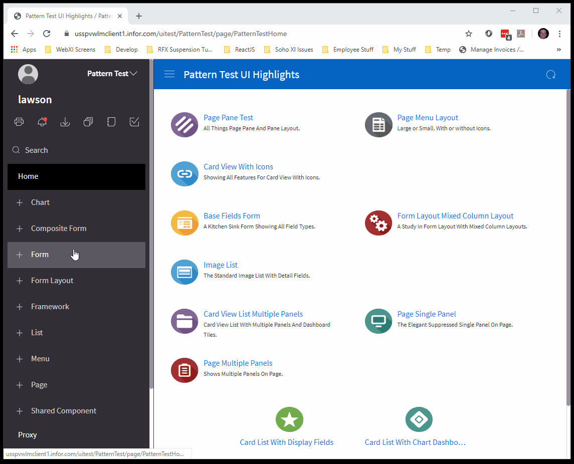
There are more field tests as well that may be useful.
https://usspvwlmclient1.infor.com/uitest/PatternTest/page/PatternTestHome
- Go to Shared Component > Components
- Each item will first bring up a datagrid of records and you must open a row (double click or select and open icon) in the datagrid to see its form.
pwpatton
on 3 Jan 2020
Stopping here for QA. Will continue the remaining items either during beta QA or 4.26 https://github.com/infor-design/enterprise/issues/3329
tmcconechy
on 14 Jan 2020
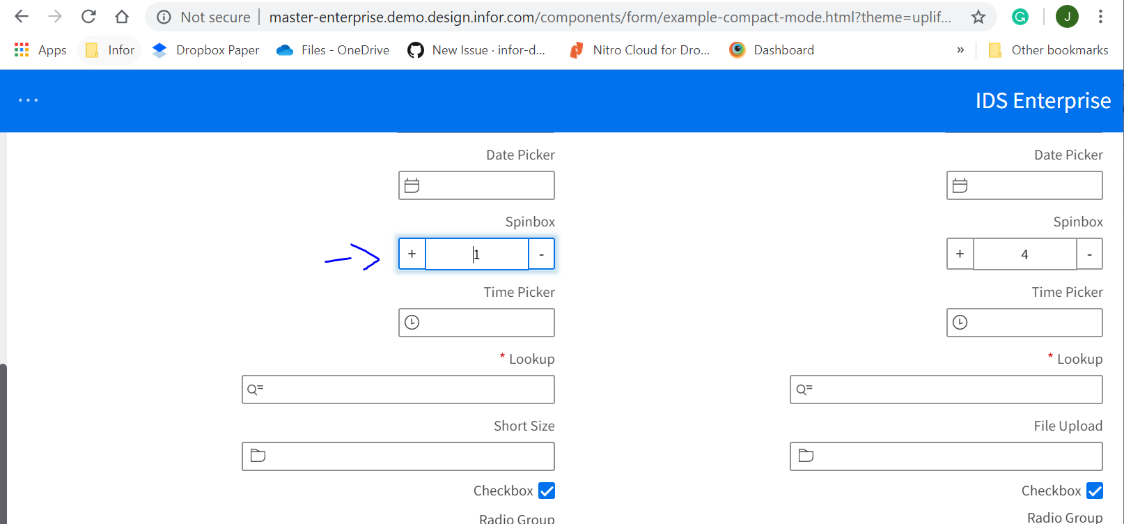
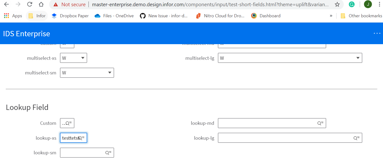
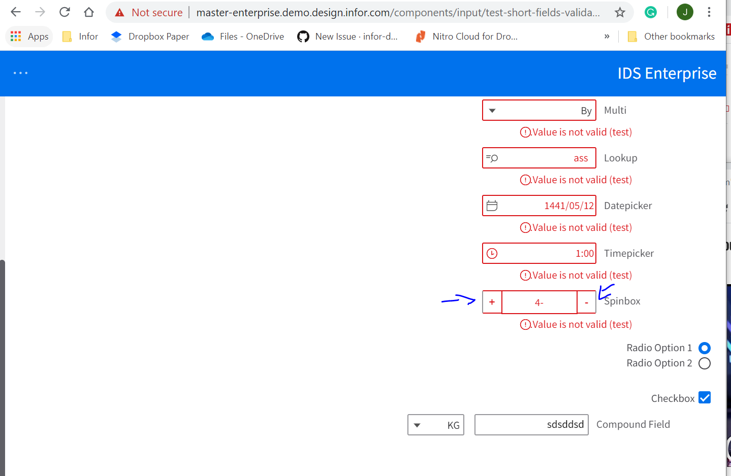
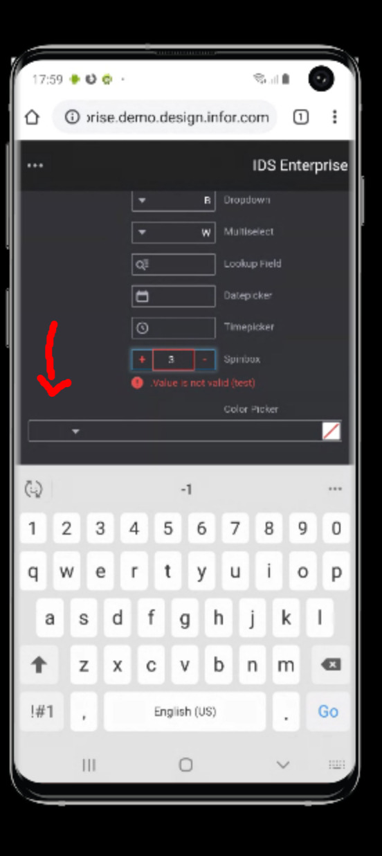
Hello guys, found these issues below as I test the ticket.
The spinbox appears to be un-aligned.
http://master-enterprise.demo.design.infor.com/components/form/example-compact-mode.html?theme=uplift&variant=light&locale=ar-SA
Texts overlap the lookup field icon.
http://master-enterprise.demo.design.infor.com/components/input/test-short-fields.html?theme=uplift&variant=light
The Spinbox has a different color on the side in validation example
http://master-enterprise.demo.design.infor.com/components/input/test-short-fields-validated.html?theme=uplift&variant=light&locale=ar-SA#
Cannot see validation clearly in Dark mode, Vibrant Theme.
Sublte:
http://master-enterprise.demo.design.infor.com/components/input/test-short-field-sizes.html?theme=soho&variant=dark&locale=ar-SA
Vibrant:
 janahintal
on 16 Jan 2020
janahintal
on 16 Jan 2020
I retested this ticket on http://4250-beta0-enterprise.demo.design.infor.com//components/input/test-short-field-sizes.html?theme=soho&variant=dark&locale=ar-SA
On Windows 10 Chrome alignment issues are still appearing. Also on the Android and IOS iPhone the color picker alignment is not correct. Please see screen shot below. Thanks, Cindy
 CindyMercadoReyes
on 16 Jan 2020
CindyMercadoReyes
on 16 Jan 2020
For issue #4, we should be using the two color alert state of the icon:
https://design.infor.com/code/ids-enterprise/latest/demo/components/alerts/example-index?theme=uplift&variant=dark
kentonquatman
on 21 Jan 2020
Adding some addition fixes for all noted issues i could address for the RC. If any additional issues please make a new issue for them as this issue is dragging on.
tmcconechy
on 22 Jan 2020
QA Passed. Will Move to Done.
Retested in:
• http://4250-rc0-enterprise.demo.design.infor.com/components/form/example-compact-mode.html?theme=uplift&variant=light&locale=ar-EG open the dropdown and check the arrow for alignment
• http://4250-rc0-enterprise.demo.design.infor.com/components/form/example-compact-mode.html?theme=uplift&variant=light&locale=ar-EG tab out of the validation field and check the alignment
• http://4250-rc0-enterprise.demo.design.infor.com/components/input/test-short-field-sizes.html?locale=ar-EG check the alignment of text and icon in the button
• http://4250-rc0-enterprise.demo.design.infor.com/components/input/test-short-field-sizes.html?locale=ar-EG open the multi select and the items and checks should be 5x from the right now
• http://4250-rc0-enterprise.demo.design.infor.com/components/input/test-short-field-sizes.html?locale=ar-EG resize to mobile and the color picker should look Ok
• http://4250-rc0-enterprise.demo.design.infor.com/components/form/example-compact-mode.html?theme=uplift&variant=light&locale=ar-SA spin box should look aligned on focus
• http://4250-rc0-enterprise.demo.design.infor.com/components/input/test-short-fields-validated.html?theme=uplift&variant=light&locale=ar-SA tab out of the spin box and the border should be on all sided of spin box and the message should align
• http://4250-rc0-enterprise.demo.design.infor.com/components/input/test-short-field-sizes.html?theme=soho&variant=dark&locale=ar-SA test in firefox and IOS
• http://4250-rc0-enterprise.demo.design.infor.com/components/fieldset/example-short test this page
• http://4250-rc0-enterprise.demo.design.infor.com/components/field-filter/example-index and test this page too
• http://4250-rc0-enterprise.demo.design.infor.com/components/field-filter/example-index.html
janahintal
on 24 Jan 2020
Related issues
 swetteinfor
·
3Comments
swetteinfor
·
3Comments
 jbrcna
·
3Comments
jbrcna
·
3Comments
 SofiK
·
3Comments
janahintal
·
3Comments
SofiK
·
3Comments
janahintal
·
3Comments
 EdwardCoyle
·
4Comments
EdwardCoyle
·
4Comments
Most helpful comment
i will take a look after #3007 is done.