Emotion: Howto keep inheritance when using composition
emotionversion: 7.3.2reactversion: 15.6.1
Relevant code
const btn = css`
border-radius: 1em;
border: 0;
margin-right: 1em;
padding: 1em;
`;
const active = css`font-weight: bold;`;
const btnGroup = css`
& .${btn} {
margin: 0;
border-radius: 0;
}
& .${btn}:first-child {
border-radius: 1em 0 0 1em;
}
& .${btn}:last-child {
border-radius: 0em 1em 1em 0em;
}
`;
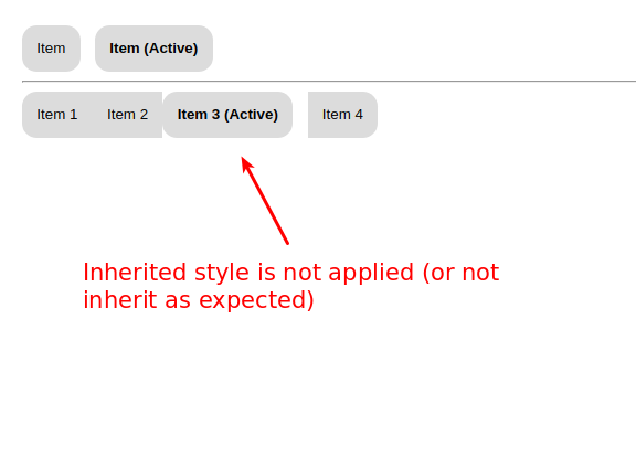
export default () => (
<div css={`padding: 2em;`}>
<button css={btn} type="button">
Item
</button>
<button css={`composes: ${btn}; composes: ${active};`} type="button">
Item (Active)
</button>
<hr />
<div css={btnGroup} role="group">
<button css={btn} type="button">
Item 1
</button>
<button css={btn} type="button">
Item 2
</button>
<button css={`composes: ${btn}; composes: ${active};`} type="button">
Item 3 (Active)
</button>
<button css={btn} type="button">
Item 4
</button>
</div>
</div>
);
What you did
What happened
The inherited style of button (within buttonGroup) is not applied, am I doing something wrongly or is it a bug with composition?
Reproduction
Problem description
Suggested solution
 brikou
All 15 comments
Try this. I removed the composes because they are no longer needed.
const btn = css`
    border-radius: 1em;
    border: 0;
    margin-right: 1em;
    padding: 1em;
`;

const active = css`font-weight: bold;`;

const btnGroup = css`
    & .${btn} {
        margin: 0;
        border-radius: 0;
    }

    & .${btn}:first-child {
        border-radius: 1em 0 0 1em;
    }

    & .${btn}:last-child {
        border-radius: 0em 1em 1em 0em;
    }
`;

export default () => (
  <div css={`padding: 2em;`}>
    <button css={btn} type="button">
      Item
    </button>
    <button css={`${btn}; ${active};`} type="button">
      Item (Active)
    </button>
    <hr/>
    <div css={btnGroup} role="group">
      <button css={btn} type="button">
        Item 1
      </button>
      <button css={btn} type="button">
        Item 2
      </button>
      <button css={`${btn}; ${active};`} type="button">
        Item 3 (Active)
      </button>
      <button css={btn} type="button">
        Item 4
      </button>
    </div>
  </div>
);
I've never seen anyone use emotion like this. It's not wrong or anything, just thought it was interesting.
 tkh44
on 23 Sep 2017
tkh44
on 23 Sep 2017
I already tried without composes keyword to follow emotion 8. The only way I found to make it work is with classname attribute. Not so nice. I know that nobody uses emotion with that kind of reusable utility classes. But this usage is widely used with legacy CSS and supporting it would allow easy conversion. If you are interested I wrote a tool to convert regular CSS to emotion. I've converted bootstrap V4 and it gives me 1200 JS files usable by emotion.
brikou
on 23 Sep 2017
You do not need the composes with emotion 7. Just so we are clear, the css prop is just an illusion, a trick.
<button css={`${btn}; ${active};`} type="button">
  Item 3 (Active)
</button>
is converted to
<button className={css`${btn}; ${active};`} type="button">
  Item 3 (Active)
</button>
You almost have the correct idea but seem to be missing the forest for the trees. I would just make another style that is a combination of the 2 and assign it to the className.
const activeButton = css`
  ${btn};
  ${active};
`

<button className={activeButton} type="button">
  Item 3 (Active)
</button>
I am interested in the tool you should post the repo.
tkh44
on 23 Sep 2017
Hey @tkh44 the example repository is here https://github.com/brikou/CSS-in-JS-experiences and you can see live bootstrap example here https://css-in-js-experiences.ga/
I can wait to have your feedback, my css to js converted is not yet ready to be open sourced, but we can talk about it later.
brikou
on 24 Sep 2017
Here is a link to the "not working as expected" example https://github.com/brikou/CSS-in-JS-experiences/blob/emotion_issue_330/pages/emotion-issue-330.js
brikou
on 24 Sep 2017
When you do class composition
css`${btn}; ${active};`
what you get back is another class name with all the styles combined.
In your button group, you're using ${btn} class name explicitly, change it to something generic like button tag:
const btnGroup = css`
    & button {
        margin: 0;
        border-radius: 0;
    }

    & button:first-child {
        border-radius: 1em 0 0 1em;
    }

    & button:last-child {
        border-radius: 0em 1em 1em 0em;
    }
`;
or concatenate class names on the button:
 <button className={`${btn} ${active}`} type="button">
        Item 3 (Active)
here's playground: https://stackblitz.com/edit/react-mv2zqp
 marzelin
on 28 Sep 2017
marzelin
on 28 Sep 2017
I think I'm also hitting this limitation, in a way. I've made an example button component here,
const baseStyle = css`
    border: 2px solid cyan;
    border-radius: 2px;

    padding: 0.25rem 1rem;

    font-size: 1rem;
    font-weight: 500;

    &:focus {
        outline-color: cyan;
        outline-offset: 1px;
        outline-style: double;
        outline-width: 2px;
    }

    &:hover {
        background-color: cyan;
    }

    &:active {
        background-color: black;
        color: white;
    }

    &:disabled {
        border-color: lightgrey;
        cursor: initial;
        background-color: white;
        color: grey;
    }

    & + & {
        margin-left: 1rem;
    }
`

const Button = styled.button`
    ${baseStyle};
    font-size: ${( {small, large} ) => (large ? '1.5rem' : small ? '0.75rem' : '1rem')};
    cursor: ${({ disabled }) =>  (disabled ? 'not-allowed' : 'pointer') };
    pointer-events: ${({disabled, loading, success}) => (disabled || loading || success ? 'none' : null)};
`
There are many use cases where selecting & + & is important and I can't find a way to let emotion handle this. Because the dynamic props are creating new classes with the entire style composed, instead of attaching an additional style where it differs.
I'm guessing this is a situation where we need to use cx instead of leaning on dynamic props?
 camflan
on 29 Mar 2018
camflan
on 29 Mar 2018
Nevermind, cx combines all styles into a new class name....that doesn't help at all.
camflan
on 29 Mar 2018
This issue has been automatically marked as stale because it has not had recent activity. It will be closed in 7 days if no further activity occurs. Thank you for your contributions.
![stale[bot] picture](https://avatars.githubusercontent.com/in/1724?v=4&s=40) stale[bot]
on 7 Aug 2018
stale[bot]
on 7 Aug 2018
I am facing the same problem. If you have two separate classes btn and active, composing them gives a new class with a combined footprint of both. So, having variants of button actually results in the base class btn being repeated in all the variants.
One solution was to export these classnames and give them to the button directly, like so -
<button className={`${btn} ${active}`} type="button">
But this means I can not have interpolation functions which require props (since I can't use styled).
If I do use styled, I am back to square one.
So, its either between using styled or making classes and composing them without emotion's css?
 urvashi01
on 28 Aug 2018
urvashi01
on 28 Aug 2018
composing them gives a new class with a combined footprint of both
@urvashi01 What do you mean by this?
tkh44
on 29 Aug 2018
@tkh44
Let's say if I have the following classes -
btn - base style
primary, secondary - specific styles
To style a variant, I could use cx or styled.
So, primary button will be -
styled.button`
   ${btn}
   ${primary}
`
Secondary will be -
styled.button`
   ${btn}
   ${secondary}
`
Now, styled will take all the interpolations and create one new class out of them.
Hence, className passed to primary button and secondary button will have the rules of btn repeating (repeating footprint). This increases my overall style sheet because the same rules are occuring thrice now, once in btn class, and the other two through variants.
In css, we reuse the classes, but this isn't possible here.
urvashi01
on 4 Sep 2018
@tkh44 I was reading through the create-emotion-styled's code for the Styled HOC.
I found 2 useful options - staticClassName and stableClassName.
stableClassName is perfect for this reusability use case. I could attach btn class as stableClassName and that way my new interpolated className will not have the rules in it.
But, my concern is, I don't see this in the documentation anywhere. Is this intentional because you don't aim to support this in the future or just a documentation miss?
urvashi01
on 4 Sep 2018
@urvashi01 - from a look at the new NextEmotion packages, seems like it will be supported but changed from stableClassName to just target.
 JoshRosenstein
on 5 Sep 2018
JoshRosenstein
on 5 Sep 2018
@tkh44 After the release of Emotion10, only target is presently supported.
But the change in the way css now returns serializedStyles instead of class names is posing a problem in integration with target.
To give an example, if I make a style like so -
const btn = css(...rules);
And decide to make this a target class for my Button component, like so -
const Button = styled(button, {
  target: btn.name
})(...otherStyles);
This will be lead to no btn styles being applied because -
btnstyles haven't been inserted by anything yet.btn.namelacks the cache key prepended to its name which results in a wrong class.
As a workaround, even if I decide to make a wrapper and write my own variation of styled, it won't be possible because I will need access to cache to do the above 2 steps and I can't access it unless I wrap my component in withEmotionCache.
To summarise, I can't use target anymore because I need to be inside a component instance to access cache whereas target is defined alongside a component's definition.
urvashi01
on 26 Dec 2018
Related issues
 Zn4rK
·
3Comments
Zn4rK
·
3Comments
 acnebs
·
3Comments
acnebs
·
3Comments
 AlexanderProd
·
3Comments
AlexanderProd
·
3Comments
 rockmandash
·
3Comments
rockmandash
·
3Comments
 bitttttten
·
3Comments
bitttttten
·
3Comments
Most helpful comment
@tkh44 I was reading through the
create-emotion-styled's code for theStyledHOC.I found 2 useful options -
staticClassNameandstableClassName.stableClassNameis perfect for this reusability use case. I could attachbtnclass asstableClassNameand that way my new interpolated className will not have the rules in it.But, my concern is, I don't see this in the documentation anywhere. Is this intentional because you don't aim to support this in the future or just a documentation miss?