Embla-carousel: Loop carousel with previous/next slide partly visible
Hey David,
Huge fan of the carousel 👍 . I've got an interesting feature request, that if you have insight into how I could do without rolling into the core would love some eyes on it:
What I would want the expected behavior to be is that the slideshow either:
- clones a first/last item to the end of the chair (I feel like other slideshows do this, don't believe it's necessary and over complicates)
- the slide to the left/right of the visible end of loop is not moved until after dragEnd.
Using the example above I put a border around the visible container, and you can see as you drag the active item left or right that the next/prev slide sort of pops out of frame. I know that your more standard implementation has an overflow:hidden wrap. But I often encounter slideshows where the design lends itself to seeing the next/prev slide on the edge of the slideshow so I created that effect to the best of my understanding of the embla world. Perhaps this isn't something that is core but wondering if there is another way I can basically delay the left: 0 that occurs as you drag an item in and out of the frame.
 iamkevingreen
All 3 comments
Hello Kevin (@iamkevingreen),
But I often encounter slideshows where the design lends itself to seeing the next/prev slide on the edge of the slideshow...
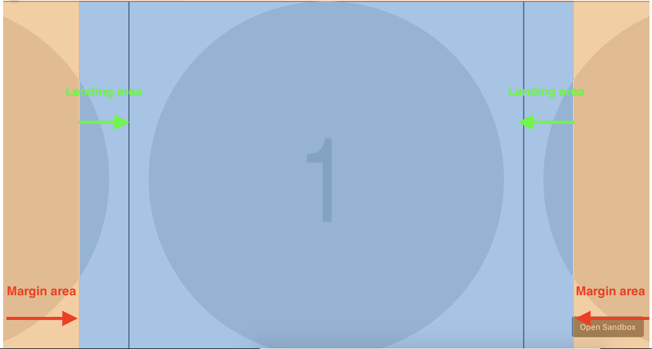
Embla allows for this and the Embla loop engine is actually more precise than the Flickity one. The issue in your example is caused by the horizontal auto margin applied to the container, because you have max-width: 800px; and margin: 0 auto; applied to it.
If you resize your window to anything smaller than 800px, it should work as expected right? It works because the margin is gone. So what's happening is that the margin areas are added as additional space to the lending area which leaves the loop effect exposed.
The problem
The solution
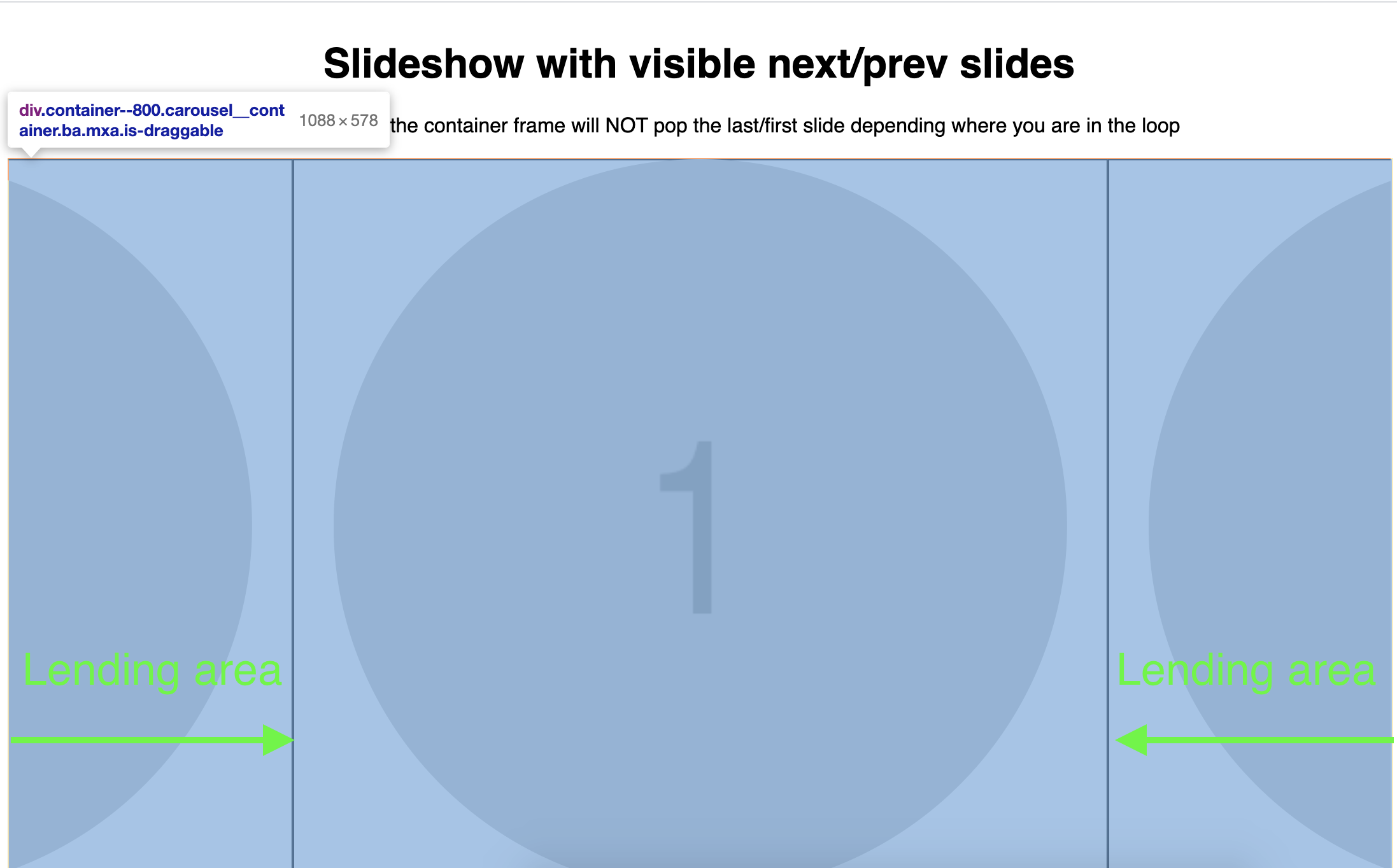
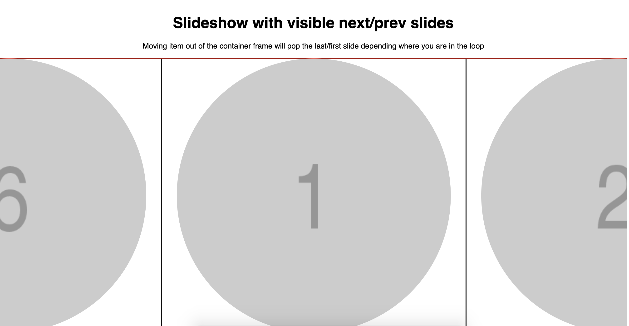
The solution to this is that the Embla container has to be full width. You basically have to remove the max-width: 800px; from the Embla container, and apply a max width directly to the slides instead. In the example you provided, the slide widths are 80% of a 800px container, so each slide should have a max width of 800px * 0.8 = 640px. Here's a CodeSandbox demonstrating how to achieve this.
Take a look at these two screenshots showing the container size (the red line) before and after applying the suggested fix in the CodeSandbox:
Before

After
Let me know if it helps.
David
 davidcetinkaya
on 17 Nov 2020
davidcetinkaya
on 17 Nov 2020
I see what's happening, this was super helpful. I was essentially trying to create the layout before creating the slideshow, when I should have created the layout from the slideshow itself. I am tweaking the use case on my side with these suggestions and think it's coming out nicely now!
The responsiveness (max 800px) was simply a test to where I was in the process, the actual mobile->desktop will be a little different but I think this resolved everything on my end.
The solution here seems to be make the slideshow more or less full width and let the inner slides size the experience.
Cheers.
iamkevingreen
on 17 Nov 2020
Hello again Kevin (@iamkevingreen),
I’m glad my explanation made sense 🙂. Nice to hear that you got it sorted. I’m closing this issue as resolved then? Just a note: You can change slide widths in your CSS with media queries depending on the current screen size. Embla will pick up the changes because it listens to the window resize event.
Best,
David
davidcetinkaya
on 18 Nov 2020
Related issues
 EctordAniel
·
3Comments
EctordAniel
·
3Comments
 maiconrs95
·
5Comments
maiconrs95
·
5Comments
 th-km
·
5Comments
th-km
·
5Comments
 ej-mitchell
·
5Comments
ej-mitchell
·
5Comments
 jamesdbruner
·
3Comments
jamesdbruner
·
3Comments
Most helpful comment
I see what's happening, this was super helpful. I was essentially trying to create the layout before creating the slideshow, when I should have created the layout from the slideshow itself. I am tweaking the use case on my side with these suggestions and think it's coming out nicely now!
The responsiveness (max 800px) was simply a test to where I was in the process, the actual mobile->desktop will be a little different but I think this resolved everything on my end.
The solution here seems to be make the slideshow more or less full width and let the inner slides size the experience.
Cheers.