Elementor: Text only widget list - wider scroll bar
Many complain about the widget list. Lots of scrolling to get to the one you want. I find myself collapsing all the major widget headings one-by-one which is a pain. Why not have a Text Only setting for the widgets? They would likely then all fit on the screen. The icons are not needed. All of the icons in the WordPress section are identical. Hardly necessary and a big space waster. Could you at least make the scroll bar wider? On my high res screen, I must really focus to scroll. Also a button to collapse all widget headings would be nice so I don't have to do this one-by-one.
Bottom line - A Text Only option (no icons) should solve this.
Please let me know if I've missed a setting. I'm a brand new user of Elementor.
 ebowmagoo
>All comments
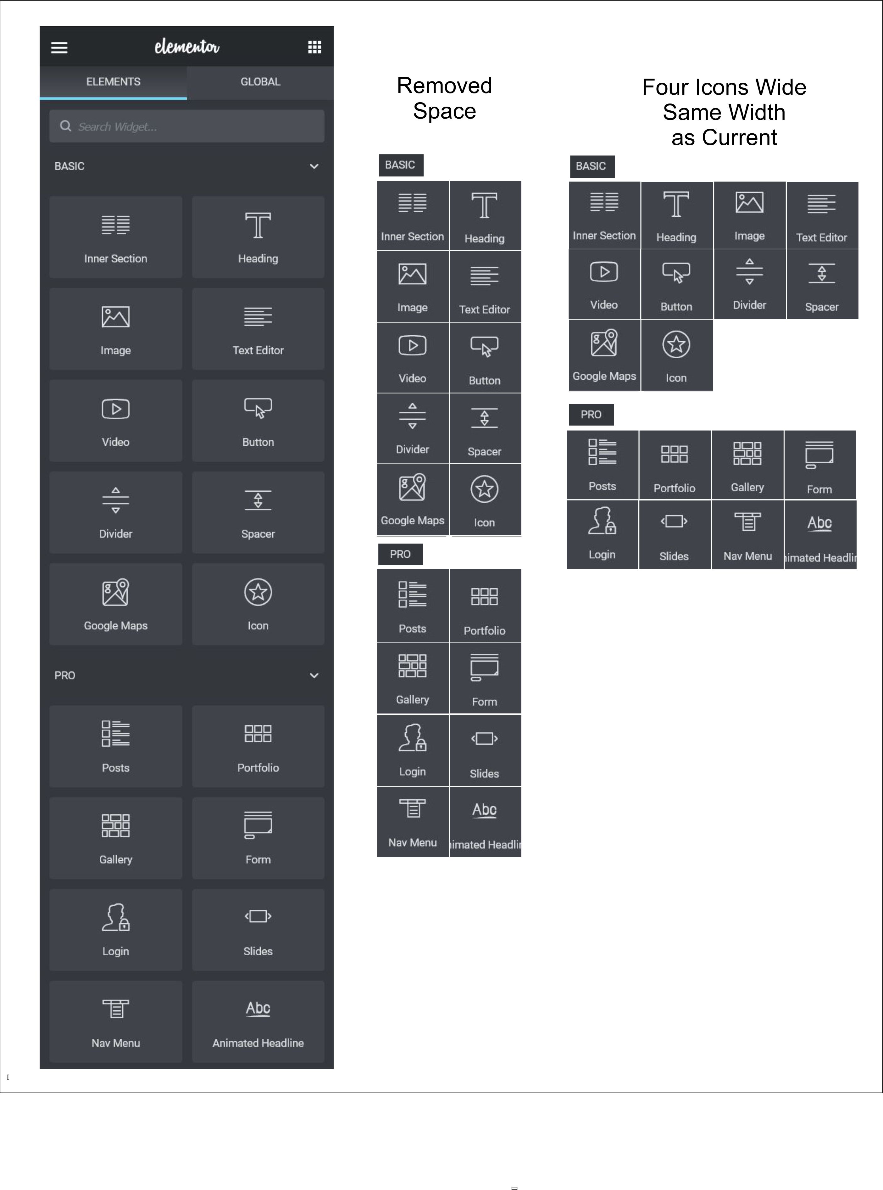
Here's a mock-up keeping the icons but conserving space.
ebowmagoo
on 10 May 2020
Related issues
 Guardiannw
·
3Comments
Guardiannw
·
3Comments
 stratboy
·
3Comments
stratboy
·
3Comments
 tudormnt
·
3Comments
tudormnt
·
3Comments
 rahulv3a
·
3Comments
rahulv3a
·
3Comments
 pingram3541
·
3Comments
pingram3541
·
3Comments
Most helpful comment
Here's a mock-up keeping the icons but conserving space.
