Element: [Feature Request] Selectable date range to render
Existing Component
Yes
Component Name
DatePicker
Description
The DatePicker component renders dates years from now and backward, with the ability to disable certain dates.
I would like to be able to select a date range for the DatePicker to render and only be able to navigate to those dates.
Example: 30 September 2018 - 30 December 2018
Only the dates within that range will be rendered on the DatePicker, not allowing users to even see additional dates (as opposed to disabling them)
The reason for this feature request is that running a disabled check with the "disabledDate" picker options can become slow with computationally expensive operations, as the operations are performed on multiple years worth of days, instead of say, 4 months worth of days.
 shnparker
All 10 comments
How expensive, do you have measurements?
I don't see why 4 months of days (or 10 years) will be a problem on popular devices.
 wacky6
on 14 Aug 2018
wacky6
on 14 Aug 2018
Thank you for the quick feedback.
The issue we are facing is with time conversion between UTC times (our backend) and the DatePicker (JS Date), with some additional string manipulation operations such as .toString().substring() to fix timezone issues, which is where the slow computation comes in when it runs on each date in the picker. We also have to support older devices such as 32-bit laptops.
In the event that we know how far back users can select dates, e.g. 4 months into the past, and none into the future, it is meaningless to provide them with years worth of disabled dates instead of showing them dates from which they can choose.
shnparker
on 14 Aug 2018
Well. Then you need rethink about the disabledDate implementation.
My recommendation is: do not perform complex computations in disabledDate, do them beforehand.
From my experience, a correctly implemented disabledDate function called over 10 year of dates is quite fast. The most preferred disabledDate implementation should only perform numerical comparisons, such as:
MIN_TIME = do_whatever_UTC_conversion(server_params)

disabledDate(date) { return MIN_TIME <= date.getTime() }
Also, a word of caution. Native JS date do not have timezone support, and element can cause edge cases during timezone shift (i.e. the moment when daylight saving is turned on/off).
I personally won't do string manipulations when dealing with timezones. Though, date-picker and JS date does come with a few guarantees / alternatives:
- User always sees local time (browser's timezone)
- When you get timestamp (
getDate), it will be normalized to UTC unix epoch. See: MDN - You can use
value-formatto get string style date (which will be local time), and combine it with a time-zone selector.
wacky6
on 14 Aug 2018
I will reconsider the way I implement this and try to find a better solution with your recommendations.
We are aware of the time zone issues with Native JS, and are therefore using moment.js to deal with all date-time related properties. However I must be messing up somewhere, will look into it and leave a comment on the findings.
In regards to my final paragraph, what are your thoughts on the UX of showing many disabled fields vs showing only fields that are available? Would this be an option to consider adding to the component?
shnparker
on 14 Aug 2018
I am not entirely clear about your meaning of hiding disabled fields. You can make a screenshot to illustrate your point.
As for date picker, I don't think showing disabled dates cause problem to users.
Assume user can only choose dates in the past. Normally, they choose the available ones. Unless they are really boring and start navigating to future years.
Another reason for showing disabled dates is to maintain the shape of date table. I assume most users want to see something like a calendar. Hiding disabled dates breaks this mental model somehow.
wacky6
on 14 Aug 2018
My suggestion for the date picker to have the option to hide selected dates are as follows:
- The shape of the table will not change at all, it will still look like a calendar.
- As an example, user can select 5 dates in a row into the past, all others will be disabled.
With that being said, all the dates not currently in view (dates in other months) do nothing, hence I want to not render those extra days to boost performance a little and so that users cannot scroll to months where all dates are disabled.
Screenshot of this example
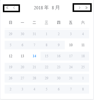
My suggestion would be to select a range of months that will be rendered, for example, August.
All months outside this range will not be rendered, thus the arrows in the black boxes I have drawn will not be visible either, as there is only one month selected.
Does this make sense? I can try to clarify more if needed.
shnparker
on 14 Aug 2018
I am unsure if my previous comment made it clear as to what I mean with hiding dates away from users that are unselectable.
Here is an example of how Vuetify's date picker performs the action that I was referring to, where the arrows are disabled because the dates outside of this month are all disabled.
I hope this clears up any confusion.
shnparker
on 15 Aug 2018
I see.
This requires API change. I don't think we will implement this feature in near future. It's similar to selectableRange in time picker.
I will leave this issue open for further discussion. If this feature is highly requested, we will start consider implementing it.
wacky6
on 15 Aug 2018
Any news on this?
 mkantautas
on 25 Mar 2019
mkantautas
on 25 Mar 2019
This issue has been automatically marked as stale because it has not had recent activity. It will be closed if no further activity occurs. Thank you for your contributions.
![stale[bot] picture](https://avatars.githubusercontent.com/in/1724?v=4&s=40) stale[bot]
on 22 Nov 2020
stale[bot]
on 22 Nov 2020
Related issues
 zhguokai
·
3Comments
zhguokai
·
3Comments
 mochenxm
·
3Comments
mochenxm
·
3Comments
 makunsusu
·
3Comments
makunsusu
·
3Comments
 Kingwl
·
3Comments
Kingwl
·
3Comments
 akaylh
·
3Comments
akaylh
·
3Comments
Most helpful comment
My suggestion for the date picker to have the option to hide selected dates are as follows:
With that being said, all the dates not currently in view (dates in other months) do nothing, hence I want to not render those extra days to boost performance a little and so that users cannot scroll to months where all dates are disabled.
Screenshot of this example
My suggestion would be to select a range of months that will be rendered, for example, August.
All months outside this range will not be rendered, thus the arrows in the black boxes I have drawn will not be visible either, as there is only one month selected.
Does this make sense? I can try to clarify more if needed.