Element-web: New room list has too little contrast for unread rooms in dark mode
Description
New room list has font-weight: 600 (CSS class .mx_RoomTile2_nameHasUnreadEvents) for rooms with unread messages, the default weight being 400, I believe. Normal bolding is weight 700. I'm a person with normal eyesight and pretty good monitor (admittedly not calibrated), and I'm unable to reliably discern between unread and read rooms. This must be way worse for vision impaired users.
Steps to reproduce
- Open Element and select dark mode
- Be on more than one channel
- Receive message on channel that's not open
- Observe room list and try to see the difference between rooms
Version information
Observed with the newly styled Element (https://app.element.io/) since today (2020-07-15).
 maakuth
All 6 comments
I'm unable to reliably discern between unread and read rooms.
There is also a grey dot to help with this;

 t3chguy
on 15 Jul 2020
t3chguy
on 15 Jul 2020
They grey dot is there indeed, but as it's separated from the room name by some space, at least for myself it's harder than before to discern which rooms have unread items.
maakuth
on 15 Jul 2020
Yeah, this is pretty bad now. I feel like using font-weight in general for this isn't the greatest. For example here is the distinction between unread and read in Discord's dark mode:
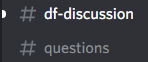
There is a very clear visual difference between grey and white text for the whole channel name.
 Sancus
on 15 Jul 2020
Sancus
on 15 Jul 2020
I've always struggled with it in Riot, but was generally able to at least tell the difference. I honestly can't anymore. I didn't even notice the grey dot, but it gets lost among all the other things that can be in that right hand column. Can we at least get a setting somewhere for making the contrast muuuuch easier. It'd also be nice if the room list order didn't jump around constantly (this isn't the "always show new activity first" thing - sometimes just clicking around on already-read rooms causes the order to jump around).
 jonkloske
on 16 Jul 2020
jonkloske
on 16 Jul 2020
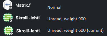
Here's sample of what it looks like, I tried font-weight: 900 and it's better.
maakuth
on 16 Jul 2020
We believe we've fixed this - if it continues to be a problem, please open a new issue.
 turt2live
on 20 Jul 2020
turt2live
on 20 Jul 2020
Related issues
 lampholder
·
3Comments
lampholder
·
3Comments
 arthurlutz
·
3Comments
arthurlutz
·
3Comments
 ara4n
·
3Comments
ara4n
·
3Comments
 richvdh
·
3Comments
richvdh
·
3Comments
 n-o-o-b
·
3Comments
n-o-o-b
·
3Comments
Most helpful comment
Yeah, this is pretty bad now. I feel like using font-weight in general for this isn't the greatest. For example here is the distinction between unread and read in Discord's dark mode:
There is a very clear visual difference between grey and white text for the whole channel name.