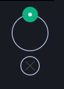
Element-web: new X button to dismiss read marker is hard to see on dark theme
the circle is fine, but the 'X' is a darker grey that isn't as visible
 uhoreg
All 7 comments
 aaronraimist
on 7 Mar 2020
aaronraimist
on 7 Mar 2020
The top circle was never that bad :(
 turt2live
on 7 Mar 2020
turt2live
on 7 Mar 2020

This is what I see.
 anoadragon453
on 7 Mar 2020
anoadragon453
on 7 Mar 2020
@aaronraimist Are you using a non-standard theme? If so, maybe we need a new class for the top-arrow button.
anoadragon453
on 7 Mar 2020
if it is a custom theme, a new issue would be best. We're trying to avoid having a thousand classes/variables though.
turt2live
on 7 Mar 2020
No that is the standard dark theme. The missing arrow from the top circle is not 100% reproducible. Sometimes it is there, sometimes it loads in after a few seconds, sometimes it never loads and can only be fixed by a page refresh. I was actually just trying to show how the bottom button was hard to see. The arrow being gone from the top circle has happened to me for a while, not a super recent regression.
aaronraimist
on 8 Mar 2020
Let's focus this issue on just the bottom X then and track the rest separately.
 jryans
on 9 Mar 2020
jryans
on 9 Mar 2020
Related issues
 richvdh
·
3Comments
richvdh
·
3Comments
 lukebarnard1
·
3Comments
lukebarnard1
·
3Comments
 lampholder
·
3Comments
lampholder
·
3Comments
 nvbln
·
3Comments
turt2live
·
3Comments
nvbln
·
3Comments
turt2live
·
3Comments
Most helpful comment
Let's focus this issue on just the bottom X then and track the rest separately.