Element-web: Adjust reactions tooltip safe mousing area
 turt2live
All 12 comments
Ah yeah, maybe we do need to tweak the "safe mousing area" once the tooltip opens so that doesn't cover the other actions at all...
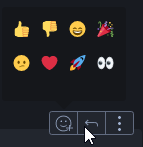
At the moment, it is nice that it's easy to enter the tooltip even if you make a diagonal motion which might cross over the neighbouring button (reply in the screenshot above).
@turt2live As a user, was it confusing?
 jryans
on 27 Jun 2019
jryans
on 27 Jun 2019
It was very confusing for the person who received my message. I clicked, typed a reply, and was surprised when the message wasn't a reply. Took a bit to figure out why my click didn't work
turt2live
on 27 Jun 2019
@nadonomy Any thoughts from the design side? How does this aspect of the tooltip feel to you?
Should we change to ensure every pixel of neighbouring buttons will perform the button's action even if that makes the tooltip a bit harder to reach?
jryans
on 27 Jun 2019
Should we change to ensure every pixel of neighbouring buttons will perform the button's action even if that makes the tooltip a bit harder to reach?
Yeah I think so. I just moused around the action bar for a bit and we almost want some kind of diagonal safe area to the tooltip, although I appreciate that'll be a PITA to implement.
I'm not sure of the mechanics we're using to ensure we don't dismiss the tooltip, but perhaps it needs tweaking a bit to be less aggressive?
 nadonomy
on 27 Jun 2019
nadonomy
on 27 Jun 2019
I'm not sure of the mechanics we're using to ensure we don't dismiss the tooltip, but perhaps it needs tweaking a bit to be less aggressive?
At the moment, we're drawing a 10px safe area in all directions around both the button and the tooltip as a crude attempt.
Let's start by removing the safe area around the button (which will fix this issue) and see how that feels. If the tooltip closes too easily, we can try something more sophisticated like a diagonal safe area.
jryans
on 27 Jun 2019
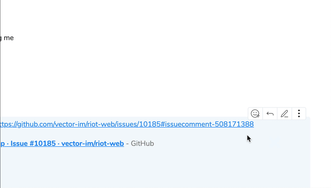
@jryans Sorry to report after dogfooding this more I lose/dismiss the tooltip frequently (roughly 1 in every 3-4 times I interact with reactions). 😞
Based on your last comment it looks like we removed the safe area altogether? Is it simpler than diving into diagonal territory to only have the safe area for the top and left sides, to have the effect of the button to the right (reply) occlude it? Or to have a huge 'safe area' and be smarter about using z index?
Edit: To be specific, here's how I end up accidentally dismissing the tooltip most of the time:
nadonomy
on 3 Jul 2019
No changes have been made to the safe area yet, so it's still 10px in all directions from the button and from the tooltip.
We did tweak some behaviour recently around a full screen background that was blocking the rest of the UI, so it's possible we were inadvertently relying on that somehow.
I think if we tweak the safe area to be diagonal, it would fix the case you recorded above.
jryans
on 3 Jul 2019
I think if we tweak the safe area to be diagonal, it would fix the case you recorded above.
Fwiw, I think this is absolutely the most ideal solution (like https://bjk5.com/post/44698559168/breaking-down-amazons-mega-dropdown), but just can't speak to the complexity involved with implementing it.
nadonomy
on 3 Jul 2019
i am hitting nad's behaviour too day-to-day, ftr. think it needs a bigger hitmask at the bottom when the overlay is present.
 ara4n
on 3 Jul 2019
ara4n
on 3 Jul 2019
For now I don't think we need to block phase 2 on this, but let's treat it as the first thing to pull in phase 3.
jryans
on 4 Jul 2019
Here's yet another post on this subject: https://css-tricks.com/menus-with-dynamic-hit-areas/
jryans
on 4 Jul 2019
Here's yet another post on this subject: https://css-tricks.com/menus-with-dynamic-hit-areas/
Having just played with the demo (https://slides.com/wireframe?debug=2#menu) this is awesome.
nadonomy
on 4 Jul 2019
Related issues
 anoadragon453
·
3Comments
turt2live
·
3Comments
turt2live
·
3Comments
ara4n
·
3Comments
ara4n
·
3Comments
anoadragon453
·
3Comments
turt2live
·
3Comments
turt2live
·
3Comments
ara4n
·
3Comments
ara4n
·
3Comments