This issue thread has been created for collecting / catalog general UX issues and enhancements -- things that aren't necessarily broken but could work a bit better.
Here is a somewhat comprehensive list of issues added to date. Updated 11/19/2017.
Untracked issues:
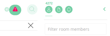
- [ ] Many icons are repeated for different purposes, like the Start Chat and the icon below the number of users https://github.com/vector-im/riot-web/issues/2984#issuecomment-273549897
- [ ] Many icons do not have hints when the mouse is over them https://github.com/vector-im/riot-web/issues/2984#issuecomment-273549967
- [ ] When previewing an image I expect that the preview closes after clicking on the dark area https://github.com/vector-im/riot-web/issues/2984#issuecomment-273550007
- [x] It could be better to have an arrow to collapse the right sidebar instead of clicking on the person icon, to be consistent with the left sidebar https://github.com/vector-im/riot-web/issues/2984#issuecomment-273550151
- [ ] One minor thing that's been mildly annoying me is how some UI elements in end-to-end encrypted rooms don't obey the room's Tinting. The green padlocks will stay green even if I set the room's color to Blue in settings, which just feels wrong... https://github.com/vector-im/riot-web/issues/2984#issuecomment-273730267
- [ ] UX I would find super handy: being able to swipe left to right from within a convo to go back to my convo list. I constantly try to do it and it just highlights whatever message I'm swiping over. https://github.com/vector-im/riot-web/issues/2984#issuecomment-273900152
- [ ] I find the bot messages to be difficult to read if I have some distance between my head and the screen as the screen is bright and Riot is light and I am supposed to read gray text against white background which might be doable when there isn't so much text, but when all room activity is bots (RSS) integration it gets difficult. https://github.com/vector-im/riot-web/issues/2984#issuecomment-274257686
- [ ] We should have a stronger contrast on color pallette, like level 700 in material design guidelines. The lines in the icons should be also bolder. https://github.com/vector-im/riot-web/issues/2984#issuecomment-274257983
- [ ] Sender text should be bold and optionally colored, not grayed out. https://github.com/vector-im/riot-web/issues/2984#issuecomment-274257983
- [ ] The margin between messages is too big, and we should use some line/color elements to make it smaller. https://github.com/vector-im/riot-web/issues/2984#issuecomment-274257983
- [ ] The default light color scheme is uncomfortable to use on my laptop with a TN screen. The contrast between the colors in the color scheme is low enough that the bad viewing angles of the TN panel makes the colors sort of vary uncomfortably when looking at the screen from slightly different angles (vertically). https://github.com/vector-im/riot-web/issues/2984#issuecomment-274262080
- [ ] Most IRC clients can be operated solely with the keyboard, most web-based chat systems can be operated largely with the keyboard. It would be nice if Riot supported some baseline keyboard behaviour https://github.com/vector-im/riot-web/issues/2984#issuecomment-274275276
- [ ] Determine which general features should be made available for E2E chat, which should be optional, and which should be banned. https://github.com/vector-im/riot-web/issues/2984#issuecomment-274594540
- [ ] Add badge or naming convention to identify bots and distinguish them from human chat participants https://github.com/vector-im/riot-web/issues/2984#issuecomment-274615634
- [ ] No save button in Riot browser settings (fe. when changing nickname) https://vector.im/develop/#/settings - User has to click Enter, unintuitive. https://github.com/vector-im/riot-web/issues/2984#issuecomment-277786769
- [ ] Riot Android defaults to notifying of every message in chatrooms, which results in loads of notifications. - Should notify only at mentions. https://github.com/vector-im/riot-web/issues/2984#issuecomment-277786769 https://github.com/vector-im/riot-web/issues/2984#issuecomment-280089178
- [ ] When catching up with conversation (group, but probably all of them) in Riot Android ie. reading old comments, because people write so fast, when you switch to another chat (because someone sent something important) and the back to where you were, you're on the bottom of the conversation instead of where you were before, you have to scroll all the way up in search of that sentence. - This is a default for Whatsapp, but I think it shouldn't be as it's easy to scroll down (or tap a scroll all the way to the bottom button). https://github.com/vector-im/riot-web/issues/2984#issuecomment-277786769
- [ ] The plus button in Riot Android opens a menu where you choose whether to start chat or create room. I think it should open the 'start chat' view /with/ an option in there to create a room. - Requires unnecessary additional tap. https://github.com/vector-im/riot-web/issues/2984#issuecomment-277786769
- [ ] The view after you tap the search button in Riot Android shows a Rooms pane inside of which is a Browse directory button. When you search for something, it doesn't show the results instantly, but you have to tap that button. The button seems to be not needed at all. A proposed solution: after going to the search view (nothing typed in), in Rooms pane show the rooms directory (alternatively show recently used rooms and a Browse directory button above, but this probably is a less ideal solution, as they are visible in the main view too (unless there are a lot of 1:1 convos) - think it through), consider showing contacts in the People pane, last files in Files pane and latest messages in Messages pane. When you type in something (search) - show the search results immediately with no additional tap required. https://github.com/vector-im/riot-web/issues/2984#issuecomment-277786769
- [ ] I tested SIP with a friend once. She told me that Whatsapp didn't disconnect on network change (mobile to home wifi). I don't know if this is the case with Riot, but mention anyway. https://github.com/vector-im/riot-web/issues/2984#issuecomment-277786769
- [x] 1:1 conversations are together with group conversations/rooms in the main view of Riot Android. This may be messy. The irc-like group conversations aren't important for people, ie. they don't need them easily-accessible when they are on the go for example, they are something used when you have time for casual conversation with mostly strangers. The situation is different with 1:1 and group chats between friends/contacts (you know, group chats as present in Facebook Messenger, Whatsapp etc.) You want them accessible instantly after opening the app and right now, you will see all the public irc-like rooms (unless they are completely dead) at the top of the screen and the private conversations at the bottom. // This also makes it seem that the app is intended to be used like an IRC client and 1:1 chats are an additive like pms on irc. - Solution: Whatsapp and Messenger do it using panes, one for Calls, one for Chats, one for Contacts. Here it would be one for private conversations, one for public rooms. Think about it. https://github.com/vector-im/riot-web/issues/2984#issuecomment-277786769
- [ ] I'm not sure what are the goals of Riot. The immediate impression is that it's a Slack competitor, an app designed for public conversations in IRC manner, something for collaboration. The slogans on riot.im also indicate that, while my impression from the conversations on #Riot room was that there is some desire to hit the masses, nontechnical people and 1:1 conversations. And the mission described in Matrix FAQ mentions interoperability with existing networks. Well, this won't hit the masses if it's going to be this way. This project has huge momentum and that could be put to good use. Even me, a technical person deep in this stuff, created an account half a year ago and immediately ignored the platform because of the impression that this isn't really what I'm looking for - a second generation messenger (think Whatsapp), but free software and secure. https://github.com/vector-im/riot-web/issues/2984#issuecomment-277786769
- [ ] If you want to appeal to the masses, I think there should be some major UI changes and even website changes (it mentions things like bridge networks or work collaboration). Although maybe this is directed more at where the money is - corporations (similarly to Ring or Jitsi) in which case the UI goals would be different and the name and design choices would be rather strange. I'm willing to discuss this in more detail with others. https://github.com/vector-im/riot-web/issues/2984#issuecomment-277786769
- [x] There should a an all black theme, not just dark grey (probably best to push it along with the dark grey). - On (AM)OLED screens it uses much less battery and produces much less light which is beneficial for eyes. On all screens, produces less light and is good to use at night, especially in rooms with other people sleeping. https://github.com/vector-im/riot-web/issues/2984#issuecomment-277786769
- [x] Create a new account button on https://riot.im/app/#/login is small, hard to find. Consider either making it bigger or putting it on a similar background as the Sign in button. https://github.com/vector-im/riot-web/issues/2984#issuecomment-277968932
- [ ] When you create an account and then change your nickname, you can't sign in with your new nickname, but only with the old one. This is because you can't change your login, the old login is still visible when you enter a room. Consider making nickname and login equal? Hide the login and only show the nickname? Hide the server data (is this needed?)? https://github.com/vector-im/riot-web/issues/2984#issuecomment-277968932
- [x] Riot browser. When in conversation view, timestamps when the messages were sent aren't visible unless cursor is hovered over the message. This provides a minimalistic trendy design, but is not functional, not ergonomic. Therefor this can stay. Although another thing is pretty bad, when you hover over the timestamp you should see the complete date (day, month, year, hour, minutes, seconds), but this doesn't happen. https://github.com/vector-im/riot-web/issues/2984#issuecomment-277968932
- [ ] When you join a private 1:1 conversation, it's called a room, which is very misleading for anyone that never used IRC and a pretty misleading for those who did. If this is meant to be used as a normal consumer messenger, this has to be changed. Also, think about changing private conferences name 'room' to 'group chat' or whatever name proprietary messengers use. https://github.com/vector-im/riot-web/issues/2984#issuecomment-277968932
- [ ] Riot Android. When in conversation view, when you tap a message it get highlighted. I consider this an over-engineered, useless feature. You tap stuff by accident, especially when you're scrolling, when you do, you get annoyed, because you have to tap again to un-highlight. This doesn't provide any usability, as the screen is small and letters are big anyway, you can read the message no problem and you won't have to search for a sentence (like in a book for example) because there's only several on the screen. https://github.com/vector-im/riot-web/issues/2984#issuecomment-277968932
- [ ] Consider adding a Whatsapp like message status inficators - sent, received, read. Right now only read status is obvious, sent is provided (the message turns black). https://github.com/vector-im/riot-web/issues/2984#issuecomment-277968932
- [ ] Avatars of both you and the person whom you're talking with are on the left instead of how it is elsewhere, you on the right, he/she on the left. https://github.com/vector-im/riot-web/issues/2984#issuecomment-277968932
- [ ] Lots of technical chatter in the application, fe. "user turned on end-to-end encryption (algorithm m.megolm.v1.aes-sha2)" (the cipher used will scare the user, show it when hovering or don't show at all?); "user (@user:matrix.org) joined the room" (while user (or user:matrix.org) joined the room would be enough. BTW user:matrix.org is not standard like [email protected] is, but the latter is taken as an email address by a normal person, which is not ideal either. Some brainstorming needed on this issue? https://github.com/vector-im/riot-web/issues/2984#issuecomment-277968932
- [ ] Riot browser. Couldn't all of the settings be fit on one screen without need for scrolling? https://github.com/vector-im/riot-web/issues/2984#issuecomment-277968932
- [ ] Riot Settings. Consider hiding advanced settings like Device list, Cryptography stuff, Server data, Sync request timeout and delay, Version of the application, TOS etc. This could be accessible by additional button "Advanced settings" and only the absolutely necessary stuff be left in normal Settings. https://github.com/vector-im/riot-web/issues/2984#issuecomment-277968932
- [ ] Riot browser settings view. Remove the change password boxes from there, waste of space. Leave just the Change password button that will open another window containing these boxes. Change "Messages containing keywords" to Mentions/When mentioned, something like this throughout the platform. Delete this: "Advanced notifications settings There are advanced notifications which are not shown here. You might have configured them in a client other than Riot. You cannot tune them in Riot but they still apply.", you don't want to see settings of other apps in another app, you can access them in the respective app. https://github.com/vector-im/riot-web/issues/2984#issuecomment-277968932
- [ ] Riot browser. Too many buttons, too much possible tinkering, people don't like tinkering, they want it to just work. There's a button to hide room's user list, to hide rooms list, to show them. // This is useful for the desktop app though, you can put it on the left side of the screen, hide both lists and there's lots of space for messages. A good solution would be to make best default settings for different resolutions and window positions. https://github.com/vector-im/riot-web/issues/2984#issuecomment-277968932
- [ ] Riot browser dark theme. Manage integrations view of the room, letters are not visible. The X button is not visible. https://github.com/vector-im/riot-web/issues/2984#issuecomment-277968932
- [ ] Riot browser room settings. Options you can't change are visible, maybe hide them a bit instead of showing them on the top? Hide Local addresses for this room and Remote addresses for this room parts of the view. Two options for the same setting: Enable URL previews for this room (affects only you) and Disable URL previews for this room (affects only you) - there should be one setting for this. Hide Addresses, Privileged users, Banned Users, Advanced settings and Permissions. https://github.com/vector-im/riot-web/issues/2984#issuecomment-277968932
- [ ] Riot browser. Full room description is not visible when it's long. Clicking on the room's name shows settings, doesn't show the description. // Hovering shows full description. A good alternative would be to instantly expand the top bar when hovering and show full description. This would look better and would be more intuitive. https://github.com/vector-im/riot-web/issues/2984#issuecomment-277968932
- [ ] Riot browser and desktop. If the left pane, list of rooms is hidden, highlight rooms with unread messages. Don't highlight chatter (user joined etc.) https://github.com/vector-im/riot-web/issues/2984#issuecomment-277968932
- [ ] Riot browser and desktop. Room directory. When you type in something to search and hit enter, it doesn't show the results, but opens the room, even if it doesn't exist. It's not really intuitive. It should show the results and allow to choose the result. An option to direct joining a room could be provided if you type in the full address #room:server. https://github.com/vector-im/riot-web/issues/2984#issuecomment-277968932
- [ ] View already verified keys https://github.com/vector-im/riot-web/issues/2984#issuecomment-280486843
- [ ] High contrast icon: https://github.com/taw00/riot-rpm/tree/master/source-riot-extras-desktop/riot-extras-desktop/extras https://github.com/vector-im/riot-web/issues/2984#issuecomment-282020905
- [ ] Add ability to mark messages unread #4406
- [ ] Panel open/closedness could persist over refreshing the app
Tracked issues:
- [ ] Implement Sticker Packs #2950
- [ ] Better user interface for screen readers and keyboard navigation #2946
- [ ] Make it easier to get people chatting: import data files #3076
- [ ] Proper UI for creating custom room tags #1373
- [ ] UI for expiring old megolm sessions that we no longer care about #3152
- [ ] User Settings refinements #660
- [ ] Make middlepanel width optionally customisable #1371
- [x] UI buttons on right-hand panel are mis-aligned #3171
- [x] invite UI has become incredibly slow #3204
- [x] invite UI doesn't search displayname #3205
- [ ] UI to show whether rooms are public or not #3206
- [x] Improve Visibility of Encryption "Lock" Icons #3317
- [ ] dashboard for scalar integ status in usersettings #3319
- [ ] add UI for setting HTTP proxy to desktop app #3320
- [x] Room directory icon is not discoverable enough #2955
- [x] Please add support for linking to a room (for new people to join it) #3341
- [x] Show more clearly when sending non E2E encrypted message #2850
- [x] "R" logo when searching for users is ugly #2934
- [x] Option to autoplay animated GIFs #2433
- [ ] link to community-written guides somewhere #3308
- [x] Replace the icons with Google Material Design Icons #3372
- [ ] Community UX feedback from GNOME devel land (metabug) #3373
- [x] Compact layout mode for power-users (less vertical whitespace) #109
- [ ] Optionally include higher contrast colour scheme #2300
- [ ] Start Chat and Invite dialog boxes should make it clear what a Matrix ID looks like #3533
- [ ] Feature request: person icon in "people" room should change color based on presence #4199
 tessgadwa
All 112 comments
Many icons are repeated for different purposes, like the Start Chat and the icon below the number of users
 youcha33
on 18 Jan 2017
youcha33
on 18 Jan 2017
Many icons do not have hints when the mouse is over them
youcha33
on 18 Jan 2017
When previewing an image I expect that the preview closes after clicking on the dark area
youcha33
on 18 Jan 2017
It could be better to have an arrow to collapse the right sidebar instead of clicking on the person icon, to be consistent with the left sidebar
youcha33
on 18 Jan 2017
Having hitlists like this are really useful (although some of these are duplicates of other issues in the enormous bugtracker) - thanks. please keep them coming :) It may be worth including checkboxes on the issues so they can be checked off when resolved, e.g.:
* [ ] Like this
=>
- [ ] Like this
 ara4n
on 18 Jan 2017
ara4n
on 18 Jan 2017
Thanks, I was thinking it might be helpful as a way to separate out UX issues from the whole pool of everything else that's in motion. Some redundancy is probably unavoidable, but the goal is to have a big bucket that's easy to find.
- [x] Comment created
- [x] With checklists!
tessgadwa
on 18 Jan 2017
yay! for finding existing ui/ux bugs in github, you'd look & search within labels; specifically: https://github.com/vector-im/riot-web/labels/cosmetic and https://github.com/vector-im/riot-web/labels/ui%2fux. However, there are a few hundred at least, so in practice I'd suggest just jotting down quick wins as you see them here, and I can worry about reconciling them with the main bugtracker. It's better to have dups than none!
ara4n
on 18 Jan 2017
agree -- I did a quick search before creating the issue, will look through those labels as well
tessgadwa
on 18 Jan 2017
One minor thing that's been mildly annoying me is how some UI elements in end-to-end encrypted rooms don't obey the room's Tinting. The green padlocks will stay green even if I set the room's color to Blue in settings, which just feels wrong...
https://matrix.to/#/!blHeuKmYNNfIqDlWGO:matrix.org/$14847994894067xhrhG:atauno.com
tessgadwa
on 19 Jan 2017
Implement Sticker Packs #2950
tessgadwa
on 19 Jan 2017
UX I would find super handy: being able to swipe left to right from within a convo to go back to my convo list. I constantly try to do it and it just highlights whatever message I'm swiping over.
Submitted from designUX
tessgadwa
on 19 Jan 2017
I find the bot messages to be difficult to read if I have some distance between my head and the screen as the screen is bright and Riot is light and I am supposed to read gray text against white background which might be doable when there isn't so much text, but when all room activity is bots (RSS) integration it gets difficult.
I think this might also be an accessibility issue and I hope the dark theme will fix it.
 Mikaela
on 21 Jan 2017
Mikaela
on 21 Jan 2017
We should have a stronger contrast on color pallette, like level 700 in material design guidelines. The lines in the icons should be also bolder.
Sender text should be bold and optionally colored, not grayed out.
The margin between messages is too big, and we should use some line/color elements to make it smaller.
 ishitatsuyuki
on 21 Jan 2017
ishitatsuyuki
on 21 Jan 2017
The default light color scheme is uncomfortable to use on my laptop with a TN screen. The contrast between the colors in the color scheme is low enough that the bad viewing angles of the TN panel makes the colors sort of vary uncomfortably when looking at the screen from slightly different angles (vertically).
Now it is of course known that TN panels are crap (and I'm waiting for my IPS panel to arrive in the mail) but I still think it's important for the UI to feel nice to use even on a low-quality screen 😃
 vurpo
on 21 Jan 2017
vurpo
on 21 Jan 2017
Most IRC clients can be operated solely with the keyboard, most web-based chat systems can be operated largely with the keyboard. It would be nice if Riot supported some baseline keyboard behaviour here too:
- Switch to a specific room/person by name.
- Switch to a room/person by some relative positioning (the last room/person, the room below the currently selected one, etc.)
- Go to the next room/person with activity (prioritising mentions/keywords over general activity, maybe prioritising people over rooms)
 jonathanj
on 21 Jan 2017
jonathanj
on 21 Jan 2017
Determine which general features should be made available for E2E chat, which should be optional, and which should be banned. Currently unavailable features:
- searching
- notifications on mentions
- listing uploaded files
- bots
- bridges
- voice/video conferences
- URL previews should not be available (by default), but currently are
Searching and listing uploaded files is being worked on by doing it client-side. Bots and bridges could be done in theory, but may not be a good idea depending on your level of paranoia.
tessgadwa
on 23 Jan 2017
- [ ] Add badge or naming convention to identify bots and distinguish them from human chat participants
tessgadwa
on 23 Jan 2017
Better user interface for screen readers and keyboard navigation #2946
tessgadwa
on 24 Jan 2017
Thanks for the dark theme on develop ... it's already quite usable and was able to build the electron version locally after building in node_modules/matrix-js-sdk and node_modules/matrix-react-sdk
 bdefore
on 25 Jan 2017
bdefore
on 25 Jan 2017
Make it easier to get people chatting: import data files #3076
tessgadwa
on 27 Jan 2017
If checklists work in gists, maybe this list could be externally managed there? @tessgadwa
 madduck
on 27 Jan 2017
madduck
on 27 Jan 2017
Gists look really good, but is there a way to tie them to a specific
repository?
On Jan 27, 2017 12:51 AM, "martin f. krafft" notifications@github.com
wrote:
If checklists work in gists, maybe this list could be externally managed
there? @tessgadwa https://github.com/tessgadwa—
You are receiving this because you were mentioned.
Reply to this email directly, view it on GitHub
https://github.com/vector-im/riot-web/issues/2984#issuecomment-275616758,
or mute the thread
https://github.com/notifications/unsubscribe-auth/AGLNGxUPaQEskqzWQelFg9LRTMyO8ytPks5rWbAigaJpZM4LnMQr
.
tessgadwa
on 27 Jan 2017
@madduck checklists do work on gists, for future ref
tessgadwa
on 27 Jan 2017
Proper UI for creating custom room tags ( ##1373)
tessgadwa
on 6 Feb 2017
UI for expiring old megolm sessions that we no longer care about ( #3152 )
tessgadwa
on 6 Feb 2017
User Settings refinements (#660)
Subset issue #1371 requested attention by Andrew G. Dunn
Would very much like to request #1371 get attention, lots of screen not being used right now.
tessgadwa
on 6 Feb 2017
A lot of the Riot browser stuff will also apply to Riot desktop, same with Android and iOS.
There's also this, created by someone on #riot:matrix.org: https://alpha.cryptpad.fr/pad/#/1/edit/d6tzfEh8ibQSKl1tikRwFA/93J48EkJwIT1HJ9vanXzfbNB
[ ] No save button in Riot browser settings (fe. when changing nickname) https://vector.im/develop/#/settings - User has to click Enter, unintuitive.
[ ] Riot Android defaults to notifying of every message in chatrooms, which results in loads of notifications. - Should notify only at mentions.
- [ ] When catching up with conversation (group, but probably all of them) in Riot Android ie. reading old comments, because people write so fast, when you switch to another chat (because someone sent something important) and the back to where you were, you're on the bottom of the conversation instead of where you were before, you have to scroll all the way up in search of that sentence. - This is a default for Whatsapp, but I think it shouldn't be as it's easy to scroll down (or tap a scroll all the way to the bottom button).
[ ] The plus button in Riot Android opens a menu where you choose whether to start chat or create room. I think it should open the 'start chat' view /with/ an option in there to create a room. - Requires unnecessary additional tap.
[ ] The view after you tap the search button in Riot Android shows a Rooms pane inside of which is a Browse directory button. When you search for something, it doesn't show the results instantly, but you have to tap that button. The button seems to be not needed at all. A proposed solution: after going to the search view (nothing typed in), in Rooms pane show the rooms directory (alternatively show recently used rooms and a Browse directory button above, but this probably is a less ideal solution, as they are visible in the main view too (unless there are a lot of 1:1 convos) - think it through), consider showing contacts in the People pane, last files in Files pane and latest messages in Messages pane. When you type in something (search) - show the search results immediately with no additional tap required.
[ ] I tested SIP with a friend once. She told me that Whatsapp didn't disconnect on network change (mobile to home wifi). I don't know if this is the case with Riot, but mention anyway.
[ ] 1:1 conversations are together with group conversations/rooms in the main view of Riot Android. This may be messy. The irc-like group conversations aren't important for people, ie. they don't need them easily-accessible when they are on the go for example, they are something used when you have time for casual conversation with mostly strangers. The situation is different with 1:1 and group chats between friends/contacts (you know, group chats as present in Facebook Messenger, Whatsapp etc.) You want them accessible instantly after opening the app and right now, you will see all the public irc-like rooms (unless they are completely dead) at the top of the screen and the private conversations at the bottom. // This also makes it seem that the app is intended to be used like an IRC client and 1:1 chats are an additive like pms on irc. - Solution: Whatsapp and Messenger do it using panes, one for Calls, one for Chats, one for Contacts. Here it would be one for private conversations, one for public rooms. Think about it.
[ ] I'm not sure what are the goals of Riot. The immediate impression is that it's a Slack competitor, an app designed for public conversations in IRC manner, something for collaboration. The slogans on riot.im also indicate that, while my impression from the conversations on #Riot room was that there is some desire to hit the masses, nontechnical people and 1:1 conversations. And the mission described in Matrix FAQ mentions interoperability with existing networks. Well, this won't hit the masses if it's going to be this way. This project has huge momentum and that could be put to good use. Even me, a technical person deep in this stuff, created an account half a year ago and immediately ignored the platform because of the impression that this isn't really what I'm looking for - a second generation messenger (think Whatsapp), but free software and secure.
If you want to appeal to the masses, I think there should be some major UI changes and even website changes (it mentions things like bridge networks or work collaboration). Although maybe this is directed more at where the money is - corporations (similarly to Ring or Jitsi) in which case the UI goals would be different and the name and design choices would be rather strange. I'm willing to discuss this in more detail with others.[ ] There should a an all black theme, not just dark grey (probably best to push it along with the dark grey). - On (AM)OLED screens it uses much less battery and produces much less light which is beneficial for eyes. On all screens, produces less light and is good to use at night, especially in rooms with other people sleeping.
 cloudyfuel
on 6 Feb 2017
cloudyfuel
on 6 Feb 2017
[ ] Create a new account button on https://riot.im/app/#/login is small, hard to find. Consider either making it bigger or putting it on a similar background as the Sign in button.
[ ] When you create an account and then change your nickname, you can't sign in with your new nickname, but only with the old one. This is because you can't change your login, the old login is still visible when you enter a room. Consider making nickname and login equal? Hide the login and only show the nickname? Hide the server data (is this needed?)?
[ ] Riot browser. When in conversation view, timestamps when the messages were sent aren't visible unless cursor is hovered over the message. This provides a minimalistic trendy design, but is not functional, not ergonomic. Therefor this can stay. Although another thing is pretty bad, when you hover over the timestamp you should see the complete date (day, month, year, hour, minutes, seconds), but this doesn't happen.
[ ] When you join a private 1:1 conversation, it's called a room, which is very misleading for anyone that never used IRC and a pretty misleading for those who did. If this is meant to be used as a normal consumer messenger, this has to be changed. Also, think about changing private conferences name 'room' to 'group chat' or whatever name proprietary messengers use.
[ ] Riot Android. When in conversation view, when you tap a message it get highlighted. I consider this an over-engineered, useless feature. You tap stuff by accident, especially when you're scrolling, when you do, you get annoyed, because you have to tap again to un-highlight. This doesn't provide any usability, as the screen is small and letters are big anyway, you can read the message no problem and you won't have to search for a sentence (like in a book for example) because there's only several on the screen.
[ ] Consider adding a Whatsapp like message status inficators - sent, received, read. Right now only read status is obvious, sent is provided (the message turns black).
[ ] Avatars of both you and the person whom you're talking with are on the left instead of how it is elsewhere, you on the right, he/she on the left.
[ ] Lots of technical chatter in the application, fe. "user turned on end-to-end encryption (algorithm m.megolm.v1.aes-sha2)" (the cipher used will scare the user, show it when hovering or don't show at all?); "user (@user:matrix.org) joined the room" (while user (or user:matrix.org) joined the room would be enough. BTW user:matrix.org is not standard like [email protected] is, but the latter is taken as an email address by a normal person, which is not ideal either. Some brainstorming needed on this issue?
[ ] Riot browser. Couldn't all of the settings be fit on one screen without need for scrolling?
[ ] Riot Settings. Consider hiding advanced settings like Device list, Cryptography stuff, Server data, Sync request timeout and delay, Version of the application, TOS etc. This could be accessible by additional button "Advanced settings" and only the absolutely necessary stuff be left in normal Settings.
[ ] Riot browser settings view. Remove the change password boxes from there, waste of space. Leave just the Change password button that will open another window containing these boxes. Change "Messages containing keywords" to Mentions/When mentioned, something like this throughout the platform. Delete this: "Advanced notifications settings There are advanced notifications which are not shown here. You might have configured them in a client other than Riot. You cannot tune them in Riot but they still apply.", you don't want to see settings of other apps in another app, you can access them in the respective app.
[ ] Riot browser. Too many buttons, too much possible tinkering, people don't like tinkering, they want it to just work. There's a button to hide room's user list, to hide rooms list, to show them. // This is useful for the desktop app though, you can put it on the left side of the screen, hide both lists and there's lots of space for messages. A good solution would be to make best default settings for different resolutions and window positions.
[ ] Riot browser dark theme. Manage integrations view of the room, letters are not visible. The X button is not visible.
[ ] Riot browser room settings. Options you can't change are visible, maybe hide them a bit instead of showing them on the top? Hide Local addresses for this room and Remote addresses for this room parts of the view. Two options for the same setting: Enable URL previews for this room (affects only you) and Disable URL previews for this room (affects only you) - there should be one setting for this. Hide Addresses, Privileged users, Banned Users, Advanced settings and Permissions.
[ ] Riot browser. Full room description is not visible when it's long. Clicking on the room's name shows settings, doesn't show the description. // Hovering shows full description. A good alternative would be to instantly expand the top bar when hovering and show full description. This would look better and would be more intuitive.
[ ] Riot browser and desktop. If the left pane, list of rooms is hidden, highlight rooms with unread messages. Don't highlight chatter (user joined etc.)
[ ] Riot browser and desktop. Room directory. When you type in something to search and hit enter, it doesn't show the results, but opens the room, even if it doesn't exist. It's not really intuitive. It should show the results and allow to choose the result. An option to direct joining a room could be provided if you type in the full address #room:server.
cloudyfuel
on 7 Feb 2017
UI buttons on right-hand panel are mis-aligned #3171
Description
Describe here the problem that you are experiencing, or the feature you are requesting.
UI buttons on right-hand panel are mis-aligned
Steps to reproduce
screencapture-riot-im-develop-1486561032025
Version information
Platform: web
Browser: Chrome
OS: Ubuntu
URL: riot.im/develop
tessgadwa
on 8 Feb 2017
- [ ] invite UI has become incredibly slow (#3204)
tessgadwa
on 10 Feb 2017
- [ ] invite UI doesn't search displayname #3205
tessgadwa
on 10 Feb 2017
- [ ] UI to show whether rooms are public or not #3206
tessgadwa
on 10 Feb 2017
About this:
- [ ] Riot Android defaults to notifying of every message in chatrooms, which results in loads of notifications. - Should notify only at mentions.
Although almost all of my users complains about the amount of notifications they receive, leading in them uninstalling the app altogether 😞. I think the user should still be in control of which notifications they want for their rooms. I don't think forcing to "mention only" is the way to go.
From my experience, the problem is that once there's some activity in a room, there are a few messages that will follow, either by other users or by the same user continuing its message.
I propose a simple simple solution: when a message is received in a room, pop a notification and set a timeout of 5 minutes until another notification can pop again. This is per room, so if there's someone talking in another room before the 5 minutes timeout, the user is still notified that there is activity in another room.
Edit:
It would also be nice to differentiate desktop and mobile notifications in your account settings. Maybe just a simple option like "On mobile, notify only for mentions".
 MightyCreak
on 15 Feb 2017
MightyCreak
on 15 Feb 2017
MightyCreak this seems like a good solution to me.
tessgadwa
on 15 Feb 2017
Obviously, the 5 minutes should be configured, and I'd actually prefer a different solution: pop up a notification only once per room until the room is visited. There is little point in receiving more notifications when one already knows that a room has activity and should be visited.
madduck
on 16 Feb 2017
@madduck I see one important point: you couldn't hear your phone when the notification arrived. Having another notification after 5 minutes if there is still some activity, is a nice compromise I think.
And I am not fond of having options for each and every settings. When an application is well balanced, it doesn't need to go that far into its configuration. And especially since Riot and Matrix is open source, there is no need to please each and everyone with an endless list of configuration options: there will be several clients for all sort of usage, I'm sure of it.
MightyCreak
on 16 Feb 2017
@MightyCreak the functionality to re-remind you is something your phone should do, it should not depend on further activity.
Options are great and increase the set of potential adopters. They need not all be exposed to every user I agree, but they make the software more flexible and thus more applicable to more people.
madduck
on 16 Feb 2017
the functionality to re-remind you is something your phone should do, it should not depend on further activity
I agree. I wonder if Android already does that actually 🤔
MightyCreak
on 16 Feb 2017
View already verified keys
My god this is frustrating, whenever someone in a room of 3+ people ask me IRL "Hey, can you check what keys X-user have?".. I have to say no..
Or I gotta press "Unverify" and then "Verify" again to get up each device-key for a particular user.. And by then I don't know that the key I just got up is the same I had verified before..
"Pressing the little locked icon (verified) next to each device under a user" --> "Get the ID and SigKey"
 Torxed
on 16 Feb 2017
Torxed
on 16 Feb 2017
@Torxed yup, the verification UX is a mess atm. we will be fixing it asap.
ara4n
on 22 Feb 2017
Show more clearly when sending non E2E encrypted message #2850
tessgadwa
on 22 Feb 2017
"R" logo when searching for users is ugly #2934
tessgadwa
on 22 Feb 2017
Option to autoplay animated GIFs #2433
tessgadwa
on 22 Feb 2017
[vector-im/riot-web] link to community-written guides somewhere (#3308)
tessgadwa
on 23 Feb 2017
Maybe useful...
For the GNOME desktop builds that I maintain... I created a pile of desktop icons for normal configuration and for highcontrast (if you flip that accessibility bit in the desktop)... It may be useful to someone and am open to feedback...
UPDATE (2019-03-02) -- updated the URL since I moved things around a bit...
https://github.com/taw00/riot-rpm/tree/master/source/testing/SOURCES/riot-1.0-contrib/desktop
And of course: If you are running Fedora,CentOS, or RHEL, go here for easy install and update: https://github.com/taw00/riot-rpm
 taw00
on 23 Feb 2017
taw00
on 23 Feb 2017
@ara4n Just glad to hear you're aware of it tbh, currently the fast growing userbase I maintain shares an A4 paper with all the users Devices and Keys.. It's a hazzle but it's the only way to use the system as of today.
Out of security concern, we would greatly appreciate this over any other type of enhancements as of today.
Torxed
on 23 Feb 2017
- [ ] Improve Visibility of Encryption "Lock" Icons #3317
tessgadwa
on 25 Feb 2017
[vector-im/riot-web] dashboard for scalar integ status in usersettings (#3319)
tessgadwa
on 25 Feb 2017
- [ ] add UI for setting HTTP proxy to desktop app #3320
tessgadwa
on 26 Feb 2017
Room directory icon is not discoverable enough #2955
tessgadwa
on 26 Feb 2017
Please add support for linking to a room (for new people to join it) #3341
tessgadwa
on 1 Mar 2017
I notice that ui/ux and other labels are being far more consistently applied to new issues, making the tracking and categorization function of this thread redundant.
tessgadwa
on 3 Mar 2017
@tessgadwa I think it would be useful to keep this issue open, since it contains issues that aren't filed elsewhere. If you think that tracking other issues in this thread is redundant, then that's fair, but I'd hate to lose all the other things mentioned in here.
 uhoreg
on 4 Mar 2017
uhoreg
on 4 Mar 2017
Thanks @uhoreg if there is interest I will keep it open. I can't promise to catch every issue that has UX or UI repercussions, but I like the fact that this is a collaborative thread to which anyone can add.
tessgadwa
on 4 Mar 2017
i've been using it, but duplicating issues into it which are already tagged doesn't help much. i'd use it to track particular issues and focuses raised by the wider community.
ara4n
on 4 Mar 2017
Word. It shouldn't be used as a comprehensive listing of open UX issues, because it's not. Labels are a better solution for that.
tessgadwa
on 4 Mar 2017
Since this is a meta-issue, it might be interesting to gather all the issues in this thread into the first comment? And maybe append the issue number if there is one, and if we use a check list, we can check the items that are done/closed.
MightyCreak
on 4 Mar 2017
@MightyCreak, I think that's a great idea. I'll be traveling and largely out of pocket for the next two days, so feel free to run with this in the interim if you feel so moved...
tessgadwa
on 4 Mar 2017
I pasted the markdown text so that you can paste it in your first comment: http://pastebin.com/QBKZbsw3
Edit
_Content removed (it's the same as in the first comment)._
/Edit
_Last comment seen: https://github.com/vector-im/riot-web/issues/2984#issuecomment-284176462_
MightyCreak
on 4 Mar 2017
I think we should consider better UI/UX for certain integrations (Like the Giphy bot) -- I'm trying to get my friend on Riot, and she asked if it has stickers. I said they're in the works, but we have Giphy, which lets you find and post relevant gifs. I told her it could be activated by typing "!giphy facepalm" to get a gif related to the keyword "facepalm", and her response was: "This sounds like CODING"
To non-techie users, it might be a good idea for new UI options in the message composer to magically appear after enabling the Giphy bot (and disappear if the bot is disabled/kicked) so that they can browse/post gifs through a GUI rather than a bot command. Perhaps this could also be tied into the UI for stickers somehow, once its created...?
 alexmat2on
on 5 Mar 2017
alexmat2on
on 5 Mar 2017
Thanks @MightyCreak so much for creating the issues list!!! It's really helpful to see everything in one place. I'm back on the ground on PDX today and finally had a moment to paste the list into the first comment. Will be taking some to go through and check off issues as appropriate. Welcome others to do the same.
tessgadwa
on 6 Mar 2017
Community UX feedback from GNOME devel land (metabug) #3373
Great and helpful list of comments. Thx @ara4n for bringing this to folks' attention.
tessgadwa
on 6 Mar 2017
Theming documentation. Not strictly an Issue, but definitely relevant to UX. https://github.com/vector-im/riot-web/blob/master/docs/theming.md
tessgadwa
on 6 Mar 2017
Replace the icons with Google Material Design Icons #3372
tessgadwa
on 6 Mar 2017
Community UX feedback from GNOME devel land (metabug) #3373
tessgadwa
on 6 Mar 2017
I'd also really encourage folks with any kind of interest in UX or UI to submit and comment in the #designUX room on Matrix. https://riot.im/app/#/room/#designUX:matrix.org I am the mod there and will do my best to respond personally and move discussion forward along a constructive path.
tessgadwa
on 6 Mar 2017
New discussion, mockups, and CSS samples on Issue #109 - Compact layout mode for power-users (less vertical whitespace)
Thanks @allanday @juliusv
tessgadwa
on 7 Mar 2017
Optionally include higher contrast colour scheme #2300
Working on this with designer @allanday Theming capabilities are extremely limited right now because so much of the core CSS and image assets are hardcoded elsewhere, but developing two higher contrast themes seems like a good place to start.
tessgadwa
on 16 Mar 2017
Latest screenshots for issue #2300 opened by @ara4n
https://matrix.to/#/!blHeuKmYNNfIqDlWGO:matrix.org/%241489662994571517Ykcql:matrix.org
tessgadwa
on 16 Mar 2017
Sign-in page lets me specify both email & phone number #3526
tessgadwa
on 29 Mar 2017
IP address in validation token email is the IP address of the homeserver (#3532)
tessgadwa
on 29 Mar 2017
Start Chat and Invite dialog boxes should make it clear what a Matrix ID looks like #3533
 lampholder
on 30 Mar 2017
lampholder
on 30 Mar 2017
Use the right riot logo on the login page#3577
tessgadwa
on 10 Apr 2017
… duplicating …
Whenever a comment is duplicated here, or made here before being remade in the appropriate issue, it makes both issues more difficult to track.
It should suffice to simply reference this umbrella issue from within each focused issue. As immediately above, we see the title of an issue and its state (at the time of writing: Closed).
 grahamperrin
on 29 Apr 2017
grahamperrin
on 29 Apr 2017
Focus text input on key press #3841
tessgadwa
on 8 May 2017
Haven't seen anyone else mention this, but there should be a way to view the full size room icon. When I click a user's icon in their side pane/info view I can see the full sized image. As far as I can tell there's no way to get the same behavior for the room icon. This is a little inconsistent, don't you guys think?
 kebertx
on 10 May 2017
kebertx
on 10 May 2017
Probably already mentioned somewhere: the small icon on 1-1 rooms tagged as "Direct Chat" could reflect the online/offline status of the other participant with colors. Something like that:
Online:

Away:

Offline:

 Ezwen
on 31 May 2017
Ezwen
on 31 May 2017
There can be several people in a people room.
Your proposition is good, but I propose that we add another icon for rooms with several people -- maybe simply several "little guy" icons, we could even show all or partial presence with all or one of the "little guy" icon in a different colour.
MightyCreak
on 31 May 2017
I like your suggestion a lot. Icons don't have to represent the exact number of people -- there can just be an icon for "one"and "many."
tessgadwa
on 31 May 2017
Also @MightyCreak , I've been trying for a while to think of a good, gender-neutral, informal word to substitute for "guy." How do you feel about "peep" (short for people)?
tessgadwa
on 31 May 2017
@tessgadwa "Person" or "Identity" is also neutral. (I like "Peep" because I like the word "Peeps" in short for people, but then again I'm a weirdo so maybe these two alternatives are more "everyone-friendly" ^^)
Torxed
on 31 May 2017
Thx. I like all of these, and I think the goal is to have a number of good options to choose from. The goal is to not sound like the HR or Legal Department, but still be inclusive.
Personally, I am in no way bothered or offended by the word "guy" and consider it to be gender-neutral in most usage, but am aware that others may find it exclusionary. @MightyCreak sending good vibes
tessgadwa
on 31 May 2017
"peep" is cool, I like it!
As a tabletop games player, I would also propose "meeple" (little wood figurine symbolizing a person). But it's mainly for the sake of having several propositions.
MightyCreak
on 31 May 2017
Nice. I hadn't heard "meeple" before.
tessgadwa
on 31 May 2017
Riot Android. When in conversation view, when you tap a message it get highlighted. I consider this an over-engineered, useless feature. You tap stuff by accident, especially when you're scrolling, when you do, you get annoyed, because you have to tap again to un-highlight. This doesn't provide any usability, as the screen is small and letters are big anyway, you can read the message no problem and you won't have to search for a sentence (like in a book for example) because there's only several on the screen.
I disagree - I like this feature as it lets me show someone else my screen with the message I'm bringing attention to highlighted.
 jfrederickson
on 5 Jun 2017
jfrederickson
on 5 Jun 2017
How important and how many people really want and use this feature. I agree that this feature is useful in the use case @jfrederickson told, but since it happens quite often that users write their message using several one-line messages, this feature starts to become useful is very specific situations. Situations that are so uncommon that it ends to be more of a nuisance than anything else.
I personally only use this feature to see the time, but as you can see in these WhatsApp screenshots, the date could be displayed always without cluttering too much the interface.
Once again, it's a matter of "what is the most useful?" and I find that the date of a message is more useful than the ability to highlight just one message.
MightyCreak
on 5 Jun 2017
Can we add #4406 ?
 colans
on 24 Jun 2017
colans
on 24 Jun 2017
and #4199 as well :) (mentionned just above)
Ezwen
on 24 Jun 2017
Done.
tessgadwa
on 25 Jun 2017
Can you add: Adapt better to narrow screens #1633: Riot's UI reconfigures poorly when the window is made small.
 JasonLocklin
on 19 Jul 2017
JasonLocklin
on 19 Jul 2017
@tessgadwa just wanted to say thanks again for curating this epic bug; it's really useful to have so much stuff gathered in one place like this when trying to get perspective on our UX problems.
ara4n
on 18 Sep 2017
You are most welcome!
tessgadwa
on 18 Sep 2017
In the Linux chatroom, I noticed that the timestamp was behind my avatar:

Riot stable, Chromium Version 60.0.3112.78 (Developer Build) (64-bit)
 benrob0329
on 24 Sep 2017
benrob0329
on 24 Sep 2017
@benrob0329 have you tried to force reload the page, or clear your cache?
MightyCreak
on 24 Sep 2017
@benrob0329: that's #2284
uhoreg
on 24 Sep 2017
Some comments from the discussion with gutigen at around https://matrix.to/#/!DgvjtOljKujDBrxyHk:matrix.org/$15079470492091056AtPEp:matrix.org:
- [ ] more variation in background colour, to differentiate different parts of the UI
- [ ] "it's hard to tell who is talking out of the box, I think it's the issue with user icon alignment to the text in message and username"
- [ ] some UI elements are misaligned, e.g.
- [ ] "more color changing on hover to indicate immedietaly what UI element is under pointer"
- [ ] "and while we are at it, more Emacs or Vim keybinds :D"
 uhoreg
on 14 Oct 2017
uhoreg
on 14 Oct 2017
"and while we are at it, more Emacs or Vim keybinds :D"
"More"? you got me intrigued now.. are there already some Vim keybinds in Riot?
MightyCreak
on 14 Oct 2017
Notifications UX:
5383
5278
5382
 heyakyra
on 21 Oct 2017
heyakyra
on 21 Oct 2017
Improve the UX for messages that cannot be decrypted #5642
tessgadwa
on 19 Nov 2017
Expose metadata about a homeserver, useful for server discovery and general experience https://github.com/matrix-org/synapse/issues/2693
tessgadwa
on 20 Nov 2017
[ ] Disconnect : On Riot Web, the "disconnect" / "log out" button is complicate to find. Most of users instead go to the room settings and click on "leave the room", as the difference between "leave the room" and "log out" is not evident for non geek. _Could it be possible to have a "log out" button on the top right corner, like most web apps have ?_
[ ] Start Direct Chat : On Riot Web and Desktop, when you want to direct chat with one member of a room, you click on its icon/name, and you go to "Direct Chat". Then majority of users click on "Start a new chat" (then creating a new direct chat room) because there is no indication that the above logo and name could be selected on to continue existing direct chat. _Would it be possible to have the wording "Continue existing direct chat" in front of the already existing direct chat with this member ?_
[x] Home/welcome page : it is very confusing for non geek to have all these information, chat bot, suggested rooms when you log in Riot web. _Could it be personalized in order to remove this information or to include relevant room / communities linked to the server they are connected to ?_ The welcome page of Riot Android is much more easy to handle.
 croulibri
on 22 Nov 2017
croulibri
on 22 Nov 2017
@croulibri These suggestions makes a lot of sense.
MightyCreak
on 22 Nov 2017
Thanks @MightyCreak !
Another issue...
- [ ] Collapse Event information : The information related to inviting or leaving the room can already be collapsed. _Would it be possible to collapse / expend also information related to calls ?_ This will allow to avoid having many lines occupied by "user make a call" "user answer call" "user make a call" "user answer the call", and will make more visible the chat elements (discussions, file exchanges, etc.).
croulibri
on 23 Nov 2017
I hope this is the right place to post this:
- [ ] The notification settings table might benefit from some kind of visual guide separating rows (spacing, alternate row colouring, etc.)

 ScoreUnder
on 16 Dec 2017
ScoreUnder
on 16 Dec 2017
Would you add an option to list users and rooms not in this (current) way...
PEOPLE
1 2 3 4 5 6 7 8 9 10

ROOMS
A B C D E F G H I J
...but in this way:
PEOPLE
1 2 3 4 5
6 7 8 9 10

ROOMS
A B C D E
F G H I J
...so that all PEOPLE and ROOMS listed in more than one horizontal line so that the user is not forced to scroll horizontally?
The current way (at least in Riot F-Droid v0.7.03) is quite confusing because users are more used to scroll vertically (as they are used to do reading a chat: scrolling vertically). More than one time people asked me: where are my contacts and rooms adding more and more contacts).
Thx!
Edit: moved to https://github.com/vector-im/riot-android/issues/1800#issuecomment-354339057 - thx @uhoreg
 ghost
on 28 Dec 2017
ghost
on 28 Dec 2017
@saljut7 you should post comments about the Android app in https://github.com/vector-im/riot-android/issues, rather than here. This repository is only for the web/desktop versions. Your comment could added either be a new issue in that repository, or a comment on https://github.com/vector-im/riot-android/issues/1800.
uhoreg
on 28 Dec 2017
The small avatars on the right that show who read a message don't do anything when clicked, apart from lighting up. Maybe it should show their profile like what happens when you click someone's avatar?
ghost
on 2 Jan 2018
@mission712 yes, that issue is tracked in #5784 (It actually does to something already: it shows all the read receipts if there are more than 5 on a certain message.)
uhoreg
on 2 Jan 2018
Would you consider to merge PEOPLE and ROOMS as well as "Start chat" and "Create room"?
People totally understand the "everything is a room" idea. There is no need to separate something that is technically the same.
Idea:
- Merge "Start chat" and "Create room" by just keeping "Create room" (because everything is a room - people are able to learn this and will experience this later anyway - even using "Start chat" I'm allowed to add more than 1 user, which makes it even more confusing).
- Show rooms with max. 2 users as circle-avatar like now.
- Show rooms with more than 2 users with a square avatar.
Thx for Matrix and Riot!
ghost
on 26 May 2018
Should be able to turn off the 'encryption lock icon' on mobile (Android), such as it is in the web client.
 baardkrk
on 28 Feb 2019
baardkrk
on 28 Feb 2019
This general UX issue is not actively monitored and doesn't really match our current way of working. I would suggest opening a new issue for each thing. I would recommend focusing the issue on describing your use case so we can understand your perspective, instead of proposing a specific solution.
 jryans
on 28 Feb 2019
jryans
on 28 Feb 2019
I had to google and come to this page in order to find the link https://riot.im/app/#/login
There are some websites I have seen that place a login link on the front page, or even have the form there ready for you to login when you go there.
Just saying.
 morkeltry
on 30 Aug 2020
morkeltry
on 30 Aug 2020
Related issues
 turt2live
·
3Comments
turt2live
·
3Comments
 bagage
·
3Comments
lampholder
·
3Comments
bagage
·
3Comments
lampholder
·
3Comments
 richvdh
·
3Comments
richvdh
·
3Comments
 t3chguy
·
3Comments
t3chguy
·
3Comments
Most helpful comment
The default light color scheme is uncomfortable to use on my laptop with a TN screen. The contrast between the colors in the color scheme is low enough that the bad viewing angles of the TN panel makes the colors sort of vary uncomfortably when looking at the screen from slightly different angles (vertically).
Now it is of course known that TN panels are crap (and I'm waiting for my IPS panel to arrive in the mail) but I still think it's important for the UI to feel nice to use even on a low-quality screen 😃