Element-android: Filter bar instead of bottom tabs
Riotx's bottom tabs feel kind of awkward, because:
They force you to choose between seeing direct conversations and seeing rooms, even though there's no big difference between them.
Direct conversations / rooms is just one of many factors that could be used instead, such as read / unread / notified, favorites / normal priority / low priority, custom tags, and so on.
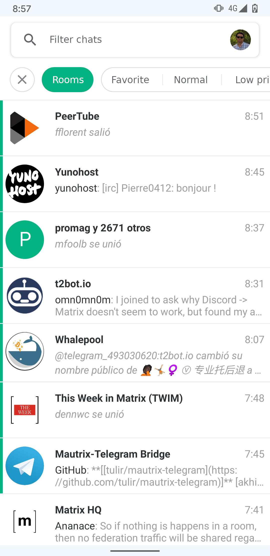
I think a filter bar (like the one used in the Google Play Books app) would be much better at letting the user filter according to any of these factors, and get in the way much less. Here is a mockup of what it could look like:
 frandavid100
All 4 comments
While I'm not sure the above mockup is the best option, I do agree with the general awkwardness of the tabs currently. The way I ended up using them:
- I basically never use the home tab
- I tag the most interesting/smaller rooms (even with multiple people) as "direct message"
- I tag the less interesting/larger rooms as "rooms"
- Then there are additionally the other tags for further sorting
So I basically already use the bottom bar as a sort of tag bar proposed here.
 steef435
on 10 Feb 2020
steef435
on 10 Feb 2020
Yes, that's been basically my experience too.
frandavid100
on 10 Feb 2020
FWIW I mainly use the room filter, which mixes DM and rooms, and also the breadcrumbs panel, which also mixes all sort of rooms...
That said, the home tab is not the final version.
 bmarty
on 10 Feb 2020
bmarty
on 10 Feb 2020
It is a bit confusing finding my messages. I have to check the direct messages and rooms tab.
So in my opinion merging these two views improves the usability (for me).
The filter idea is okay to cover "power users". I just want to have a single list containing my chats.
 weeman1337
on 20 Jul 2020
weeman1337
on 20 Jul 2020
Related issues
 Yajo
·
3Comments
Yajo
·
3Comments
 Flam3z
·
3Comments
Flam3z
·
3Comments
 jtagcat
·
3Comments
jtagcat
·
3Comments
 David-Else
·
3Comments
David-Else
·
3Comments
 2011
·
3Comments
2011
·
3Comments
Most helpful comment
It is a bit confusing finding my messages. I have to check the direct messages and rooms tab.
So in my opinion merging these two views improves the usability (for me).
The filter idea is okay to cover "power users". I just want to have a single list containing my chats.