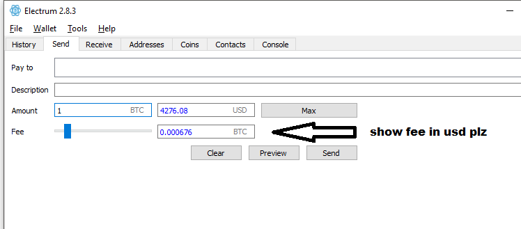
Electrum: Feature request: show fee in fiat in Send tab
I am using 2.8.3
please include option to show fee in USD next to the slider bar.
currently only showing fee in btc. not very helpful for those of us who think fee in terms of dollars.
thank you.
 charleshsu168
All 19 comments
Yeah, this is useful. I second this.
 pmukherjeee
on 4 Sep 2017
pmukherjeee
on 4 Sep 2017
Or more usefully, display it in the fiat currency that the user has selected in the preferences.
 cdodd
on 4 Sep 2017
cdodd
on 4 Sep 2017
the fiat fee is already shown in the confirmation dialog.
how many times should it be shown?
 ecdsa
on 5 Sep 2017
ecdsa
on 5 Sep 2017
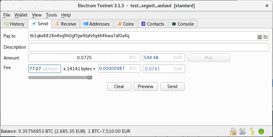
@ecdsa Ideally, it should be shown on the page with the slider, where you are selecting what level of fee to select, before you click send. So putting the fiat fee as specified in the picture above would be superior to putting it in the confirmation dialog (which the user has no reason to assume will appear after hitting send, with a fiat fee given).
 Engelberg
on 6 Sep 2017
Engelberg
on 6 Sep 2017
My preference would be to show the fiat fee to the right of the bitcoin fee in the above photo, rather than having it instead of the bitcoin fee. Both are useful to see.
Engelberg
on 6 Sep 2017
@ecdsa I don't see any downside to showing the fee in fiat on this screen. Support.
 pydlv
on 9 Sep 2017
pydlv
on 9 Sep 2017
I also want to reference this feature request, which partially duplicates this one: https://github.com/spesmilo/electrum/issues/2788 . The alignment of the amount and fee fields is pretty confusing. At very least, the fee slider and the BTC fee field should swap positions.
 fresheneesz
on 14 Sep 2017
fresheneesz
on 14 Sep 2017
Displaying the fee in fiat (next to the fee input) would be useful to prevent nasty surprises, but I'd suggest making it read-only. Proper fees for a bitcoin transaction can only be calculated in BTC. If the fee seems too high, the user might choose to simply delay a transaction until there is less network congestion.
 jonathancross
on 17 Sep 2017
jonathancross
on 17 Sep 2017
the fiat fee is already shown in the confirmation dialog.
how many times should it be shown?
@ecdsa It should be shown in both places because for now one has to continuously press "Send" and then go back just to adjust fees. Other than being time-consuming, this is also frustrating and unnerving because one doesn't like to hit "Send" on something that they don't know the full costs of. This especially applies to new users who don't know how Electrum works and will be intimidated. Experienced ones will know that fees will be displayed later and that a password entry will be needed before the transaction is sent, but even then it's unnerving.
 leafcutterant
on 6 Jan 2018
leafcutterant
on 6 Jan 2018
Is the fee ever visible in fiat when saving the transaction for cold signing? If not, that's another reason for putting the fiat fee earlier.
Engelberg
on 6 Jan 2018
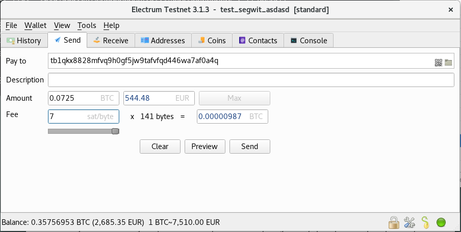
For reference, this is how the Send tab looks now by default:

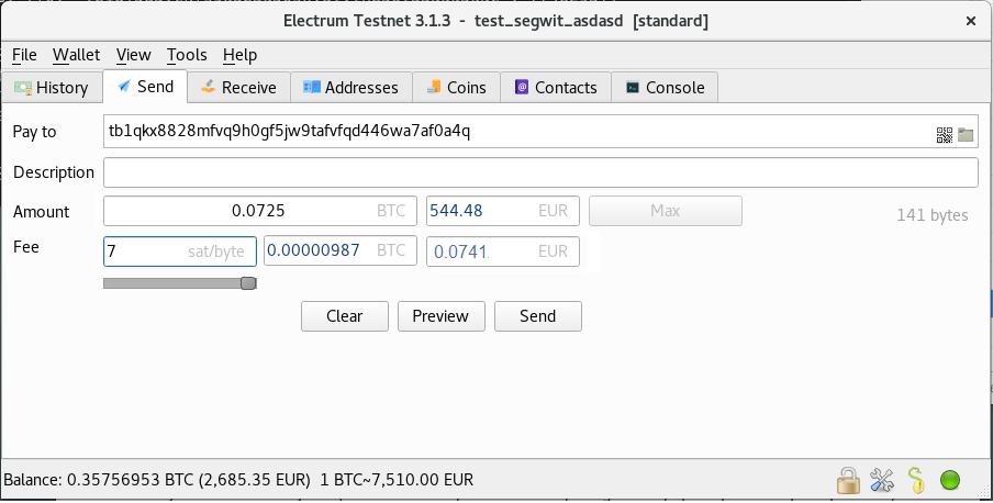
And with Edit fees manually enabled:
 SomberNight
on 27 Apr 2018
SomberNight
on 27 Apr 2018
For what its worth, I still think fee info should be vertically aligned with the send amount info of the same type. What I mean is that the fee in BTC should be directly below the send amount in BTC. Also, the fee in fiat should be directly below the send amount in fiat. To retain symmetry with this idea, the number of bytes should be put directly above the sat/byte amount for the fee (rather than where it now currently is). The visual placement of these fields has always been a bit confusing for me even after many times using electrum.
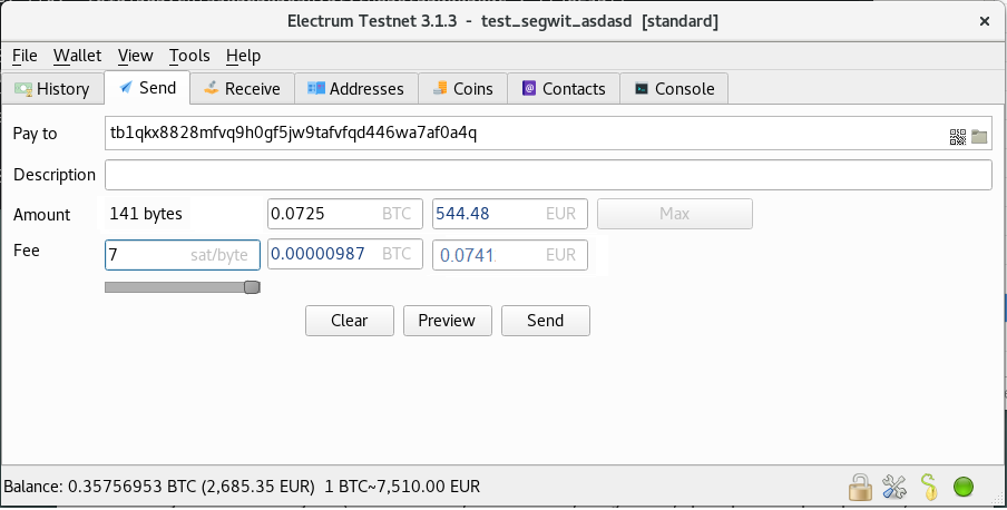
On second thought, maybe the amount line isn't the right place for the number of bytes. I'd say we can just remove that information. No one really needs to know it, and they can already find it out (in the few cases someone might care) by viewing a preview of the transaction.
fresheneesz
on 27 Apr 2018
@fresheneesz I tend to agree with you about aligning the values. I also agree that the transaction size is a technical metric that would confuse many and would do more harm than good in the position you've put it in. However I can imagine it being displayed somewhere else - see my placement.
Both alignment and filling the empty space before the amount could be dealt with via using a stretched-out box and justifying the text to the center:
leafcutterant
on 27 Apr 2018
@leafcutterant That looks good to me. I think that's an improvement over my suggestions.
fresheneesz
on 28 Apr 2018
I also agree that the transaction size is a technical metric that would confuse many and would do more harm than good in the position you've put it in
The transaction size was added to educate users how a fee is calculated; so that e.g. they are less likely to start asking questions why the absolute fee is so large. _(For instance, there was one user on IRC around November, who was outraged that they were suggested to pay a ~0.12 BTC fee (which is above the 0.1 BTC bitcoin core policy limit so the tx would not even propagate but that's another story). He was trying to send all his coins to an exchange to sell, had many small mining UTXO, and the tx was 10 KB+. He was unaware that the tx size in bytes matters for the fee.)_
SomberNight
on 28 Apr 2018
The transaction size was added to educate users how a fee is calculated
Help information like that should ideally be easily accessible, but also not front and center. A small mouse-over question mark next to the fee that gives additional information would be better, especially since its currently taking up valuable real estate that could be usd to make the interface easier to use for both new and long-time users.
fresheneesz
on 29 Apr 2018
@SomberNight Sorry, I already forgot how the Send tab looks right now. I agree that it's good to display transaction size, the thing I argues was @fresheneesz's placement. I also agree that the feeRate × txSize = fee is visually a good way to explain fees, even if it takes up some space.
Taking all into account, here's my sketch.
- I shrunk the fee rate box to not let the aligned box above it to be irrationally long, but be able to accommodate four digits. (It's fair to expect that fees will never be higher than 9999 sat/b, and beyond 99.99 sat/b, you don't really need decimal precision to be displayed. In the opposite case, 0.001 sat/b should be good for a long time.)
- Likewise, it's fair to expect (or is it?) that there won't be transactions over 99999 bytes (= 97 kB), though this could be expanded to 7 digits (not 8 because we are limited to 4 virtual MBs).
- Expanded the slider to have better precision, not being limited to the shrunk fee rate box.
- I thought about whether it is good to have a fee that is editable on fiat basis or not. It increases the chance for user error, but I ended up up thinking yes because 1) user freedom, 2) a less common way of defining fees exists that goes like "the average tx fee is 25 dollars" and I saw at least one site that gives fee advice in such a way.
leafcutterant
on 29 Apr 2018
Also, fiat value of mining fee is never displayed, even on confirmation screen, in the mobile app.
Engelberg
on 17 May 2018
not relevant anymore. the fee is no longer set in the send tab. (version 4.0)
ecdsa
on 4 Jun 2020
Related issues
 juniorjp
·
5Comments
juniorjp
·
5Comments
 GuestInCorle
·
3Comments
GuestInCorle
·
3Comments
 reardenlife
·
4Comments
reardenlife
·
4Comments
 dl3br
·
4Comments
fresheneesz
·
4Comments
dl3br
·
4Comments
fresheneesz
·
4Comments
Most helpful comment
My preference would be to show the fiat fee to the right of the bitcoin fee in the above photo, rather than having it instead of the bitcoin fee. Both are useful to see.