Electron-cash: Update the current logo to a square
The current logo is good, as it is based upon the official Bitcoin Cash logo. I made a square version to use across different platforms.

It retains the essence of the traditional logo of Electron Cash, and it is more easily displayable in low resolution screens, as a favicon, and places where only a square of a fixed amount of pixels per side is available to use.
 EasyRaw
All 31 comments
Any chance you can also supply this as .svg? We've been on an SVG kick lately because we like scalable vector graphics. Scalable vector graphics are forever! When we get 10k virtual reality 3d smell-o-vision monitors you'll thank me!
 cculianu
on 17 Jul 2019
cculianu
on 17 Jul 2019
We do need to go to a square icon but we need to choose which one. I am attaching my previous proposals here. I personally would prefer one of the variants with the bigger B, especially for small icon sizes <=24px.
 EchterAgo
on 17 Jul 2019
EchterAgo
on 17 Jul 2019
My vote is for the first one, Logo-test. But I like all of them. Also the BigB one.
cculianu
on 17 Jul 2019
Yea, I'd also prefer logo test. Note that I screwed up the file and it is actually not square but 512x521. I'll fix that if we go with that one.
EchterAgo
on 17 Jul 2019
Hey, @cculianu, here is the SVG version! I tried to upload it as such, but GitHub will not let me. So now it is zipped.
Thank you!
EasyRaw
on 17 Jul 2019
Looks great! thank you!
Ok so now how do we decide? Who wins? I propose trial by combat. Fight to the death and may the man left standing choose. :)
It's the viking way.
(No, but seriously.. how do we decide? I Jonald even down for an icon change? I really want to change it to something square too but Jonald gets the final say).
cculianu
on 17 Jul 2019
The magic of software is that it can be changed.
So, to me, we can choose one and then change it if it is not loved.
I also like the first one proposed by @EchterAgo. It is just a matter of taste. Mine is the _BCH Logo For Wallets / Exchanges_ present at Logos / Graphics (in blue, of course).
EasyRaw
on 17 Jul 2019
My two cents,
The square logo is not as unique or interesting, however it's a bit more standard and would likely be easier to use in different scenarios.
 marceloneil
on 17 Jul 2019
marceloneil
on 17 Jul 2019
@EchterAgo in your zip file, is the logo_test.svg also for iOS even though it doesnt say iOS in the file name?
 fyookball
on 18 Jul 2019
fyookball
on 18 Jul 2019
are these proposed logos only for iOS?
fyookball
on 18 Jul 2019
The file names are not intended to say anything about which platform they are for. Logo ios is called that way because it looks exactly like our current ios logo, just as svg. The svg icons can be used on any platform (some might need rasterizing). I think ideally we should use the same icons on all platforms.
EchterAgo
on 18 Jul 2019
I see. I like the perfect square one @BeltranLeo posted the best.
fyookball
on 18 Jul 2019
That format is also fine with me, most important is making it square. If we go with that design I would still increase the size of the B though, it really helps with small icon sizes.
EchterAgo
on 18 Jul 2019
im fine with increasing the size of the B
fyookball
on 18 Jul 2019
Ok, I tried all the icons. On second thought I do not like the one proposed in this issue. The corners hanging off the end look a bit strange in practice. Here are some screenshots:
1. The one proposed at top (first one):
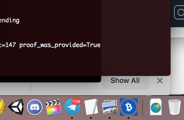
I dislike the way the corners look. They need to not be flush with the circle. It looks like someone cropped them in MSPaint. Also the B could be bigger. Sorry!
2. One of ichundes's ones (logo_test I believe):
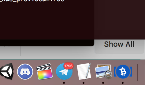
It's better fine, I like it more than (1) above; but the bigger B ones 3 & 4 below are better IMHO.
3. "Logo ios" (ignore the name)
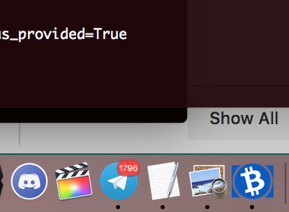
I like it more than (1), bit it still has the "almost looks cropped by MS-Paint corners" issue creeping in...
4. Logo_ios_big_b
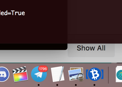
This is my favorite one by far. PLEASE this one!? :)
cculianu
on 18 Jul 2019
Here is (4) above (my favorite) in the "About Electron Cash" window on macOS:
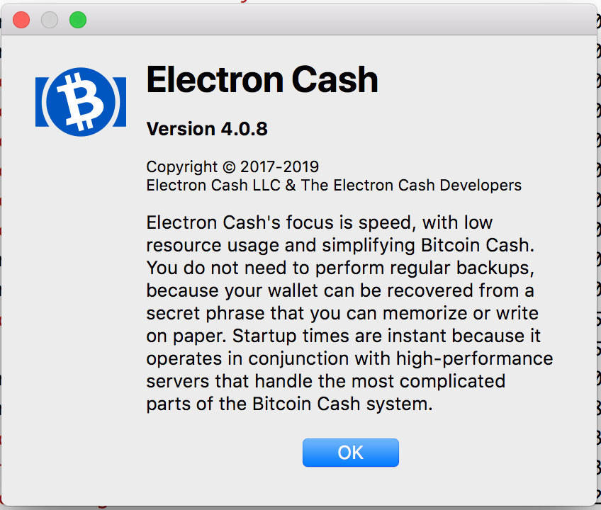
It's so handsome!
cculianu
on 18 Jul 2019
I can see what you mean about the square one not looking great in the tray. @cculianu . But in other contexts I don't agree with your opinion. So maybe we should get other opinions. Also we should challenge the assumption that we should only have 1 version of the logo. (Maybe its ok to have a different one in the tray).
fyookball
on 18 Jul 2019
@fyookball Just to clarify terminology: in this context "tray" means usually the system tray (the tiny little icon which on windows is in .. the system tray!). I think you mean "task bar" or "dock" as they are called on Linux & Windows and Mac respectively.
That being said -- yeah nobody I think wants it to be just one icon for everything ...
cculianu
on 18 Jul 2019
And yeah maybe we can ask the community how they feel.. 👍
cculianu
on 18 Jul 2019
The big B looks _very not good_ (?) to me, it is too disproportionate.
It would be nice to let the community decide. You are right that the logo I proposed looks a bit odd, maybe it could be changed, but I still would suggest to make it square. Maybe something like this.

And, of course, here is the source file.
EasyRaw
on 18 Jul 2019
i dont mind the square w rounded corners... i think we should enummerate all the palces the logo is used so we can judge better. i like the original square first but when Calin showed in context I agreed with him. so yeah.
fyookball
on 19 Jul 2019
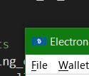
Windows - Window title bar
EchterAgo
on 19 Jul 2019

Windows - Systray light
EchterAgo
on 19 Jul 2019
Windows screenshots are at 125% scaling.
EchterAgo
on 19 Jul 2019
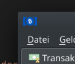
Arch Linux KDE Plasma - Window title bar
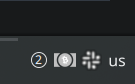
Arch Linux KDE Plasma - Systray
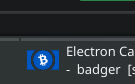
Arch Linux KDE Plasma - Task bar
EchterAgo
on 19 Jul 2019
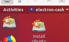
Ubuntu 18.04 GNOME - Task bar (not sure if that's what its called). This is a really bad example
EchterAgo
on 19 Jul 2019
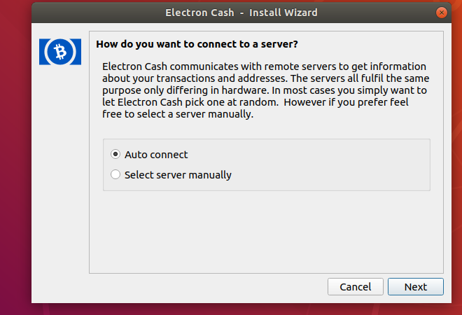
Ubuntu 18.04 GNOME - Install wizard
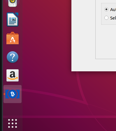
Ubuntu 18.04 GNOME - Side bar
EchterAgo
on 19 Jul 2019
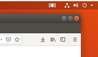
Ubuntu 18.04 GNOME - Systray
EchterAgo
on 19 Jul 2019
Note the light systray icon needs to be improved too. It has way too low contrast between the light gray and the white B. I had a version with black fill for the B, but haven't submitted a PR for that yet.
EchterAgo
on 19 Jul 2019
One between the IOS logo and IOS logo with big B, as requested in Telegram:
EchterAgo
on 19 Jul 2019
Ok, icon updated as per conversation in Telegram, etc. We are using the latest one posted by @EchterAgo .
Thanks a lot for opening the issue and bringing it to our attention, @BeltranLeo
cculianu
on 20 Jul 2019
Related issues
 Subzerocold
·
4Comments
Subzerocold
·
4Comments
 uncleschaeflit
·
6Comments
uncleschaeflit
·
6Comments
 markblundeberg
·
4Comments
markblundeberg
·
4Comments
 imaginaryusername
·
5Comments
imaginaryusername
·
5Comments
 Drac42
·
6Comments
Drac42
·
6Comments
Most helpful comment
One between the IOS logo and IOS logo with big B, as requested in Telegram:
logo_ios_medium_b.zip