Dokuwiki: Move edit button to be above horizontal line section divider
The edit button is placed below the horizontal line, where in my opinion it is more intuitive that the edit button is placed above the line within the block that it will edit.
I propose the edit button is moved to appear above the hr
 kalenpw
All 9 comments
I feel this confusing as well. PR welcome.
 phy25
on 5 Mar 2020
phy25
on 5 Mar 2020
Sweet, just wanted to make sure it was agreed upon before I started working on it. I'll do this and leave https://github.com/splitbrain/dokuwiki/issues/1339 for later since this bothers me every day and I've never once used the revert button.
kalenpw
on 5 Mar 2020
I like it is below the section. One of the reasons is that it is more clear which part you will edit. Is this not something for a plugin or just a modification doable via CSS?
 Klap-in
on 5 Mar 2020
Klap-in
on 5 Mar 2020
Looks like different people have different understanding towards this UI 😶 I don't quite remember if there is a hover state with a darker background to indicate which section is being edited - there might be one on the section header but I think it should be more visible. (on a phone now)
And yes this ia definitely doable via userstyle/plugin.
phy25
on 5 Mar 2020
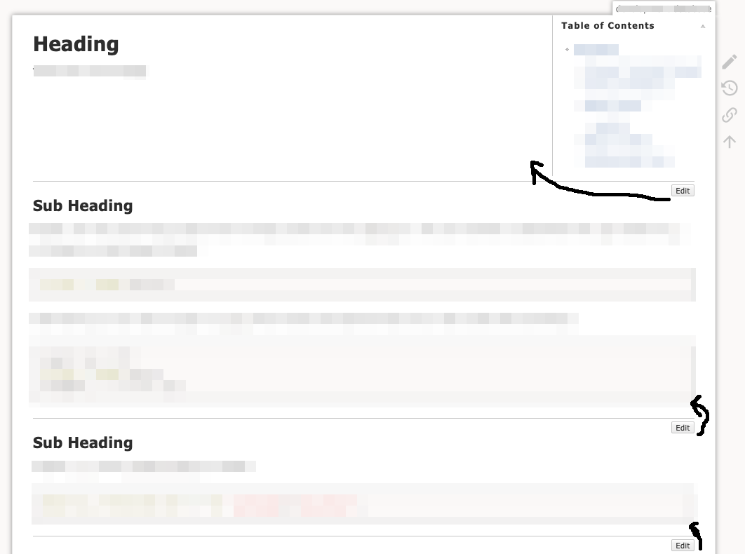
This is how it is currently:

The section's content ends at A, then there's some space towards the next section (which starts at B) and within that space the button is located.
When hovering the button, side borders C signal the section that will be edited.
It would be possible to move the button upwards using a negative top margin. In fact that is what we used to have in the old default template. However this becomes problematic when the section's content is extending all to the right and the button starts to overlay important content.
So personally I find the current layout perfectly reasonable.
However I believe that the problem with @kalenpw's screenshot is a different one. @kalenpw uses HRs (----) to visually separate sections. But the HR meant to signal the start of a new section is actually part of the old section - which results in the confusion with the button placement.
I would argue that this is a misuse of the HR syntax (In fact I regret ever having added HRs at all, but that's a different discussion). If there is a need to separate sections further than what is achieved by the spacing between A and B, then that separation should be added by CSS. Eg. by a top border for section headlines. It should not fall into the editing user's responsibility to do "layout" in a wiki.
 splitbrain
on 5 Mar 2020
splitbrain
on 5 Mar 2020
Agreed that it is a misuse of hrs, but I like the styling so I do it that way. ¯\_(ツ)_/¯
The problem with a css solution is it takes away the first subsection starting where the table of contents ends.
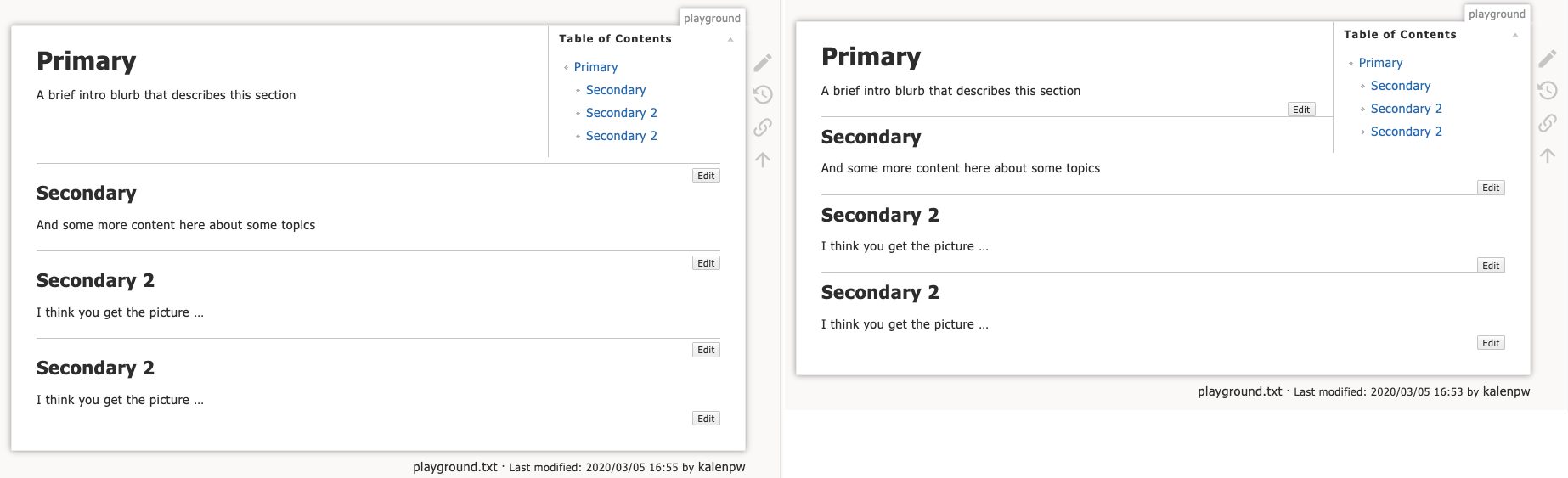
I would argue that whether it is a good use of something or not doesn't change the fact that it can be done and the current behaviour is unintuitive.
That said I am definitely biased since this is how I lay out all my pages and am perfectly okay with doing this via plugin if preferred.
kalenpw
on 6 Mar 2020
You can use some simple css to add the horizontal line (either as a border of the section/heading or as a horizontal line proper) that starts the section and refrain from adding markup to the content
 mprins
on 6 Mar 2020
mprins
on 6 Mar 2020
Thanks for the detailed explanation @splitbrain! Though it's not that obvious (I almost forgot how the hover effect works - especially when on a phone), I agree that the current design makes sense.
I would probably use some CSS to add more directional indication (e.g. arrow before the edit text, a "ugly" button with no top-border). For reference, Wikipedia puts this edit button next to the section title which has very clear indication.
Also I don't think it's elegant to put hr markup manually after each section. A :after CSS should usually do the trick if border-bottom is not nice enough.
I guess this can be closed now?
phy25
on 7 Mar 2020
The problem with the css ::after solution is it causes the line to not intersect at the bottom of the table of contents
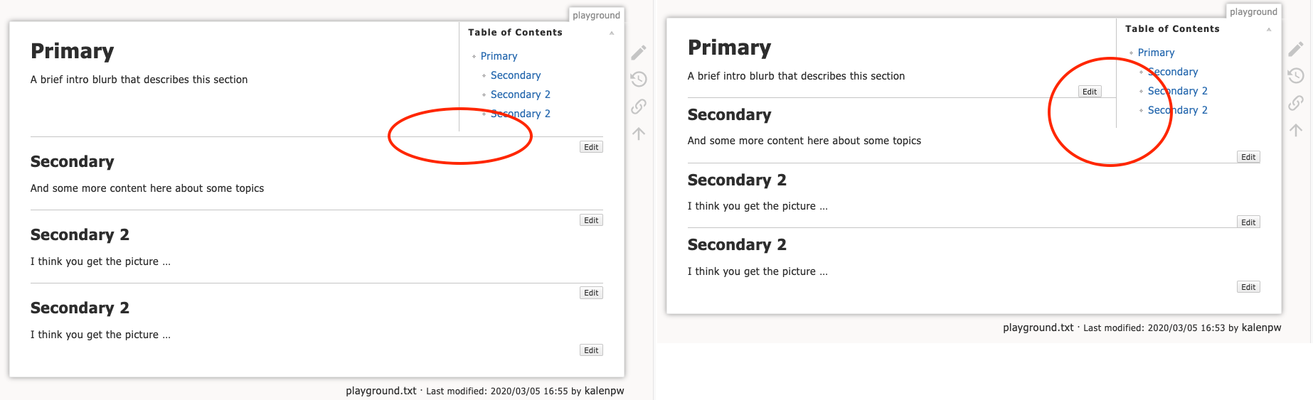
Moving the edit button's position above the line with css causes text to overlap if has wide content.
There is also a javascript solution:
window.onload = () => {
    jQuery('h2').before("<hr/>");
};
but I don't like how the lines appear after pageload.
as @splitbrain points out it's not really a problem with DokuWiki, but a problem in HR usage so I'd say this issue is safe to close as a number of workarounds have been presented.
kalenpw
on 10 Mar 2020
Related issues
 wangxu94
·
5Comments
wangxu94
·
5Comments
 benbrunner
·
6Comments
benbrunner
·
6Comments
 qezwan
·
3Comments
qezwan
·
3Comments
 epeios-q37
·
4Comments
epeios-q37
·
4Comments
 selfthinker
·
6Comments
selfthinker
·
6Comments
Most helpful comment
You can use some simple css to add the horizontal line (either as a border of the section/heading or as a horizontal line proper) that starts the section and refrain from adding markup to the content