Hi, I'm just moving here this forgotten proposal from the dismissed bug tracker.
From the Feature Request FS#2670 opened on flyspray by @splitbrain:
FS#2670 - redesign DokuWiki logo
The DokuWiki logo https://www.dokuwiki.org/logo could use a modern refresh. This is a task for a designer, who'd like to see his work used in widely recognized software.
We're generally happy with our current logo as it represents collaboration (multiple pens) and the idea of a wiki with multiple pages and simple linking (arrows). But the logo looks a little bit outdated on our new design.
Here's what we need:
A modern reinterpretation of our current logo in the following formats:
- Full Color logo as scalable SVG for arbitrary larger sizes
- Simplified color version as pixel perfect 16x16 pixel PNG for favicon use
- Simplified grayscale version as pixel perfect 16x16 pixel PNG for interwiki link icon use
- Monochrome lineart version as scalable SVG for use on T-Shirts
- Optionally other pixel perfect sizes as PNG for small sizes (24x24, 32x32) when a downscaled SVG does not suffice
The logo would need to be licensed under the GPL.
If you're a designer and like to have a go at this project, feel free to contact me via mail if you have any questions (andi [at] splitbrain [dot] org)
A more detailed design brief is available at https://www.dokuwiki.org/devel:logo-designbrief
 spaeps
All 17 comments
This is the first version of my proposal, opened to suggestions.
I'm not a designer but I like the idea described in the DokuWiki Logo Redesign inspirations of a more modern, simple, flat style logo, without going too far from the original, the way those big companies already did.


spaeps
on 30 Jun 2016
You did a great job with this. My only complaint is that its very hard to see at smaller sizes, so maybe simplifying the smaller sizes more would help with that. The 16px wide image could just be "[[DW]]" in blue.
 meskarune
on 5 Jul 2016
meskarune
on 5 Jul 2016
@spaeps I think it's not working for me (and others who downvoted). I like the approach of simplifying, but for that it doesn't go far enough. It basically looks like the original, straightened out. But it still has a whole bunch of filigrane elements and shadows. The small version is completely unrecognizable.
I don't totally hate it, but I'm not loving it either.
 splitbrain
on 21 Jul 2016
splitbrain
on 21 Jul 2016
I think "down voting" without any sort of explanation to the author is rude and useless. I hope that the designer who created these icons will still continue to work on them and that the other people who added thumbs downs will post their thoughts rather than hide behind an emoji.
meskarune
on 22 Jul 2016
I like that they are the very first logos which actually follow the brief! :) So, it's definitely going into the right direction. But I also think that they are not yet flat/abstract enough.
That reminds me that I actually had a go at designing a new logo myself nearly 3 years ago. I just dug them up again... Please note, I am not a designer and I don't really propose these as a new logo, they are just ideas. I only wanted to demonstrate with them what I personally look for in a new logo. As such they might help the discussion.


 selfthinker
on 24 Jul 2016
selfthinker
on 24 Jul 2016
actually I like the current logo, retro is hot.
 mprins
on 28 Jul 2016
mprins
on 28 Jul 2016
I find the current also ok. I just had a little wait for a server update. Enclosed my sketch. :)

 Soeldner
on 31 Jul 2016
Soeldner
on 31 Jul 2016
I don't have any real preference for a new logo - though I dislike (MS) flat styles because they lack the lusciousness of 3D while adding no extra meaning.
I would strongly vote for larger sizes than squint-o-vision 16x16 and 32x32 (does _anything_ use those sizes if given a choice? i.e. are the smaller sizes needed for anything?).
Most modern browsers will use 128x128 for favicons in tabs, and in Opensearch (I've requested that limitation in DokuWiki be fixed).
Using the icons created by spaeps earlier in this thread I created a favicon that uses the 16x16.png, 32x32.png, 48x48.png, 64x64.png, and the 128x128.png (see attached). Firefox and Chrome use the 128x128 pixel image, I haven't tested other browsers.
Contents of the favicon.ico:-
--icon --index=1 --width=16 --height=16 --bit-depth=32 --palette-size=0
--icon --index=2 --width=32 --height=32 --bit-depth=32 --palette-size=0
--icon --index=3 --width=48 --height=48 --bit-depth=32 --palette-size=0
--icon --index=4 --width=64 --height=64 --bit-depth=32 --palette-size=0
--icon --index=5 --width=128 --height=128 --bit-depth=32 --palette-size=0
 SFITCS
on 26 Sep 2016
SFITCS
on 26 Sep 2016
I know it has been a while since this was last updated but I'd like to add some suggestions to this discussion.
A few general thoughts on this:
- a clean modern logo will require decluttering (even if this means removing details that had a meaning)
- small details become invisible/unrecognizable when scaled down (i.e. favicon size)
- In order to be recognizable even at favicon size we will need to use strong color and/or brightness contrasts (especially the beige color of the current logo is problematic)
- using less colors (or just one color) will allow the logo to be more recognizable when printed in grayscale
- We also need to question if we want to have letters in the logo at all. If so we will need to make them large enough to be recognizable at smaller sizes (which stands in contrast to the "The logo should not be made up primarily of typeface" restraint)
If we take all these things (identified problems with the old logo & restraints) into account we need to accept that the new logo will look nothing like the old one.
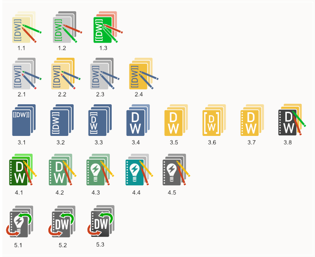
Here are a few sketches. Do not consider any of these final, these are just ideas. I tried to pick up at least some of the design elements from the old logo.
Opinions are welcome!
 m-erhardt
on 25 Sep 2019
m-erhardt
on 25 Sep 2019
Nice! Thanks for sharing some general thoughts as well!
I like the following logos, because:
1.2, 1.3 - clear colors (but contrast between items is not enough imho)
2.4 - simpler appearance and ok contrast
3.8 - like the use of bright colors, combined with simpler appearance
... - light bulb is interesting idea, but all these colors-variants of row 4 are not my piece of cake
5.3 the best of above! I like the contrast more than 5.2
5.1 the light bulb is quite interesting, but my feeling is that with contrast of 5.3 it will improve further.
 Klap-in
on 25 Sep 2019
Klap-in
on 25 Sep 2019
I like the cleanliness of 3.4 most, but agree that using letters might not be ideal. I would like to see a version of 3.4 that uses negative space to symbolize a pen or the arrows and drops the letters instead.
splitbrain
on 25 Sep 2019
Ok, @splitbrain here are a few more versions based on the 3.4 design.
I've also added a version with a slight gradient (6.6) which gived the logo a more vivid appearance.
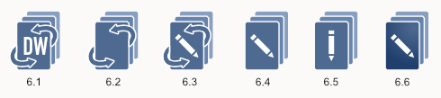
This is how these versions look like at 16x16px:

m-erhardt
on 25 Sep 2019
Wow. I really like these. I think my favorite is 6.3
I think for the 16px version the pixels would need to be handcrafted (instead of scaling down the original) and it would probably need to be simplified much more.
splitbrain
on 25 Sep 2019
I like the way this is going. :+1:
I also prefer getting rid of the letters. The lightbulb is quite fitting. Although I like the 6.x logos the best (and before that 4.x with the lightbulb), I don't like that the symbols for collaboration are gone. I don't know how to add a separate pencil back in without it being too cluttered or if anything else could be done. I think the arrows are quite weak without the pencils, the pencils are the more important part of that symbolism.
selfthinker
on 28 Sep 2019
@splitbrain : I agree that the 16x16 version should be handcrafted with slightly modified proportions to better fit the 16x16 grid
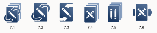
@selfthinker : here are a few versions with a 2nd pencil. I tried a few things in order to make two pencils and the arrows work together in the current arrangement but as you already anticipated this makes the logo look to cluttered.
I personally prefer the versions with a slight gradient over the ones with a flat color just because it looks more vivid.
As far as further simplification goes I also made a few versions without the additional pages... any opinions on that?
m-erhardt
on 28 Sep 2019
I'm happy with this issue revival and I want to share some ideas.
I don't like that the symbols for collaboration are gone. I don't know how to add a separate pencil back in without it being too cluttered or if anything else could be done. I think the arrows are quite weak without the pencils, the pencils are the more important part of that symbolism.
I also think pencils are the only required, since they can graphically symbolize arrows by themselves.
I was pleased by the 6.x proposal so I tried to re-elaborate it with the pencils inclusion and I ended up with 7.5 that, meanwhile, was already posted :)
I think for the 16px version the pixels would need to be handcrafted (instead of scaling down the original) and it would probably need to be simplified much more.
So, what about crafting a logo design based on a 16x16 grid directly and then scale it up?
I tried to re-elaborate the @m-erhardt great work, trying to simplify as much as possible and this come out:

(those are just caps from the inkscape icon preview tool)
Obviously, this is not a proposal but an example of what I mean by _bottom up_ approach.
Just for saying, It reminds me the @selfthinker proposal, but more symbolic.
Also, I opted for centering the main paper above the others (that now seems brackets, or they could be if shifted).
In order to be recognizable even at favicon size we will need to use strong color and/or brightness contrasts (especially the beige color of the current logo is problematic)
Colours (red and green) are back in this example since a monochromatic solution was quite unrecognizable.
I personally prefer the versions with a slight gradient over the ones with a flat colour just because it looks more vivid.
I also think the gradient version looks nicer, but I think the logo should be sticky to the requirement, also with flat colours.
As far as further simplification goes I also made a few versions without the additional pages... any opinions on that?
As I stated before, I like the two pencils approach but crossing them looks more like a negative symbol, especially in a 16x16 icon (it would look like an X).
So, I like 7.5 more, maybe with colours, so it would be visually recognizable in 16x16 icons too.
spaeps
on 29 Sep 2019
@spaeps, I like the simplification and stylization of your version. But for some reason it's still quite cluttered. What if you removed the lines within the "document"? (Not sure if that is enough to de-clutter it, though.)
selfthinker
on 30 Sep 2019
Related issues
 wangxu94
·
5Comments
splitbrain
·
4Comments
wangxu94
·
5Comments
splitbrain
·
4Comments
 systemofapwne
·
6Comments
selfthinker
·
6Comments
systemofapwne
·
6Comments
selfthinker
·
6Comments
 BenoitPoulet
·
3Comments
BenoitPoulet
·
3Comments
Most helpful comment
I know it has been a while since this was last updated but I'd like to add some suggestions to this discussion.
A few general thoughts on this:
If we take all these things (identified problems with the old logo & restraints) into account we need to accept that the new logo will look nothing like the old one.
Here are a few sketches. Do not consider any of these final, these are just ideas. I tried to pick up at least some of the design elements from the old logo.

Opinions are welcome!