🚀 Feature
Feature request from Canny:
I think the back to top button in the v1 should be also implemented in v2. Long docs will need it.
Have you read the Contributing Guidelines on issues?
Yes
Motivation
Many docs sites have a back to top button. Docusaurus v1 also had similar built-in feature. This is especially useful for long web pages.
Pitch
- Better backward compatibility from v1
- Nice UX improvement
 lex111
All 11 comments
We need to think about how this button will look like and where to place it on the web page. Any options?
lex111
on 1 Oct 2020
The original design from v1 seems like a good start. Are there other ideas?
 michaelknowles
on 1 Oct 2020
michaelknowles
on 1 Oct 2020
Design this button based from v1 is not mobile-friendly on v2.
lex111
on 1 Oct 2020
We could place the button above or to the side of the hamburger.
To the side seems like a good option since the hamburger will already be obscuring any text on this horizontal row. Placing it above will mean another row of text is obscured.
Putting it as an option inside the hamburger doesn't sound great because I think scroll to top probably shouldn't take an extra click to get to.
michaelknowles
on 1 Oct 2020
It's worth mentioning this other issue: https://github.com/facebook/docusaurus/issues/2220
As users are not totally satisfied with the current mobile layout/navigation, we should think about what design we really want first, and where the back to top button would fit in this fixed design.
 slorber
on 1 Oct 2020
slorber
on 1 Oct 2020
What if the back-to-top button is visible when the user is scrolling up...instead of the hamburger button and stays for few seconds, and gets hidden if the user doesnot scroll up or scrolls down. Aso I didnot see any hamburger button in mobile view
If like my idea...i can start working
 Sayan-dev
on 2 Oct 2020
Sayan-dev
on 2 Oct 2020
@slorber OK, I'll continue discussion on that issue.
michaelknowles
on 3 Oct 2020
I think the Back to top button should only be visible when scrolling.
 hamzahamidi
on 14 Oct 2020
hamzahamidi
on 14 Oct 2020
@lex111 @michaelknowles i could fix this by adding a round opaque arrow ( up or down) icon to scroll to the top.
If we are worried about it obscuring other content, the button could be made to fade out on the screen after few seconds of inactivity using scrollEventListeners.
I would like to implement this.
 vickywane
on 15 Oct 2020
vickywane
on 15 Oct 2020
I have a simple prototype working in my fork here: https://github.com/EricAtMSFT/docusaurus
I tried a few things and landed on the button being inline, materializing after 400px of vertical scrolling, displayed as a small overlay on the content so as to not disrupt the sometimes long side bar content. It has a gradient to make it less noticeable. On mobile it snaps to align with the Hamburger button on the bottom left.
Feedback welcome for iteration!
Update. Added small arrow image to accompany link.
 EricAtMSFT
on 16 Oct 2020
EricAtMSFT
on 16 Oct 2020
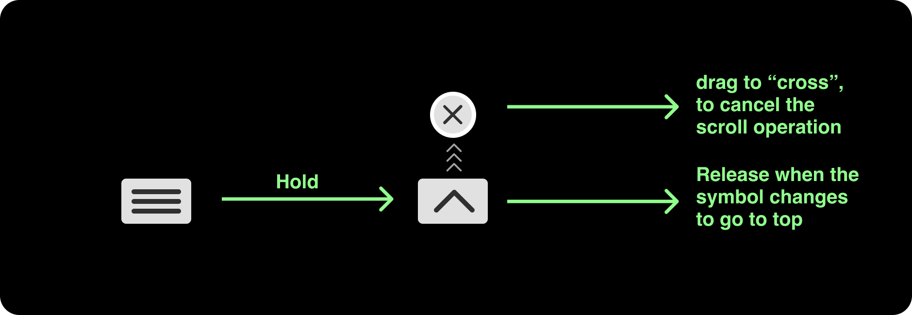
@lex111 Putting the "scroll to top" button along with the hamburger not only covers the screen but, it would be frustrating if someone clicked "scroll to top" instead of hamburger by accident
How about using something with the same hamburger, like holding the hamburger or swiping it or anything similar? as it would resolve both the issues I implemented correctly!
To say the very least, it can be a good silent temporary fix!
I can work on this if it sounds good!
(I am just a beginner, so ignore any mistakes)
 Vishal19111999
on 12 Dec 2020
Vishal19111999
on 12 Dec 2020
Related issues
 sebqq
·
3Comments
sebqq
·
3Comments
 azu
·
3Comments
azu
·
3Comments
 awibox
·
3Comments
lex111
·
3Comments
awibox
·
3Comments
lex111
·
3Comments
 chandankumar4
·
3Comments
chandankumar4
·
3Comments