docs design has low information density
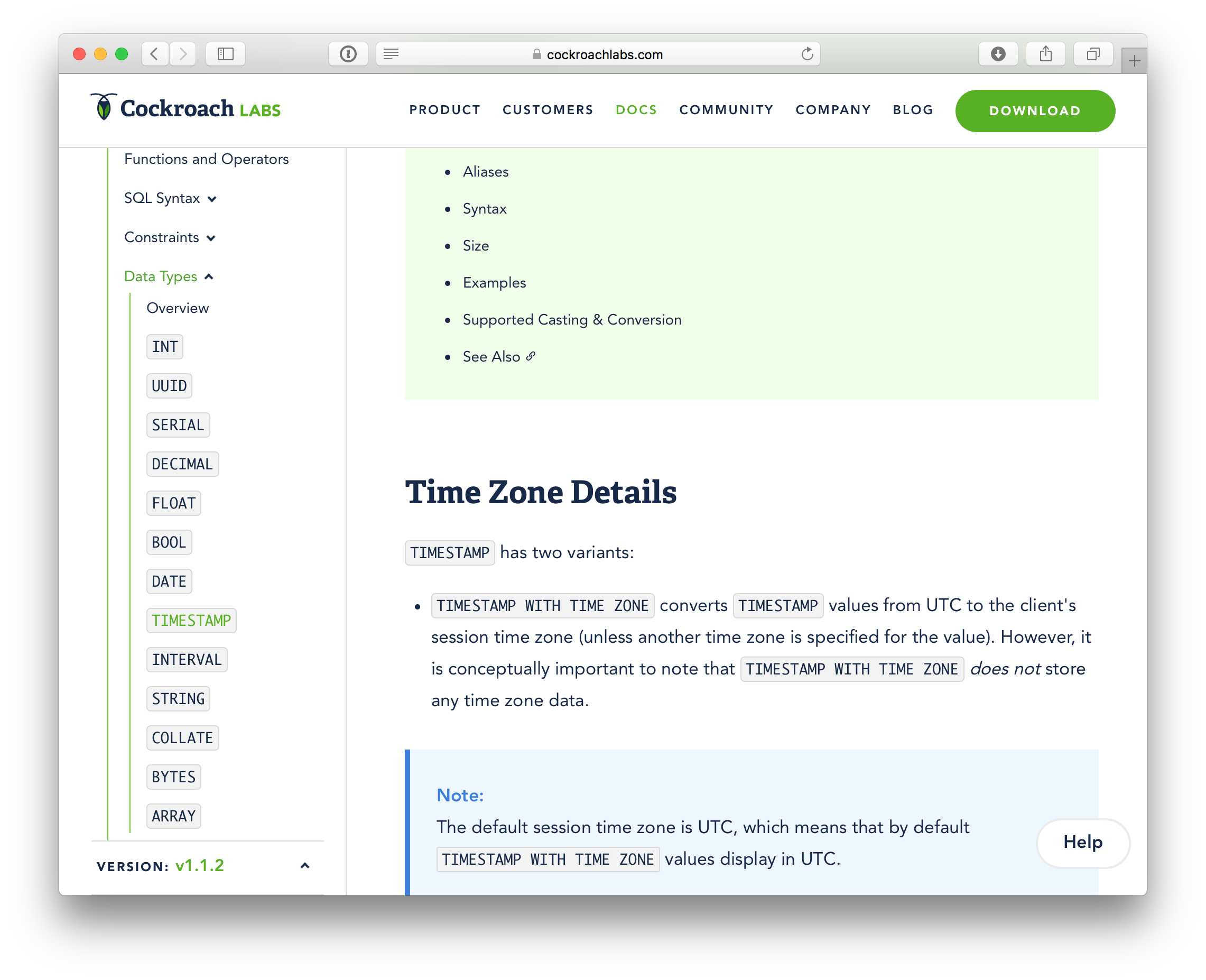
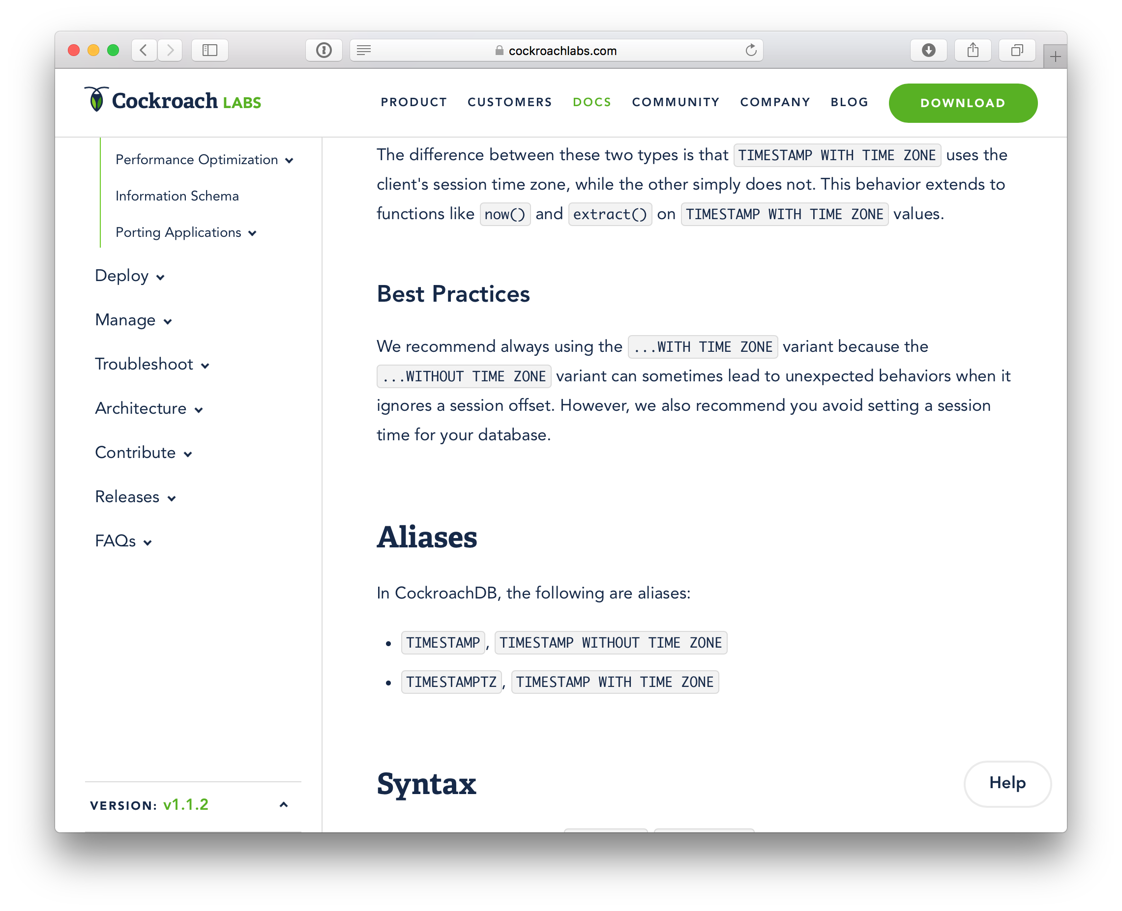
As visually appealing as our docs are, I fear their information density is too low. There are many places where we barely pack two or three sentences onto the screen at a time:
Compare that to the PostgreSQL docs:
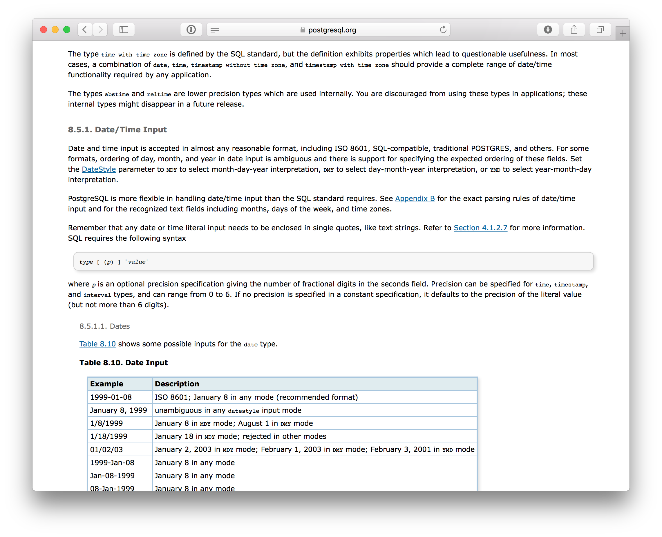
To be quite honest this makes reading our documentation a very frustrating experience for me personally. Others may feel differently, of course.
@kuanluo, this is obviously your wheelhouse, so assigning to you for analysis/triage. @jseldess @Amruta-Ranade @sploiselle also curious to hear your thoughts on the matter.
/cc @knz who I'm sure has thoughts too.
 benesch
All 34 comments
Yes I agree with you fully. I would also like a much more compact documentation site overall. I've always wanted that, but somehow I got a signal early on that our stylesheet was not negotiable, so I didn't push further.
 knz
on 18 Nov 2017
knz
on 18 Nov 2017
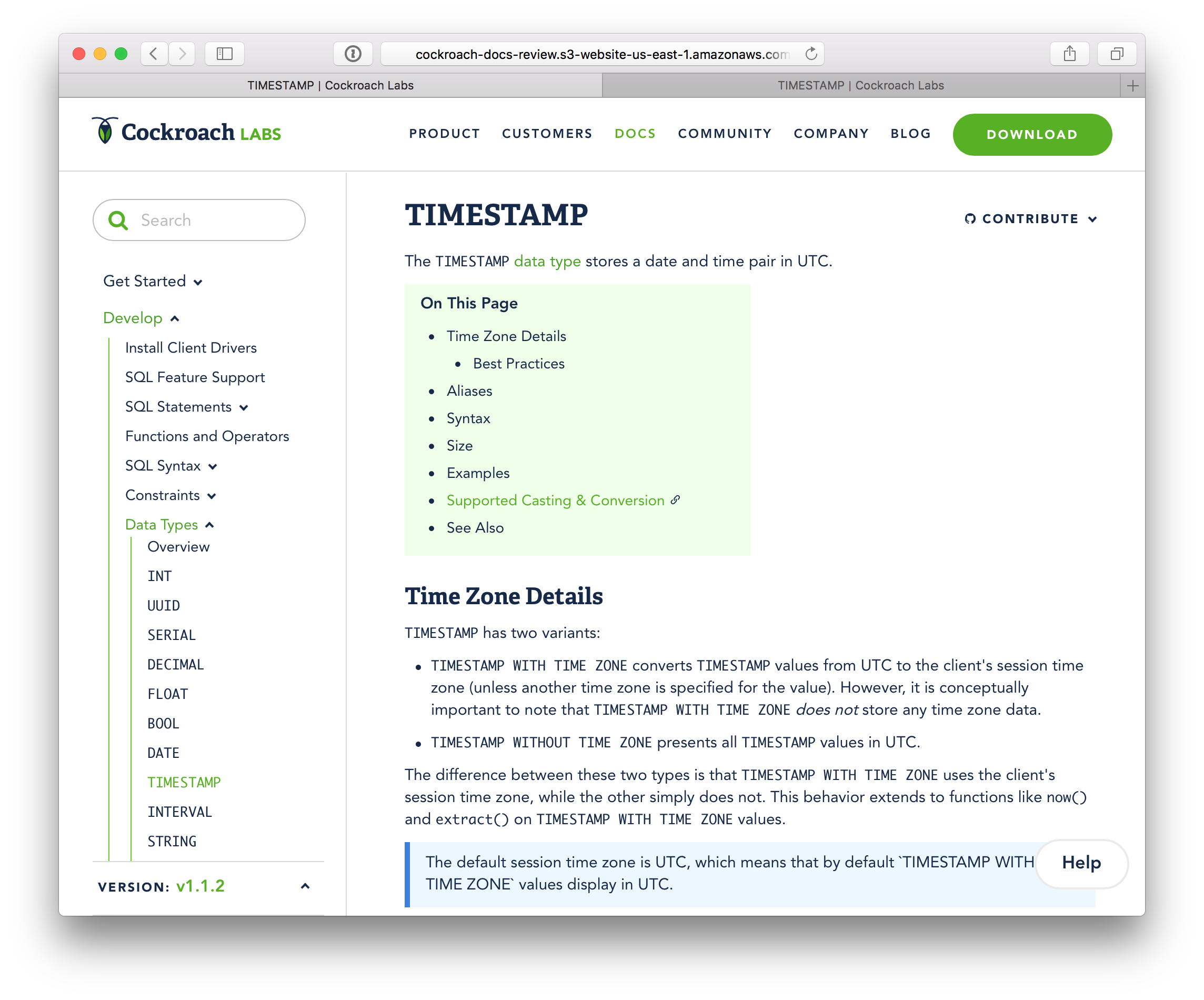
Here's a rough prototype of how I think this should look: http://cockroach-docs-review.s3-website-us-east-1.amazonaws.com/156f9e7b452641f9946360fb05a691e6d4b63166/stable/
Before:
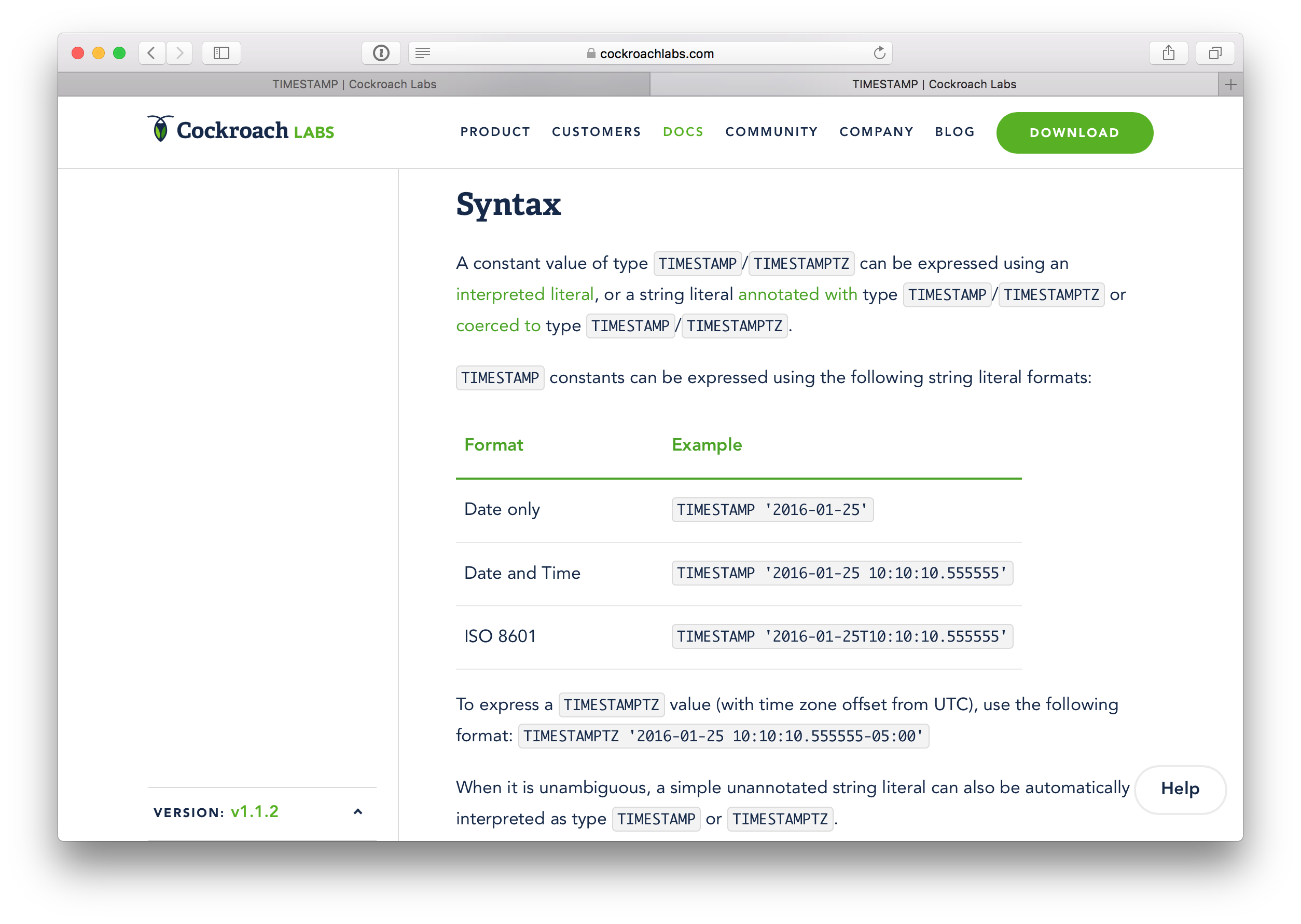
After:
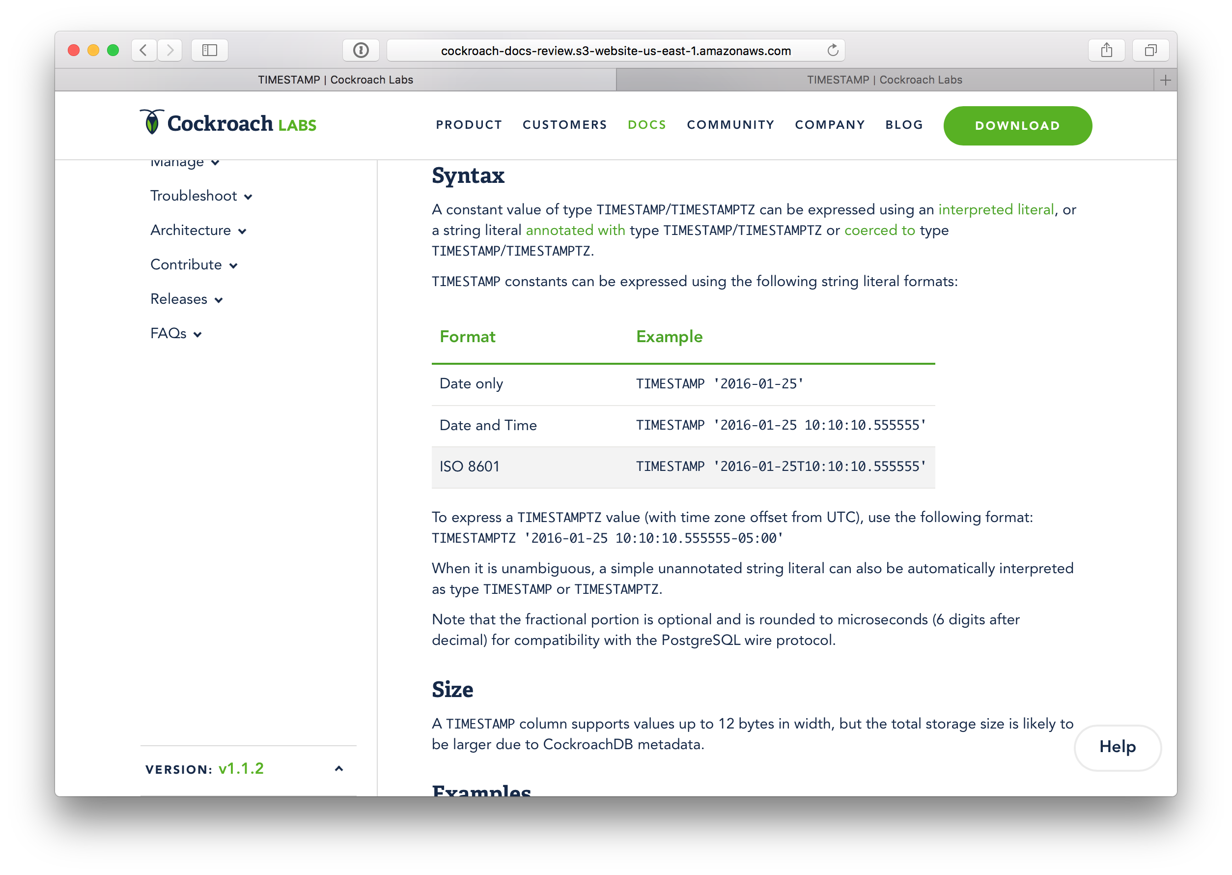
Before:
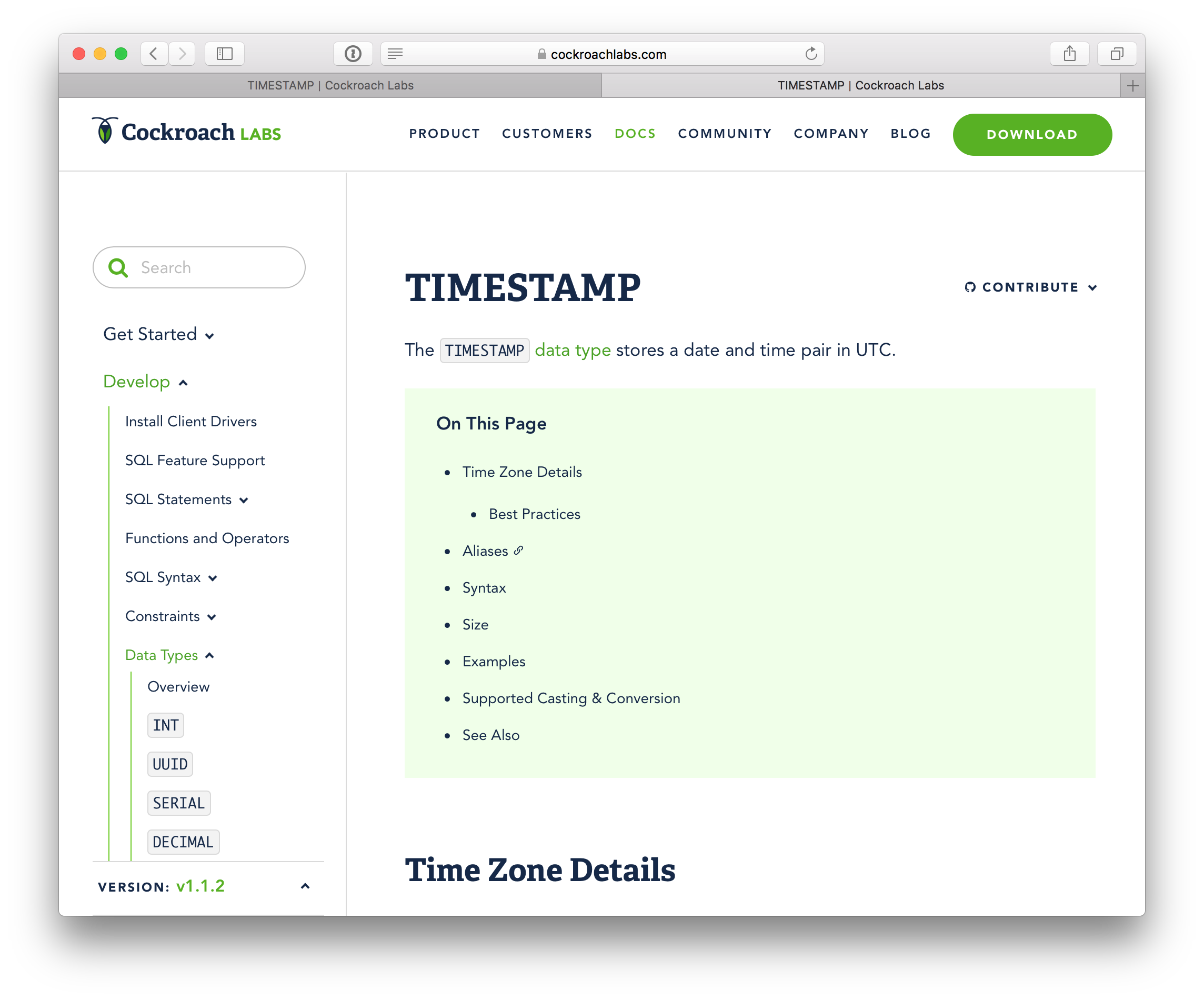
After:
benesch
on 18 Nov 2017
The stylesheet has gone through several iterations, including to match the style of the broader website, so it's certainly negotiable. I never intended to send a signal otherwise. It's rather something that's quite subjective and that we haven't heard anything about from users (we also haven't asked them, though).
I personally find the readability of the Postgres docs poor precisely due to an overly long line length and short line height. I think this is what @benesch and @knz like about it, though.
I'm all in favor of making changes, but I'd like Design (@kuanluo and @j-low) to be involved. Perhaps we could create a few simple alternates (one like Nikhil's, one mid-way, and the current) and include this in our user testing of the new docs info architecture next month. We could also do a poll across Engineering and go with whatever the clear preference is.
 jseldess
on 18 Nov 2017
jseldess
on 18 Nov 2017
Yeah, I also find the Postgres docs to have an overly-long line length, but
I just resize my browser to my desired reading width and the text
automatically reflows.
Zooming out sort of works similarly for our docs, but I find the text gets
too small by the time I get the spacing down to where I want it.
On Sat, Nov 18, 2017 at 2:25 PM, Jesse Seldess notifications@github.com
wrote:
The stylesheet has gone through several iterations, including to match the
style of the broader website, so it's certainly negotiable. I never
intended to send a signal otherwise. It's rather something that's quite
subjective and that we haven't heard anything about from users (we also
haven't asked them, though).I personally find the readability of the Postgres docs poor precisely due
to an overly long line length and short line height. I think this is what
you two like about it, though.I'm all in favor of making some tweaks, but I'd like Design (@kuanluo
https://github.com/kuanluo and @j-low https://github.com/j-low) to be
involved. Perhaps we could create a few simple alternates (one like
Nikhil's, one mid-way, and the current) and include this in our user
testing of the new docs info architecture next month. We could also do a
poll across the Engineers and go with whatever the clear preference is.—
You are receiving this because you authored the thread.
Reply to this email directly, view it on GitHub
https://github.com/cockroachdb/docs/issues/2195#issuecomment-345464871,
or mute the thread
https://github.com/notifications/unsubscribe-auth/AA15IDo2k-Bi6Ht2R9FNWBvdP3O5rbZSks5s3y8QgaJpZM4QjEqw
.
benesch
on 18 Nov 2017
The (incorrectly variable) long line length of pg's and the (fixed) too short line length of our docs are two extremes of a spectrum, where a good middle ground is possible.
Let's make a stylesheet that matches good typographic standards - set the line length to about 60-70 characters (60em). See e.g. https://baymard.com/blog/line-length-readability. Currently the width is fixed to 997 pixels, which with the current choice of font and font size is about 40em - much too narrow. Also I think the stylesheet is problematic. Fixing the width with pixels makes it impossible to change the size of the text without making the lines either too short or too long. The width should be a multiple of the font size (using em or ex) instead of pixels! (px)
Then the excessive inter-line spacing is yet separate concerns. I agree with typographic standards that suggest that anything less than 1.1em is too narrow. But currently the line spacing is fixed to 30px, which with the current font and font size is about 1.7em, again much too high. Again the same argument applies, it is misguided to use a fixed height in pixels, it should be expressed relative to the font size, so we can change the font size without making the lines too high or too narrow. I personally like 1.2em, but anything below 1.4-1.5em is fine by me.
knz
on 20 Nov 2017
Also, without disrespecting the value of creative design, I'd like to highlight that there are different audience objectives with docs than the main web site. Docs must be designed to be functional, not look pretty. Docs should not appeal to a creative artist, but to technologists who spend many hours per week consulting the documents. Density and accessibility should be number 1 and 2 concerns, with consistency with the rest of the marketing story far, far, far, faaaaaaar behind.
knz
on 20 Nov 2017
Totally agree, @knz, but our aesthetic preferences in terms of functional effectiveness are pretty far apart. My preferences aren't high prio, though, of course, so I'm very much in favor of Kuan's team taking on this project (some research to figure out the optimal changes and then implementation) when they can. @kuanluo, do you think this is something your team can help kick off this year?
@knz, @benesch, I think it might be helpful to add links here to 2-3 developer-facing docs sites that you think are well styled. I'll do so later today, too.
jseldess
on 20 Nov 2017
- A widely acclaimed docs site is Haskell's, for example: https://wiki.haskell.org/Language_and_library_specification -- with an ideal stylesheet too, 1.4em line height and 50em width. Resizes perfectly with the text.
- I find the GNU project's standard doc stylesheet highly effective, for example: https://www.gnu.org/software/make/manual/make.html - on the plus side, it has an ideal line height (1.3em) and font-relative line width (74em) although I would probably be OK with a slightly more narrow layout (60-70em)
- this is my favorite documentation content-wise, and has an ideal inter-line spacing (1.2em): https://www.freebsd.org/doc/handbook/bsdinstall-partitioning.html - however unfortunately it lets the width flow, which forces me to resize the browser to get a good width. The same applies for the Python docs, e.g. https://docs.python.org/3/reference/executionmodel.html#exceptions -- very good inter-line spacing (140% font size, which AFAIS is about 1.3em with their font choice) but free-flowing width.
- most readers of the Unix manual use a 72-character wide layout, with monospaced font or not, and a line height of 1.2em. See for example: https://www.freebsd.org/cgi/man.cgi?query=ls
Note that the font-relative sizing is not strictly necessary to achieve proper density/balance. For example, the ZeroMQ doc is a well-known example of "examplary documentation" in open source projects, for example: http://api.zeromq.org/4-2:zmq-pgm but it uses a fixed-size pixel-baased width. However its default font choice at 12pt and line height at 1.2em makes it still extremely readable (about 70em width in practice) and reduces the need to make manual adjustments.
As an example of something not to do I nominate the Rust reference, for example: https://doc.rust-lang.org/reference/attributes.html
This uses a fixed text width but doesn't even bother to configure the font size or line height. The result with default browser sizing makes lines that are too narrow, and too much mashed together (not high enough).
knz
on 20 Nov 2017
I love this explanation of line spacing: https://practicaltypography.com/line-spacing.html
knz
on 20 Nov 2017
And while we're at it, the space between paragraphs needs some love too. I just realized this because I came across this: https://practicaltypography.com/space-between-paragraphs.html and I noticed our inter-paragraph spacing is too large too. This may be an artifact of the excessive line height though.
knz
on 20 Nov 2017
Lively discussion on type! :)
My first thought is that we can certainly tighten up the spacing for ToC - It’s been on my list for quite a while, I just haven’t gotten to it.
I’m on vacation this week - will comment more next week.
On Nov 20, 2017, at 6:26 AM, kena notifications@github.com wrote:
And while we're at it, the space between paragraphs needs some love too. I just realized this because I came across this: https://practicaltypography.com/space-between-paragraphs.html and I noticed our inter-paragraph spacing is too large too. This may be an artifact of the excessive line height though.
—
You are receiving this because you were mentioned.
Reply to this email directly, view it on GitHub, or mute the thread.
 kuanluo
on 20 Nov 2017
kuanluo
on 20 Nov 2017
@benesch's prototype (thanks for doing that!) has a few things I really liked:
- Remove line-height for ToC
- Reduce header font size according to styleguide
- Deduce margin-top for h2 to 30px
We can get to those right away (@j-low), and leaving the rest, more holistic style guide changes to next year.
cc: @josueeee
kuanluo
on 27 Nov 2017
@knz @benesch Awesome examples for docs typography! We're looking at improving our typography styles so I'd love to chat with each of you soon to get your thoughts on further docs improvements.
 josueeee
on 27 Nov 2017
josueeee
on 27 Nov 2017
Thanks @kuanluo, @josueeee, and @j-low for helping to make these improvements!
jseldess
on 30 Nov 2017
Status update: @j-low and I will take a look at this next week.
kuanluo
on 6 Dec 2017
The grpc docs are pretty nice! https://grpc.io/docs/tutorials/basic/python.html
jseldess
on 18 Dec 2017
The grpc docs use a fixed pixel width for the line but a variable font size. On a narrow screen, this causes a very narrow column with fewer than 4-5 words in the width of the text. If I increase the font size for readability, then there are even fewer words per line. That's rather unreadable :)
The error they're making is the same I was explaining throughout above -- the typography should make the line width a fixed multiple of the character width! If there's a desire to make the line width constant, then the font size should be made constant too. (not that I'd recommend that -- the user should be able to change the font size and see the line width adjust accordingly)
knz
on 18 Dec 2017
Points taken. I wasn't posting that as the idea example. Just shows improvements in some dimensions.
jseldess
on 18 Dec 2017
@benesch @knz @jseldess @kuanluo @josueeee
I made some changes to increase information density on docs based on some of the feedback above. It's not perfect and intentionally doesn't address certain issues (i.e. line height/width) which will require changes to fundamental pieces of our styles and layouts which are larger issues to be addressed individually to keep a close handle on the impact of such changes. That being said, I think this is a big improvement on our current docs density and I would welcome any feedback.
The results of the changes can be viewed here: http://cockroach-docs-review.s3-website-us-east-1.amazonaws.com/765b5dfe96153b33a907591d1abe662ad93ed590/stable/
 j-low
on 18 Dec 2017
j-low
on 18 Dec 2017
Thank you, @j-low! The improvements look good to me. Next year, we can address bigger issues (line-height, width, font-size) to continue making the docs better!
kuanluo
on 18 Dec 2017
Thanks, Joe. LGTM as a first step!
On Mon, Dec 18, 2017 at 3:18 PM, kuanluo notifications@github.com wrote:
Thank you, @j-low https://github.com/j-low! The improvements look good
to me. Next year, we can address bigger issues (line-height, width,
font-size) to continue making the docs better!—
You are receiving this because you were mentioned.
Reply to this email directly, view it on GitHub
https://github.com/cockroachdb/docs/issues/2195#issuecomment-352545806,
or mute the thread
https://github.com/notifications/unsubscribe-auth/APKD8q8VvyEqUYBEY3z6L9v8Vt5flIN3ks5tBsh9gaJpZM4QjEqw
.
jseldess
on 19 Dec 2017
@j-low can you reference this issue from the PR where you made this change? I can't seem to find it.
knz
on 19 Dec 2017
I've been wanting to improve the ToC section for a while now, here's a rough idea that doesn't break or current grid as an immediate improvement:
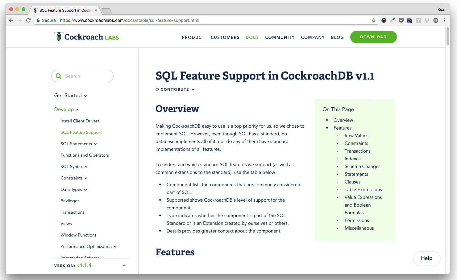
It will behave the same way as the current ToC, but the content will wrap around it, so you get to the information much faster.
Thoughts? @jseldess @j-low @lhirata @Amruta-Ranade
kuanluo
on 31 Jan 2018
I definitely like this direction, @kuanluo, but I'm afraid that wrapping the body content will be awkward on some pages. Perhaps we should test it on a few just with in-browser dev tools?
I suspect a better solution is to use the whitespace/margin to the right of the main body. Not sure if we're ready to try that, though?
jseldess
on 31 Jan 2018
We can definitely take a look on staging/in-browser dev tools first. Will report back on findings.
kuanluo
on 31 Jan 2018
Here are some suggested pages to look at:
jseldess
on 31 Jan 2018
Also like this direction! Another thing to look at is how docs with longer headings look - some headings might take up 3+ lines, which would look weird.
 lnhsingh
on 31 Jan 2018
lnhsingh
on 31 Jan 2018
I completely agree with the original post and am really happy to see us making progress here!
As another data point, I find that docker's docs to strike a great balance between information density and aesthetic. They are also structured fairly similarly to our docs, so I think they're useful to compare against. Here are a few example pages:
I'd also like to voice a similar concern about our blog. While the blog posts look great, the combination of font size and line spacing make them particularly difficult to digest. Are we aiming to keep the style consistent between the docs and the blog? Will changes made here apply to our blog posts as well? (This may be the wrong place to discuss the blog)
 nvanbenschoten
on 4 Apr 2018
nvanbenschoten
on 4 Apr 2018
Thanks, @nvanbenschoten, I agree that the docker docs are another good model.
@kuanluo, @j-low, do you think there's design bandwidth to take some further steps here in the Q2/Q3 timeframe?
jseldess
on 4 Apr 2018
Thanks, @nvanbenschoten and all for the feedback so far! It's going to be an ongoing improvement, and we are more developer-bandwidth-constrained than anything else. There's only one @j-low for all of us! Let's discuss priorities, @jseldess and then we can figure out a plan to improve docs in the coming quarters.
kuanluo
on 4 Apr 2018
Update:
- Widening our overall site grid a priority for Q2, and thus can make room for ToC content on the right side rail. Stay tuned for that update!
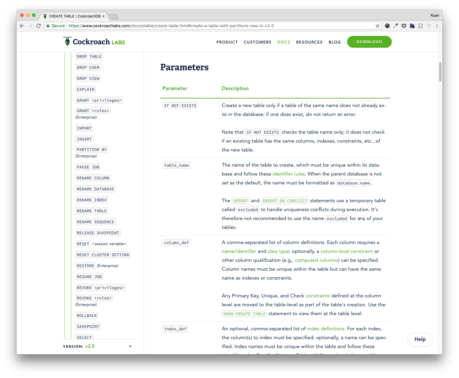
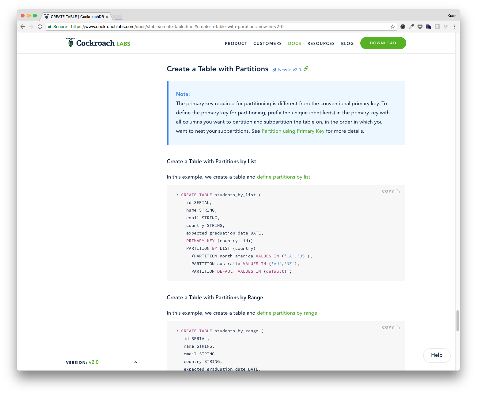
- Meanwhile, we can change font-size for all docs (p, tags, notes, table, etc) to 15px with 25px line-height, which is almost what Docker does.
- Furthermore, our heading styling can all be smaller. h2 can be 24/35 (one notch down), h3 can be 20/35 (one notch down), and h4 can be 17/20 with
text-transform: uppercase
Very quick screenshots:
Before | After
------------ | -------------
 |
| 
 |
| 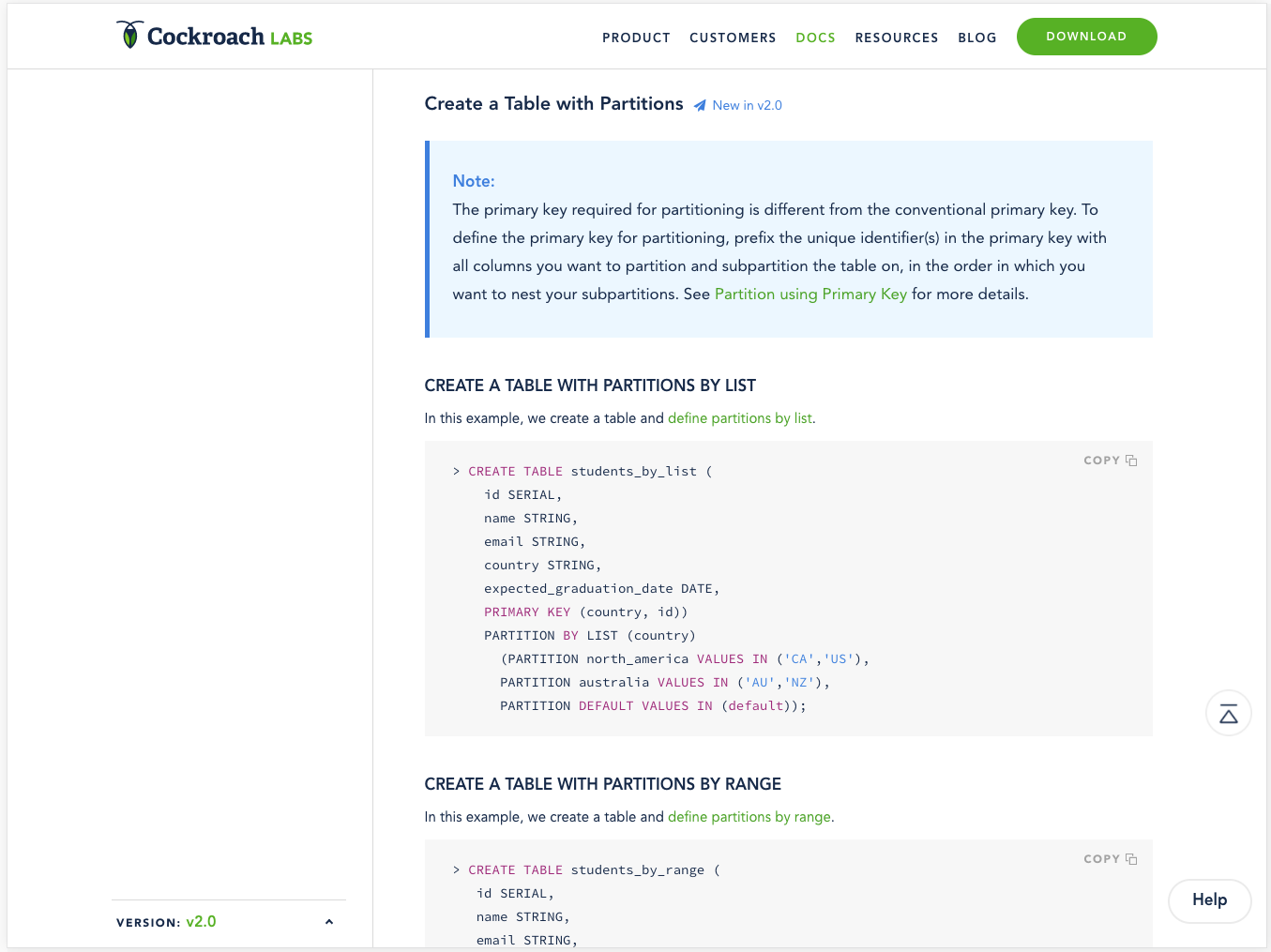
There's more fine-tuning needed for spacing before/after the headings, but all feedback welcome!
kuanluo
on 4 Apr 2018
LGTM, @kuanluo! We might even consider always using the full width of the screen on docs, or at least testing that out, if we're willing for docs to diverge from the main site in this way.
jseldess
on 5 Apr 2018
@jseldess Great. We will implement these changes in the next iteration. Also, once @j-low is able to widen the overall site grid, we can see how it affects docs. If someone is using a large monitor, my assumption is that the text width of the docs content should still be readable, and thus confines to some sort of grid.
kuanluo
on 5 Apr 2018
By and large, the main current of this issue was addressed in https://github.com/cockroachdb/docs/pull/3284 and related PRs, so closing this issue.
jseldess
on 13 Sep 2018
Related issues
 andreis
·
7Comments
andreis
·
7Comments
 dankellycockroach
·
3Comments
jseldess
·
7Comments
dankellycockroach
·
3Comments
jseldess
·
7Comments
 robert-s-lee
·
4Comments
jseldess
·
6Comments
robert-s-lee
·
4Comments
jseldess
·
6Comments
Most helpful comment
@knz @benesch Awesome examples for docs typography! We're looking at improving our typography styles so I'd love to chat with each of you soon to get your thoughts on further docs improvements.