Docs-website: Middle column cuts off table
Description
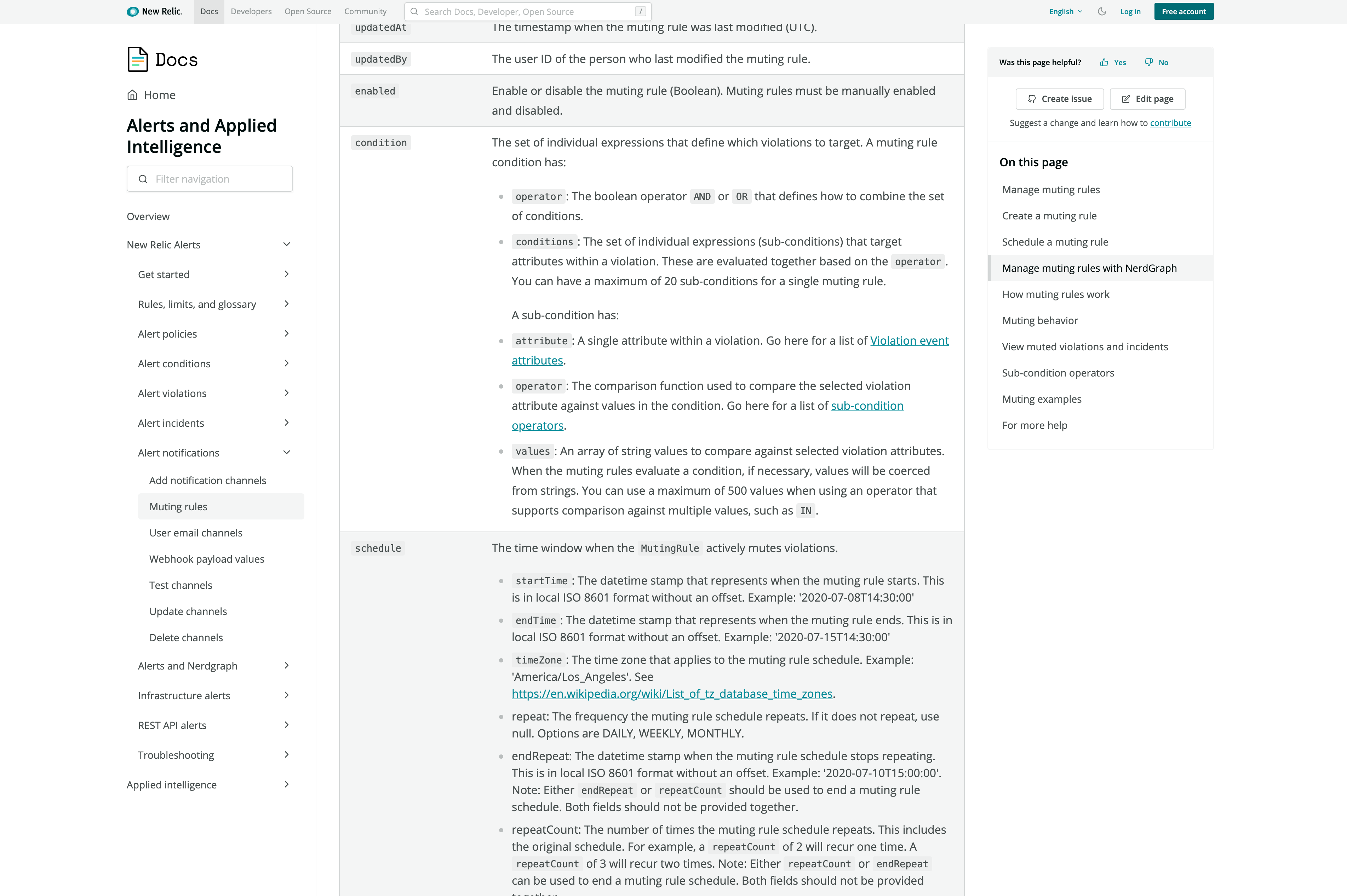
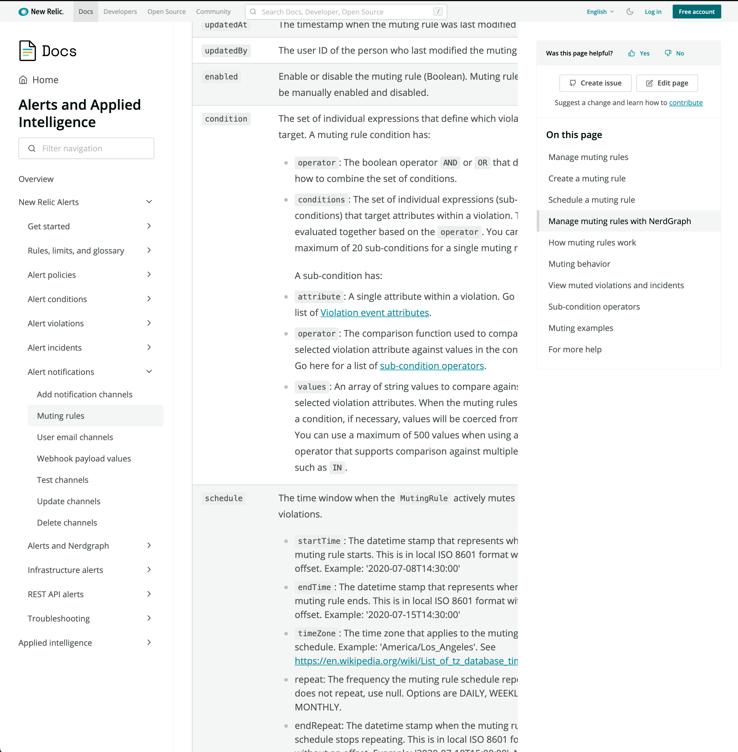
When looking at a page that has three columns, if I make the browser window exactly half the width of my screen, words get cut off by the formatting of the middle column. If the browser window is any bigger or smaller than 50% of the screen width, the words wrap correctly. I have only tested this on a 3840 × 2160 monitor.
Steps to reproduce
- Go to https://docs.newrelic.com/docs/alerts-applied-intelligence/new-relic-alerts/alert-notifications/muting-rules-suppress-notifications/#manage-with-nerdgraph
- Scroll down to the table of muting rules definitions.
- Resize the window to 50% of monitor width.
- See text cut off on the right side of the middle column.
Expected behavior
The text should wrap or columns should resize to allow all text to be seen.
Screenshots
Full screen
50% screen width
Additional context
When using a touchpad, it is possible to scroll to the right inside the middle column, allowing you to see the cutoff text. However, this is not something a user with a mouse could do.
 wrekone
All 3 comments
@wrekone I can't reproduce on Firefox or Chrome what browser did you happen to see this in?
 jpvajda
on 19 May 2021
jpvajda
on 19 May 2021
also tested firefox and I can't reproduce. so i'm going to close it until we know what browser this was in.
jpvajda
on 20 May 2021
This behavior was seen in Chrome 89.
I can no longer reproduce the behavior in Chrome 90.0.4430.212
wrekone
on 20 May 2021
Related issues
 hsue
·
9Comments
hsue
·
9Comments
 jerelmiller
·
8Comments
jpvajda
·
3Comments
jerelmiller
·
8Comments
jpvajda
·
3Comments
 zstix
·
5Comments
jpvajda
·
10Comments
zstix
·
5Comments
jpvajda
·
10Comments
Most helpful comment
This behavior was seen in Chrome 89.
I can no longer reproduce the behavior in Chrome 90.0.4430.212