Docs.rs: Broken toolbar layout with long crate names + 'go to latest version'
Long-ish crate names, especially combined with the presence of the 'go to latest version' link, breaks the toolbar layout:

 jnqnfe
All 17 comments
Hmm, maybe we should be switching to the narrow layout sooner:

Not sure how to write that in CSS but I expect it wouldn't be too hard to add.
A related bug is that sometimes we switch over to the narrow view for only the right items and switch the left items too late:

 jyn514
on 11 Dec 2020
jyn514
on 11 Dec 2020
I think we could also consider moving the "source" and "feature flag" links in the dropdown.
 pietroalbini
on 11 Dec 2020
pietroalbini
on 11 Dec 2020
@pietroalbini why only those two, what makes them different from Platform?
jyn514
on 11 Dec 2020
The impression I get is that "platform" is something you need to switch between while reading the documentation, while both the source code and the feature flags are extra crate "metadata".
pietroalbini
on 11 Dec 2020
"Source" is sorta confusing up there since it's a tab on the crate details view as well, we could maybe get rid of it and just make you go through the crate details page to get there.
EDIT: And I guess the exact same argument applies to features too, so maybe moving them under the details dropdown would make sense.
 Nemo157
on 14 Dec 2020
Nemo157
on 14 Dec 2020
@Nemo157 I'm ok with that for 'Source', but the problem with moving 'Features' is that no one visits the crate details page, so if we move it no one will know it's there.
jyn514
on 14 Dec 2020
This sounds like something that could be tackled incrementally. If just moving Source is sufficient (as it looks to be in the screenshot), then Features can remain where it is until that real estate is needed.
Additionally, if no-one has laid claim to this issue just yet, I'd love to take it on.
 arusahni
on 28 Dec 2020
arusahni
on 28 Dec 2020
@arusahni go for it! Just moving Source for now sounds like a good approach.
jyn514
on 28 Dec 2020
I noticed the other day that for yanked versions even more space is eaten up:

jnqnfe
on 28 Dec 2020
Yeah, I've been experimenting, and it seems like there are a few decision points to be made.
On a listing with just the "Go to latest version" link present, moving just the "Source" link into the crate menu isn't quite enough to address the overflow bug. I'm experimenting with selectively collapsing buttons at various breakpoints.
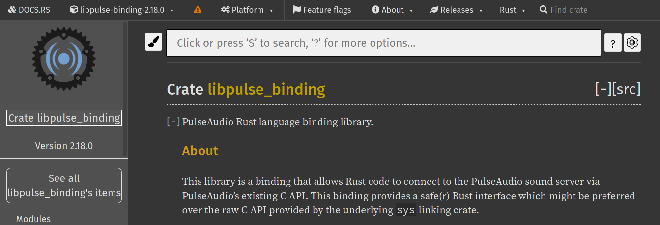
Would this suffice? The tooltips still display, so they're not necessarily indecipherable. If so, what would we consider to be the appropriate priorities for collapsible buttons? I'm leaning towards having the "Old version" and "Yanked version" buttons collapse at a medium breakpoint, as well as "Feature flags".
As an aside, I think a yanked version is a higher severity notice, so it might be worth presenting different than we do the old version message (e.g., red, with a circled x). Thoughts?
arusahni
on 29 Dec 2020
@arusahni I would rather collapse 'About/Releases/Rust' than the warning bar - you see those on almost every page, so you'd know what they mean after a while, and they're also less important than the version being out of date IMO. The warning is bright yellow because we want people to look at it, and if it's collapsed it's more effort on their part.
jyn514
on 29 Dec 2020
Cool :+1: I'll prioritize those breakpoints. If we need more navbar space, then which buttons would we prefer to collapse next? Presumably "Feature flags" then "Platform"?
arusahni
on 29 Dec 2020
Maybe Platform before Feature flags? At that point the screen is already pretty small and I'd expect it to switch all of them to icons tbh, I'd test it to make sure you actually need another breakpoint.
jyn514
on 29 Dec 2020
I still need to test with the yanked warning, but here's what things can look like with just adjusting the menu on the right.
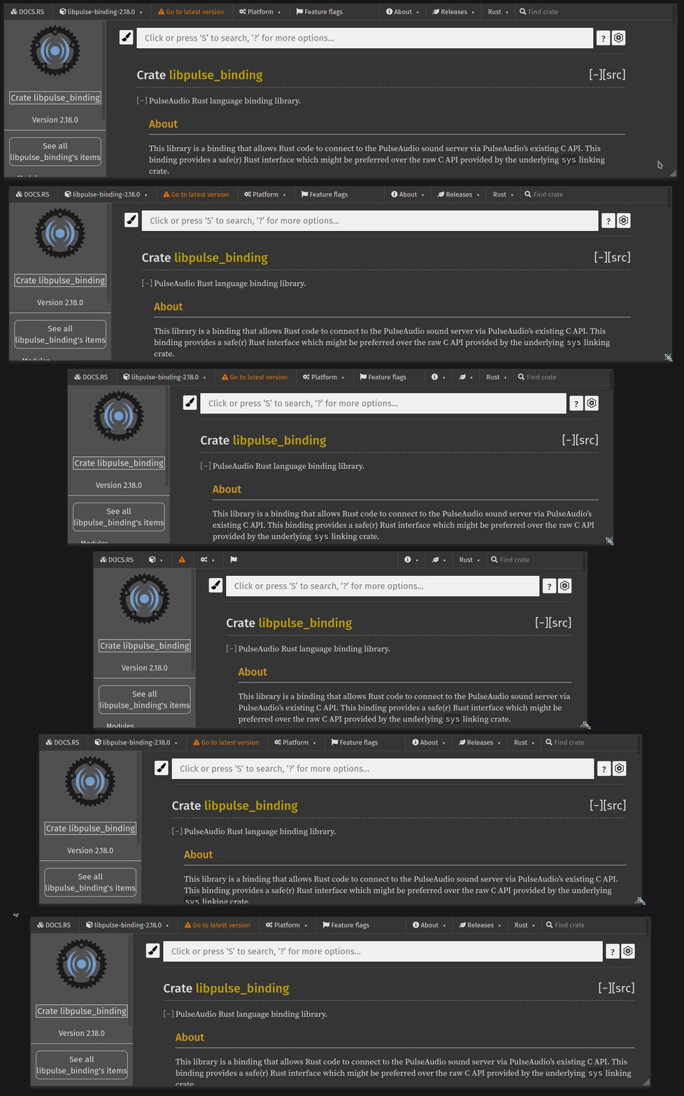
I think this works. Worst case, when the wider "yanked" message is present, we define a different set of breakpoints.
arusahni
on 29 Dec 2020
Alright! I think I have something that works. Give it a spin and let me know what you think. If it passes the smoke test, I'll file a PR.
What I did to test:
# add two versions of a crate with a long name
cargo run -- build crate air-interpreter-wasm 0.0.33
cargo run -- build crate air-interpreter-wasm 0.0.35

# Start the webserver
cargo run -- start-web-server --reload-templates

# From the web UI, verify that the breakpoints are correctly hit for the latest version
<browse to http://localhost:3000/air-interpreter-wasm/0.0.35/air_interpreter_wasm/index.html >
# From the web UI, verify that the breakpoints are correctly hit for an older version
<browse to http://localhost:3000/air-interpreter-wasm/0.0.33/air_interpreter_wasm/index.html >

# Now, yank both versions
psql postgresql://cratesfyi:password@localhost:15432 -c "UPDATE releases SET yanked = true FROM  crates WHERE releases.crate_id = crates.id AND crates.name = 'air-interpreter-wasm'"

# From the web UI, verify that the breakpoints are correctly hit for the latest version
<browse to http://localhost:3000/air-interpreter-wasm/0.0.35/air_interpreter_wasm/index.html >
# From the web UI, verify that the breakpoints are correctly hit for an older version
<browse to http://localhost:3000/air-interpreter-wasm/0.0.33/air_interpreter_wasm/index.html >
@arusahni could you open the PR directly? It's easier for me to review that way; what you have already looks good though :)
jyn514
on 30 Dec 2020
@jyn514 sure thing, PR filed! #1232
arusahni
on 30 Dec 2020
Related issues
pietroalbini
·
6Comments
 nagisa
·
4Comments
pietroalbini
·
4Comments
nagisa
·
4Comments
pietroalbini
·
4Comments
 jsha
·
3Comments
jsha
·
3Comments
 stefan-k
·
6Comments
stefan-k
·
6Comments
Most helpful comment
I still need to test with the yanked warning, but here's what things can look like with just adjusting the menu on the right.
I think this works. Worst case, when the wider "yanked" message is present, we define a different set of breakpoints.