While comparing a few items in my inventory, I didn't realize I had dupes of some items showing in the menu, and was struggling to find them. I it might be helpful to highlight them a slightly, or possibly a mix of highlighting and dimming out items not in the compare menu.

baseline
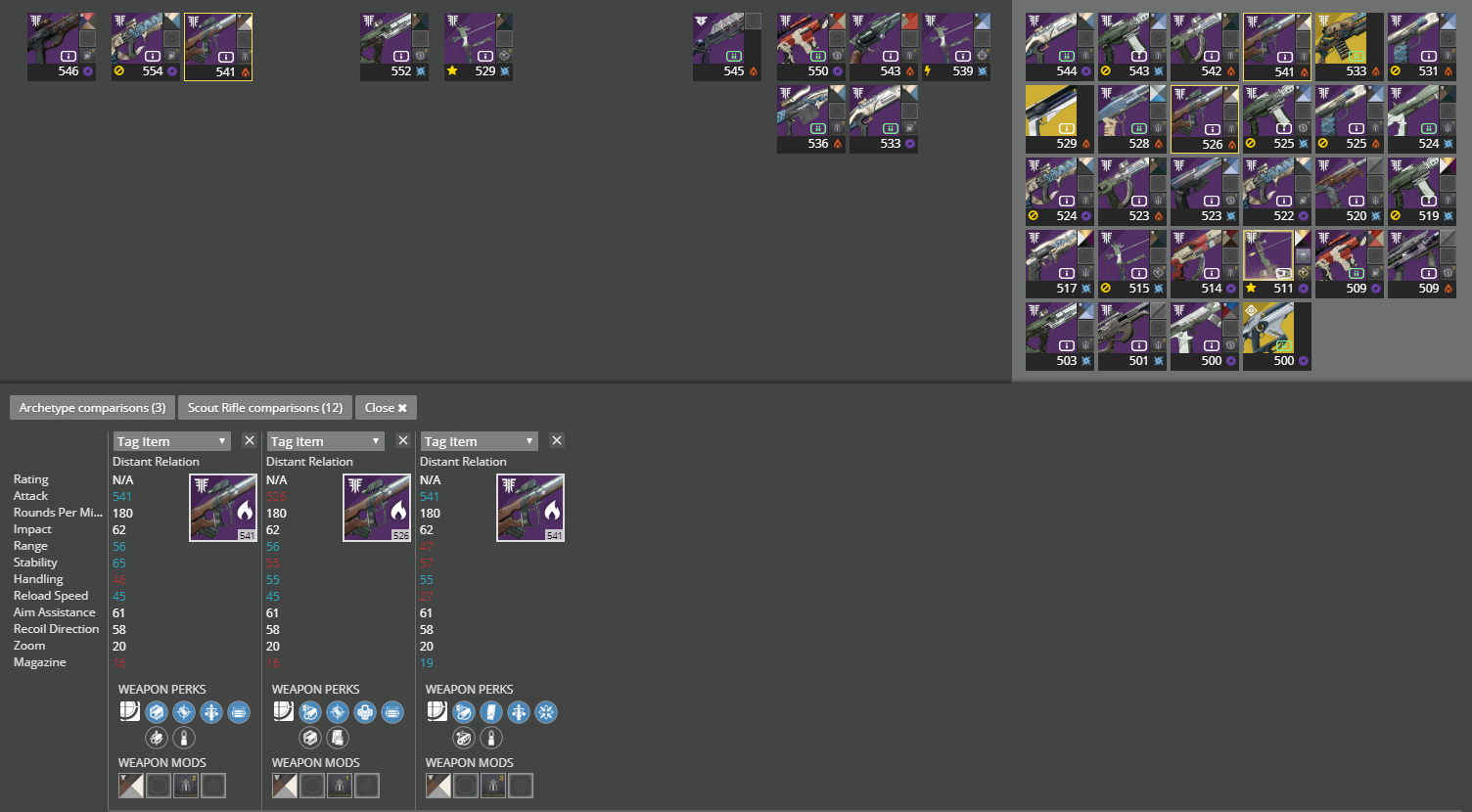
highlighting
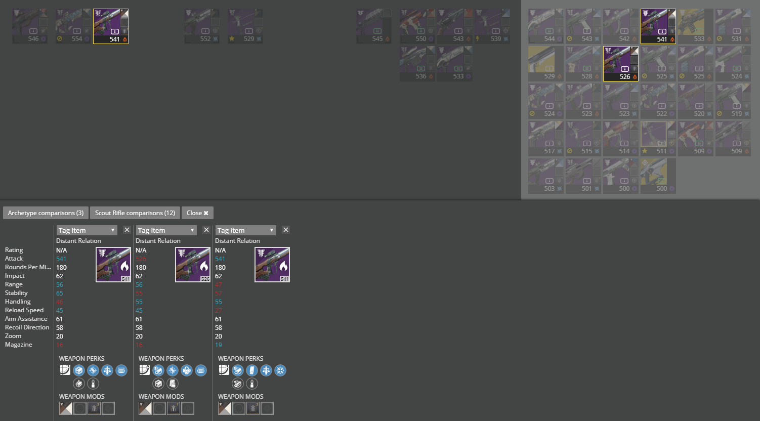
highlighting + dimmable
Probably a different colour would be ideal since the random yellow i chose resembles masterwork too closely, which could induce more confusing ux.
Thoughts?
 dhazelett
All 5 comments
Hmm, I agree it can be confusing to know what items have already been added to the compare list.
I'm hesitant to apply opacity to the non-matched items, because a user should be able to look over the other items and be able to click them to add to the compare. Being said, maybe we could use a border with an icon on it to indicate that it's being used in the compare (or the loadout) panels.
Similar to what you were saying with the border... Maybe a red/greenish border with a triangle on the top left with an icon on it to indicate that it is part of your multi-selection.
The compare screen does need some work...
 kyleshay
on 20 Sep 2018
kyleshay
on 20 Sep 2018
I definitely agree about the opacity, too.
I'm worried about adding another icon though, were very overwhelmed with them as is. I've also heard concern on other tickets about covering the expac indicator too.
I think it might be right to use a bolder, un-used color for a border.
dhazelett
on 20 Sep 2018
To "find" a item already on the compare tool, just click on their name.
Only works on desktop though.
 duckmanBR
on 20 Sep 2018
duckmanBR
on 20 Sep 2018
I think the whole compare feature is due for a refresh :-)
 bhollis
on 21 Sep 2018
bhollis
on 21 Sep 2018
@bhollis can't wait to see the refresh.
Until than can you make Mods available again in the comparison screen? They're very helpful when comparing weapons with fixed perks (like Vestian Dynasty).
 DDaniali
on 6 Nov 2018
DDaniali
on 6 Nov 2018
Related issues
duckmanBR
·
3Comments
bhollis
·
3Comments
 javalasers
·
6Comments
javalasers
·
6Comments
 InstaSteve
·
4Comments
InstaSteve
·
4Comments
 joshminnie
·
3Comments
joshminnie
·
3Comments
Most helpful comment
I think the whole compare feature is due for a refresh :-)