Devextreme: Material Design theme
The Problem
Material Design is getting popular and becoming one of the modern web UI standards. For web developers, it’s frequently a requirement for new apps. Implementing it from scratch is a tremendous task.
The Solution
We decided to provide the Material Design theme for DevExtreme components out-of-the-box. You can enable it using the predefined themes approach.
The new theme is available as dx.material.blue.light.css in the DevEextreme npm, Bower and NuGet pre-release packages. Also, you can use npm CDN to reference it:
  <link rel="stylesheet" href="https://unpkg.com/[email protected]/dist/css/dx.common.css" />
  <link rel="stylesheet" href="https://unpkg.com/[email protected]/dist/css/dx.material.blue.light.css" />
For Angular apps, follow the corresponding guide to setup your app.
Screenshots
DataGrid

TreeList
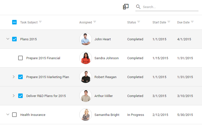
Form

Try It And Give Us Feedback
Live Sandbox
Installation
Follow the installation guide from the release page and leave us feedback on this topic.
 dxbykov
All 16 comments
hi it is possible change primary and accent color?
 brux88
on 13 Apr 2018
brux88
on 13 Apr 2018
@brux88, we are working on adding the Material theme to the ThemeBuilder. Also, we plan to release a number of predefined color schemes for the Material theme. You can now change the @base-accent variable in material.blue.light.less and build your own dx.material.blue.light.css, following our Developer's Guide
 babich-a
on 13 Apr 2018
babich-a
on 13 Apr 2018
Some widgets look like no work has been done on them since they do not fit in material theme:
- dxLookup
- dxSelectBox
- dxTextArea
- dxTextBox
- dxNumberBox
Context menu items have buttons? I think what android theme had for context menu is closer to material theme.
Also it would be awesome if you could provide an easy way of defining a template for no data. I am talking here about widgets that display data items, like grid or list. At the moment we can only define text that will be displayed when no data is available but I think providing us with a template function and giving us a abilitay to define empty template would be most beneficial. For instance, we could put an image of some sort, a text description and maybe a button to add new data in case no data is displayed.
Is toast message style pulled from some other theme at the moment or are you rolling with this. At the moment I get green toast bacground for success when the style should be pretty much the same as what you have in android theme.
Antoher thing I would like to add is the popup buttons. When dxButton is placed in popup via toolbar it gets ripped of its style and it becomes a flat button. It would be really nice if you could give us an option to retain the styling applied via "type" property(There are workarounds but they are ugly).
That being said I really like the new look and feel of grid. It is much more spacey and cleaner than that of android theme.
 rprimora
on 15 Apr 2018
rprimora
on 15 Apr 2018
Hey @rprimora! Thank you for your detailed feedback. We continue improving the Material theme and fixing some minor issues. That's why some of the widgets don't have a final look yet. For example, we have rolled out the dxToast with today's pre-release build and making some improvements in dxLookup right now.
Material guidelines don't describe every control and every feature we already have in DevExtreme. In some cases, we adapted the guidelines for our realities. For example, the difference between dxLookup and dxSelectBox is that we render SelectBox as a picker (we think it's ready) and Lookup as a dropdown menu (work on this hasn't been done yet). Here we follow this part of guidelines. For the TextBox, TextArea and NumberBox we used this part of guidelines. Right now, our editor controls don't have a label option so the only way to render editors with labels is to use the dxForm control. Right now, we don't have the focus animation of a label in a form but it's going to be added later this year. As for the label option in editors, we are discussing to add it in the next releases. Currently, we don't know about other issues here, please let us know if you see any differences with guidelines.
For the Toast control, please use the "info" value of type option to get the message with the gray background. For the other types, we use green, yellow and red colors from Material Design color palette to emphasize the differences of messages a user gets.
Right now, we use "dx-button-flat" CSS class to make a button flat and add use the same styles to all buttons inside toolbars and popups according to Material Design guidelines. It's impossible to set any option to make a button 'non-flat' there right now. The good news is we are considering adding this option later this year for all available themes.
Talking about a collection widget template for 'no data', we added this idea to the internal product backlog for future discussion.
Not sure I got your question about the context menu. Can you describe the result you're expecting? A simple code block, an image or a guideline link would be helpful.
 groshenkovamarina
on 16 Apr 2018
groshenkovamarina
on 16 Apr 2018
As for the label option in editors, we are discussing to add it in the next releases
Great. This is a must have to make the editors look seamless in a material site. The dxForm options works in some cases but won't work everywhere.
 sccrgoalie1
on 17 Apr 2018
sccrgoalie1
on 17 Apr 2018
@groshenkovamarina Here are some images of how it looks on my side.
This is dxLookup. It has a border all around which I think is not part of material look.

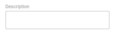
Thi is dxTextArea. It also has borders all around. I think this might be what you are saying - still in development.
This is the hover effect of simple dxTextBox. The first input is the one I am hovering. In my opinion, the black border does not go well with this.

Forgive me for mentioning dxContext menu, It seems I have implemented dxActionSheet instead of context menu.
I know this is still work in development and I am really looking forward to this theme but at this point android theme is much closer to material guidlines than this them.
rprimora
on 17 Apr 2018
@rprimora Thanks for the clarification.
Yes, the dxLookup doesn't have a Material Design look yet. I'll let you know when we merge fixes of this control.
TextArea works as expected - check this image from Material Design guidelines. Opposite of the TextArea with a fixed height, the multi-line editor has a floating height and only a bottom border but we don't support multi-line editing for the dxTextBox. Do you need this kind of component in your application?
The hover effect of dxTextBox also works according to the guidelines - please check the image with different states from this page.
 BingoRUS
on 17 Apr 2018
BingoRUS
on 17 Apr 2018
I gotta admit I did not scroll down to the textArea explanation but having seen it now I completely despise it 😄
Yes I was thinking more along the lines of multi-line editor like so...
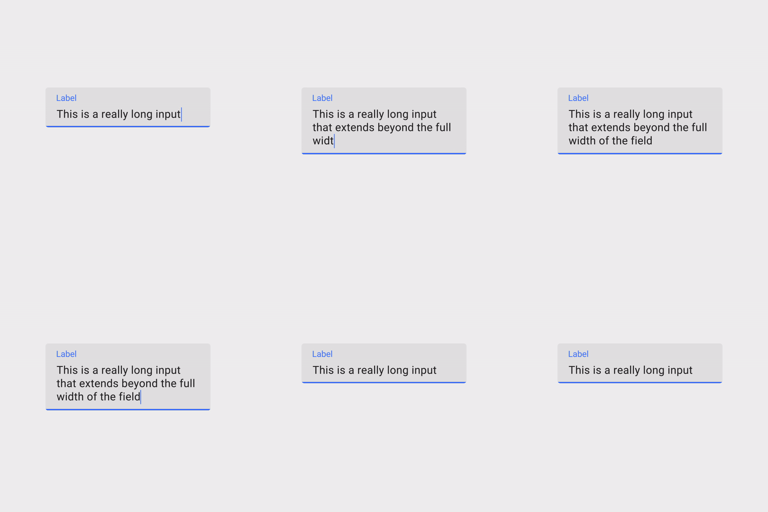
...this currently works in your android theme for dxTextArea and it can be seen in some places on web for instance when writing YouTube comments. It would be nice to support this so we are not limited by dxTextArea when wanting to make a multiline input.
I can see now the hover effect on the google material guidlines and it kinda looks different than your but I checked and the color is indeed black so I don't know. Might be my screen.
Also, do you have plans on implementing character counter below input border?
rprimora
on 17 Apr 2018
@rprimora I've added the multi-line mode and the character counter to our product backlog for future discussion. And I would like to say thank you once again for your detailed feedback.
BingoRUS
on 17 Apr 2018
Lookup dropdown in DataTable is too small in material theme. See the following two screenshots of android vs material theme:
Good (android theme)
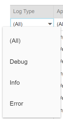
Not working (material theme)
 pfeigl
on 18 May 2018
pfeigl
on 18 May 2018
Hi @pfeigl!
The drop-down window width is equal to the editor width by default. This logic doesn't depend on a particular theme.
At the same time, we added default paddings for each column in the material theme (see our blog post for more information).
So, the editor width is small and is not enough to display text. We recommend you extend this column.
We appreciate you pointing out to this behavior and will consider improving it in the future.
groshenkovamarina
on 18 May 2018
Already realised that the lookup extends in size as soon as the column gets bigger.
What I don't understand is: Why is the dropdown so much bigger than the original field with the android theme? There is is also much bigger than the actual column (see my first screenshot)
Anyways: Big thanks for the new theme, it's looking fantastic, very nice work there!
pfeigl
on 18 May 2018
hi, I have the same problem, because the descent was like the column, before it was bigger, how can I fix it
brux88
on 18 May 2018
@pfeigl Thank you for your positive feedback! You're right, in the android theme the width of the drop-down window is calculated differently. We'll check if we can move the same logic to the material theme.
groshenkovamarina
on 21 May 2018
Hi @brux88,
As I wrote above, in the material theme default paddings of the grid column were increased.
If extending the column does not suit you, then you can reduce the paddings using CSS.
If your scenario is more complex, I recommend you contact our Support Team in the Support Center.
groshenkovamarina
on 21 May 2018
Thanks for trying the feature. Based on your feedback, we improved some use cases in the Material theme. It is available since v18.1.3. Also, we extended a list of planned features for the next major release. Right now, I'm closing this discussion thread and recommend you create a new issue here or a ticket in our Support Center in case of any bug, question or feature request related to Material Design and DevExtreme widgets.
BingoRUS
on 5 Jun 2018
Related issues
 Semigradsky
·
3Comments
Semigradsky
·
3Comments
 Walgermo
·
4Comments
Walgermo
·
4Comments
 hakimio
·
4Comments
hakimio
·
4Comments
 FabianoCastro
·
5Comments
FabianoCastro
·
5Comments
 Bykiev
·
9Comments
Bykiev
·
9Comments