Developer-roadmap: Accessibility & Understandability - Color scheme
Question
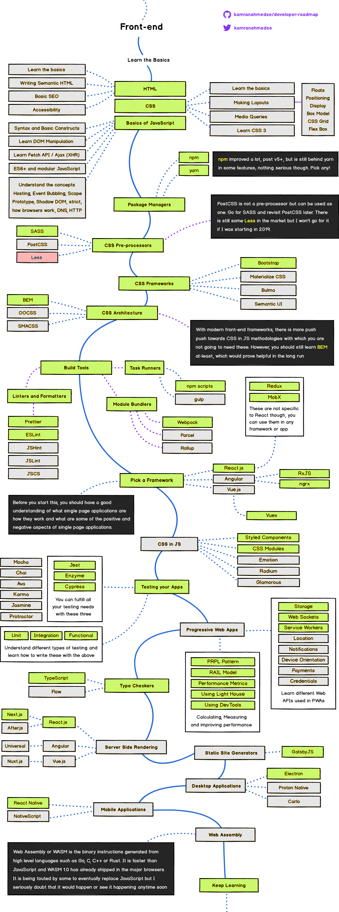
Would it make sense to pick a higher contrast, better Recommended / Possibilities / Meh color scheme?
As an experienced web dev, it wasn't immediate obvious which items were being recommended vs being an possibilities. Both the Yellow and Orange have a heavy / deep color. Even with a key, there is mental overhead parsing the meaning.
My recommendation:
Recommend = Green
Possibilities = Grey
Meh = Very Soft Red
This will make the recommended route be more apparent. As green traditionally means 'good', 'grey' neutral, and 'red' bad. Think of a stoplight. Other colors could also be chosen that are more accessible.
Rough Demo
 TheBox193
All 5 comments
I would prefer if the color of the additional descriptions could be changed from black and white font to something more in tune with the current color map.
 Daniel-Yonkov
on 12 Apr 2019
Daniel-Yonkov
on 12 Apr 2019
Also, would be good to consider colorblind accessible colors. Green / Grey / Red might not be the best colors in that regard.
 oryan
on 30 Apr 2019
oryan
on 30 Apr 2019
Also, would be good to consider colorblind accessible colors. Green / Grey / Red might not be the best colors in that regard.
I searched this issue out for this very reason.
As a color blind individual, this was impossible for me to parse without utilizing the colorblind filters in Windows 10.
Some great info here either way, though!
 lando-cal
on 28 Jun 2019
lando-cal
on 28 Jun 2019
Just as an addition, i agree with all posts here, but i don't think the use of red here would be a great idea. For a roadmap that has non-experienced people, red at first look may sound as wrong...
Grey sounds nice for Meh IMO though. I think we could use Grey for the ones labeled as "meh", some (light) color for the possibilities and some (heavy) color for the other ones.
I think the problem is not the Yellow, but the orange. it also passes a heavy perspective...
Note: I don't know much about colorblind colors, so i can't give a good idea for a color...
 Ronkiro
on 28 Jun 2019
Ronkiro
on 28 Jun 2019
This has been fixed and will be published in the coming release. Thank you 🙏
 kamranahmedse
on 4 Jan 2020
kamranahmedse
on 4 Jan 2020
Related issues
 IuryAlves
·
3Comments
IuryAlves
·
3Comments
 sxnaprkhr
·
3Comments
sxnaprkhr
·
3Comments
 GTHell
·
5Comments
GTHell
·
5Comments
 parv0888
·
5Comments
parv0888
·
5Comments
 huseyincelik
·
3Comments
huseyincelik
·
3Comments
Most helpful comment
Also, would be good to consider colorblind accessible colors. Green / Grey / Red might not be the best colors in that regard.