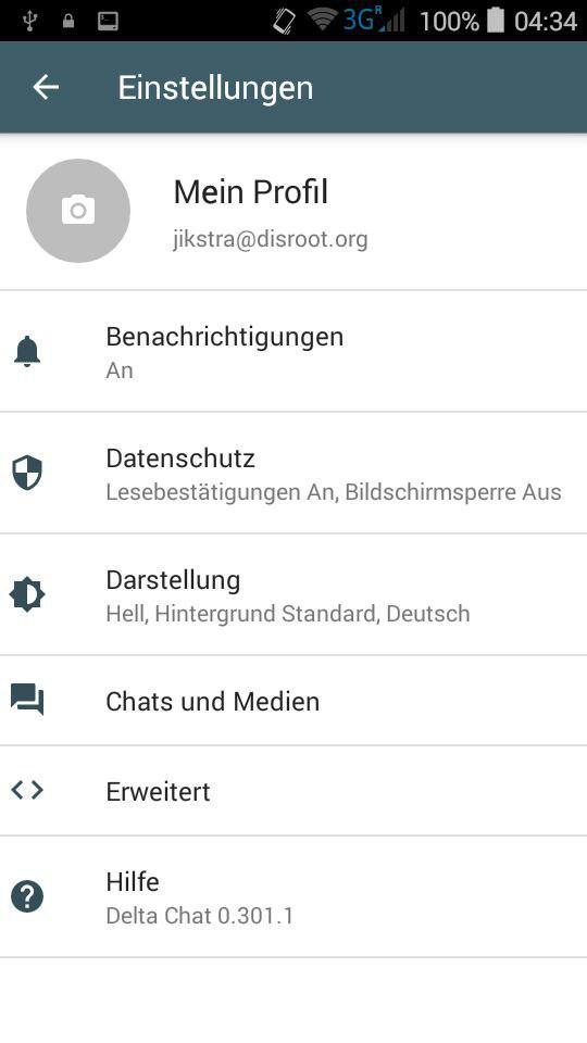
Deltachat-android: on Android 4, the Settings screen looks weird and misses some padding
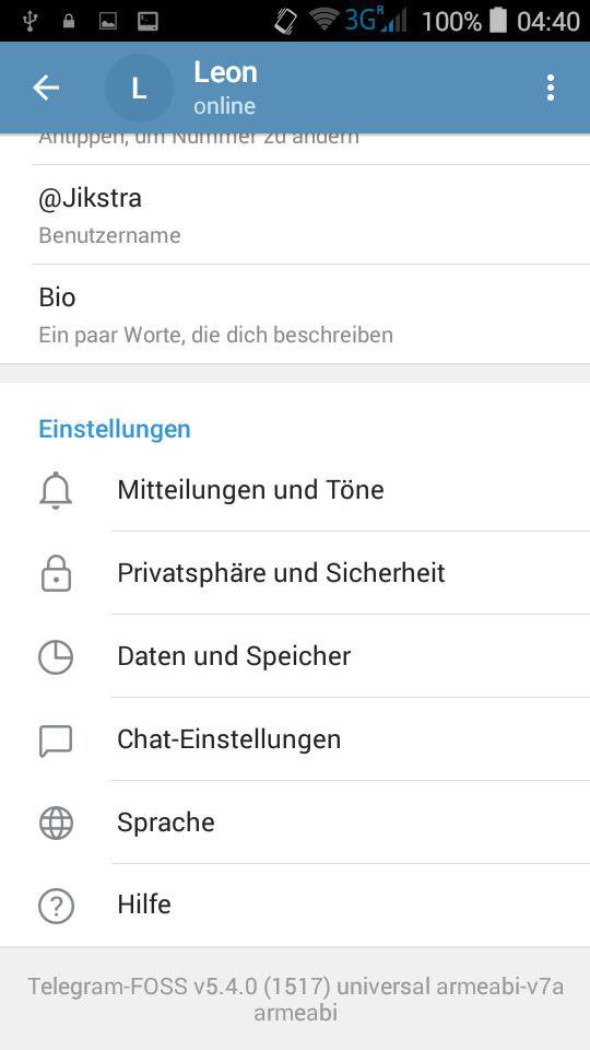
Telegram in comparison:
Icon/Text of settings is really close to the screen border. Not sure if this is specific to my old device.
 Jikstra
All 6 comments
Not sure if this is specific to my old device.
i think so, also noticed that for android 4.x. not totally sure, what the reason for that is, however, whatever the fix might be, this may result in keeping two layout files which results in additional maintenance then. so i am not sure if it is worth the effort.
there are already lots of workarounds to avoid android 4 crashes, eg. https://github.com/deltachat/deltachat-android/pull/865 :/
@Jikstra otoh - is only the settings main page that looks weird to you?
 r10s
on 8 May 2019
r10s
on 8 May 2019
wrt Telegram: well they paint everything on their own and do not use the typical views. this makes the app unusable for screen readers and so on (we're in contact with some blind people that test such things)
r10s
on 8 May 2019
@Jikstra otoh - is only the settings main page that looks weird to you?
The loading dialog/popup with that rotating circle thing is also misaligned. But that's all I came across.
EDIT: It's the same in the "Profil anzeigen" thing. Probably more which use the same layout.
this may result in keeping two layout files which results in additional maintenance then.
So maybe not worth it. I'm fine with having it not 100% polished on older devices.
Jikstra
on 8 May 2019
thanks for the info. we're about to redesigning the profile view anyway, so we'll probably test android 4 for not crashing anyway. if it does not come with cost of maintainability, we'll also have an eye one the layout then :)
r10s
on 8 May 2019
I am wondering if the results from an Android Studio Code Inspection give valuable hints regarding behavior on older Android Versions:
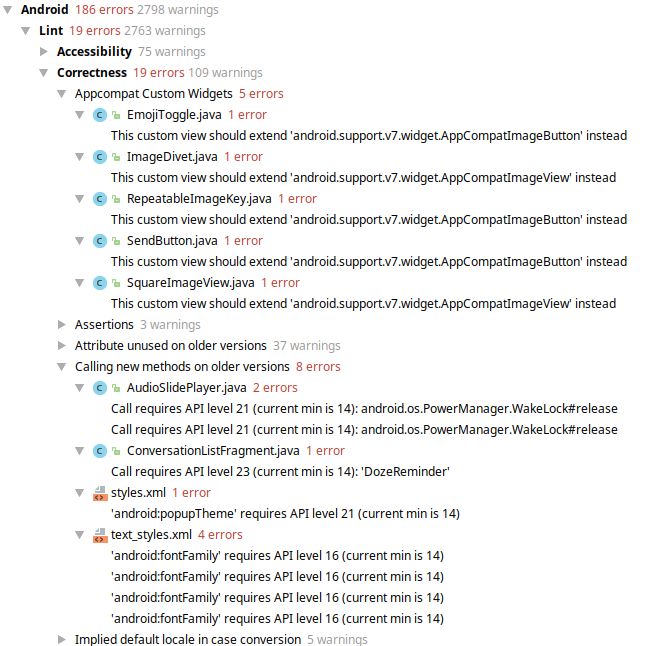
(The total amount of errors/warnings depends on the selected Checks)
 Ampli-fier
on 8 May 2019
r10s
on 18 Jun 2019
Ampli-fier
on 8 May 2019
r10s
on 18 Jun 2019
Related issues
 BoFFire
·
4Comments
BoFFire
·
4Comments
 travisfw
·
5Comments
travisfw
·
5Comments
 AndreasLattmann
·
4Comments
AndreasLattmann
·
4Comments
 gerroon
·
3Comments
gerroon
·
3Comments
 angelo-fuchs
·
3Comments
angelo-fuchs
·
3Comments
Most helpful comment
wrt Telegram: well they paint everything on their own and do not use the typical views. this makes the app unusable for screen readers and so on (we're in contact with some blind people that test such things)