Deltachat-android: Chat UI not touch friendly
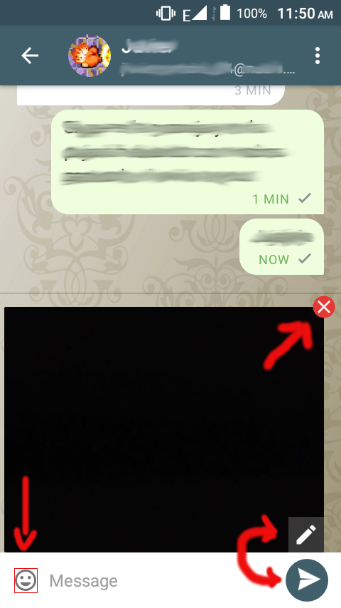
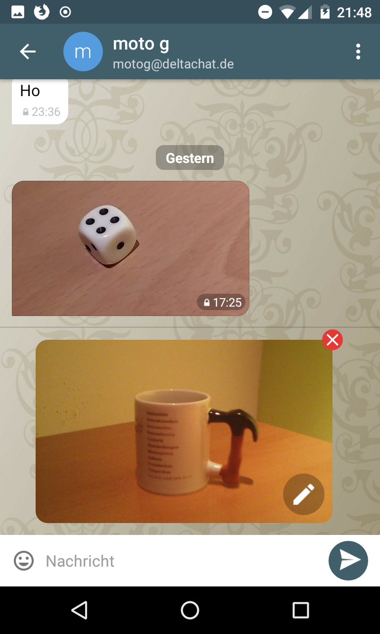
Some buttons are a bit hard to tap, as you can see in the screenshot, the "x" button on the image is small, the edit image (pencil) button is too close to the send button so it is easy to send the image accidentally, the emoji icon's padding is small making it hard to tap.
- Platform (android/blackberry/anbox): Android
- Device: BLU
- Delta Chat Version: 0.97.1
- Screenshots:
 adbenitez
All 24 comments
hm, compared to the touch keyboard, the buttons look good to me.
i think also that the real touch-sensitive-area is a bit larger.
 r10s
on 3 Jan 2019
r10s
on 3 Jan 2019
after targeting #202 and opening the preview when pressing the staged-image, i agree that at least the edit button could be a bit larger.
will also add some space between the staged-image and the text input which will also move the send-button a bit away.
r10s
on 4 Jan 2019
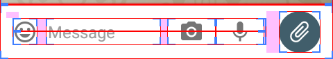
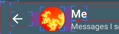
I think the touching area of the emoji icon could be bigger (look the attached image), there are lot of empty space around it, perhaps it is the screen size of my phone, but the icon is small and hard to tap with my dummy fingers ;) seriously, I usually have to tap it several times before the keyboard shows up, don't know if it is related to the touching area or because the low RAM (458MB) of my phone.
adbenitez
on 4 Jan 2019
thanks for explanation :)
maybe we can change the _magin_ of the image to a _padding_, at least for the emoticon/keyboard button.
however, still not sure if this is really needed. did not got reports about too small buttons before :)
r10s
on 4 Jan 2019
On Fri, Jan 04, 2019 at 08:37 -0800, björn petersen wrote:
thanks for explanation :)
maybe we can change the _magin_ of the image to a _padding_, at least for the emoticon/keyboard button.
however, still not sure if this is really needed. did not got reports about too small buttons before :)
then again, there are not many reporters who give feedback
at this precision/detail level :)
 hpk42
on 4 Jan 2019
hpk42
on 4 Jan 2019
r10s Well IMO the more dangerous thing was the edit button too close to the send button all the rest are less important details.
adbenitez
on 4 Jan 2019
the edit-button is now larger and a bit more away from the send button:
r10s
on 4 Jan 2019
however, maybe we can move the edit button further into the image. and maybe show it as a round button.
r10s
on 4 Jan 2019
I don't know anything abut UI design but the edit button could go in the left side so it is close to the hard to tap emiji icon so it is save there ;)
(just joking, I think it is good enough)
adbenitez
on 4 Jan 2019
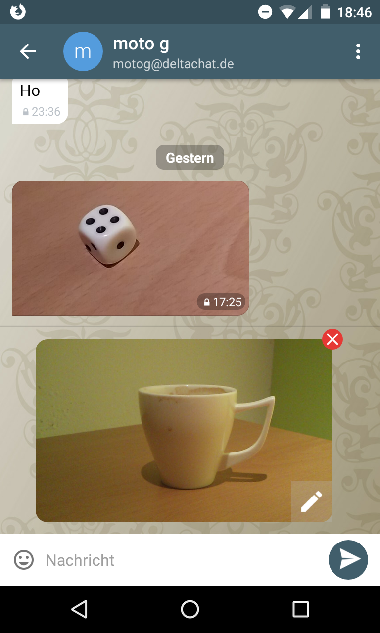
anyway to avoid user taps on the image accidentally while trying to tap the edit/close icons, there are space out of the image, something similar to this could be done, for example:
adbenitez
on 4 Jan 2019
hm, i would leave the close button where it is, this style is sort of known.
if needed, we can make the reponsive area larger.
however, tapping the image accidentially is not as worse as tapping the close button accidentially :)
maybe, in mid-term, we can also skip the edit button completely and open the editor on _any_ click in the image (currently, the _editor_ lacks some functions available in the _preview_ so, for now, this is not an option)
r10s
on 4 Jan 2019
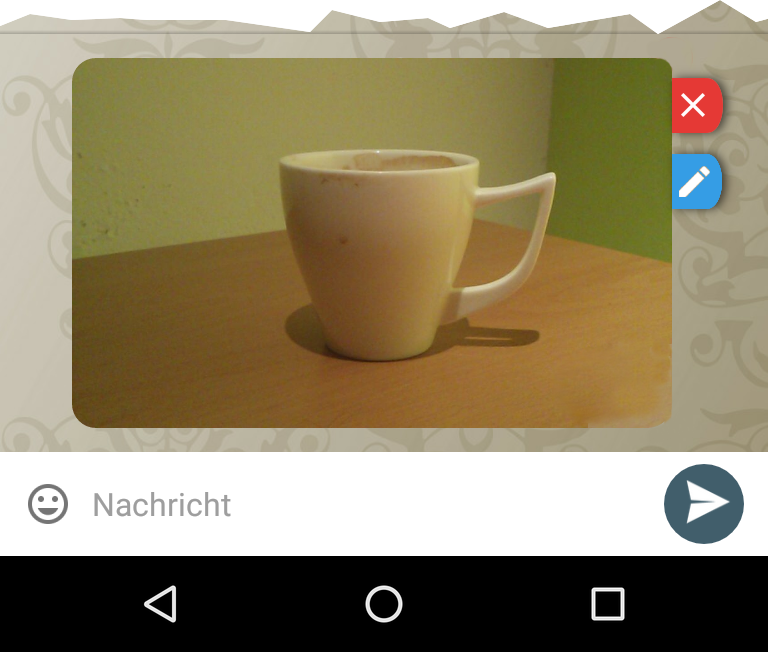
this is what i was talking about:
r10s
on 4 Jan 2019
tapping the image accidentially is not as worse as tapping the close button accidentially :)
Right, I realized it but after all that GIMP work, decided to upload it anyway XD
I like much more this round edit icon +1
adbenitez
on 4 Jan 2019
sure, thanks for uploading and for all your help. this is very useful. :+1:
r10s
on 4 Jan 2019
@r10s @adbenitez Can this issue be closed?
 angelo-fuchs
on 25 Jan 2019
angelo-fuchs
on 25 Jan 2019
not yet, the emoji-button can indeed be at least wider.
however, it's might be a bit tricky to move margins to paddings and needs also some of testing.
r10s
on 25 Jan 2019
The emoji icon have no padding in the default state of the textedit when the user types more lines of text the padiding grows.
adbenitez
on 25 Jan 2019
maybe, in mid-term, we can also skip the edit button completely and open the editor on _any_ click in the image (currently, the _editor_ lacks some functions available in the _preview_ so, for now, this is not an option)
I like this idea, as well as the bigger round edit button.
From my experience, it is not just the emoji button, it is:
- The back button in the upper left corner
- The input message area (could be higher)
- The add photo, record voice message and emoji buttons
It is possible to tap all of them but it could be better, especially as there would be enough space around them. IIRC this was better in the old Telegram-UI. And @adbenitez yes, there are two millimeters of unused space over and over the emoji button on my device.
 Hocuri
on 12 Feb 2019
Hocuri
on 12 Feb 2019
@Hocuri some friends also complained about the back button!!! I had not encountered this issue since I use my phone is back button instead of the app is button, also I think the add photo, record voice message buttons could have more padding but I didn't keep complaining about here because I think this touch problem is more related to UI unresponsiveness, since some times the buttons don't work even when I am sure I am touching their epicenter ;)
see: #435
adbenitez
on 13 Feb 2019
This did never happen to me, it just took some time until DC reacted. Anyway, the touch areas could be bigger as can be seen at your screenshot: https://github.com/deltachat/deltachat-android/issues/427#issuecomment-451462213
Hocuri
on 13 Feb 2019
i think the back-button has system-size and style (both, the one in the navigation area and the one in the title bar).
r10s
on 14 Feb 2019
that is why I think it is more a unresponsiveness issue...
adbenitez
on 14 Feb 2019
i think the back-button has system-size and style (both, the one in the navigation area and the one in the title bar).
I don't think so, in other apps the title bar back button area is much bigger:
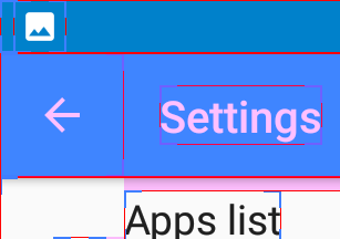
Hocuri
on 14 Feb 2019
@Hocuri thanks!
r10s
on 14 Feb 2019
Related issues
 travisfw
·
5Comments
travisfw
·
5Comments
 webratte
·
4Comments
adbenitez
·
4Comments
webratte
·
4Comments
adbenitez
·
4Comments
 gitkald
·
5Comments
adbenitez
·
4Comments
gitkald
·
5Comments
adbenitez
·
4Comments
Most helpful comment
On Fri, Jan 04, 2019 at 08:37 -0800, björn petersen wrote:
then again, there are not many reporters who give feedback
at this precision/detail level :)