Deck: Undo removal of "has description" icon for cards
Is your feature request related to a problem? Please describe.
Due to a general card layout discussion (see here) the decision was made to remove the "has description" icon in version 1.0.0. Reason for it being that the icon only indicates a tooltip which was too little obvious.
Personally I think this was a very helpful little feature to give a quick overview if a card has gotten more attention (like thinking about a possible way to resolve a bug). The tooltip itself is (in my opinion) not that important since one can just open the card details to read it.
It is very similar to the "has comment" icon. Without the icon one have to redundantly check the full card details to see if it has a description (or, for comparison, has a comment).
Describe the solution you'd like
Undo the removal of the "has description" icon.
Cheers,
MonkeySon
 MonkeySon
All 23 comments
Okay, I didn't search the closed issues, sorry..
Look at #1827
MonkeySon
on 12 May 2020
Reopened and edited following the short conversation here.
MonkeySon
on 13 May 2020
My point from https://github.com/stefan-niedermann/nextcloud-deck/issues/298#issuecomment-605644227 still stands
Because tooltips are really not obvious. First line of description gives way better context and directly shows what’s there.
Personally I don't see much value in showing the first line of the description, I would even argue that we could remove the description indicator icon in the web app, since that only helps if you use it with the tooltip.
The thing is that we have quite limited space and want to provide an easy overview over the most important status indicators here, where I don't see the information of "has nor has no description" as valuable as the rest of the icon indicators.
@nextcloud/designers Any input on this?
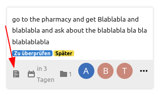
For reference, it is about this icon from the old web UI:
 juliushaertl
on 14 May 2020
juliushaertl
on 14 May 2020
ad. tooltips: As i just tested, there are none in version 1.0.0, which I am personally OK with.
ad. first line of description: I agree on it being not that valuable.
I think your view on the importance of the "has description" icon is a rather subjective one since I used and liked it a lot. And I also think there are others who found it helpful.
I could also argue that the display of the actual number of attachments is not that important, but that would mainly be because I don't use this feature (yet).
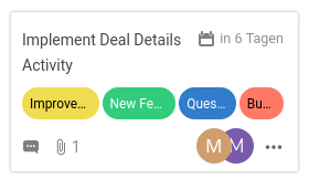
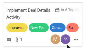
In terms of limited space I agree that it should not be too cluttered to give a good overview. Therefore I made an example card with (I think) all of the icons visible:
Plain card:
Hovering near assigned users:
I don't know how many people are usually assigned to one card, but in case of 2 there is still pretty much space. So one more icon would not have such a dramatic impact on the density of the layout.
MonkeySon
on 14 May 2020
There is a third icon which displays a task counter.
Add
- [x] item 1
- [ ] item 2
to your description and you will see it.
 stefan-niedermann
on 14 May 2020
stefan-niedermann
on 14 May 2020
Okay, I see your point:
With an additional icon, there would be a maximum of 2 assigned people possible without overlap.
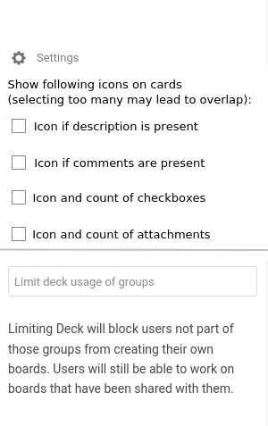
But considering a trade-off: would it be feasible to implement a checkbox field in the settings for enabling/disabling the display of icons? This way the user can decide on the importance of the icons for himself.
BTW: Is the dash at the beginning of each checkbox now mandatory syntax, or is it a side-effect/workaround for the current markdown rendering problems?
MonkeySon
on 14 May 2020
I can only decide for the Android client, but a setting for this is ridiculous. People are using deck differently and we have to make a tradeoff that fits for everyone as good as possible - but it's impossible to fit everyones needs.
In this case, you simply assume that most of the users won't assign more than 2 people to a card, but this is just an assumption that fits your needs. The description icon is arguable not as useful as you know your workflow. If someone uses descriptions, one will look into it, and in this case the description indicator is useless.
I align with the opinion of @juliushaertl in this point as i can't see a benefit that judges nor the visual clutter on the cards neither cluttering the settings.
stefan-niedermann
on 14 May 2020
People are using deck differently and we have to make a tradeoff that fits for everyone as good as possible - but it's impossible to fit everyones needs.
Yes, it's out of question that it is impossible to fit everyones needs. But thats why I was starting this conversation, to look if my opinion matches with other peoples.
... a setting for this is ridiculous.
And I do not think it is ridiculous. The Files app also uses settings for viewing/hiding hidden files or the rich workspace. So why not apply this to card item icons?
In this case, you simply assume that most of the users won't assign more than 2 people to a card, but this is just an assumption that fits your needs. The description icon is arguable not as useful as you know your workflow. If someone uses descriptions, one will look into it, and in this case the description indicator is useless.
I think you misunderstood me there: my point was that I agree with you that it would be too cluttered with 4 icons and 2+ people. My idea was to stick with the current layout decisions but in addition add a customization option for users with different needs.
EDIT: I use the description as a place where I collect thoughts about a certain problem/bug. So it is not just a matter of using or not using the description. For me it is an indicator if I have put deeper thoughts into a card. Not having the icons needs me to redundantly checking the description.
The settings could look something like:
MonkeySon
on 14 May 2020
I understood you well, i just don't agree :wink: .
What I could imagine is, that the web ui could put a css class like has-description or an data-has-description-attribute to the card if there is a description, call it a "plug-in" mechanism or a "api-hook" if you want.
A user who really really relies on this, could then throw 2 lines custom css onto it to restore the old behavior.
Another option i could imagine is to use some kind of config file, but those options should definitely not go into the UI like you suggested. Just my opinion, i don't speak for the developer of course.
stefan-niedermann
on 14 May 2020
Okay then I misunderstood your response :P
Well... hacking around in the sources or extra server config files is not what I would call an "accessible feature".
@stefan-niedermann
May I ask why your are so much against this feature or even an option in the settings?
Has this something to do with the android side of things?
As I said, I think it's not only about whether someone uses or not uses the description for the icon to be helpful or useless respectively. There are some in-between cases like myself. And you certainly cannot fit everyone's needs but it would definitely help (at least a few) other people to add an option for that. This way the default, intended behavior would not be changed and everyone who seeks customization will find it in the settings.
MonkeySon
on 14 May 2020
May I ask why your are so much against this feature or even an option in the settings?
@MonkeySon relevant article on the settings part: "Choosing our Preferences".
And relevant image – this is what we don’t want Nextcloud to look like:
 jancborchardt
on 14 May 2020
jancborchardt
on 14 May 2020
As for the issue itself, I’d say showing the icon indicator that there is a description can be quite useful. Trello does this as well with a simple "4 lines text" icon. Of course tooltip makes no sense there though, and we don’t need to have it.
jancborchardt
on 14 May 2020
Yep, the short answer is: I don't want Nextcloud to look like the screenshot that @jancborchardt posted. I always prefer a good default over a setting no matter what the default is, at least if there is not a good reason to make a setting (and this for sure isn't).
From my point of view the better default is to not show the icon, because
- i don't think it's useful because it does add zero information (compared to e.g. the task counter)
- we have limited space and this will make cards look more crowded than necessary
- we have recently discussed and committed to the layout of the cards for a long time with many people and we cannot make progress and implement new features if we change our mind every 5 minutes.
- the relevant information will be better / more discoverable without this icon
- Task counter, as well as comments are way more useful because if one works alone, he knows that there is a description because he obviously wrote it himself, but if one works in a team (and collaboration is a main target group of this app i think), one does not simply alter the description without notifying the team mates but comments the issue
No offense, just trying to explain my point :)
stefan-niedermann
on 14 May 2020
Fair enough, an interface like the screenshot is not what anybody wants!
I always prefer a good default over a setting no matter what the default is...
I assume that you also hold this opinion if you use a service whose defaults partially do not match your workflow. And I understand and respect this opinion: it makes the service easier to use and more uniform. But on the other hand it therefore lacks any kind of customization for users who are not totally happy with the defaults. This could, pessimistically spoken, limit the expansion of a service, depending on their target audience.
i don't think it's useful because it does add zero information
That may be right for your workflow, not for mine.
we have limited space and this will make cards look more crowded than necessary
Agreed.
we have recently discussed and committed to the layout of the cards for a long time with many people and we cannot make progress and implement new features if we change our mind every 5 minutes.
Also agreed. But I am just a user who missed this feature after the update. So I started this discussion to see if more people miss it. If yes, the developers may change it. If not, well, then maybe I have a unusual/rare workflow and I have to accept it.
Task counter, as well as comments are way more useful because if one works alone, he knows that there is a description because he obviously wrote it himself
Maybe, depends on the workflow. In my case (working alone), I have a "Backlog" with about 20 cards. Since creation of the oldest one a lot of things happened, so I don't remember if I added a description to each card. (I guess this is one of the reasons for using such a service like Deck, to not have to remember everything)
No offense, just trying to explain my point :)
I am not offended, I actually appreciate the time and energy you are putting into the discussion :)
Okay, so I have at last two ideas on how to maybe handle this topic:
Add an option in the settings BUT only a single checkbox (something like "Legacy Icons" or "Legacy Mode") to basically _allow_ cluttering of the card.
No Description: no icon; Text-only description: has-description-icon; Description with checkboxes: tasks icon like the current default
The latter one would not require a setting but I fear that it is as little unintuitive for some users.
What do you think?
MonkeySon
on 14 May 2020
No Description: no icon; Text-only description: has-description-icon; Description with checkboxes: tasks icon like the current default
Actually i think this is the best proposal you made yet :slightly_smiling_face: !
It signals the user if a description is present or not. If there are tasks, a user knows there is something in the description and it can safely replace the description icon with more valuable information.
Final choice is up to @juliushaertl
stefan-niedermann
on 14 May 2020
Maybe selections in the filter menu ?
 marcatsmci
on 16 May 2020
marcatsmci
on 16 May 2020
This issue has been automatically marked as stale because it has not had recent activity. It will be closed if no further activity occurs. Thank you for your contributions.
![stale[bot] picture](https://avatars3.githubusercontent.com/in/1724?v=4&s=40) stale[bot]
on 18 Jul 2020
stale[bot]
on 18 Jul 2020
No Description: no icon; Text-only description: has-description-icon; Description with checkboxes: tasks icon like the current default
Would be fine by me. Pull requests are welcome. We could also make the description icon a bit more fitting to the other icon style, maybe something like https://thenounproject.com/search/?q=text&i=3077357 instead of the default document icon that was used before
juliushaertl
on 20 Jul 2020
Just for information: Android App implemented this behavior for 1.8.3.
stefan-niedermann
on 20 Jul 2020
Hello again!
I finally set up a nextcloud dev-env to tackle this issue.
Adding the logic to show a seperate icon when no checkbox is present in the description seems pretty easy.
The line
<div v-else-if="card.description && checkListCount == 0" class="card-tasks icon icon-description" />
has to be inserted here:
https://github.com/nextcloud/deck/blob/622106d5de974c0f42b3f358cd718204d06d4cd8/src/components/cards/CardBadges.vue#L30
Unfortunately, I have no idea where the classes _card-tasks_, _icon-comment_ or _icon-checkmark_ are defined and what they to (ok, the prupose of the icons are obvious, their location is not ;) ). Thus, I also don't know how to add or choose an alternate icon like the one mentioned by @juliushaertl .
A project-wide text-search for the icons didn't yield any results, therefore I assume they are imported from somewhere else.
Can anyone give me a hint on this one?
Thanks in advance
MonkeySon
on 27 Nov 2020
Okay, after digging a little deeper in the documentation, I found the way to include a new icon.
First, I added a SVG icon to /img/ and named it desc.svg. (P.S.: For now, I converted your vector graphic to an SVG, @stefan-niedermann)
Second, I added the following line to /css/icons.scss:
@include icon-black-white('desc', 'deck', 1);
But now I have the problem that the icon is not displayed when using it via icon-desc.
I tried to re-compile the project with make build-js-dev or during make watch.
Do I have to perfom another step in order to "update" the resources?
Thanks,
MonkeySon
MonkeySon
on 28 Nov 2020
@MonkeySon maybe you can open a draft Pull Request, so it easier to test and see the actual changes? 🙂 Great btw that you started working in this issue :) 🚀
stefan-niedermann
on 28 Nov 2020
Thanks :)
I think the problem was just a caching-related thing.
After rebuilding and restarting the machine, it works with the new icon.
At the moment, I am preparing the pull request.
MonkeySon
on 28 Nov 2020
Related issues
 ampoz
·
4Comments
ampoz
·
4Comments
 Dubidubiduu
·
4Comments
Dubidubiduu
·
4Comments
 woosting
·
3Comments
woosting
·
3Comments
 jbonlinea
·
4Comments
jbonlinea
·
4Comments
 scoopex
·
4Comments
scoopex
·
4Comments
Most helpful comment
Actually i think this is the best proposal you made yet :slightly_smiling_face: !
It signals the user if a description is present or not. If there are tasks, a user knows there is something in the description and it can safely replace the description icon with more valuable information.
Final choice is up to @juliushaertl