Deck: Cards not very readable with NC 14 black theme
Hey over here !
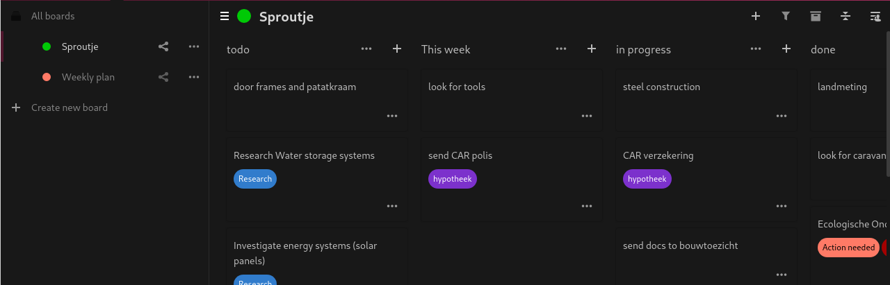
Describe the bug
Simple feedback of a short usage of this wonderful app, once the Nextcloud 14 black theme has been enabled : Cards are not really readable...
To Reproduce
Steps to reproduce the behavior:
- Run the Deck application
- Choose a board
- See the unreadable aspect of cards
Expected behavior
A cards design compatible with the black theme.
Screenshots

Client details:
- OS: Debian 10 (_Buster_)
- Browser: Firefox
- Version: v62.0.3
- Desktop environment: Cinnamon (with a dark theme too)
- Device: Laptop
Logs
Browser log
Content Security Policy: The page’s settings blocked the loading of a resource at self (“script-src”). Source: (()=>{
        let ODP=(t,p,o)=>{
            try
            {
.... deck:1
Thanks bye :wave:
Want to back this issue? Post a bounty on it! We accept bounties via Bountysource.
 HorlogeSkynet
All 5 comments
Thanks for reporting. I have already started fixing this in #643
 juliushaertl
on 12 Oct 2018
juliushaertl
on 12 Oct 2018
Wow such a fast feedback, thanks to you and sorry then (your PR does not contain "black" nor "theme" :joy:) !
++ :bowing_man:
HorlogeSkynet
on 12 Oct 2018
@HorlogeSkynet Let's keep it open, so we can properly keep track of it :wink:
juliushaertl
on 12 Oct 2018
Although merged and fixed, it looks like (at least since deck 1.0 and nextcloud 18.04) the cards are yet again indistinguishable from the background. Also the line seperating the columns has gnone missing presumable using the same color as backgorund.
Additionally, in the list of project, IMO the line seperating projects seems to be to thick.
I think it has to do with the fact, dark mode's global background used to be a bit brighter.
I don't know if that's stepping in with shoes in your house, but perhaps I could play around with css and submit some ideas if you don't mind.
 muppeth
on 9 May 2020
muppeth
on 9 May 2020
@muppeth Suggestions how to increase the visibility of the cards are very welcome. Feel free to open a new issue to discuss this in detail or just a pull request with some css changes :wink:
juliushaertl
on 11 May 2020
Related issues
 woosting
·
3Comments
juliushaertl
·
4Comments
woosting
·
3Comments
juliushaertl
·
4Comments
 ampoz
·
4Comments
ampoz
·
4Comments
 poVoq
·
4Comments
poVoq
·
4Comments
 langfingaz
·
3Comments
langfingaz
·
3Comments
Most helpful comment
@HorlogeSkynet Let's keep it open, so we can properly keep track of it :wink: