Dashboard: Dark Mode Palette Lacks Sufficent Contrast (Can be hard to read)
Environment
Basic Microk8s installation.
Installation method:
kubectl apply -f https://raw.githubusercontent.com/kubernetes/dashboard/v2.0.0-beta3/aio/deploy/recommended.yaml
Kubernetes version: 1.15.0
Dashboard version: 2.0.0-beta3
Operating system: Ubuntu 18.04
Node.js version ('node --version' output): v8.10.0
Go version ('go version' output):  1.12.7
Steps to reproduce
Installed beta3 of Dashboard.
Turned on Dark Mode.
Observed result
The colours palette made the screens hard to read. In particular the blue links are very hard to read against the dark background.
Expected result
Readable screens, with sufficient contrast.
Comments
The colour palette works great on standard mode.
The dark mode was very hard to read, and was almost vibrating for me.
Depending on your monitor, and the individual's eye sight, this may or may not be readable. The colour palette needs sufficient contrast.
I was looking forward to a dark mode on the dashboard, but cannot current use it in its current state.
 ncouse
All 15 comments
No useful information provided.
/close
 floreks
on 9 Aug 2019
floreks
on 9 Aug 2019
@floreks: Closing this issue.
In response to this:
No useful information provided.
/close
Instructions for interacting with me using PR comments are available here. If you have questions or suggestions related to my behavior, please file an issue against the kubernetes/test-infra repository.
 k8s-ci-robot
on 9 Aug 2019
k8s-ci-robot
on 9 Aug 2019
@floreks: Description was accidentally submitted as blank. Description updated.
ncouse
on 9 Aug 2019
I went to https://app.contrast-finder.org/?lang=en
I entered the values for the worst offenders, A elements. If I got it right, they're #326DE6 against the main view's #424242 background. That's a contrast ratio of 2.14, which is way lower than the recommended 4.5. Chrome's developer tools compute the same ratio, if you use CTRL-Shift-C to point at the hyperlinks. It even shows a warning sign.
Playing a bit, I found that e.g. using #52B5FF for the foreground gives you a ratio of 4.5.
The same #326DE6 against the darker #212121 looks better, but it still has a ratio of 3.42. I don't understand how this whole palette business in _dark.scss works, but hopefully the above is useful.
 therc
on 28 Oct 2019
therc
on 28 Oct 2019
/reopen
floreks
on 28 Oct 2019
@floreks: Reopened this issue.
In response to this:
/reopen
Instructions for interacting with me using PR comments are available here. If you have questions or suggestions related to my behavior, please file an issue against the kubernetes/test-infra repository.
k8s-ci-robot
on 28 Oct 2019
We can work further with provided information. Thanks @therc
floreks
on 28 Oct 2019
@floreks would it be enough if I did a global find/replace in _dark.scss? There are four occurrences of #326dE6 in _dark.scss...
therc
on 31 Oct 2019
Replace it and check how it works. You can attach some screenshots, so we will be able to see the difference.
 maciaszczykm
on 31 Oct 2019
maciaszczykm
on 31 Oct 2019
Don't change the 326dE6 color. It's Kubernetes base blue. I'd rather change background color.
floreks
on 31 Oct 2019
I know you like to maintain the standard product colours, but consider for dark mode that this doesn't always work.
A mistake I see often in dark mode is that designers try to hard to stick to "brand" colours. Dark mode palette can be completely different, and often works better, when it is.
Consider details in this article: https://uxplanet.org/8-tips-for-dark-theme-design-8dfc2f8f7ab6
It should still be possible to maintain your brand blue, but just some things to consider.
ncouse
on 31 Oct 2019
Primary color: #3276F5
Background color: #121212
Contrast ratio: 4.50099

How about that? It's close enough to the original color and ratio is ok.
floreks
on 31 Oct 2019
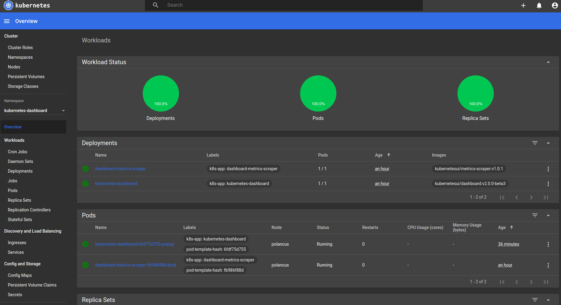
@floreks a few screenshots from the latest PR changes. I used your values, but also dimmed the top toolbar.
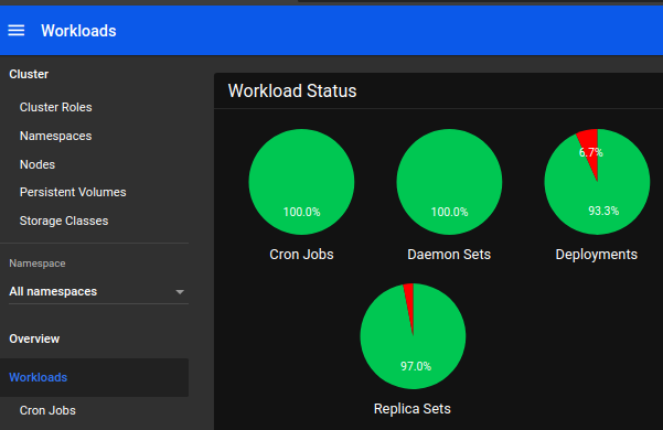
For some reason, GH scales all three images.
therc
on 1 Nov 2019
The graphs have a lot of hardcoded colors, e.g. in src/app/frontend/common/components/workloadstatus/component.ts or src/app/frontend/common/components/graph/component.ts
therc
on 1 Nov 2019
I guess we should prepare new color palette for the background around this "black'ish" color.
floreks
on 2 Nov 2019
Related issues
 lukmanulhakimd
·
4Comments
lukmanulhakimd
·
4Comments
 minminmsn
·
4Comments
minminmsn
·
4Comments
 mhobotpplnet
·
3Comments
mhobotpplnet
·
3Comments
 puja108
·
5Comments
puja108
·
5Comments
 kasunsjc
·
3Comments
kasunsjc
·
3Comments