Dashboard: Design dark theme color palette
Background
As part of the Angular migration (#3152), a dark theme is being introduced for Dashboard. This is all custom CSS in one file, and will make it easy to customize Dashboard's color scheme – a feature requested in #1657.

A possible use case for this custom theming would be to distinguish dev / staging / prod environments by color-coding them.
Relevant issues:
- #2618
- #2417
- #1938
Goal
The current dark theme has not had design attention, and as a result 1) Is not aligned with the Kubernetes brand, and 2) Has not been assessed in terms of color connotation (e.g. orange = warning) or accessibility (e.g. contrast). We would like to address these with a comprehensive color palette redesign that identifies key color(s) that can be swapped out to distinguish between Dashboard instances.
 danielromlein
All 8 comments
@maciaszczykm @konryd PTAL and see if this makes sense to you.
danielromlein
on 26 Jul 2018
@danielromlein It makes sense but unfortunately there are no volunteers with their ideas yet :) Perhaps you can take a look in free time?
 maciaszczykm
on 30 Aug 2018
maciaszczykm
on 30 Aug 2018
@Stritty want to post here anything you think is ready for feedback?
danielromlein
on 10 Sep 2018
@danielromlein @stritty Do you have any updates? Migration is finally going forward so it would be nice to change this before release.
maciaszczykm
on 8 Nov 2018
Finally got the angular dev build working thanks @maciaszczykm I will have updates for this shortly
 stritt
on 8 Nov 2018
stritt
on 8 Nov 2018
Any update?
maciaszczykm
on 13 Dec 2018

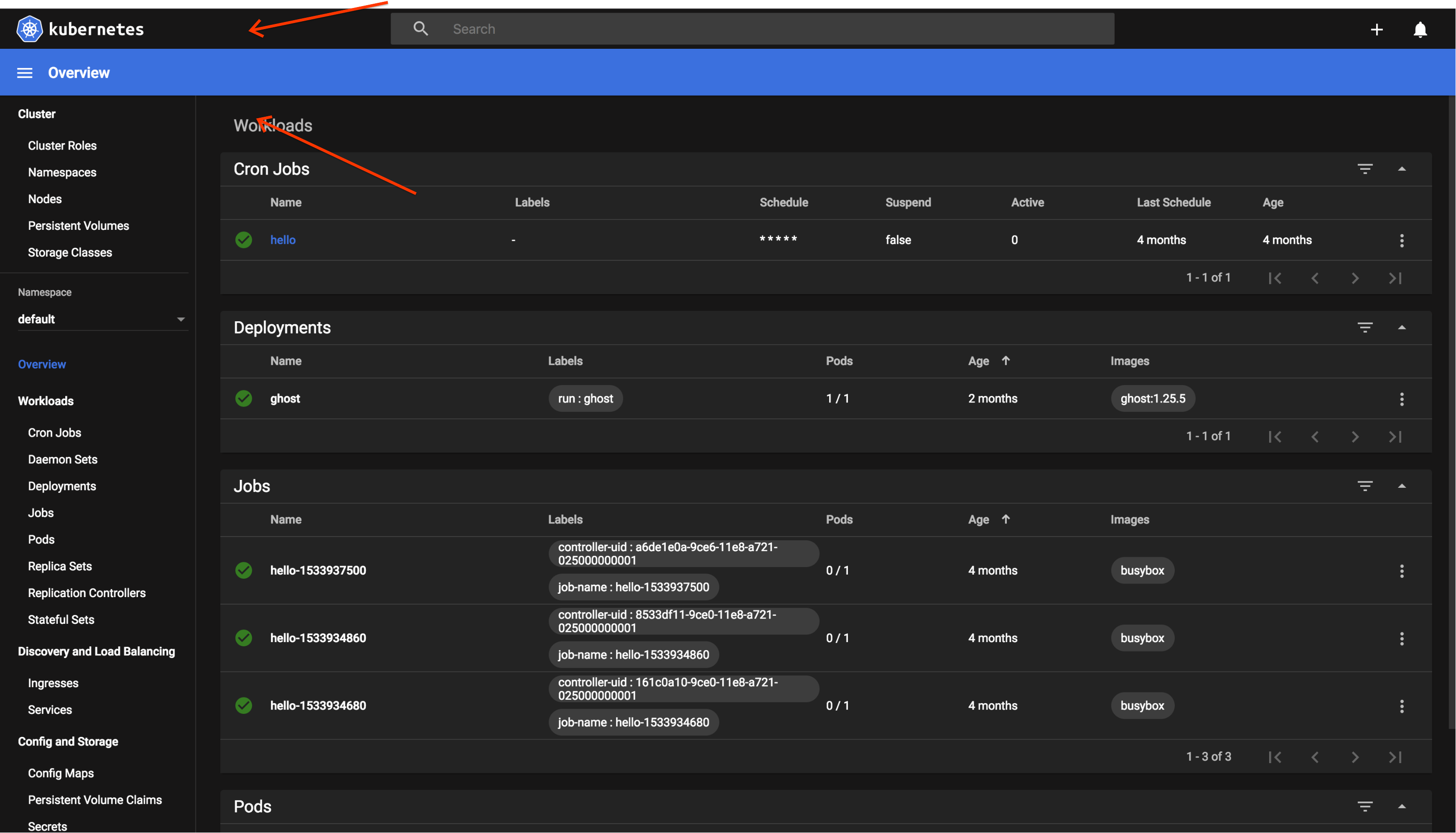
Updated styling to be on brand and WCAG accessible, you can see hover color of a card on the 'hello' cron job. Let me know what you guys think and I will go in and make any necessary changes
stritt
on 13 Dec 2018
I think this is looking awesome @stritt. Taking a cue from Mojave, I think if the top bar were lighter it would help the blue bar across look less jarring:
Right now I feel like the two dark sections are sort of isolated and my eye is distracted by the top bar.
danielromlein
on 3 Jan 2019
Related issues
 wheestermans
·
32Comments
wheestermans
·
32Comments
 cescoferraro
·
56Comments
cescoferraro
·
56Comments
 saschagrunert
·
30Comments
saschagrunert
·
30Comments
 saikatgithub
·
34Comments
saikatgithub
·
34Comments
 ijl
·
65Comments
ijl
·
65Comments
Most helpful comment
I think this is looking awesome @stritt. Taking a cue from Mojave, I think if the top bar were lighter it would help the blue bar across look less jarring:

Right now I feel like the two dark sections are sort of isolated and my eye is distracted by the top bar.
